Categories: General

Design Route B: The Connector

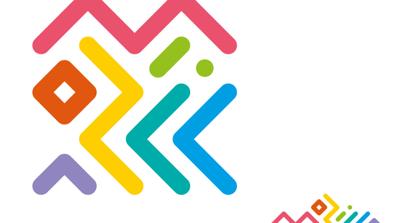
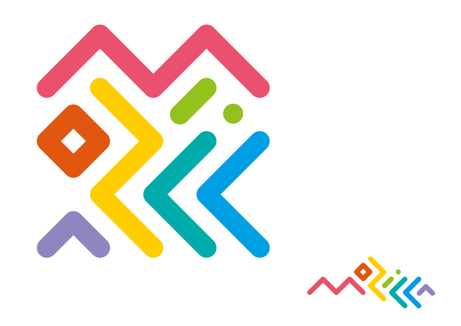
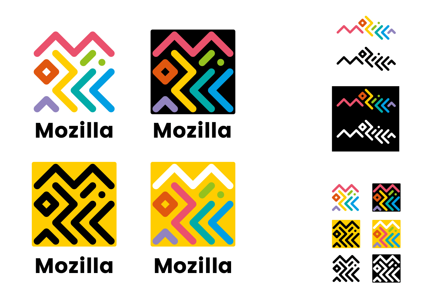
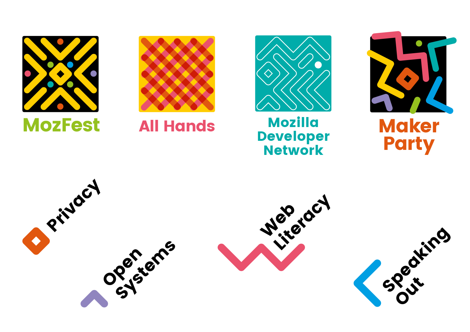
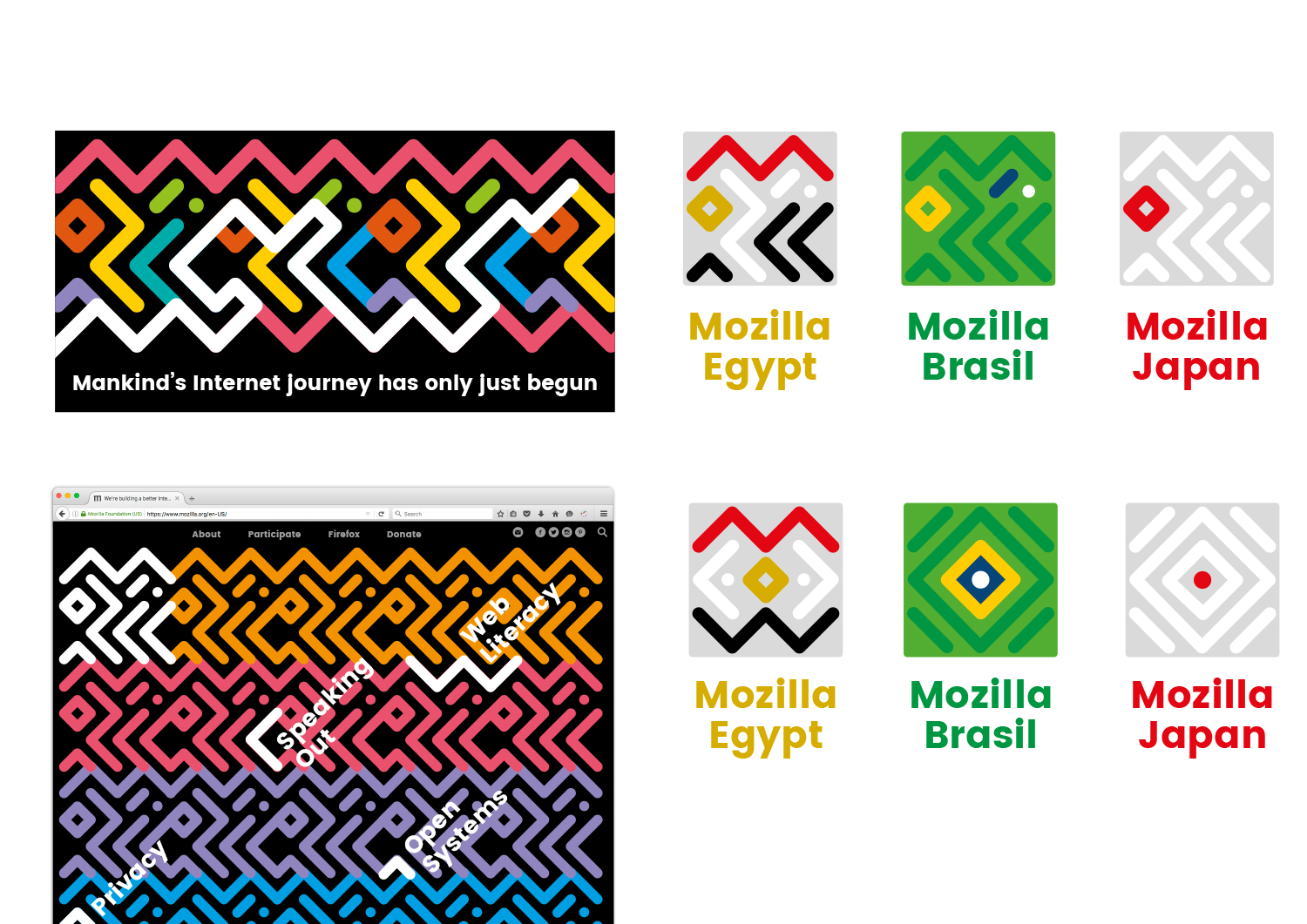
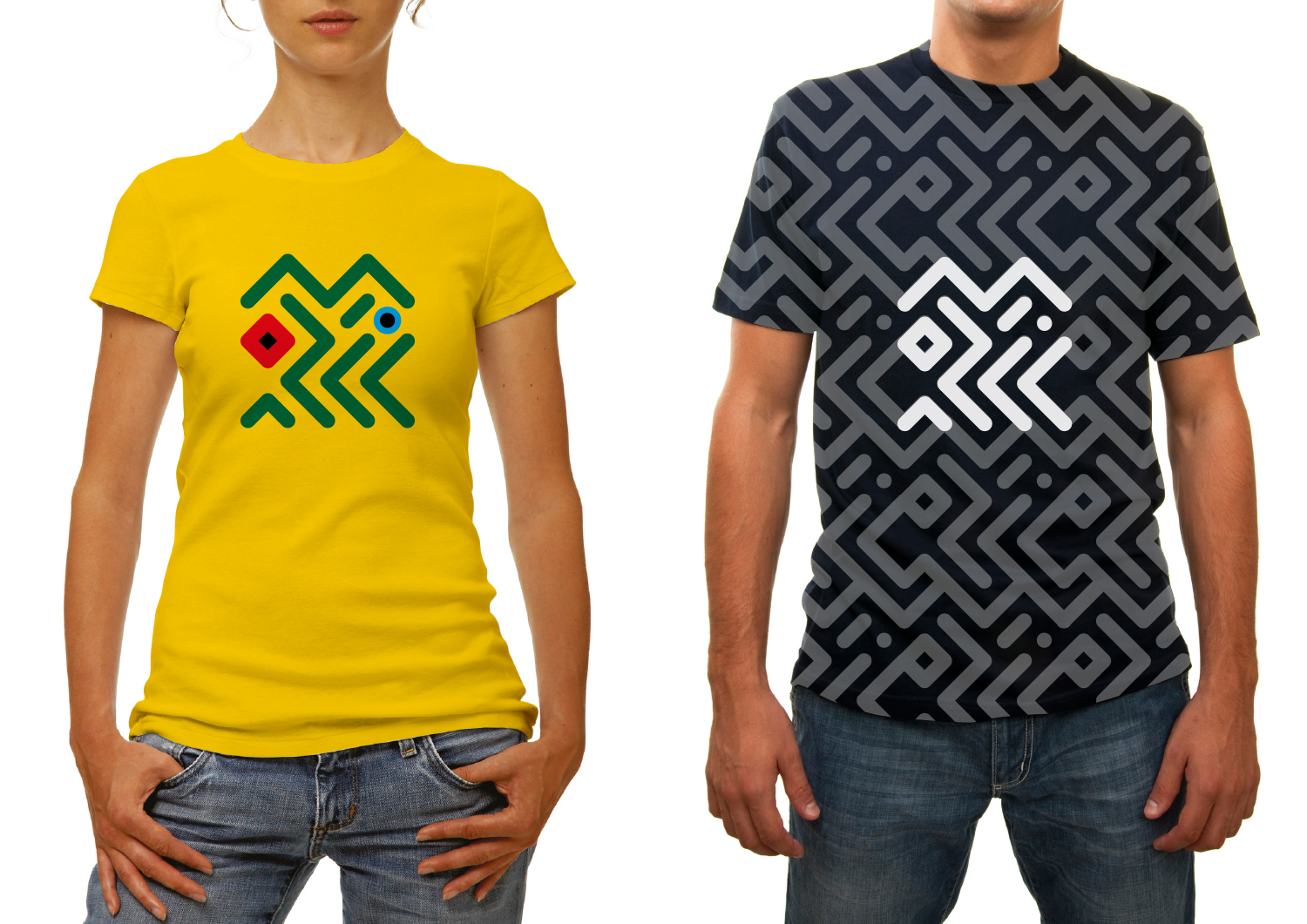
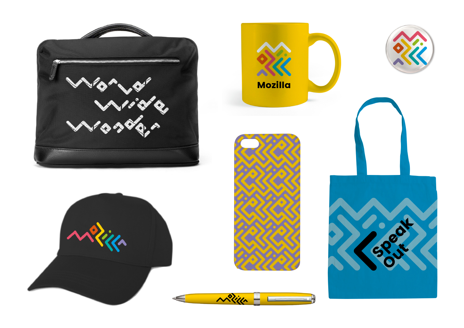
Typographic experiments with the ‘Mozilla’ name led to this route – where the letters are intertwined around each other to create two interrelated marks, inspired by circuitry and tribal patterns.

This design direction stems from the narrative called Mozilla. For the Internet of People.

Mozilla. For the Internet of People

Mozilla believes that the Internet should work for people – and the best way to achieve that is to give people the power to shape the Internet. At its best, the Internet is humanity’s greatest invention. It has the ability to connect human minds and free human potential on a scale never seen before. But we need to keep it open, always. We need to distribute power widely, not divide it narrowly. We need to build bridges, not walls. e future of the Internet is amazing, as long as it remains the Internet of People.

Click the first image below to see how this logo might animate:

jb_Mozilla_design_pres_edit_3.keyjb_Mozilla_design_pres_edit_3.keyjb_Mozilla_design_pres_edit_3.keyjb_Mozilla_design_pres_edit_3.keyjb_Mozilla_design_pres_edit_3.keyjb_Mozilla_design_pres_edit_3.key

181 comments on “Design Route B: The Connector”

  1. Victor Angulo wrote on

    It’s wonderful as a dynamic brand but maybe it’ll lead people to confusion and lose the essence of it.

  2. Sam wrote on

    This one is probably my favorite, or at least one of them. I like Mozilla presenting itself and the web as a connector. I like that the the design of the logo looks like it will last at least a few years and work in a variety of places. I like that the logo looks approachable and neat. I like that it doesn’t come off as too corporate or too unprofessional. I think this design would fit Mozilla pretty well.

    I’ve asked a few people what they thought of these concepts, and this logo seemed to leave a good first impression, maybe a better one if it’s tweakef or cleaned up a bit.

    Overall I like this one and would also wear one of those shirts.

  3. Wesley wrote on

    This concept looks really cool, but I just feel that it looks a little too busy. Logos should be simple and having so many lines just confuses the eye too much. I mean hats off to whoever came up with this because it looks great, but I feel that it’s just not the best option.

  4. Jenn Anderson wrote on

    Like the tribal aspect a lot, but feels too 80’s. How about the design knocked out of red or black?

  5. Benjamin Kinzer wrote on

    Direction E is still my favorite for Mozilla. But I find this one fascinating. I almost like that you have to decipher the letters; for me that communicates encryption. Encryption for security or possibly decoding the next scientific break-through. Great work.

More comments: 1 2 3 4