
Critiquing Design
This is me about 25 years ago, dancing with a yoga ball. I was part of a theater company where I first learned Liz Lerman’s Critical Response Process. We used … Read more
This is me about 25 years ago, dancing with a yoga ball. I was part of a theater company where I first learned Liz Lerman’s Critical Response Process. We used … Read more
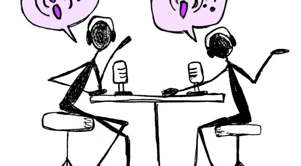
Podcast Enthusiasts and Podcast Newbies Podcasts are quickly becoming a cultural staple. Between 2013 and 2018, the percent of Americans over age 12 who had ever listened to a podcast … Read more
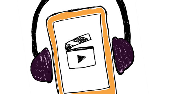
Understanding how people listen When we first set out to study listening behaviors, we focused on audio content. After all, audio is what people listen to, right? It quickly became … Read more

More and more people are using smart speakers everyday. But how are they really using them? Tawfiq Ammari, a doctoral candidate at the University of Michigan, in conjunction with researchers … Read more
I thought we involved stakeholders in research pretty perfectly, here at Mozilla. Stakeholders come to research studies, listen attentively to research report-outs, and generally value the work our team does. … Read more
On the Firefox UX team, a human-centered design process and a “roll up your sleeves” attitude define our collaborative approach to shipping products and features that help further our mission. … Read more

Prototyping with HTML and CSS grid is really helpful for understanding flexibility models. I was able to understand how my design works in a way that was completely different than … Read more
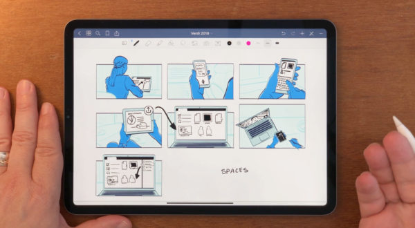
I’m always making notes and sketching on my iPad and people often ask me what app I’m using. So I thought I’d make a video of how I use GoodNotes … Read more
Something I really like about the Firefox UX team is how we are all open to learning from each other. So, when one of my colleagues shared this specific image … Read more