See it, understand it, click it: The new Firefox is organized better
We’ve released an all-new Firefox to the world, and it includes a lot of new browser technology that’s super fast. We’ve made many of these changes over the past year under-the-hood, but we also made sure not to forget all the user-facing UI touches that make a browser worth using in the first place. Because if it doesn’t “feel fast” to a user, then all the performance in the world won’t come through nearly as much.
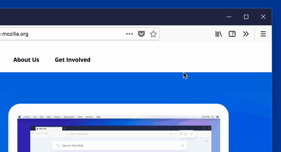
Our front-end refresh included several important changes—a big one was to improve how Firefox Navigation Icons are organized and how they look and feel. After all, it’s been about five years since our last UI refresh, and we wanted to make it bold and modern.
First, we made sure the new Firefox fit with the most recent design of current operating systems. After all, they’ve updated their design, and so should we! So we found a happy medium between our look and theirs.
Second, we evaluated where things were on our navigation hierarchy and broke things down into logical groups. We put the main nav on the left, and made everything on the URL bar relate to the page. We put personal items on the far right side, so you always know where to find things like history, screenshots, and Pocket.
So tell us what you think! Try the new Firefox today, and check out Firefox Navigation. We hope you’ll find the improvements to be as great as the speed and ease of the new Firefox itself. After all, a new thing shouldn’t just run better. It should feel better, too.
And if you know someone you think would appreciate a browser that isn’t hell-bent on selling your information to third-party advertisers, then tell them to join the big browser resistance by downloading Firefox, built by the not-for-profit Mozilla.
Let’s keep browsing free!
This post is also available in: Deutsch (German)