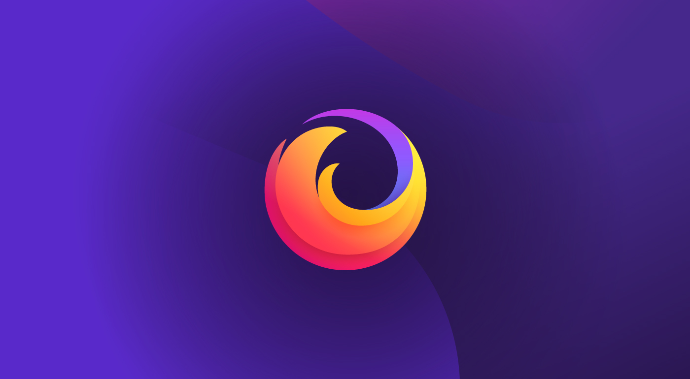
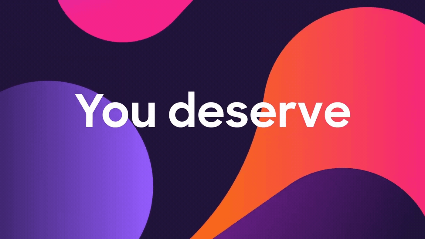
Consider the fox. It’s known for being quick, clever, and untamed — attributes easily applied to its mythical cousin, the “Firefox” of browser fame. Well, Firefox has another trait not found in earthly foxes: stretchiness. (Just look how it circumnavigates the globe.) That fabled flexibility now enables Firefox to adapt once again to a changing environment.
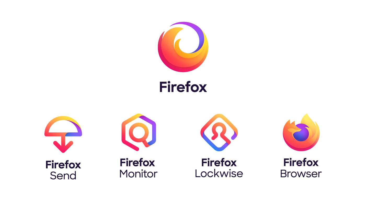
The “Firefox” you’ve always known as a browser is stretching to cover a family of products and services united by putting you and your privacy first. Firefox is a browser AND an encrypted service to send huge files. It’s an easy way to protect your passwords on every device AND an early warning if your email has been part of a data breach. Safe, private, eye-opening. That’s just the beginning of the new Firefox family.
Now Firefox has a new look to support its evolving product line. Today we’re introducing the Firefox parent brand — an icon representing the entire family of products. When you see it, it’s your invitation to join Firefox and gain access to everything we have to offer. That includes the famous Firefox Browser icon for desktop and mobile, and even that icon is getting an update to be rolled out this fall.
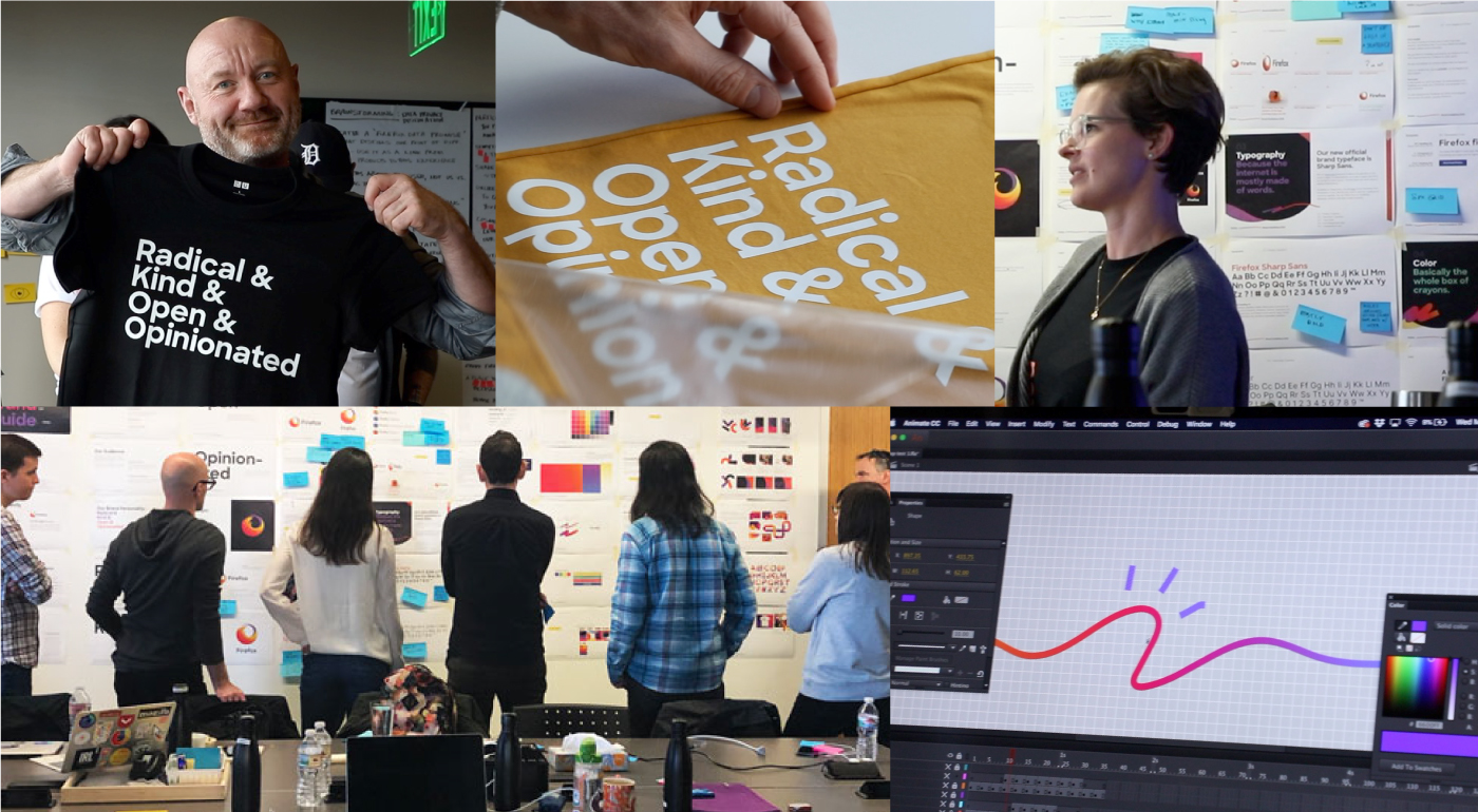
Here’s a peek behind the curtain of how the new brand look was born:
Design beyond identity.
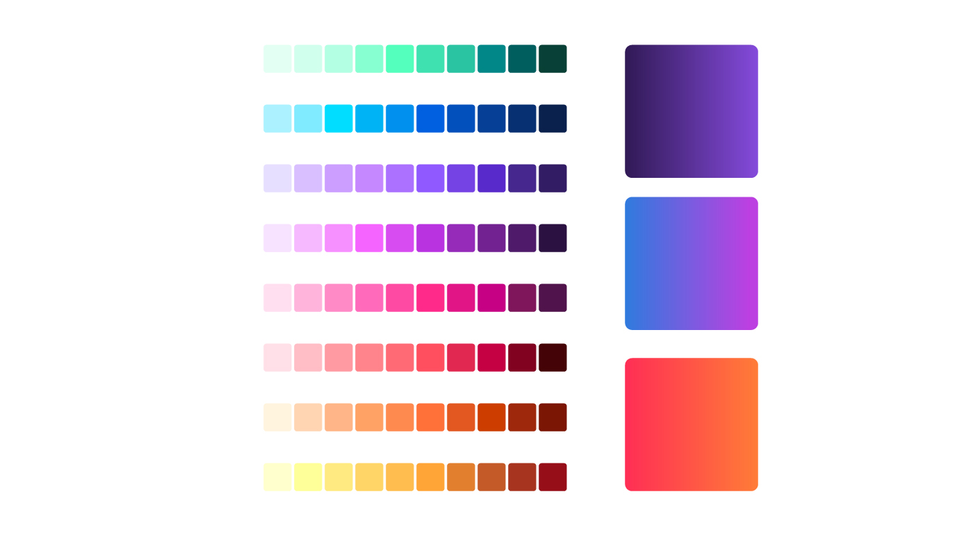
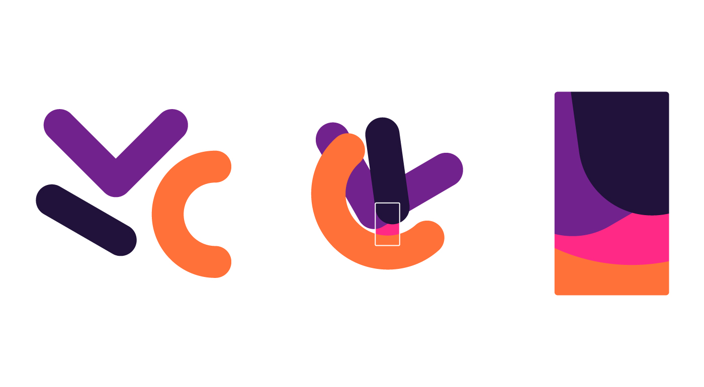
This update is about more than logos. The Firefox design system includes everything we need to make product and web experiences today and long into the future.
- A new color palette that expands the range of possibilities and makes distinctive gradients possible.
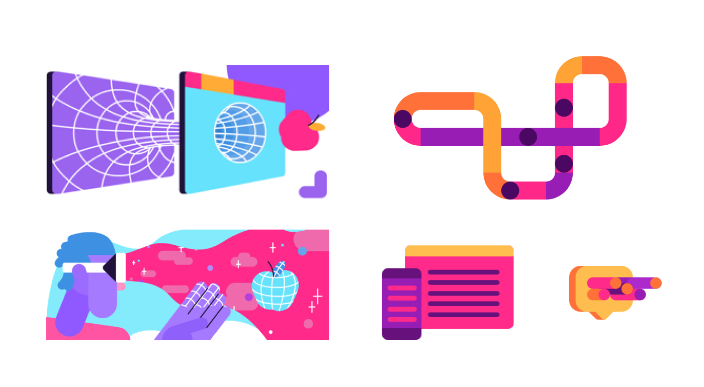
- A new shape system derived from the geometry of the product logos that makes beautiful background patterns, spot illustrations, motion graphics and pictograms.

- A modern typeface for product marks with a rounded feel that echoes our icons.

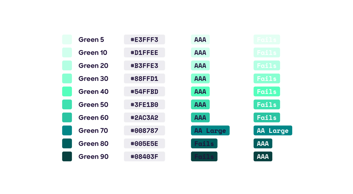
- An emphasis on accessible color and type standards to make the brand open to everyone. Button colors signal common actions within products and web experiences.
Meaning beyond design.
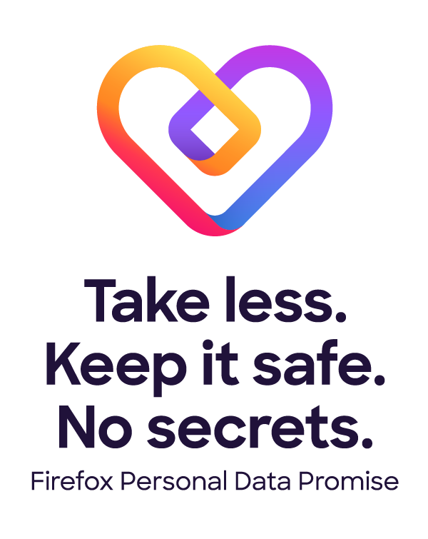
Privacy is woven into every Firefox brand experience. With each release, our products will continue to add features that protect you and alert you to risks. Unlike Big Tech companies that claim to offer privacy but still use you and your data, with us you know where you stand. Everything Firefox is backed by our Personal Data Promise: Take Less, Keep It Safe, No Secrets.
The brand system is built on four pillars, present in everything we make and do:
Radical. It’s a radical act to be optimistic about the future of the internet. It’s a radical act to serve others before ourselves. We disrupt the status quo because it’s the right thing to do.
Kind. We want what’s best for the internet and for the world. So we lead by example. Build better products. Start conversations, Partner, collaborate, educate and inform. Our empathy extends to everybody.
Open. Open-minded. Open-hearted. Open source. An open book. We make transparency and a global perspective integral to our brand, speaking many languages and striving to reflect all vantage points.
Opinionated. Our products prove that we are driven by strong convictions. Now we’re giving voice to our point of view. While others can speak only to settings, we ground everything in our ethos.
The end of the beginning
The Firefox brand exploration began more than 18 months ago, and along the way we tapped into many talents. Michael Johnson of Johnson Banks provided early inspiration while working on the Mozilla brand identity. Jon Hicks, the designer behind the original Firefox browser logo, was full of breathtaking design and wise advice. Michael Chu of Ramotion was the driving force behind the new parent brand and system icons.
We worked across internal brand, marketing, and product teams to reach a consistent brand system for our users. Three members of our cross-org team have since moved on to new adventures: Madhava Enros, Yuliya Gorlovetsky, and Vince Joy. Along with Mozilla team members Liza Ruzer, Stephen Horlander, Natalie Linden, and Sean Martell, they formed the core working team.
Finally, we’re grateful to everyone who has commented on this blog with your passionate opinions, critiques, words of encouragement, and unique points of view.
Tell us. We can take it.
As a living brand, Firefox will never be done. It will continue to evolve as we change and the world changes around us. We have to stretch our brand guidelines even further in the months ahead, so we’re interested in hearing your reaction to what we’ve done so far. Feel free to let us know in the comments below. Thanks for being with us on this journey, and please stay tuned for more.
Hugh wrote on
Tim Murray wrote on
-dsr- wrote on
Colin Davis wrote on
Tim Murray wrote on
ANO wrote on
Ian Thomas wrote on
Tim Murray wrote on
Jesse Salens wrote on
Nick wrote on
Tim Murray wrote on
Alex wrote on
Tim Murray wrote on
Juan wrote on
Irvin wrote on
Tim Murray wrote on
Hideki L. wrote on
DWW256 wrote on
Tim Murray wrote on
Heather Anderson wrote on
Tim Murray wrote on
Cassidy wrote on
Oscar wrote on
Rezmason wrote on
David wrote on
Diego Lindner wrote on
Tomáš Zelina wrote on
lecroix wrote on
Tim Murray wrote on
PrairieRanger wrote on
Gonzalo wrote on
Dan wrote on
Dan wrote on
Pianta wrote on
Josh Triplett wrote on
Tim Murray wrote on
Josh Triplett wrote on
Sentience wrote on
Gerald wrote on
Alexey wrote on
John wrote on
Me wrote on
James wrote on
Kari Linder wrote on
Vjatsheslav wrote on
Lindsey wrote on
Cori wrote on
leo wrote on
H Arrison wrote on
Kayden wrote on
Alex wrote on
Laurent wrote on
Rye wrote on
wojtekmaj wrote on
Sv wrote on
ha1zum wrote on
Summani wrote on
Shiaubo wrote on
Tim Murray wrote on
John wrote on
John wrote on
Laurent Simon wrote on
Yattoz wrote on
Tino Didriksen wrote on
Dani wrote on
Paul Vossiek wrote on
Zsolt wrote on
DansLeRuSH wrote on
B Brooks wrote on