Categories: General

Now for the fun part of Mozilla’s logo design.

On our open logo design journey together, we’ve arrived at an inflection point. Today our effort—equal parts open crit, performance art piece, and sociology experiment—takes its logical next step, moving from words to visuals. A roomful of reviewers lean forward in their chairs, ready to weigh in on what we’ve done so far. Or so we hope.

We’re ready. The work with our agency partner, johnson banks, has great breadth and substantial depth for first-round concepts (possibly owing to our rocket-fast timeline). Our initial response to the work has, we hope, helped make it stronger and more nuanced. We’ve jumped off this cliff together, holding hands and bracing for the splash.

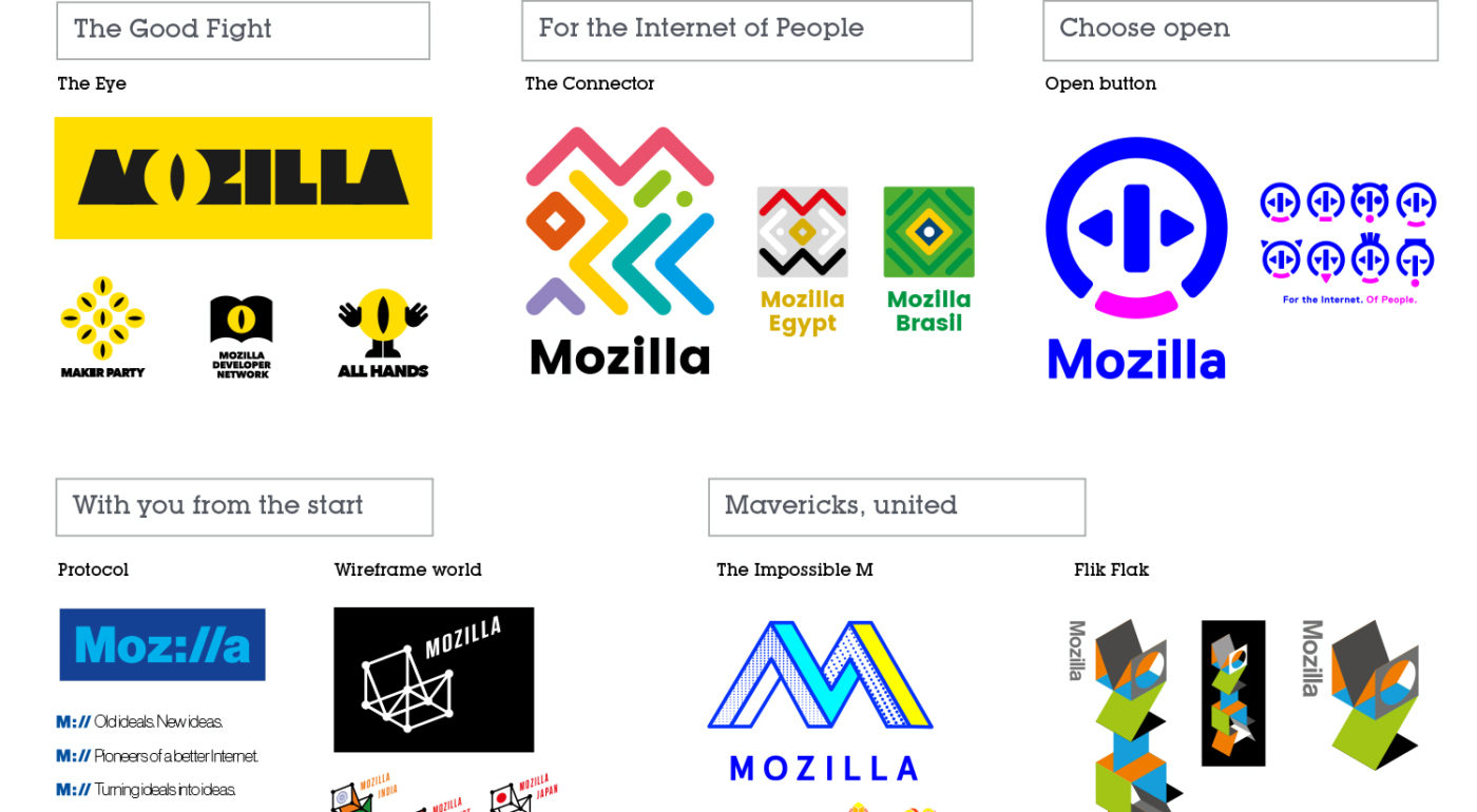
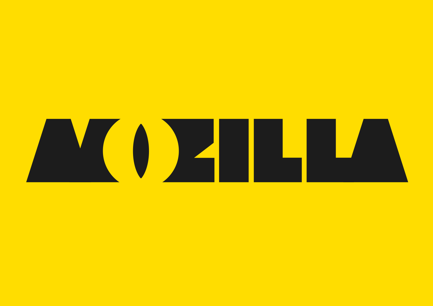
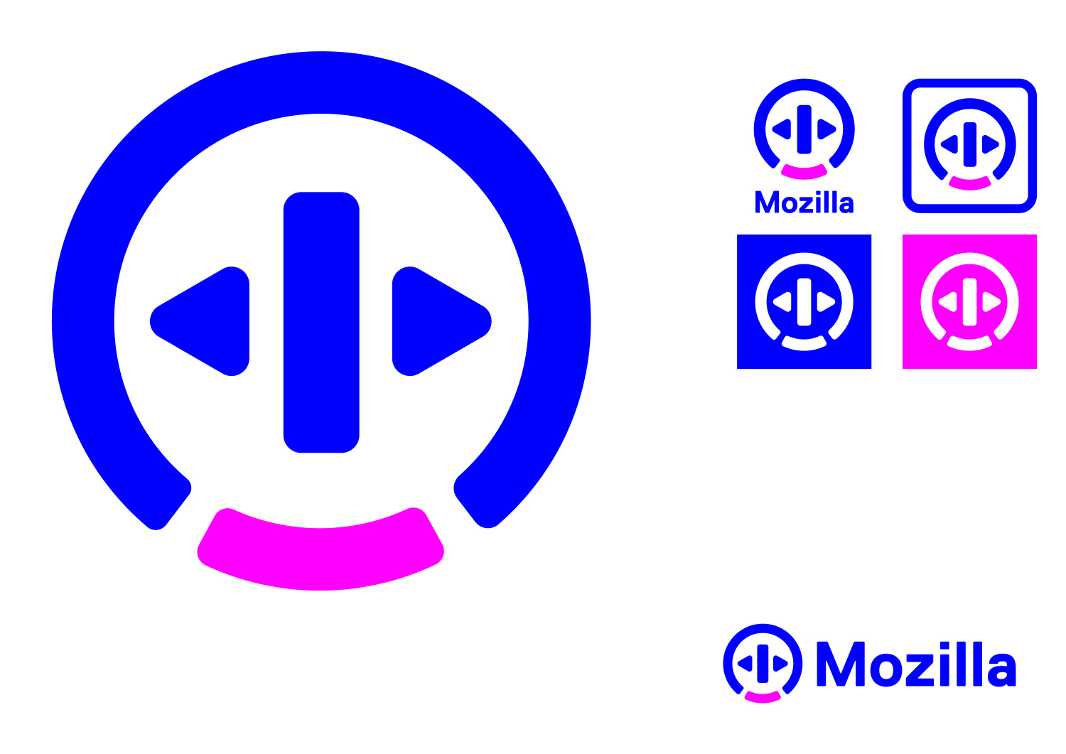
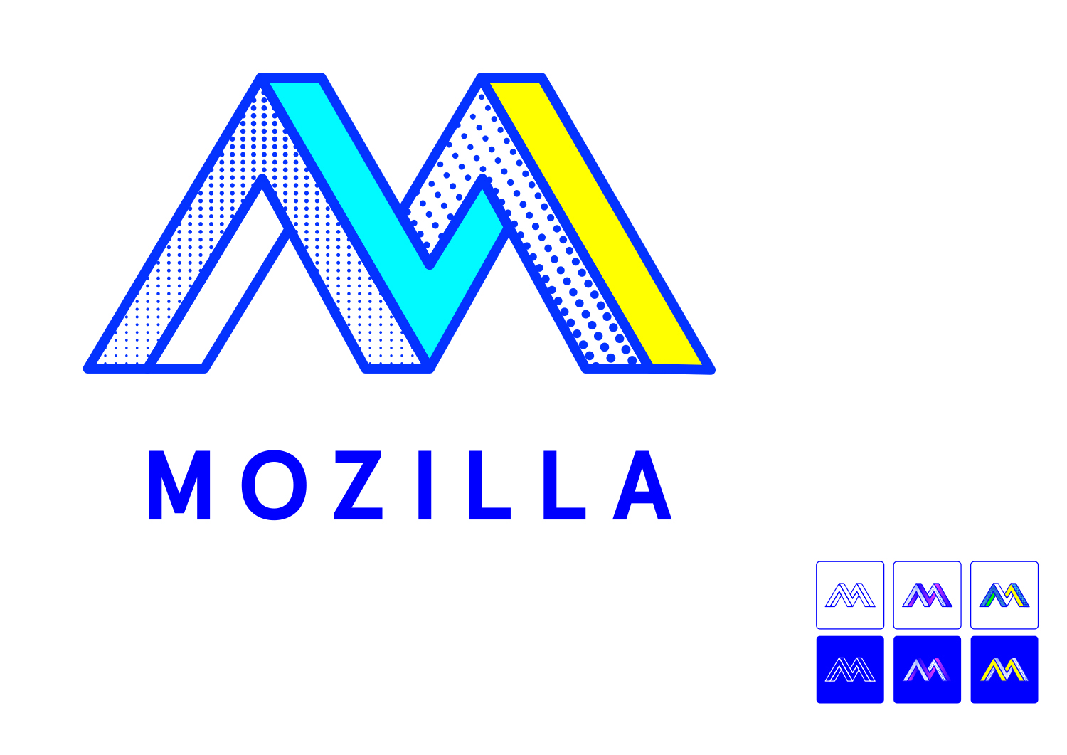
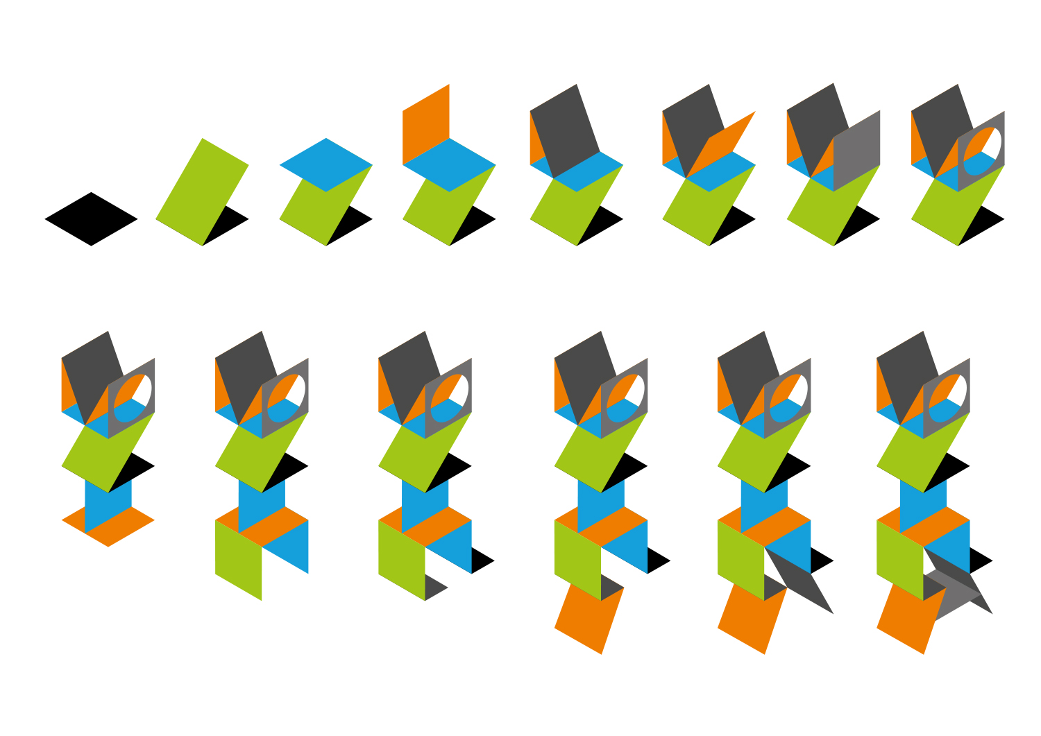
Each of the seven concepts we’re sharing today leads with and emphasizes a particular facet of the Mozilla story. From paying homage to our paleotechnic origins to rendering us as part of an ever-expanding digital ecosystem, from highlighting our global community ethos to giving us a lift from the quotidian elevator open button, the concepts express ideas about Mozilla in clever and unexpected ways.

There are no duds in the mix. The hard part will be deciding among them, and this is a good problem to have.

We have our opinions about these paths forward, our early favorites among the field. But for now we’re going to sit quietly and listen to what the voices from the concentric rings of our community—Mozillians, Mozilla fans, designers, technologists, and beyond—have to say in response about them.

Tag, you’re it.

Here’s what we’d like you to do, if you’re up for it. Have a look at the seven options and tell us what you think. To make comments about an individual direction and to see its full system, click on its image below.

Which of these initial visual expressions best captures what Mozilla means to you? Which will best help us tell our story to a youthful, values-driven audience? Which brings to life the Mozilla personality: Gutsy, Independent, Buoyant, For Good?

If you want to drill down a level, also consider which design idea:

  • Would resonate best around the world?
  • Has the potential to show off modern digital technology?
  • Is most scalable to a variety of Mozilla products, programs, and messages?
  • Would stand the test of time (well…let’s say 5-10 years)?
  • Would make people take notice and rethink Mozilla?

This is how we’ve been evaluating each concept internally over the past week or so. It’s the framework we’ll use as we share the work for qualitative and quantitative feedback from our key audiences.

How you deliver your feedback is up to you: writing comments on the blog, uploading a sketch or a mark-up, shooting a carpool karaoke video….bring it on. We’ll be taking feedback on this phase of work for roughly the next two weeks.

If you’re new to this blog, a few reminders about what we’re not doing. We are not crowdsourcing the final design, nor will there be voting. We are not asking designers to work on spec. We welcome all feedback but make no promise to act on it all (even if such a thing were possible).

From here, we’ll reduce these seven concepts to three, which we’ll refine further based partially on feedback from people like you, partially on what our design instincts tell us, and very much on what we need our brand identity to communicate to the world. These three concepts will go through a round of consumer testing and live critique in mid-September, and we’ll share the results here. We’re on track to have a final direction by the end of September.

We trust that openness will prevail over secrecy and that we’ll all learn something in the end. Thanks for tagging along.

jb_Mozilla_design_pres_edit_3.keyjb_Mozilla_design_pres_edit_3.keyjb_Mozilla_design_pres_edit_3.keyjb_Mozilla_design_pres_edit_3.keyjb_Mozilla_design_pres_edit_3.keyjb_Mozilla_design_pres_edit_3.keyjb_Mozilla_design_pres_edit_3.key

583 comments on “Now for the fun part of Mozilla’s logo design.”

  1. kneekoo wrote on

    Moz://a is by far the coolest and geekiest in my book. The problem is, most people would be unable to read it correctly.

    The eye-ish O looks like a surveillance thing (always looking) – definitely stay away from any suggestions about that.

    The others are either retro or too abstract for my taste.

    1. Tim Murray wrote on

      Thanks for the feedback, Kneekoo. Interesting feedback about Protocol (M://). People are often in two camps with regards to mind puzzles like this one. Either they love the challenge of figuring it out (and the accompanying feeling of success), or they can’t be bothered.
      As for The Eye, I’m curious how you would feel about if it were always looking out for you online. Perhaps its all in the perspective?

      1. Aaron wrote on

        The eye definitely feels like surveillance or always looking (not looking out for you). I think it is because the eye being used is more of an “evil” eye. This type of eye is often used to represent: black cats, snakes, tigers, witch craft, and even Sauron from Lord of the Rings.

        1. Aurelia wrote on

          Agreed, it’s hard to divorce a lizard eye from the LOTR surveillance eye, and the colors feel like caution tape on top of that. I do like the simplicity, lizard-allusion, and legibility of it, but reflex reaction is “evil eye”.

          1. Adam wrote on

            If that warning eye is used with page and website security then it would be dual purpose.

            I really like the eye, it’s a strong catching visual.

            My only negative is that it a similar idea to Monsters Inc.

        2. HergotH wrote on

          I absolutely agree. The eye feels really surveillancish, it was the first thing that came to my mind. Very uncomfortable.

          In overall that logo looks like some of the “securitas agency that will install cameras in your property and provide you with monitoring”. And colors even stress it out, like “warning, this area is being monitored”

      2. Omar wrote on

        Always looking out for you is always creepy, even with good intentions. I don’t even like the CBS logo

      3. Sychedelix wrote on

        Still I don’t think it’s the best one to bring Mozilla worldwide. Many peopel won’t get it!

      4. Camden Narzt wrote on

        I’ve gotta add my support to the people saying the eye looks like the eye of Sauron, and like you are surveilling us. That was an immediate and visceral reaction I had to that logo, and even after giving it some thought I doubt people would get past that initial negative reaction.

      5. Alan Hysinger wrote on

        The reason people are reading the eye as big brother is because the color combination of yellow and black communicates caution and triggers a fear/caution response in the viewer. This is either a rookie mistake, or a rule-break fail by your top dollar designer. Try maybe a neon-ish green or maybe orange instead of the yellow. Probably green as it gives a nod to Mozilla’s original branding.

        1. Jan wrote on

          I disagree with all of You. First of all an abstract logo is okay because Mozilla is not an end user brand, that is what ‘Firefox’ (etc.) are for. The ‘Dinosaur Eye’ is the only design that builds upon the already 18+ years long established Mozilla brand. But its genious lies in the fact that it brings the focus to what Mozilla does not and will never do: Microsoft, Google, Amazon, Yahoo and Apple all have to avoid associations of the ‘eye’ at all costs, because the collection and sale of user data are part of their business plan. This is also why they will shy away from Logos that make them appear too big and powerfull. But people use Firefox because you care about stuff like mass surveillance, after all “Mozilla is the proud non-profit champion of the Internet, helping to keep it healthy, open and accessible to all.” In a list with all those cutesy and harmless logos of the internet behemoths it will serve as a reminder what the others won’t tell you. Mozilla must not be shy.

          1. Laurence “GreenReaper” Parry wrote on

            Yes, it must. It shouldn’t try to stand out. It’s a browser, and the choice of those with technical competence. Build on *that*.

          2. Tim Murray wrote on

            Thanks for contributing your comment, Laurence, and for mentioning the Forefox open-source browser. This design exercise is for Mozilla, the nonprofit championing a healthy Intetnet for all. Let us know if this influences your opinion about these designs. Thanks.

      6. Hildy J wrote on

        I don’t see the :// as difficult to decipher. I might try it with a slanted M and a small capital A with the M and first A uprights paralleling the // and the last A upright vertical as a sign off.

        As for the others, the eye is weird, and not in a good way. The connector is too difficult to decipher and too busy. The open is inoffensive and not particularly memorable. Wireframe is just odd. The impossible M has potential but I would follow it with ozilla rather than putting Mozilla underneath. As for flik flak, no, just no.

      7. Alberto Rojas wrote on

        Specially the multi eyed “Maker Party”. That’s a no no.

      8. JASON M GEORGE wrote on

        I agree with Kneekoo concerning the eye. The very first thing that popped in my head was “Godzilla is watching me”, followed immediately by “My every move is being watched! Oh no!”

    2. Aki Sasaki wrote on

      +1 to m:// being the best of the bunch, and O carrying negative connotations.

      +1 to the general sentiment below that the entire set is underwhelming. I realize we’re not voting, but if starting over is an option, I think it should be seriously considered. I would prefer to either have something nice to say or nothing at all, but I also don’t want us to make a mistake with our brand, so I’m adding my say.

      Let me try being more constructive: Perhaps instead of taking the word ‘Mozilla’ and trying to brand that, perhaps the exercise should be branding the concept of our mission in visual language. I realize the wireframe and flikflak are trying to do that, but building 3d shapes does not intuitively translate to protecting the open web and making it accessible and empowering to users. I don’t know what image or icon could encompass all of that, but I do know we haven’t solved it yet. I think a Foxkeh face would probably be more successful, in my mind, than any of the above examples, with the caveat that it would tie Mozilla even further with the fox imagery. I think we may want to try other, possibly less angular-geometric, attempts at this before we start trying to narrow down the field.

      1. Justin Wood (Callek) wrote on

        +1 from me to pretty much everything :aki said.

        As a contributor for more than 10 years, and an employee for far less, these designs are both underwhelming, don’t feel like they represent the brand I love (to me), and feel like they’d be *harder* to describe the brand I love and what these icons/graphics mean to friends/family. At least I can sorta describe the Mozilla Dinosaur and Firefox itself.

        1. Tim Murray wrote on

          First, a huge thanks for being a long-time contributor, Justin. If not for you and others like you, Mozilla would not be what it is today. I’d love to hear more about what comes to mind for you when thinking about the work Mozilla does in the world. Does the dinosaur reflect what we’re about? Thanks for continuing to challenge these designs. Really appreciate the feedback.

          1. Justin Wood (Callek) wrote on

            For me, the dino does not quite reflect what we’re about but more reflects our roots (Gecko, Lizzard, Dinosaur, Older dominant technology emerging to take on the big dogs [Microsoft at the time] — I have little insight into what came to be the original logo since it was born before I was a contributor, but thats that).

            The current Mozilla I find harder to directly envision as a logo (from scratch) personally, I just know these don’t feel like it.

            I want our logo to be both easily identifiable, and easily recognizable as “Mozilla” without necessarily being recognized as “Firefox” (To this day I tend to say, “Mozilla, company that makes Firefox” when saying where I work, due to the decreased brand recognition).

            I also endeavor for our logo to be a measure of our mission/values. Which at least the Eye of Sauron image (as others have compared it) doesn’t. And the Moz://a while does appeal to the geek in me, won’t help make others feel we’re necessarily good for them (nor is it easy for all to read) — And I dislike the M:// shorthand there.

            Personally I think what would help me is a few more, drastically different Proof Of Concepts in terms of logo art, potentially even from a different outsourced firm or two (if these are all the same firm) to get alternative proposals on the table, so that I and the greater community at large, can help inform what *is* our logo in a meaningful way. I’m not sure if this is an option though.

            Maybe some greater prose on *why* you and others felt these logo proposals were standout, how they came to be, etc would be useful to me as well. What do you feel they represent, were there alternative designs of these things in earlier stages where they could have made sense taken a slightly different way? Things like the “artsy vertical Mozilla” how do you see it portrayed on banners/products/websites/advertisements?

            A brand re-image is a hard thing to get right, comes with a great deal of scrutiny and stop-energy and a wrong re-image can hurt the brand long term. I don’t envy your job here, but I do hope we can come up with something I can feel proud in displaying as “Mozilla” without feeling dread that I’d have to explain it repeatedly, in a greater detail/pain than I already do with the Dino/plain-text-Mozilla.

          2. Justin Wood (Callek) wrote on

            Allow me to say, that I actually didn’t realize we had the larger prose I asked for in my last (still in mod queue) post.

            So I’ll be reading those sometime today.

          3. Simon wrote on

            I’d agree with Justin… the dinosaur logo doesn’t reflect what the organisation is about, but it *does* represent the long history of Mozilla.

            And frankly, none of the other logos reflect what the organisation is about either. Remember, normal people won’t be reading all the associated documentation you’ve posted to this site, the explanations of what the elements of a logo represent. They’re just looking at a small picture in the corner of their screen.

        2. Tim Murray wrote on

          Thanks for letting us know how you feel about it, Justin. While the logo alone will not be able to tell the total Mozilla story, ideally it will become over time recognizable and will hint at that story.

      2. Tim Murray wrote on

        Thanks for contributing to this conversation, Aki, and for the constructive approach. Speaking to the Foxkeh face in particular (which, for those not in the know, is a Japanese mascot character created by the Mozilla Japan community around 2007), you’re right to recognize that conflating Mozilla with Firefox may not be the right path for either brand. We need a set of creative assets that can be deployed to represent Mozilla distinct from Firefox. Our exercise here is to lean into different facets of the whole Mozilla (openness, technology, participation/community, our heritage, etc). We’ll continue to refine from these first-round ideas. If you haven’t already done so, I encourage you to read earlier posts on how we identified and refined the narrative territories that underlie the designs. Thanks again!

    3. John wrote on

      m:// Just seems so expected and safe (boring) to me. I think the others are less resolved, but show WAY more promise – trust in the iterative process, they can be refined into something really special. This is a chance to do something different, memorable.

      1. Tim Murray wrote on

        Thanks for letting us know how you feel about this Protocol direction, John.

      2. LV wrote on

        To be completely honest, I thought this was a joke after looking and re-looking at these logos. They’re all pretty bad. You are getting plenty of polite replies here, but comments on other news sites and blogs that are not yours are not favorable on any of these designs at all.

        My vote: Get other professional logo ideas. Or just keep the type/logo you have right now. Involve your marketing team.

        I have no idea why you’d want to see any of these on your building, your letterheads, or on a t-shirt or other swag.

        1. John C Zastrow wrote on

          Can’t agree more.

        2. Joe Hance wrote on

          +1

        3. Yoann wrote on

          +1 so 80’s

        4. Maria wrote on

          I have to agree with LV.

          I thought this is just fun, because all those drafts doesn’t show any seriousness. Mozilla’s mission is to make the internet better and secure. This is always connected to transparency and non of those logos gives the hint of clear (transparent) but welcoming entrance to Mozilla’s world and work. I vote for more options.

    4. Karthik Rajendran wrote on

      I second kneekoo. I like Moz://a too. the type usage makes it look conventional though. Opera uses the ‘O’ logo too, so I don’t know about that direction. I am not sure about the others too.

      Didn’t Mozilla just rebrand a few years ago and that I felt was great. Why not stick to it? IMHO.

    5. nick wrote on

      really don’t care for any of these … old one is just fine IMHO

    6. Matthias wrote on

      > Moz://a is by far the coolest and geekiest in my book.

      I completely agree with that.

      > The problem is, most people would be unable to read it correctly.

      I think a small change of the font would be sufficient to make it clear. Increasing slightly the vertical size of the lower dot in the colon and decreasing the vertical size of the upper dot, as well as some tweak on the L letter could easily fix that.

      > The eye-ish O looks like a surveillance thing (always looking) – definitely stay away from any suggestions about that.

      Yep.

      All other designs don’t resonate much with, look old-ish or feel inappropriate to convey what Mozilla represent (IMHO).

    7. Adam wrote on

      Completely agree on the Moz://a I really think it is one of the best if the options.

      It kind of reminds if some of the history of Mozilla too. Strangely it suggested Netscape to me, I’m not sure if that is down to the font used or the colour. But either way it is a good thing.

      Suggesting the old will only real ate with those who know, while at the same time it is a new and easily recognisable logo.

    8. Ruedas wrote on

      Really? I think the yellow/black is the best one. It projects confidence, and more importantly competence. It’s simple, direct, bold. It’s the opposite of sprawling, the opposite of ineffectual. The opposite of the governing-board-meeting-at-the-local-food-co-op vibe that plagues all the other 6 designs. (Trying to please everyone and offend no one – and winding up accomplishing nothing. I’ve been to those meetings.) And it has a Godzilla reference to boot. More Godzilla please. Mo’zilla. Is it bad-ass? YES IT IS. Do you want Mozilla to be more bad-ass, more focused, more effective? I sure do. “The eye” you guys are fixating on… Would it help if it were never used apart from the word Mozilla? Because I think that might help. Anyway do you really think the guy who “surveils” you is going to arrive at your doorstep sporting a lizard eye? No, he will sneak in using a smiling, friendly-looking Google Doodle.

      This logo would make people take notice and re-think Mozilla. As being focused and competent and having some cojones. People doing right are the ones who SHOULD be bold.

    9. Eric wrote on

      I agree that Moz://a is my favorite, but perhaps with a solid color rather than two shades of blue?

    10. Mark Koops wrote on

      I like the style of the m protocol, but there is definitely something special just making without the fox. Maybe look at keeping the colours from the Firefox and incorporating them? Is too drastic break…

    11. Andrew Jackson wrote on

      I agree with your points kneekoo. I really like the deep (royal?) blue M:// logo. The eye logo definitely makes me think of surveillance, like some kind of dystopian or Orwellian future. I was quite shocked when I saw that it was even suggested.

    12. AD5NL wrote on

      I like the Moz://a logo. The rest are pretty garish (although the rainbow squiggly thingy is not too bad).

    13. patricia coser wrote on

      I think Moz://a it is the coolest idea, but the color and the aplication it is looking to much tradicional, you could try more modern color and aplication to the brand.

    14. Anna G wrote on

      Personally, the Eye makes me think of Godzilla (which I’m guessing is the point). He’s always had yellow eyes. But I agree with kneekoo, the surveillance panopticon-aspect is quite glaring, and the font looks too heavy.

      I really like Connector. The bright colors and jumbled lines are reminiscent of QR codes and circuits. I find it pleasantly geeky, and the customizations/skins of the design are pretty nice. The animation is clean and quick, too. It can be a modern solo jazz pattern.

      Button’s default color combination is unpleasant and the shapes are clunky. However, the soft-edged luminous effect on some of the other examples are decent. The animations are interesting, but I feel like I’m getting an invitation to a digital baby shower.

      Protocol is simple and nerdy, and is a friendly nod to both tried-and-true Mozilla fans and an embrace of future potential users and uses. Easily the safest choice. Nevertheless, the lack of even a little trademark orange makes me sad. The emoji symbols are pretty ugly, too.

      Wireframe is interesting, but so minimalist that it doesn’t particularly stand out.

      Impossible M is way too retro. I can’t really take it seriously.

      I love Flik-Flag as a logo, despite it’s unwieldy size. It’s playful and it’s geometric patterns definitely make the coolest merch. If it could be used alongside Protocol somehow, or as a second logo, I think it could be a fitting replacement for the old globe.

    15. MrB wrote on

      You took the words out of my mouth. I agree completely.

      None of these seem to be easy to remember (except for Moz://a) and are simply too abstract. I have a feeling that they tried too hard to integrate the name into the logo.

      The logo must be something that’s easy to remember and can be remembered/identified instantly – think Nike – and most of these are simply too abstract or too complex.

      Furthermore, a good logo should reflect the mission statement of the company (https://www.mozilla.org/en-US/mission/) if you want it to withstand the test of time. I’ll take Nike, again, as an example – it speaks “speed”, “motion” – all the things the brand stands for.

      Also note that logos get used on different media and should also be recognizable even when printed in black and white: to many colors and you lose legibility on this media.

      Lastly, one should also think about the applications of the logo. Logos that fit into a square box (have about 1:1 ratio) are more easily applied than stretched out logos.

    16. Dom McLoughlin wrote on

      The eye is spy…it’s staring at me and in the context of the web it should probably be avoided

  2. D wrote on

    Probably not what you want to hear but I have been using your browser and other services for about a decade. And none of the signage above signifies open source internet to me. Almost all of those designs seem to represent being “boxed in” . And since you really are not crowd sourcing the decision just looking for opinions. My opinion is that signage is representative of the messy and mostly unintuitive direction the company has been heading. SMH.

    1. Tim Murray wrote on

      Thanks for sharing your opinion and being a part of this process, D.

      1. Gozzin wrote on

        Well,Design Route C: The Open Button is ok..The rest I really don’t care for. The eye one makes me think of Mordor, so nope on that one.
        I trust you will be keeping the fox around Earth. I can’t think of ANYTHING better than that one. I started using FF six months after in came out and used Netscape too.

        1. Tim Murray wrote on

          Thanks for clarifying, Gozzin and for giving your feedback on these design directions. The work in front of us only deals with Mozilla, not Firefox. Congrats and thanks for being such an early advocate of Firefox!

  3. MiMoz wrote on

    I am speechless (and not “positively”).

    1. Tim Murray wrote on

      Tell us more.

      1. MiMoz wrote on

        In all honesty all the proposed “themes” are very bad and totally fail to catch Mozilla’s essence. All of them.

        All these proposals might be applied to whatever other brand and be as effective, hence they look and feel empty, dull and seldom lame.

        Mozilla is a unique reality and “trivialize” its legacy, mission and goals with such proposals should be a reason to revisit the whole branding effort. As a member of the community I’d be very sad to see one of these things as Mozilla logo.

        Also, some of these proposals look and feel rather amateur-ish; I don’t even know how something that clearly resembles a vagina can be taken in consideration by the Mozilla staff. It’s a real shame. It’s Mozilla, not a tampon company, for God’s sake!

        From what I understood Mozilla has chosen to seek help from an external firm: probably it’d make sense to save the money and engage the internal design team that has by far a better understanding of Mozilla.

        I hope you folks will review the outcome of this almost unanimous global disappointment and learn from it to move forward by going back to square one.

        Please, please, please, don’t fuck up with Mozilla’s identity.

        1. Tim Murray wrote on

          Thanks for elaborating, MiMoz. Your passion for Mozilla comes through loud and clear. It would be great to hear what sort of words and visuals you think would best represent the Mozilla of your experience.

          1. Worried wrote on

            Maybe you should try (properly) reviving the dinosaur logo.

            I also personally agree with the outsourcing remark.

  4. Kelsey wrote on

    I think the Mavericks M, while awesome in style, won’t stand the test of time. It might be too “on trend” for what is considered to be stylish. Same goes for The Connector. I love it, trust me, I love the colors and the brightness and ever single letterform, but it’s just a little too “on trend”.

    The Eye isn’t as appealing nor as “light” as the other logos. It feels very heavy and I’m not sure that’s what the company is going for. While it’s a great concept, its execution makes it a little less than compared to the other logo options.

    The two stand-outs for me is the Protocol and the Wireframe mark. Sure, they both have their trendiness but they also have a (literal) point behind them (and in them). It is a clear point and it’s very easy to tell why each logo would be used for this particular company. In my opinion, you can’t go wrong with either one!

    1. Tim Murray wrote on

      Thanks for the detailed feedback, Kelsey.

  5. Pippa wrote on

    The rainbow angles makes me the most excited and reminds of my time formally in Mozilla, it is a wonderful diverse group of passionate people who have many projects. I feel like it could be rearranged to support a lot of sub-branding. I would love to see it animated too!

    Second for me is the protocol, it is reminiscent of the default link blue. It’s clever but it doesn’t totally grab me.

    The first reptile eye is OK, but feels like a movie poster for a franchise.

    1. Tim Murray wrote on

      Thanks, Pippa. Animations have been added to the site, so let us know if any of them change your perspective on the ideas.

  6. Skatox wrote on

    I like de Moz://a logo, maybe retouched to no make it hard for the people. The impossible M is good but too wide.

    Stay away for the eyes, seems like: We are watching you!! So much 1984, I believe this the logo to represent the opposite of what it is Mozilla.

    I believe you can generate more ideas.

    1. Tim Murray wrote on

      Thanks for the feedback, Skatox. It’s most likely we’ll continue to work on refining these ideas based on a combination of thoughts expressed here on the blog, design expertise, and the best way to communicate the Mozilla brand in the world. Glad you are part of the conversation.

  7. Sebastiano Develli wrote on

    I will give a review to each one in the order above.

    I quite like The Eye, some might find it like it is always watching, I´d try to make it clear that Mozilla is trying to care for you and if you go into private mode looks away or closes in a quick animation. The typo is also quite bold and could make it stand out with the strong yellow. The whole concept around the use/ application should be rethought a bit for clarity. It looks the most stable for sure and could easily be branded worldwide and be recognizable.

    Tribal is an interesting idea, with the whole aspect of community, it kind of reminds me of Vaio though. I love the use of the name in a creative way and the reuse of the same elements, though they should always stay the same, don’t use new or modified letters, use the ones you have. Recognizing and global reach will be a hard one with this one, it’s not instant, it’s a slow approach logo (what I mean by that is that you have to get used to it over a long time to really recognize and appreciate the connections).

    Please don’t use the elevator one at all, it’s kind of terrible, colors, shapes and meaning seem to far off to be any good. I don’t see any value in this one.

    The most technical yet is Moz://a, love it for its clever use of characters and meaning, it’s hard to see this one outside of community driven aspects that have a deep connection to the brand. It also may seem like a silicon valley pun like Tumblr or Flickr. Hard to market to a bigger audience because of those limitations and quite boring appearance.

    Wireframe looks interesting, is too common for it to be special, just look at Watch Dogs or any other tech company that wants to be edgy. Everyone seems to love the wireframe, most forget that it is so common that it is interchangeable with anything else. Interesting animations could be possible, the limitations of not being recognizable kill the concept for me.

    Impossible M is a retro modern approach alla MTV with the changing logo fillings, it feels retro but also new because it hasn’t been done for a while, instead of giving it a plain filling this one lets the brand explore more of the day to day basis (Google Doodle). Memorable for sure if there is interesting content provided inside the logo and if it tells a story or conveys an emotion, if not it will fail quickly and become another 3D like letter (Medium). Keep the edginess and embrace it, separate the Logo from the name and make them stand for themselves, the strong point is the interchangeable voice the logo can speak, use it to your advantage and show that you are always on the pulse of time.

    Flik Flak looks promising, in animation or not, but there is just to much going on for my taste, maybe try to make it simpler and always convey it with movement to show the deepness of the ideas that are put with it. Colors should also be rethought and be chosen to fit together better and in a more defining way, maybe a 2 color variant, with black and violet, which would stand out for sure and make it one of the few with that color that could embrace it. Violet would be a goof fit for several reasons amongst them being different and conveying a sense of thrust that goes along with it.

    Those are my quick opinions on those concepts, hope I could help out.

    Sebastiano Develli

    1. Tim Murray wrote on

      Sebastiano,
      Thanks for taking the time to put together such well-considered and detailed feedback. It’s a great contribution to the future of how Mozilla will communicate to the world.

    2. David Tenser wrote on

      I think I’m mostly in agreement with Sebastiano’s feedback so I’ll +1 it while I consider my own response to the designs concepts.

  8. Damian Brown wrote on

    I like the first and the third. Some of them are bit abstract and the sixth one just doesn’t do it for me.

    1. Tim Murray wrote on

      Thanks for the input on The Eye and The Open Button, Damian.

  9. Jidé wrote on

    This is work from an agency ?… Looks amateurish to me :/

  10. Hdurham wrote on

    The first one makes me think of Monsters, Inc or Gravity Falls. I am not a fan of any of the designs, really. It does not accurately depict Mozilla as I see it in my mind. If having to choose, I like the concept of a logo like “The Connector” creating the words “Mozilla” in the design, but I’m not a fan of that particular design. I like how it translate to the Egypt and Brasil logos. It shows similarity so a consumer (hopefully) would automatically think Mozilla because of the consistent design feature. I would tweek the main logo if it was my choice and eliminate the mix of colors. Too much.

    1. Tim Murray wrote on

      Thanks for contributing to this conversation, Hduram, and for your reactions to The Connector.

  11. punctum35 wrote on

    i initially thought the first look was a fun play on the letter “O” without realizing it was called “the eye”, which then threw me off.
    the second one “the connector” would be best suitable for branding locally but not sure about the main logo.
    the third option, the open button, felt too generic. However, it is – including the first two – possibly the best option to scale accross different products.
    i imagined “the protocol” would be used by mozilla on internal memos (it look too professional)
    “the impossible M” reminded me of the 90s internet era which would be too retro for young audiences.
    lastly, if shown without context, i would have never guessed “wide frame” or “flik flak” represented the new mozilla logo.

    1. Tim Murray wrote on

      Thanks for the comments, punctum35. Appreciate you being a part of this review process. Stay tuned!

  12. Bogdan wrote on

    I don’t really think I like any one of these. Let’s start with the yellow one. First of all, I didn’t even notice an eye at first, and is an eye really what Mozilla means? I don’t think so. The design might fit some brands but definetly not Mozilla. The connector one is by far the most interesting, but there’s just too much going on for a logo, it would look awesome with a ton of simplification. “Open button” more like generic logo, if it didn’t say Mozilla I would’ve never thought. The protocol one is great, but not what I would call “appropriate”. It’s too “simple”, when comparing to the simple old mozilla text, it’s like putting the IE logo side by side with Edge logo. Moreover it looks like :/ The wireframe one is decent, but just like the first one, not really what fits the brand the best (IMHO), but it’s closer to home. If it is chosen I won’t go screaming “Mozilla isn’t what it used to be”. After that we have windows 98. And the last one looks like a cutout, I don’t even get it.

    1. Tim Murray wrote on

      Thanks for weighing in with your thoughts, Bogdan. Stay tuned as we continue to refine these directions.

  13. Jess wrote on

    These all look pretty clunky to me and none of them speak strongly to the Mozilla brand. A logo should be eye-catching, simple, and instantly recognisable. I don’t feel that way about any of these options.

    If I had to choose, I would pick either Moz://a or the Eye. However, I spend a lot of time working with teens and I can promise you they will see something other than an eye, especially if you use the “All Hands” guy. If you are going to go with that option, you need to change the pupil. For the Eye I also feel the lettering is too thick and overpowering.

    The exact opposite problem is happening with Moz://a. There isn’t enough style to the letters. I don’t think it needs heaps more, but it is a bit plain at the moment. It should feel like someone designed it, right now it looks like someone just picked the first typeface they saw.

    These are my two top choices because they are fairly simple and with a few tweaks could be instantly recognisable. Looking at these logos I tried to think of which ones would look good on a button or sticker. The others are too complex, too much, and too old-fashioned. If I knew nothing about Mozilla and saw those logos I would be incredibly confused. Actually, I do know quite a lot about Mozilla and I’m still confused looking at them. Mozilla needs a good, clean logo that can last for years to come.

    I hope you find this helpful!

    1. Tim Murray wrote on

      Thanks, Jess. Very helpful!

  14. Meh wrote on

    The Protocol one is the best one. Feels the least pretentious, while the rest exudes that pseudo-intellectual art museum feeling that one wants to cringe at. Most of it is visually tiring as well.
    Stick to practicality and directness, throw the “trying to be deep with the abstract” out the window.

    1. Tim Murray wrote on

      Thanks for contributing to this effort, Meh.

  15. liuche wrote on

    I don’t really understand the point of this rebranding, especially with the designs that are featured. They strike me as trying to be “fun” and “hip”, without any long-term vision towards all the places where a logo would be used to represent the company.
    They all seem messy and don’t convey a message – maybe they could be used for a particular event, but I would be aghast to see that representing Mozilla everywhere.

    And absolutely definitely don’t use the eye! The reason why everyone finds it creepy is because it looks like…the Eye of Sauron, which is generally just associated with “evil all-seeing being” which is pretty much the opposite of what Mozilla should be trying to convey.
    http://bit.ly/2bdNKcp

    I’m really confused about the goal of this rebranding – are these seriously being considered as the logo that will replace the current Mozilla logo everywhere?

    1. Tim Murray wrote on

      Thanks, Iiuche. If you’d like to learn more about the origins of this brand refresh – why Mozilla is doing this, what problems we’re solving, and what we hope the outcome to be – please have a look of the early blog posts. Thanks for your feedback on The Eye.

      1. Tim Murray wrote on

        Hi again Iiuche,
        In response to comments from you and others, we’ve written a bit more about the strategy underlying the work here: https://blog.mozilla.org/opendesign/now-were-talking/
        Thanks!

  16. Jonathan Kingston wrote on

    The good fight:
    * A nod to the past with the eye which is nice, however it’s not clear that is what it is. It also has the chance to be creepy.
    * The colours and text structure instantly reminded me of the Netto supermarket logo which isn’t a good connotation at all

    For the internet:
    * This one is the only one that I think stands out and clearly looks like a logo
    * However I still don’t think it’s unique enough to ever remind you of Mozilla

    Open button:
    * This instantly reminded me of web 2.0 logos and design like flickr and delicious bookmarks which no longer look like this but I feel this shade of blue has been done to death

    Protocol:
    * I really don’t like this, it reminded me of older sites like slashdot and others that used tech features to design their logos. I find it confusing and over done also.

    Wireframe:
    * I like the concept, I’m not keen on the shape. Perhaps take another design and make a wireframe from that, the eye or the share icon?

    Impossible M:
    * Again this cold blue I don’t feel resembles Mozilla. The more I look at this the more I can see it working with some polish though.

    Flick flack:
    * I like that this could be animated, I like that it makes a dino subtly however I think the execution and colours just remind me of kids brick-a-brack.
    * The full logo is probably too complicated for many places on the web we use our logo.
    * I think this because of it’s complexity won’t ever identify itself as Mozilla.

    I really wish Mozilla could go back to using the dino, it still identifies itself. The outline like is used on MDN could be used in these designs somewhere including the red too.

    1. Tim Murray wrote on

      Thanks for taking the time to review each of these options and provide detailed feedback, Jonathan. Stay tuned!

  17. Guy wrote on

    I’m sorry but these are terrible. The :// one is the only one that’s not terrible and even so it is ok but it is not good.

    1. Tim Murray wrote on

      Thanks for reviewing these initial ideas, Guy. Would love to hear why you feel these are not a good fit for Mozilla so that we can learn more. Appreciate you taking the time to give us your thoughts.

      1. Guy wrote on

        They’re not visually appealing and were made with the intention of hiding some cryptic message instead of promoting a recognizable brand.

        The eye looks like it could be used on a poster for an event, once. The hieroglyphic one looks like it was made with crayons in kindergarten. The open button looks like some diversity propaganda and has clashing and ugly strong colors. The protocol one looks like it could be ok for a mozilla news site or something but its definitely not good nor recognizable enough to represent the whole brand. The 3d square looks like someone got bored because it is boring. The yellow and blue one with dots reminds me of the Metro in the soviet union and looks outdated and as ugly as the rest. And that polygon thing looks like someone took a bunch of acid and instead of making a logo tried to make a cat.

        I’m sorry to be mean but I cannot understand how you guys thought any of these were good ideas. I came here from a reddit thread on /r/firefox and nobody there likes this stuff either. You guys have lost touch with reality if you think these are good and it makes me lose faith you as a result.

        1. Simon wrote on

          > They’re not visually appealing and were made with the intention of hiding some cryptic message instead of promoting a recognizable brand.

          Yes, I think that sums up my issue with the process. There’s too much focus on the symbolism of the logo – long design articles explaining what all the elements represent. But the people encountering the logo won’t have read all of that stuff – all they have is an image on their screen. The image needs to stand on its own merits, something none of these do.

  18. Jim K. wrote on

    The T-Rex eye logo is my favorite. It harkens back to that first T-Rex logo and Mozilla’s origins. It’s got plenty of character and will be a cool logo for Mozilla going forward. Also dinos are just cool.
    The protocol design feels bland and soulless. The foldy flik flak logo is way too busy and complicated. It has too much character and is over the top.
    I think the tribal design has a cool circuit kinda feel but when it’s the letters in Mozilla it looks pretty bad.
    The impossible M is too dull/boring.
    The interconnected M logo is decent but reminds me of the EFF more than Mozilla.
    The open button is pretty cute but doesn’t feel like “mozilla” as much as the T-Rex eye logo.

    1. Tim Murray wrote on

      Thanks Jim for considering all of the options in your comment and revealing the one you feel is best for Mozilla.

  19. Victoria wrote on

    They are all ugly. The design team should try again. And probably stick to the color scheme of red and white. Mozilla has used red and white this whole time and that’s what it is associated with. For example, Google uses blue, red, green and yellow, and everyone knows it’s Google. Changing colors would be like changing Mozilla’s identity.

    1. Tim Murray wrote on

      Thanks for reviewing these designs, Victoria. Appreciate the feedback about the colors associated with Mozilla today.

  20. Lance Patrick Lim wrote on

    Nice concepts!
    The Connector is a good concept also but, it looks more like the olympic designs in my opinion.
    The Eye concept looks like the Monster Incorporated movie mashed up with another company logo.
    Moz://a is by far the most geeky, but sad to say most people won’t be able to understand the meaning of it. So it’s a design wasted because it won’t be able to relay any meaning to the user.
    By coolness, Wireframe and Flik Flak takes it all. Gotta love those flats!
    But nice designs! Really really nice. :)

    1. Tim Murray wrote on

      Hey, thanks for the shout-out on the designs and for putting your point of view out there, Lance.

  21. Michelle wrote on

    The Eye and Flik Flak are my favorites, but throwing my support behind the Eye. As a marketing person, my thoughts go to usage in advertising, promotion and PR activities. That means looking at how clean it is, how easily recognizable is at a glance, if works in both color and black and white, and if can be read/recognized when shrunk down to thumbnail/favicon size. Lastly, I’m looking at how creative can you be with the design. What you have with the Eye is very versatile while keeping core design in tact.

    1. Tim Murray wrote on

      Thanks for the thoughtful argument in favor of The Eye as a marketer, Michelle.

  22. Thomas Crowne wrote on

    The :// looks like ripping off the new curl logo. The old Mozilla brand is fine and looks way better than any of the designs here. My two cents

    1. Tim Murray wrote on

      Thanks for pointing out the reference to curl, Thomas. That was new to us.

  23. Andre Williams wrote on

    Out of all of these I love the Protocol design the most. It’s a fantastic representation of what Mozilla is to its developers and to the internet. I’d buy a TShirt with that logo on it in a heartbeat, no question.

    1. Andre Williams wrote on

      Also, my only conmplaint is the color change to blue. Leave it Mozilla orange and it’ll be easily identifiable as the company behind Firefox. Orange is a big part of Mozilla’s brand image, I think.

      1. Tim Murray wrote on

        This may be a tomato-tomahto thing… I see our current dominant Mozilla color as red, and Firefox as orange. It may be in the eye of the beholder. Thanks for the reminder of the importance of color in communicating brand at a glance.

  24. Doug Pelton wrote on

    My top three:

    1) The Connector – I like the concept, font and the colors. The idea of morphing for each country is really nice. Mozilla Brazil pops.
    2) Flik Flak – this is a cool idea. Again I like the font. Might be a bit busy. Could be cool if it was animated.
    3) The Eye – I like the eye but the font is very heavy with all caps and bold. The eye reminds me of the Opera browser, so could be some confusion.

    It would be nice to continue to have a Wordmark as an option. I like the font for The Connector alone in black as an option.

    1. Tim Murray wrote on

      Thanks for the feedback, Doug. If you go to the post related to Flik Flak. At the end you’ll find a simple gif showing motion. More animations of the others to come tomorrow.

  25. Christian Chung wrote on

    After looking through all of the pages of the designs, I would say i prefer the one where the elements inside the circle forms faces and different symbols, because it bends its way into different icons representing different projects of Mozilla, and is the most modern one out of all. However, seems that most of the people here favours the M:// one. That could work too, but that identity does not offer much flexibility into the different projects of Mozilla, and I don’t consider the pictograms as a big part of the identity. They typography of M:// is flawed since it’s using Helvetica heavy – not only a proprietary typeface and not open at all, but also would make the wordmark look too generic, just like some everyday brands you see at the supermarket. Therefore an open and more characteristic typeface, or a set of lettering specifically designed would give that identity a big boost.

    1. Tim Murray wrote on

      Thanks, Christian. We’re continuing to explore font options for Protocol (M://) and the other concepts, and are well aware that we’ll ultimately need to use an open font in our final route.

  26. Dan Callahan (:callahad) wrote on

    Hi Tim,

    It’s great to be able to see this process unfolding. I can’t wait to see where we end up. I don’t want to detract from such early concepts, but none of the concepts feel imbued with the Mozilla’s humanity or attitude. Thus far, I’m left furtively hoping that we’ll excavate The Dino.

    Impossible M is gorgeous, but lacks character. It mostly reminds me of the exhibit advertisements I see on the side of my local modern art museum. The animated treatment seems to take more than a little inspiration from MTV’s early identity.

    The developer in me loves Protocol, but I also wonder if it hews a bit too closely to Slashdot and cURL’s logos, or if it might be mistaken for Moz, the SEO company. It’s also interesting that Firefox, Chrome, Edge, Safari, and Opera all hide the ‘://’ protocol delimiter in their address bars. Tying our identity to a disappearing symbol might not be the best long-term bet.

    I love how Wireframe World’s perspective can flip depending on which faces are shaded, but… where’s the humanity? Or the Mozilla? Substitute “MoMA” for “Mozilla” and you’d still have a believable mark.

    The Connector is lovely in a 90’s kind of way, but it’s also an illegible wordmark. The tiled pattern is even worse on that account. And while the MozFest, All Hands, MDN, and Maker Party logos look quite nice alongside each other, they’ll never be presented so close together in practice. Without that proximity for immediate comparison, I don’t think I’d recognize them as part of the same brand.

    Nothing about The Open Button speaks “Open” or “Web” or “Mozilla” to me. I get a very “bloomberg.com” vibe from the typeface and colors.

    Flik Flak is super fantastic, but it still falls “flat” for me, again like something I’d see on the side of my local modern art museum. It’s just too… thin and constructed. How would it have a voice? Where’s the warmth and emotional attachment? Would a shape that complex even be recognizable from afar, or in black and white?

    The Eye immediately reminds me of caution tape, construction sites (Caterpillar!), and the evil Eye of Sauron. Oddly enough, I also can’t find a past depiction of our Dino with reptilian pupils. Go figure.

    Good luck! I’m eagerly following along,
    -Dan

    PS: Seriously, everything about the eyeballs freaks me out. The proposed MDN logo could double as a Lovecraftian horror. Nobody wants to open a pitch black book and find an unblinking, eldritch eye staring directly into their soul. Or go to a (Maker) Party filled with nine other scrutinizing eyes. Eep.

    1. Tim Murray wrote on

      Thanks for taking the time to construct thoughtful feedback, Dan. Here’s text from a poster we shared at the June All Hands meeting in London with regards to the dino:

      What about the dino head?

      Created by artist Shepherd Fairey, later known as the illustrator for
      the Obama HOPE poster, the Mozilla dino head logo was retired from
      public view in 2013. Although it lives on in on MDN and communications within the Mozilla family, it’s unlikely to rise to become the Mozilla logo again.

      As lovable as this paleo mascot is, as a logo it doesn’t help explain Mozilla’s role in the world. A great logo is both distinctive and descriptive, and the dino head leads to heavily toward the former. The dino will always be invited to Friends & Family Day.

  27. christophe MIRAILLET wrote on

    Moz://a is for me the best alternative ! others are old fashionned or weird, too much complex at my taste ! a bit or improvement for Moz://a could do the job ! maybe

    Mozi//@
    M@z://a

    with a mix of the yellow-eye concept ! one advice frome : be short, explicit and handy ! too much complicated logotypes don’t work ! i’m infographist in France and i know what i’m talking about ! great job and idea btw !

  28. Lyre Calliope wrote on

    Oof. I like where ya’lls thematic thinking is going, but none of these seem very strong.

    My initial reaction is that there’s only one really viable concept here: The Open Button. The fact that only one option seems viable to me is worrisome. But let’s take it from the top.

    The Eye: I actually like this one in the way it harkens back to the dinosaur. As a long-time contributor, it feels like it harkens back to our history but in a new, modern way. Nostalgia is a trap. This is a bad justification for a logo. We need a logo for the world, not insiders. Besides this, it feels very aggressively scary, authoritarian, and inhuman. The ‘All Hand’s variant looks like a cop telling me to stop. The Maker Party variant reminds me of insect eyes, or a hive of some kind. Generally, this makes me think my every move will be surveilled.

    The Connector: Very post modern. It looks random, and it took me a few minutes to see it’s kind of a wordmark sorta thing. It reminds me of the MIT Media Lab logo which I’m also very very much not a fan of. This is better than theirs though because colors and rounded edges. http://www.underconsideration.com/brandnew/archives/new_logo_and_identity_for_mit_media_lab_by_pentagram.php

    The Open Button: Reminds me of media player UI. Is it a button I can press? Will it play music? Is it like the iPod click wheel? As far as logos go, it’s unique and I think would lead to strong brand recognition. I’m not sure it immediately says/means anything, but the more I look at it the more it’s starting to make sense. It has a lot of potential as an animated logo and maybe even a functional UI thing of some kind. I want this on my hardware, I want it to glow, and I want to touch it. I really <3 where this is going. I don't think it's ready yet and would like to see it developed more.

    Protocol: Generic, and too developer-centric rather than user-centric. Just like the Eye, this almost conveys the opposite of our mission.

    Wireframe: Very noisy. I didn't even see the M at first. I'm not sure what this is trying to say. Is Mozilla creating a social network? Are we becoming a data analytics company? There could be something that works here, but some of the lines and dots need differentiation. I'd like to see iteration on this concept.

    The Impossible M and Flik Flak: Were these from the Alphabet (Google's parent company) reject pile? They look generic, and already dated. The former looks old, and the latter looks like it's going to be old in like 5 minutes.

    The most viable options here seem to be under the categories of 'Choose Open' and 'With you from the start'. I'd like to see these three options iterated upon.

    I'd toss the rest and go back to the drawing board with each of their respective themes (which are all great btw!) Each of these themes deserves at least one good option.

    I'd like to get some feedback from some non-mozillian non-techies. May come back with additional feedback from other peeps I share this with.

    1. Kez wrote on

      I’m definitely in agreement with the above points. These options don’t feel very strong when compared to the existing Mozilla identity. They lack a distinct connection to the brand and don’t resonate as a result.

      1. Tim Murray wrote on

        Thanks for your comment, Kez. Our existing identity consists of the word Mozilla and a few colors. We lack an icon that’s easy to recognize and relate to, and our visuals don’t express anything about what Mozilla stands for. While we may not have found the exact solution in this first-round concepts, sticking with the visuals assets we have will not serve us well as we seek to grow our audience. This may help explain the need for this work: https://blog.mozilla.org/opendesign/now-were-talking/ Thanks again.

        1. Gervase Markham wrote on

          Thing is, our existing identity is “the word Mozilla and a few colors” only in the minds of our brand team, because that’s what our identity _officially_ is. In the minds of most volunteers and even much of the public who know the brand at all, our existing identity is (the word and) the dino. The trouble you are having is that even though this identity is muddled and fragmented, and not consistently used, people don’t think the new ones are better, which is worrying.

    2. Tim Murray wrote on

      Thanks for being a long-time contributor, Lyre. Mozilla is what it is today thanks to volunteers like you. Really appreciate the time you’ve spent putting your detailed feedback together, and please do solicit more from people you know.

  29. Mark Astle wrote on

    As a designer with lots of brand identities to my name, for what it’s worth… The Connector is by far the strongest and most versatile. The Eye is one of those you put into a pitch to pad it out because it’s kind of a neat idea but knowing it’ll never get picked – far too many negative connotations and ugly as sin. One thing though – the typography that sits next to each logo – that’s the bit that really needs the work. Nearly every one uses the same, very dull, and slightly clunky font, (just use Helvetica if you must, at least it’s nicely proportioned) which doesn’t sit well with any if the logo designs. The wireframe version is the only one where the type and logo seems to have been considered as a whole, but as others have said, it’s a bit generic.

  30. Lyre Calliope wrote on

    Ok, I do have to say I really like the Open Button. I like that it looks like the power button on a computer or an electric car. I like that it looks like a key hole. Also, the subtle back/forward thing is really cool. I like the red piece underneath. Is it a smile? Is this a face? It looks really friendly. It looks interactive. It makes me feel a sense of possibility and there’s almost a promise of control in the right hands.. such as my own.

    If this doesn’t end up being the new logo, can I have it?

    1. Tim Murray wrote on

      Thanks for your comments about The Open Button, Lyre. We’ll see what happens to this one!

  31. Yaniv wrote on

    The only one I liked was Moz://a, with the other options I have problem with the colors or shape\design. Good luck! :)

    1. Tim Murray wrote on

      Thanks for contributing your voice to this effort, Yaniv.

  32. Daniele Dellafiore wrote on

    +1 for moz://a and m://

    1. Tim Murray wrote on

      Thanks for letting us know, Daniele.

  33. Teradyne Ezeri wrote on

    Honestly, all of these are just too abstract or geeky for a general brand. With Mozilla’s older “Red Mozilla Dinosaur” brand—or even just the tab with the name “Mozilla” in Fira Sans—it sends a clear and simple message about the brand.

    * Red Mozilla “Dinosaur”: Based off of Netscape, and towering over the competition.

    * “Mozilla Tab” branding: The tab has become an easily recognized staple of browsers on the desktop, and is still used in Firefox Mobile.

    Simplicity can be the biggest plus for branding, especially in a world where people have such short attention spans. Seeing the Firefox and Mozilla logos gives those people something very simple to notice and instantly identify with the company and its products.

  34. Edy Pang wrote on

    Too… many… options, Mozilla.

    You looks struggling with your own identity.

    You ask me which one I like? Well, I hate them all. You should know that I HATE THEM ALL. Each design has contrast character differences (NOT JUST “THEME” VARIANTS), make us confuse what you want —what are you trying to tell us about YOU, yourself, your character.

    I am speechless (and not “positively”). MiMoz
    But probably, this is how open source works.

    1. Tim Murray wrote on

      Hi Edy,
      Does this help explain at all why we feel this brand work is important? https://blog.mozilla.org/opendesign/now-were-talking/
      Thanks for continuing to push us toward greatness.

  35. youaskedforit wrote on

    It seems to me that many people who have commented did not click on the concepts to read and see more—or perhaps did not realize they could. I don’t know if that would change reactions much, but it almost always helps to read those narratives and to see the various explorations and applications. I see the sentence in parentheses where you’ve invited/instructed people to do so, but you might want to make that more obvious and explicit. I’d make it mandatory!

    Also, I’m curious why a single narrative wasn’t agreed before beginning the design exploration? I understand that Mozilla (like all organizations) is multi-faceted. But it feels like Mozilla has yet to decide what role they want to play in the world, or at least which of the 5 they want to major in. Perhaps the design exploration is a way to help make this strategic direction more clear? I have to imagine that some of the confusion and dissatisfaction in the comments is from a lack of clarity and agreement on the strategic narrative.

    To answer the specific questions in your post:

    Which of these initial visual expressions best captures what Mozilla means to you? – Conceptually: The Connector and Wireframe World. I think they both get at the idea of openness, but specifically through the lens of being open to a COMMUNITY that has the power and ability to shape and reshape the web and make it what they want. Of the two, I think Connector is more unique and original (visually). I feel like Wireframe World has been done before. But with Connector, I have the same concern others have expressed: it might be a little much. I wonder if you can explore a less “tribal” expression that perhaps borrows symbols from programming code instead of circuitry for a softer look and a more recognizable/resonant visual language?

    Which will best help us tell our story to a youthful, values-driven audience? – It depends on what value you think is most important to this youthful audience. Personally, I think the idea of something that is “powered by the people” or community-driven really taps into the whole spirit of the sharing economy, collaborative consumption, etc. Pardon the buzzwords. And therefore, I think The Connector tells this story best. The younger the generation, the less concerned they seem to be about privacy issues. I think they care about two things: 1) social good, and 2) being empowered to make. Of the two, caring about social good feels like a higher-order value.

    Which brings to life the Mozilla personality: Gutsy, Independent, Buoyant, For Good?

    Gusty: The Eye, Wireframe World, The Impossible M
    Independent: The Connector, Open Button, Wireframe World, The Impossible M, Flik Flak
    Buoyant: The Connector, The Impossible M (I believe The Eye has potential to be more cheerful and optimistic without going all purple and Barney on us)
    For Good: The Connector, The Eye (again, with some tweaks to feel slightly less aggressive/big brother-y/less Georgia O’Keefe-y ;-)

    Overall, I feel The Connector speaks to all but Gutsy. The Impossible M speaks to all but For Good. The Eye has potential to speak to all but Independent.

    Which design idea would resonate best around the world? – It depends on the primary audience. If it’s the masses, then The Connector. If it’s a pure developer community, then Protocol. FWIW, I think Protocol is brilliant and clever, but a bit boring tbh. That said, Connector doesn’t exactly feel safe and secure. It has so much frenetic energy. I somehow want to infuse Connector with a bit of the calm and order in Protocol.

    Which design idea has the potential to show off modern digital technology? – The Connector, Wireframe World, and Flik Flak. But what do you mean by ‘modern digital technology’ and how does that apply to Mozilla? When I think of modern and digital I think of flexibility and agility, and I think of systems. Connector, Wireframe World, and Flik Flak communicate those to me.

    Which design idea is most scalable to a variety of Mozilla products, programs, and messages? – Originally, I was going to say the same three as above: Connector, WW, and FF. Because they’re such flexible and dynamic identities, you can create infinite sub-brands and icons for all the current and future products, programs, and messages. But, one of the problems with these identities is that while they are incredible flexible, they don’t necessarily create memorable sub-brands and icons. Everything ends up sort of looking the same. The Eye, however, does a great job at creating sub-brands and icons because its simplicity and more limited nature forces a bit more creativity and personality. I love the executions for All Hands, Maker Party, Speaking Out, and Privacy. They’re fun, clever, clear, and memorable. Much more so than some of the more flexible—and arguably scalable—identities.

    Which design idea would stand the test of time (well…let’s say 5-10 years)? 5 years? All of them should be okay for the next 5. Although, The Impossible M and Wireframe World feel a bit too trendy—especially the former. 10 years? None. But that’s probably a good thing, no? Maybe Protocol. But it really feels too proud of its past. It feels just a bit too insular to allow for 10 years of growth and innovation.

    Which design idea would make people take notice and rethink Mozilla? – The Eye, The Connector, Protocol, Wireframe World.

    Overall, I like the concept behind The Connector but think it needs to be more simple and refined. My close second would be The Eye if you can solve for its various problems.

    Sorry for posting the longest comment ever. Obnoxious.

    1. Tim Murray wrote on

      Obnoxious—are you kidding? This is great. Thanks for running each of the options through our evaluation criteria. These truly are the measurements we’re using to determine which of these directions is the most viable for the future of Mozilla. Really appreciate the care and attention you took to get your thoughts out here.

  36. Luke Tonge wrote on

    Fascinating process, brave and admirable. I couldn’t do it!

    Not here to pass comment on the work, just to make an observation. My opinion of many of the routes changed significantly once I’d seen more of the graphic language, animations etc. on the JB site:

    http://johnsonbanks.co.uk/thoughtfortheweek/our-first-design-routes-for-mozilla/

    I would suggest anyone passing comment views more of the work before forming opinions. Looking forward to seeing where this goes, and if the ‘open’ nature of the process is helpful or harmful. Best of luck with it all :)

    post-58335-good-luck-were-all-counting-on-ClLw

    1. Tim Murray wrote on

      Really appreciate the rallying cry and suggestion, Luke! And don’t call me Shirley.

  37. Terry Mesku wrote on

    Not a single one of these designs tell anything about mozilla. Mozilla’s brand has been historical, the type, the dino, the lines and color – are all super strong. With these designs you transform mozilla into something that resembles fashion and clothes, they are based on design trends and most of all, there is absolutely NO relation to what Mozilla is doing…
    Please keep your brand as it is or just give the current one a touch up. there is no need to fix something that isn’t broken.

  38. SL wrote on

    The logos are pretty, but I think they don’t show that Mozilla is really fighting for something that matters.

    They look “good” and “geeky”, but they don’t look “gutsy”.

    If I have to chose, it would be the :// one but I don’t see it as a huge improvement to the original logo. Love the open process though!

  39. Alice Ralph wrote on

    For me, Wireframe World and The Connector are definitely the most interesting. I can see why people seem to like Protocol but it just seems so standard ‘tech’ and bland. At least to my eyes. Wireframe World and The Connector both provide a really fun framework that could be rolled out in really visually exciting ways. I love the idea of the regional flag options.

    The only option that I really dislike is The Eye. The initial ‘M’ reads a bit like a ‘V’ to me. I just think the type is clunky and difficult to read, and it doesn’t offer the vibrancy and flexibility that I think some of the other options have.

    Anyway. Interesting process. Good work! If I had to choose one then I would definitely go for The Connector.

  40. David wrote on

    Please work deeply, currently no one is good, it is my opinion, sorry

    1. Tim Murray wrote on

      Thanks for letting us know your thoughts, David.

    2. Gerardo wrote on

      I fully agree with you

  41. Majken Connor wrote on

    I agree with the bulk of the feedback. These are underwhelming. They feel less clean and polished than the logo we have now. I can’t really express that better (as you’ve asked others to) except to say that I can’t picture another company using any of these except the button, and that makes me think of a music or movie streaming service.

    I think the protocol one is most promising. I am not sure it would be hard for people to read, worth testing. I would guess it would be easier for the nontechie to read as their brains wouldn’t recognize the characters for what they are, and probably see them as the letters they represent.

    Other than that I think we need to be careful of trying too hard to represent specific concepts. It’s a good place to start but we really need something that looks cool, is easy to recognize and “feels” like us. A lot of these are just too complex to get that cool factor at a glance.

  42. Neha Tulsian wrote on

    My vote for Route D: Protocol m:// – Conceptual. Simple. Timeless.
    Communicates the story. But can we add some fun elements to ://

  43. Laura Moreira wrote on

    Hi!
    First of all, i’m loving this open design project. Congratulations on letting us all know the inside view of this fast-paced rebranding.
    I think most of the logos created seem to be very “trendy” and not so much as good logos capable of being used in real life and last through time.
    How do Flik Flak, Connector, or even Wireframe logos work in small dimensions as a tab icon?
    The impossible M looks to hipster/trendy to me and the the Open Button just looks to old (sorry).

    The one that I can see standing the test of time is the Moz://a. I can see the geekiness behind Mozilla and an open door to everything that is yet to be created. I can see ads going like ://reachyourfullpotencial with Moz://a

    By the Way, in the Digital Era, it would be great if we could see this logos in motion :)
    I hope you find this helpfull.

    Great work!

  44. John Roper wrote on

    I really like the M:// one! The only problem I have is that I think the color should be more of an orange or red instead of blue. That color makes me think of Microsoft and or Windows 10.

  45. Drumph wrote on

    Truly disgusting. A complete failure to understand the history, the legacy and the future of an amazing company. Nothing above is the caliber of work that anyone should expect from an agency.

    “There are no duds in the mix” – the delusion in this comment is EPIC.

    If this is the approach to a new logo for Mozilla, it’s pretty obvious a new Firefox logo will be just as horrendous.

    You’re fired. Make Mozilla Great Again.

  46. Sebastián Castiblanco Franco wrote on

    I believe that for a standalone logo, It’s a heavy weight to support all the open-source thinking and philosophy that Mozilla stands for, maybe if we could watch a more developed brand expression would help gain a consistent feeling and lean over this or that option. But for now, I don’t think I could choose one option because I think they all rely on trends and will not survive through time honestly, I think they all work as an exercise and a starting point to go on, feedback is important but at this stage isn;t a very solid path to take. I recommend that in each step, revise and revisit the guidelines, objectives and strategies you people want to print in the brand to make sure it is alligned and giving answers and supporting all that spirit Mozilla represents. I think these excersises are a visual starting point, but needs a lot of work, really.

    Oh, and Mozilla 1 reminds me of Monsters Inc.

  47. Michael Kaply wrote on

    I’ve left feedback on all the other individual designs, but this seems like the best place for overall feedback.

    I think the biggest thing missing from all of these designs is the color red.

    Red has been an integral part of the Mozilla brand from the begining and I think we lose a lot by losing that color.

    1. Tim Murray wrote on

      Very perceptive, Michael. You have not been alone in pointing that out. We’ll be looking at color variants in future rounds of design.

  48. Posted Grubb wrote on

    I thought the reptilian eye was an allusion to the old dinosaur. I like the dinosaur, but I don’t like the eye nor the sub icons created with the eye. Too many eyeballs.. creepy.

    Connector has potential, but also potential to be bland and express no solid identity.

    Open button is cryptic, hieroglyphic nonsense. Mozilla does not make elevator buttons and is not a mass transit authority, which is what all the arrows make me think of. Besides, it looks ugly.

    Protocol is boring. Most modern browsers hide the protocol portion of the URL, so it’s not going to be recognizable.

    Wireframe has no expression of identity.

    Impossible M is an intriguing shape, but the colors and shading are poor choices. It also reminds me of Monsters, Inc… toyish.

    Flick Flak has potential, especially the ‘MZ’ variant. The one with all the letters is hard to read. With sideways wordmark, it reminds me of a modern art museum… Which has nothing to do with Mozilla.

    Were there no other ideas about characters such as dinosaurs and foxes? Word-logos tend to be impersonal and boring, IMHO.

  49. NetOperator Wibby wrote on

    The protocol logo is the best one in my opinion, it looks awesome.

  50. Marco Frezza wrote on

    Assuming you’re keeping the same brand architecture then I’d say keep it simple. For that, I really like the Moz://a, but it doesn’t feel particularly resolved yet.

    If you were going down the branded house route with your products (and I doubt you are, but if you were) then I think The Impossible M or Flip Flap would have the most legs to build a design language around.

More comments:1 2 3 9