Categories: developers end users

Themes in Australis

Firefox 29, scheduled for the end of April, includes significant design and customization improvements that you can read more about here. You can also experience the new design, nicknamed “Australis”, for yourself on the Aurora channel now. We’ve blogged about how the toolbar, menu, and button changes will affect add-ons, but we also wanted to mention how the changes will affect lightweight themes.

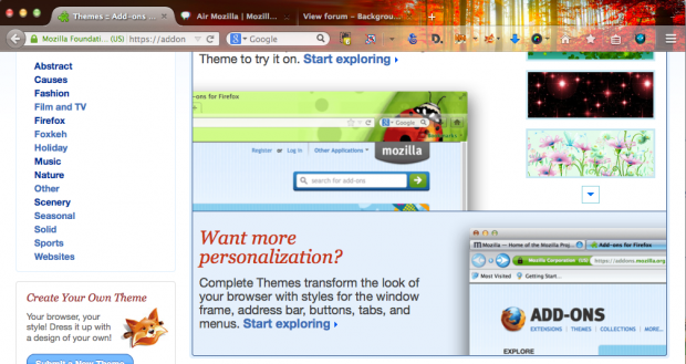
In Firefox 29, the amount of header image shown remains nearly the same, but it now stands out more because the area is less cluttered. You’ll notice that the foreground tab, URL bar, and toolbar are emphasized by a sheer overlay. This makes it easier to distinguish your active tab from non-active tabs, and it also happens to make themes look gorgeous.

Screenshot 2014-02-26 15.53.53

Since the add-on bar is going away, you will no longer see a footer image when you install a theme, unless you are using an extension that modifies your browser to include a bar on the bottom (for example, S3. Download Statusbar). A bug has been filed to make footer images optional when uploading a new theme, and in the future the option may go away altogether.

We hope you install Aurora and give it a try!
10 comments on “Themes in Australis”

  1. JMc wrote on

    The toolbar still looks too thick with lots of wasted vertical space. Have you reconsidered a “Use small icons” option? Can more advanced theme modify this?

    1. Fran wrote on

      Exactly, its a waste of space in small laptop screens.

  2. Hund wrote on

    Black text on a black toolbar? I want a grey toolbar as in previous versions.

  3. PWM wrote on

    So… what about complete themes? Mozilla could ameliorate a lot of the inevitable criticism of the new design (for example JMc’s comment above) if we could say “You can fully customize the theme. Here are a number of complete themes that do just that.” Perhaps a blog post and/or documentation for creating complete themes for the new design would be a good idea?

  4. Alexander wrote on

    The active tab actually looks inactive here, due to the greyness.

  5. BrianZ wrote on

    I am disappointed and sorry to say it, but I see this as possibly the worst bad news ever to come from Mozilla, not only for background theme lovers, but for Firefox users in general. I also feel sorry for add-on developers who I would guess are feeling like they have been betrayed (like theme designers too). How could gaining 1/4 inch of browser content space be worth sacrificing the addon bar which provides a host of useful icons and other information. I am really going to miss having my weather forecast info as well as date/time info displayed there. If you are that desperate for space, why not get a larger or higher resolution display screen?

    Why couldn’t you just provide an option to turn off/on the add-on bar instead of removing it? It’s not a good solution to hide useful add-on icons the way you plan and make them harder to access, as if you think they should be swept under the rug.

    I still don’t like and do not use “tabs on top” – will this change require that now, and remove it as an option?

    Will I be able to add space to extend the vertical space to this new smaller header area, so I can see my designs better, or will that option be removed too?

    What will happen to my Norton Security Toolbar, whose very existence is already continually threatened by the constant monthly updating of Firefox that all-to-frequently renders this important security protection unusable for Comcast users until a functional solution can be figured out between Norton & Comcast. Comcast ISP users know what I’m talking about.

    Do you have any idea how many add-ons are going to be broken or lose their usefulness because of this decision? I’m afraid that developers will just grow so tired of constantly having to adapt to Mozilla’s constant changes that ruin their hard work that they will just give up, much like I seem to have already done with creating personas/background themes (to wit, the killing of animated PNG submissions). Add-ons and customization features are what makes Firefox unique, but it seems like Mozilla is increasingly willing to sacrifice them in order to be more “plain vanilla” like its competitors. Seems like Mozilla is losing sight of what made it popular in the first place.

    I hope Mozilla will give me reasons to feel differently in the future, but right now it looks like one more step in the killing of “personas” as they used to be called, and possibly other features. First, they were stripped of their identity and renamed; then animations were rendered non-functional; now they will be dismembered by removing their only limb – the footer, and reducing their display area.

    Let the chaos begin…
    [lowering my mozilla flag to half staff]

    1. BrianZ wrote on

      PS: The name given to this new animal is reminiscent of the Australopithecus, a genus of hominids, but hopefully not a harbinger of a similar fate (extinction).

  6. Yunier J wrote on

    This UI look great and now the themes its more clear.
    I like it!

  7. martin wrote on

    This UI look great and now the themes its more clear.
    I like it! look my custom for Themes in Australis.
    [IMG]http://i61.tinypic.com/14sodvn.jpg[/IMG]

  8. Thoguht wrote on

    The top of the Australis layout now looks ridiculous on HD and UWHD, it’s TOO THICK. On wide monitors, you need content height, not great thick toolbars and tabs. The inactive tabs just all meld together now as well, especially when the sites do not supply an icon. And spare me the BS about how it’s more visually [insert meaningless buzzword]. A browser is a tool, not an art form. Will someone please kick the hippies out of the dev team and replace them with engineers?