Firefox Logo on blue background
Categories: developers end users

Style Refresh for addons.mozilla.org (AMO)

AMO is the central hub for developers to distribute their add-ons, and for users to discover them. It’s a workhorse of a site, serving as a publishing platform, online community, and marketplace where over 1 million add-ons are downloaded each month.

The current design has been in place since September 2011, with only minor design changes since. We’ve begun overhauling the entire site to modernize it and make it more reliable, but in the meantime we’ve done a quick visual refresh to bridge the gap until we finish the transformation.

The following design is scheduled to debut in Firefox 48, and will remain in place until the larger overhaul is complete:

Screenshot of the AMO Style Refresh 2016 - this new look will be coming soon

Screenshot of the AMO Style Refresh – coming soon

We started this project by tweaking the existing CSS using the Firefox Page Inspector. This is quite easy and got us visible results for every adjustment we made. Every change we liked was then recorded in a userstyle using Stylish. Adapting style-elements from the Firefox for iOS website, this resulted in AMO looking more modern within hours.

screenshot comparing AMO Style in 2011 and 2016

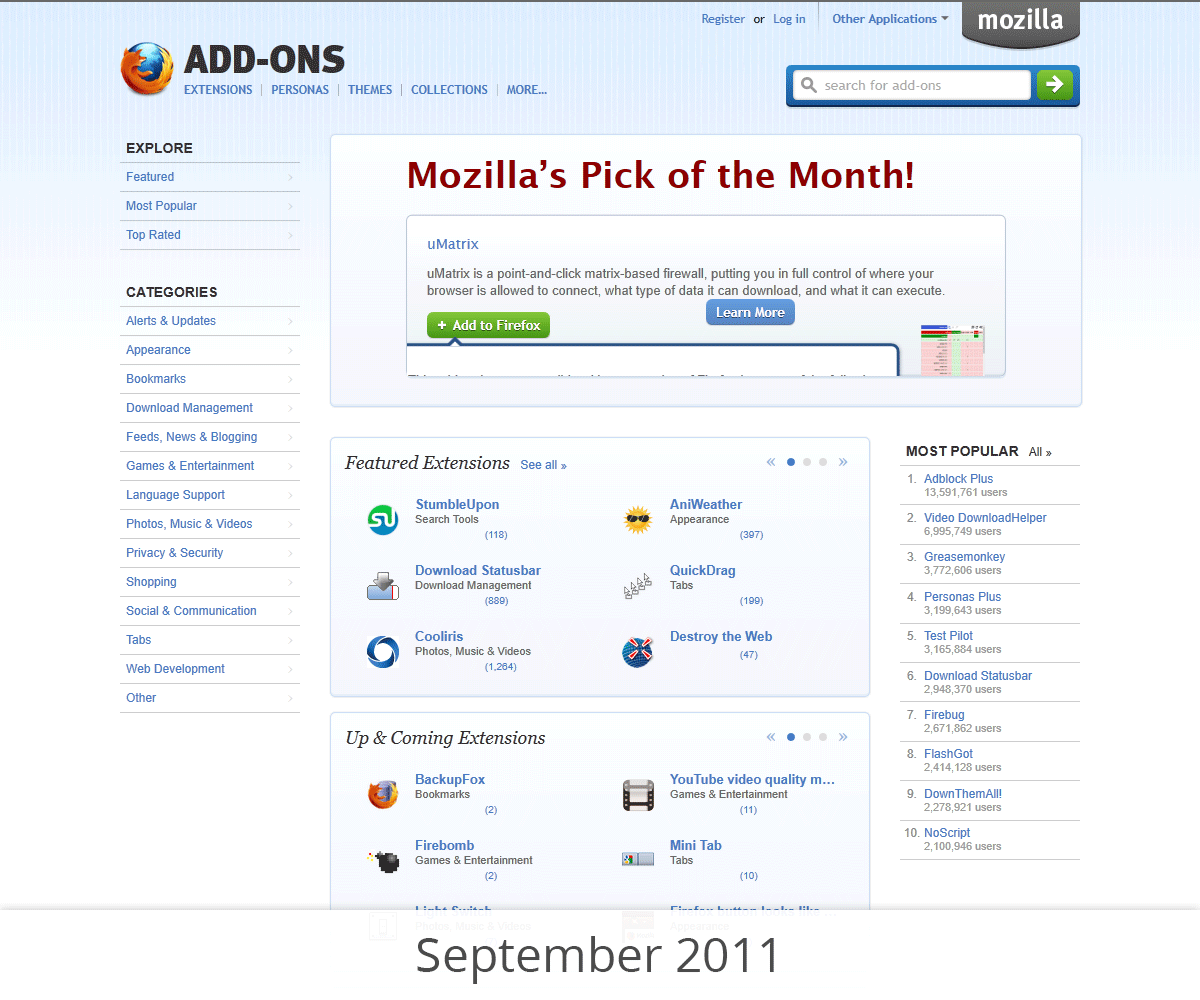
Comparison of AMO style in 2011 and January 2016

This is the first of many improvements that we will bring to the user experience of the add-on ecosystem. Many of them will take some time to be created and implemented, but they will all  have a strong focus on its users—both the developers of add-ons and the people using them.

For a preview of the new look, you can install this userstyle.

11 comments on “Style Refresh for addons.mozilla.org (AMO)”

  1. Ken Saunders wrote on

    I’m happy to hear this. It has been a long time since AMO got some love. or, well, at least some new threads. 🙂
    Blues are my favorites so, right off of the bat, I like your userstyle and color choice in it and hope that it, or something close to what you created is what the final will look like.

    After installing the userstyle, the page text was dark, but that could be due to another installed userstyle. I’ll try another profile later.

    Are you aware of any efforts for a new AMO logo?
    I think that would be nice since the AMO logo (that isn’t really used) was created in 2009.
    Perhaps it warrants a bug filing.

  2. Withheld wrote on

    I like the older look better. The older look has a blue color gradient at the top, light blue background under the extensions links, it has less eye-straining white and doesn’t look sterile and dead. In a word, the new one is “boring”.

  3. home wrote on

    new one is more modern!

  4. thanks wrote on

    thankkk ss

  5. Noitidart wrote on

    I think the issue is searchability/discoverability of add-ons. Many great addons remain undiscovered. Still though, search system is better then google chromes marketplace (that place is so spammy).

    Old UI is good, but the new UI is looking really cool too.

  6. Anonymous wrote on

    Looks the exactly the same, just flat.

  7. Katia wrote on

    I am so glad to hear about this, there is no problem with the color, the search can be hard to find the right add on, but still all appreciated.

  8. Shawn S wrote on

    I like the look. Change is good!

  9. Antonio wrote on

    It’s really amazing! It’s so beautifull, very nice work!

  10. JamesHenry wrote on

    The new changes are cool and good. Good work but, many of them are struck with the old version and feel, bit bored to the new one. It takes some time to grab the attraction.!

  11. Shawn S wrote on

    Is a new logo next?