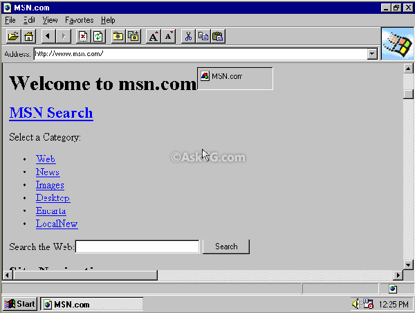
The internet has ingrained itself into every aspect of our lives, but there’s one aspect of the digital world that I bet you take for granted. Did you ever notice that many links, specifically hyperlinks, are blue? When a co-worker casually asked me why links are blue, I was stumped. As a user experience designer who has created websites since 2001, I’ve always made my links blue. I have advocated for the specific shade of blue, and for the consistent application of blue, yes, but I’ve never stopped and wondered, why are links blue? It was just a fact of life. Grass is green and hyperlinks are blue. Culturally, we associate links with the color blue so much that in 2016, when Google changed its links to black, it created quite a disruption.
But now, I find myself all consumed by the question, WHY are links blue? WHO decided to make them blue? WHEN was this decision made, and HOW has this decision made such a lasting impact?
I turned to my co-workers to help me research, and we started to find the answer. Mosaic, an early browser released by Marc Andreessen and Eric Bina on January 23, 1993, had blue hyperlinks. To truly understand the origin and evolution of hyperlinks though, I took a journey through technology history and interfaces to explore how links were handled before color monitors, and how interfaces and hyperlinks rapidly evolved once color became an option.
The ancestors of the blue hyperlink
By looking at these pre-color hyperlink solutions, we can see how hyperlinks evolved over time and how these early innovations impact usability on the web today.
1964 – Project Xanadu
Project Xanadu connected two pages of information for the first time in history. Links were visual lines between pages.
1983 – HyperTIES system
This system introduces color, as it used cyan hyperlinks on a black background. HyperTies was used as an “electric journal.” This may be an ancestor of our blue hyperlink we know and love today, but I do not believe that this is the first instance of the blue hyperlink since this color is cyan, and not dark blue.

1985 – Windows 1.0
Windows 1.0 brought a full color graphic interface. The links and buttons are still black, similar to Apple’s interface at the time. What I do find interesting, however, is that this is the first instance of our dark blue used in a layout. The dark blue is heavily used in the headings and on borders around modals.
Another interesting thing about Windows 1.0 that still appears in modern websites is the underlined hyperlink. This is the first example of an underline being used to indicate a hyperlink that I have been able to find.
To make Windows 1.0 even more interesting, we see the introduction of a hover state. The hallmarks of modern interaction design were alive and well in 1985.
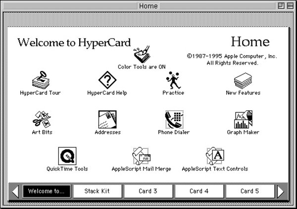
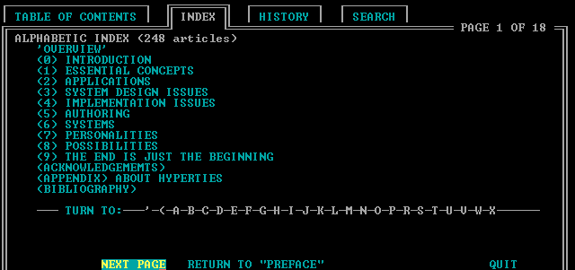
1987 – HyperCard
Released by Apple for the Macintosh, this program used hyperlinks between pages and apps. While aesthetically beautiful, this version did not use color in its hyperlinks.
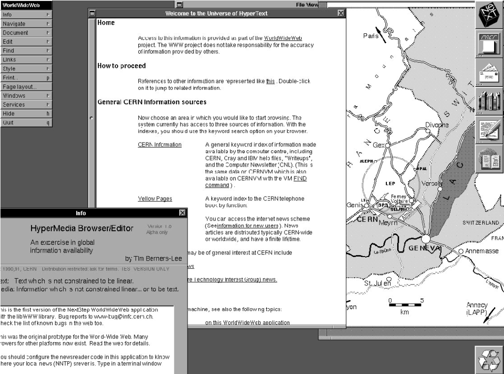
1987 – WorldWideWeb (WWW)
WWW was the first browser created by Tim Berners-Lee while working at CERN. It started out as black and white, with underlines under hyperlinks, which are still used today on modern websites, and are a great solution for colorblindness.
The hunt for who made it blue
We’ve now been able to narrow down the time frame for the blue hyperlink’s origin. WWW, the first browser, was created in 1987 and was black and white. We know that Mosaic was released on January 23, 1993 and was credited as being the first browser with blue hyperlinks. So far, we have been unable to find blue being used for hyperlinks in any interface before 1987, but as color monitors become more available and interfaces start to support color, things change quickly. The next few years will see massive innovation and experimentation in color and hyperlink management.

1990 – Windows 3.0
Windows 3 included support for 16 colors, however the text links were still black links on a white background, which turned to white text on a black background when selected.
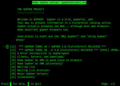
1991 – Gopher Protocol
Gopher Protocol was created at the University of Minnesota for searching and retrieving documents. Its original design featured green text on a black background.
1991 – HyperCard (Color)
Apple brought color to its HyperCards, but notably, the text links were still black and not blue. However, some UI elements did have blue accents when interacted upon which is incredibly important as it shows the slow shift of blue being used as an interaction color.

October 5, 1991 – Linux Kernel
Linux used white text on a black background.
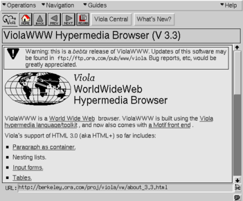
1992 – ViolaWWW
In the ViolaWWW browser, the text links are underlined, and the background color is gray, like we would see is Mosaic’s initial release. However, the text links are black.
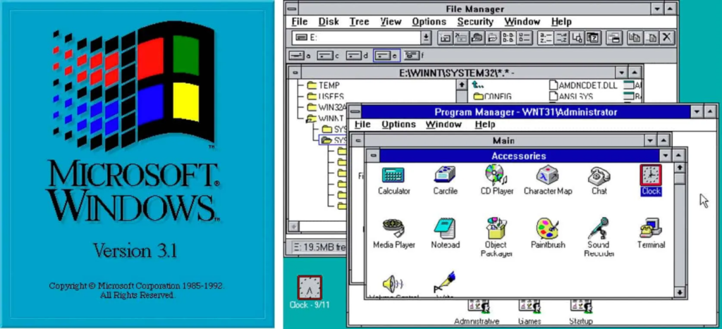
April 6, 1992 – Windows 3.1
Microsoft has been using dark blue for interfaces since 1985, but starting in 1990 they also began using it for interaction. Here Microsoft uses the “hyperlink blue” for active states when a user clicks on different drives, folders and icons. This is incredibly important because it shows the slow evolution of this blue from being a layout color to being an interactive color, preceding the time when blue would have been added to Mosaic by almost exactly a year.
January 16, 1992 – June 21, 1992 – Linux Kernel
In 1992, Linux Kernel gained support for color in their console.
Who did it first?

January, 1993 – Mosaic
The first beta version of Mosaic was created for the X Window System for the University of Illinois. The original interface was black and white and did not have blue hyperlinks, but had black hyperlinks with a bordered outline. According to the X System user guide, the hyperlinks were underlined or highlighted.
April 12, 1993 – Mosaic Version 0.13
In the changelog for Mosaic for version 0.13, there is one bullet that is of great importance to us:
Changed default anchor representations: blue and single solid underline for unvisited, dark purple and single dashed underline for visited.
Release Notes
In the immortal words of Jeff Goldblum’s Ian Malcom character in Jurassic Park, “Well, there it is.”
April 21, 1993 – Mosaic Version 1
Mosaic Launched for the X Window System. I was unable to find screenshots of what the interface looked like for this release, but according to the release notes, the visited color was changed to be a “Better visited anchor color for non-SGI’s”.
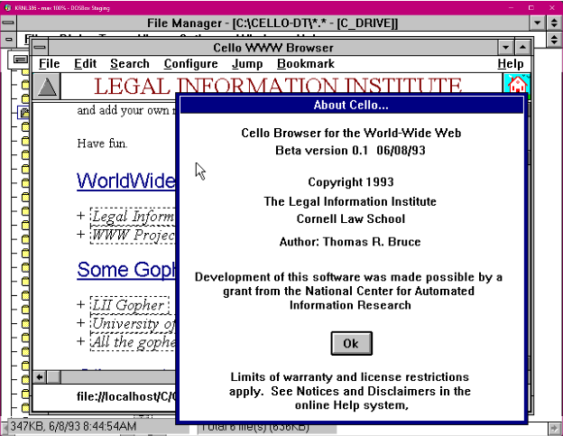
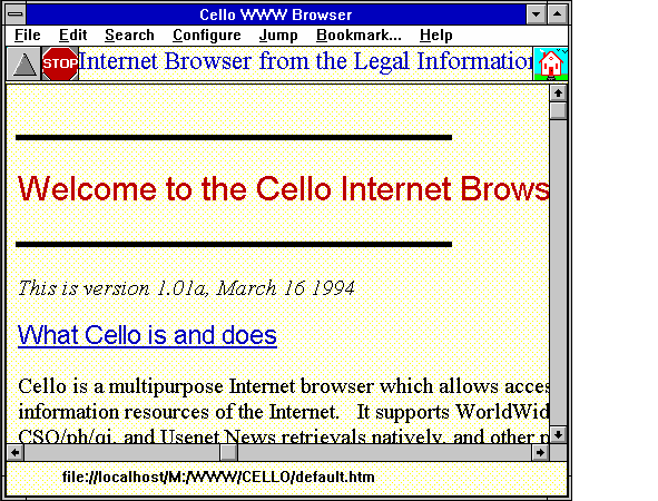
June 8, 1993 – Cello Beta
Cello was created at Cornell Law School so that lawyers could access their legal website from Windows computers. My team mate, Molly, was able to download the 0.1 beta for me, and we were shocked by what we found:
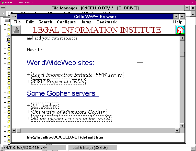
There it was! Our hyperlink style, except it wasn’t a hyperlink, it was the heading. Our “link blue” had never shown up in user interfaces before 1993, and suddenly it appears in two instances within two short months of each other in two separate browsers at two different universities being built at the same time.
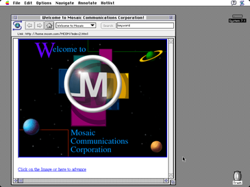
September, 1993 – Mosaic Ports
By September, a port of Mosaic was released to the Macintosh 7.1 operating system. I was able to locate a screenshot of this version which included a blue hyperlink which is the first visual evidence of the color blue being used to denote a hyperlink.
What came after the blue link?
June 1993 – Unix GUI – Common Desktop Environment
Common Desktop Environment is a GUI for the UNIX operating system, the same operating system used to build Mosaic. This interface featured black text with an underline for hyperlinks.
1994 – Cello Version 1
Cello is out of beta, but now features a yellow background, and has kept it’s link-blue underlined headers and still has black hyperlinks with a border.
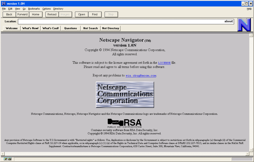
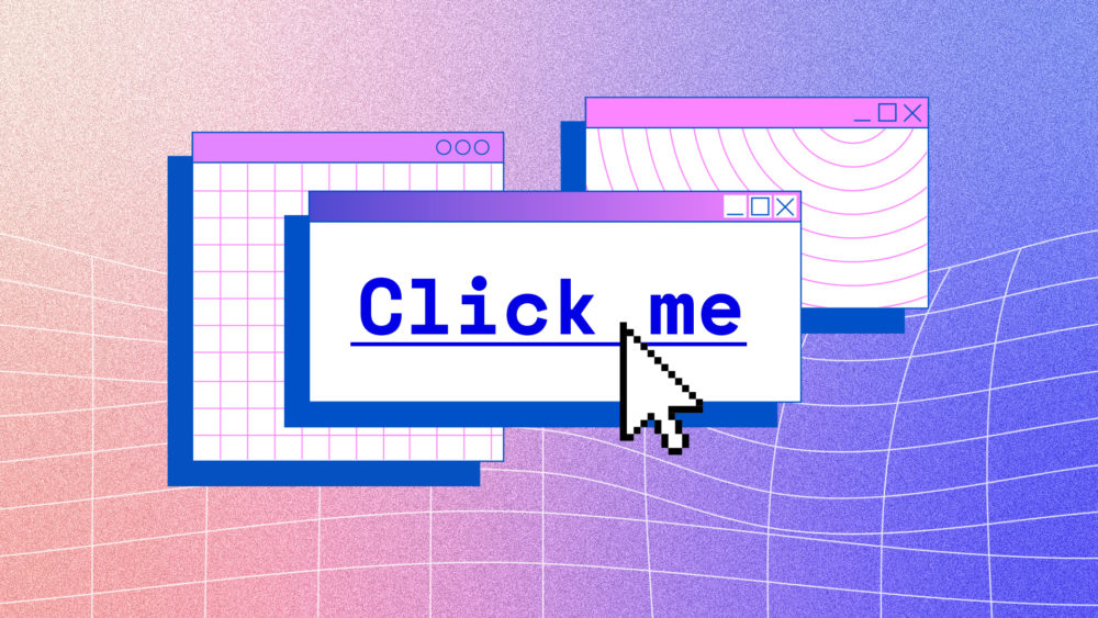
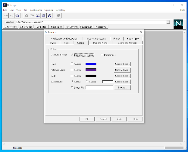
October 13, 1994 – Netscape Navigator
Created by Marc Andreessen and James H. Clark, Netscape used the same visual language of Mosaic: blue hyperlinks and a gray background.
July 1995 – Internet Explorer 1.0
In 1995, Microsoft produced Internet Explorer, and no surprise, it also featured blue hyperlinks and a gray background. Internet Explorer was packaged with Windows 95, which was the first time that a browser came with an operating system. Around this time, the browser wars began, but the look and feel of hyperlinks had been firmly established.
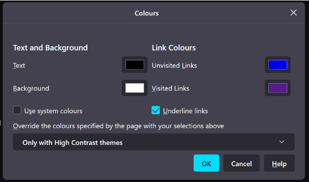
November 9, 2004 – Firefox 1.0
Mozilla Firefox was released, and also featured blue hyperlinks, which are in use to this day. These images are from Netscape 1.22 and Firefox Nightly today.
So why blue hyperlinks?
What happened in 1993 to suddenly make hyperlinks blue? No one knows, but I have some theories.
I often hear that blue was chosen as the hyperlink color for color contrast. Well, even though the W3C wasn’t created until 1994, and so the standards for which we judge web accessibility weren’t yet defined, if we look at the contrast between black as a text color, and blue as a link color, there is a contrast ratio of 2.3:1, which would not pass as enough color contrast between the blue hyperlink and the black text.
Instead, I like to imagine that Cello and Mosaic were both inspired by the same trends happening in user interface design at the time. My theory is that Windows 3.1 had just come out a few months before the beginning of both projects, and this interface was the first to use blue prominently as a selection color, paving the way for blue to be used as a hyperlink color.
Additionally, we know that Mosaic was inspired by ViolaWWW, and kept the same gray background and black text that they used for their interface. Reviewing Mosaic’s release notes, we see in release 0.7 black text with underlines appearing as the preferred way of conveying hyperlinks, and we can infer that was still the case until something happened around mid April right before when blue hyperlinks made their appearance in release 0.13. In fact, conveying links as black text with underlines had been the standard since 1985 with Microsoft 1, which some once claimed Microsoft had stolen from Apple’s Lisa’s look and feel.
I think the real reason why we have blue hyperlinks is simply because color monitors were becoming more popular around this time. Mosaic as a product also became popular, and blue hyperlinks went along for the ride. Mosaic came out during an important time where support for color monitors was shifting; the standard was for hyperlinks to use black text with some sort of underline, hover state or border. Mosaic chose to use blue, and they chose to port their browser for multiple operating systems. This helped Mosaic become the standard browser for internet use, and helped solidify its user interface as the default language for interacting with the web.
When Netscape and Internet Explorer were created, the blue hyperlink was already synonymous with the web and interaction. The blue link was now browser-agnostic and well on its way to becoming a symbol of what it means to use the internet.
Rhapsody in #0000FF
It has been almost 30 years since Mosaic put the now ubiquitous blue in its release notes, but it is no longer the early 1990s. While it is quite fun to discover the secrets of how browsers are made, here in the present, we have accepted it as gospel truth that links can and should only be blue because these early pioneers said it should be so.
When the hyperlink was created, limited colors were available. Today we have almost every color option, so what should be the default color and state of links on the internet? When given every opportunity to deviate from tradition, do we do so for the sake of progress, or should we keep the blue because it’s an established visual pattern?
If you are to change the link color, here are my lists of requirements for the perfect color when choosing a link color:
- Optimal text accessibility with the background color and surrounding text. Your design decisions shouldn’t be the reason a user can’t access content on a page.
- Interactive states should always be styled in your stylesheets. Examples include: touch, visited, hover, active and focus.
- Links and buttons should be large enough to tap or click. You can’t be sure how people are interacting with your content on devices by using styluses, fingers, mice or trackpads. It’s your job to make sure your links are easy to navigate and have enough space around them.
In closing, should all links be blue? Maybe so, or maybe not. There has been a long path of visual elements used to denote hyperlinks, and the color blue is just one of many elements that have come to represent a hyperlink. Links are about connecting information together. Always make sure that a hyperlink stands out from the rest of the surrounding content. Sometimes that means you need an underline, or a background color, or maybe just maybe, you need the color blue.
Major thanks and credit to my colleagues Asa Dotzler, Molly Howell, M.J. Kelly, Michael Hoye, and Damiano DeMonte for help with research and inspiration for this article.