We set out in 2021 to reimagine Firefox’s design to be fast, modern and inviting the first time you run it and every day after. We’ve always had your back on privacy, and still do. Now with today’s new Firefox release we’re also bringing you a modern new look designed to streamline and calm things down so you have a fresh new web experience every time you use Firefox.
We’re living in a frenetic time, where people are dealing with tough changes in our daily lives and hard to solve problems are popping up everywhere. We think the browser should be a piece of software you can rely on to have your back, pleasant to look at and working seamlessly with the web.
We’re also on a mission to save you time, whether that’s by making pages load faster, using less memory, or by streamlining everyday use of the browser. Good design is invisible. So if things just work, you don’t really think about it. But a ton of thought has been put into the flow. Our users who have tried the new Firefox have said, “the fact that I was using a new web browser slipped into the background of my consciousness.” And that’s just what we were going for.
Today’s desktop and mobile releases represent the intentional and thoughtful touches we made to give you a safe, calm, and useful experience online. We made these changes with you and your online habits in mind. Check it out for yourself:
Today’s Firefox gets you where you want to go online
Here’s a quick and easy breakdown of what you’ll find:
For starters we’ve cleaned up the amount of things that demand your attention from prompts and notifications to actions in the menu bar.
- Simplified unencumbered navigation: The first step to going anywhere online is the toolbar, just type in the URL and press return/enter, and you’re off. In some ways this area serves as your car’s dashboard that you look at every time you get behind the wheel. We kept it simple and focused on these three key areas of the toolbar: 1) Navigation – back, forward and refresh 2) Address Bar – privacy shield (so you know your ambient information is always protected), security lock and where to type in your URL. 3) Frequently Used Settings – reader mode, zoom level and bookmark. Our intent was to make it easier for people to focus on the frequently used items in this area and easily get to where they needed to go.
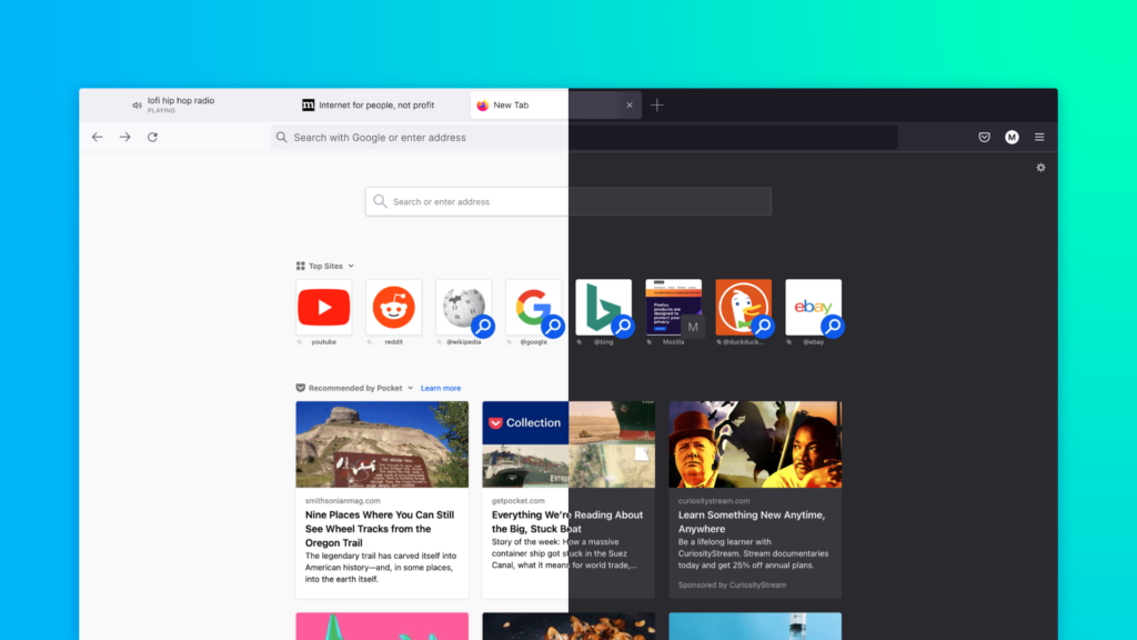
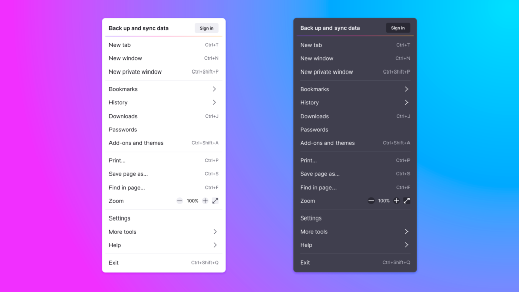
- Streamlined clutter-free menus: There are many ways to get to your preferences and settings, and we found that the two most popular ways were: 1) the hamburger menu – button on the far right with three equal horizontal lines – and 2) the right-click menu. So, we prioritized the content based on what people clicked on when they visited the menu. We made the labels less cryptic and clear and easier to understand, and we removed some icons so that it was easier for people to see at a glance where they wanted to go.
- Productivity-inspired new tab design: Tabs. We use them every day. They signal where you are, but we need them to do more work. Everything from conveying information about what video is playing to where your next Zoom meeting is. It’s no surprise that more than 50% of people have 4 tabs or more open. We redesigned these tabs so that they floated neatly, and we added the visual indicators, like blocking autoplay videos until you’re ready to visit that tab. We detached the tab from the browser to invite you to move, rearrange and pull out tabs into a new window to suit your flow, and organize them so they’re easier for you to find.
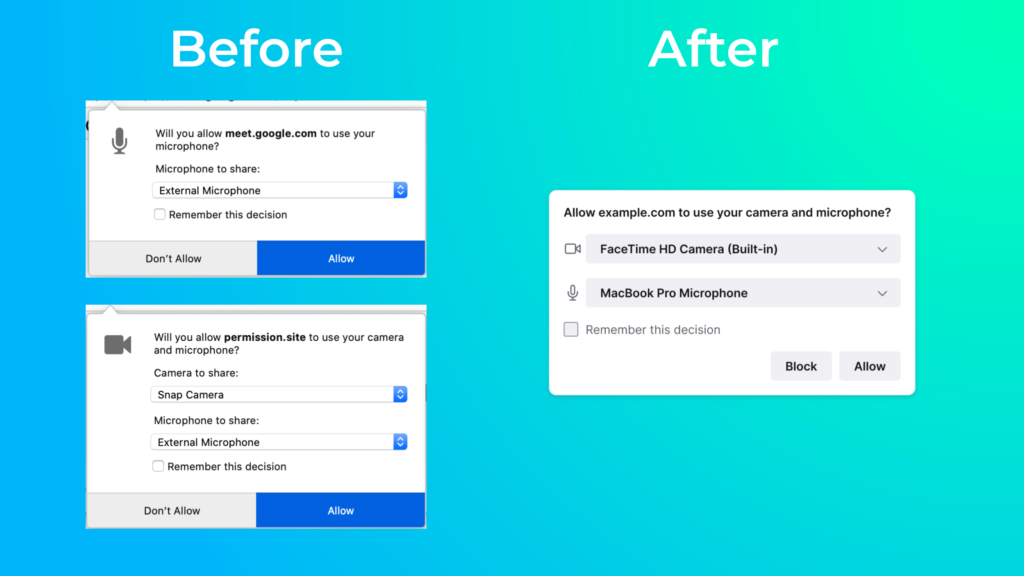
- We shushed notifications: Your web experience shouldn’t be bogged down by a bunch of notifications, and if you have to be given a heads-up on something, it should look good and not be a distraction. You’ll see consolidated the panels so you can respond more quickly and get back to why you were online in the first place faster. We specifically reduced some of the frustration and re-prompting associated with getting in and out of Google Meet meetings. Thanks to this pared down interface, you can get to all your web calls and meetings with fewer clicks.
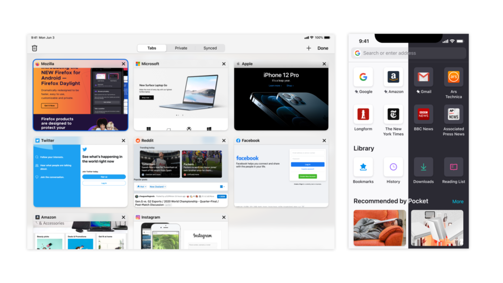
- Fresh, new Firefox for iOS: And we took care to pay attention to the key touches particularly on Apple devices. The improved iPhone and iPad experience includes a modernized, optimized and differentiated Firefox user interface. We reduced the steps to search in a new tab by automatically popping up the keyboard, emphasizing the ability to do quick searches with the search engine logo, and adding the append feature. You’ll see improved navigation around the app with new tab views and moved the synced tabs into the tab tray for better discoverability on any device. We refreshed design elements such as iconography and menu items naming to be consistent across our desktop and Firefox for Android platforms.
17 billion clicks drove us to create a new Firefox
As you can see for the past couple of months we’ve obsessed over everything from the icons you click to the address bar to the navigation buttons and menus you use. When we embarked on this journey to redesign the browser, we started by taking a closer look at where people were spending their time in the Firefox browser. We needed to know what clicks led to an action and if people accomplished what they set out to do when they clicked. For a month, we looked closely at the parts of the browser that were “sparking joy” for people, and the parts that weren’t:
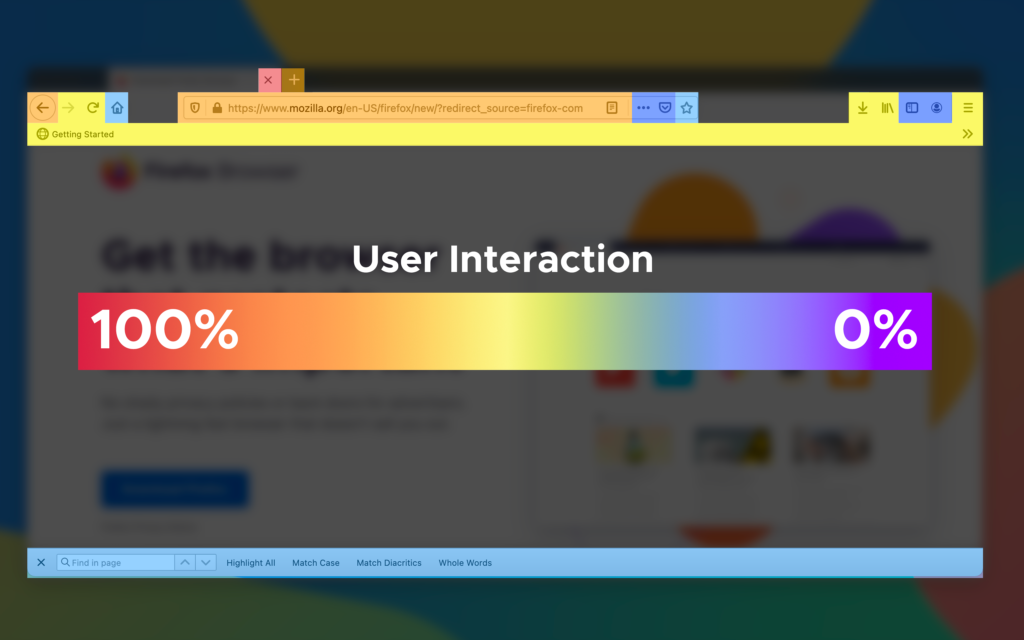
We learned there was an opportunity to create a more streamlined environment to get people where they needed to go with less clicks and distractions. Our goal was to get people to their destination faster, with the least amount of clicks. Based on our user data, we observed how people used Firefox to get to their online destinations:
In one month, there are 17 billion clicks in the Firefox browser. Out of those 17 billion clicks, there were three major areas within the browser they visited:
- Tab Bar – About 43% of the clicks go to the top portion of the browser where they can open as many tabs as they want
- Navigation Bar – About 33% of the clicks go to the area below the tab bar where people can move forward, backward or refresh; and add the URL in the address bar, as well as other functions on the navigation bar
- Bookmark bar – About 5% of the clicks go to the section where people bookmark their frequently visited place
Another area we observed was the menu area. Previously, we had three menus: right-click menu, the meatball menu (it appears as three dots at the end of the address bar), and the hamburger menu (it appears as three parallel lines at the far right of the address bar). The two popular menus were the right-click menu and the three parallel lines menu. People love or intuitively believe what they need is in the right click menu. We also saw differences around the world like:
- Canada – Gets the crown for efficiency with an average of 12+ keyboard shortcuts per user and about 19 right clicks per user.
- France – At an average of about 93 clicks pers user, France users click around the most within the browser.
- Great Britain – We always wondered which country had the most tab hoarders? In the UK, users have the most tabs opened at about 7% of users who have 16 or more tabs opened.
- India – Are the tidiest in terms of how they use browsers with over 60% of the users having 3 or less tabs opened.
- United States: We found they topped the list of countries who like to go to their settings and personalize their browser.
With these insights we wanted to create a place that felt fresh and modern, and kept things like icons and menus flowing in a cohesive way. This meant using simple design and easy-to-understand language to lessen people’s cognitive load, essentially getting them faster to the places they wanted to go. It also meant retiring intrusive alerts and messages to avoid a jarring experience and provide a more calming environment. Throughout this process, our extraordinary team of designers really thought about the colors and iconography and wanted to make them more refined and consistent.
We’ve taken Private Browsing mode to the next level
We’ve designed the new Firefox to ensure that using a browser with industry-leading privacy is always an inviting experience. For those who browse exclusively or occasionally in Private Browsing mode, we take privacy to another level with today’s privacy protections. In February, we rolled out Total Cookie Protection in ETP (Enhanced Tracking Protection) strict mode. This privacy protection stops cookies from tracking you around the web by creating a separate cookie jar for every website. Today, Total Cookie Protection is now available in Private Browsing mode.
What’s next for Firefox
We’re excited to share this new Firefox experience across your devices. We’re planning exciting new features to roll out this year that will build on the modern web redesign this new Firefox delivers. No matter what device you choose to tackle the web in the future, Firefox will be there for you. We’ll share more details once we have them.
You can download the latest version of Firefox for your desktop and mobile devices and get ready for a new look and feel.