How do we start building our experimental rapid prototyping tool? We could begin developing it tomorrow, diving straight into the code and working out the kinks as we go. Yet although engineering does constitute hacking and building a product, there is more to the story. I speak, of course, about planning—about assessing what users are interested in, how we’re going to go about meeting their needs, what technologies we’re going to use, and more. To kick this process off for our experimental prototyping project—which we’ve codenamed napkin—we just recently held a brainstorming session to delve into the mind of one of the application’s potential users. Put in a succinct way, our goal with this session was, well, to prototype the prototyper.
Assessing the Candidates
Building off Jen’s research from a week ago, I decided to begin an exploration of the prototyper’s mind with the tools that he/she uses. More specifically, I focused on five main applications: Balsamiq, Mockingbird, Sencha, Axure, and Illumination Software Creator. Coming up with my own thoughts about these applications and looking at how others reacted to them was only the first step. In an effort to pinpoint the details that we want to focus on while building napkin, I decided to consolidate each of the critiques to two main points: what about the application is the most compelling reason to use it and what misstep in the product turns us off the most. By assessing both what I like and dislike, my goal was to find out exactly what we should include and exclude in our prototyping application.
After a good deal of thought—it’s not easy to limit yourself to only one positive and negative point about each product—I arrived at the following decisions:
Balsamiq
The most pleasing part of my Balsamiq experience was simply the simplicity. With only a few panels of options, a large main canvas, and a simple drag-and-drop interface, there was little to get accustomed to while using the product. Moving components with the drag of a mouse, deleting them by hitting backspace, and aligning elements with smart grids abstracted away the complexities and problems the developers faced while building their product; to the user, the application just worked.
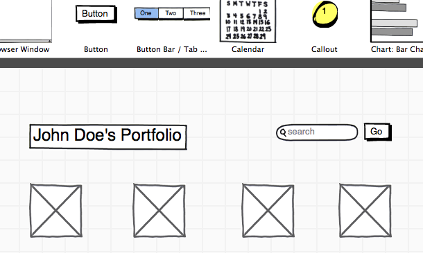
My main issue, by contrast, was the lack of organization when it came to the toolkit, or the array of components that can be added to the canvas. With quite a long side-scrolling list of elements to choose from, it immediately becomes difficult for the user to find exactly what he/she is looking for. Although Balsamiq does indeed provide a search for these components, I found it unintuitive to locate and misnamed in the interface when it should be rather highlighted.
Mockingbird
Mockingbird was my favorite application of the bunch. One of the features that brought it over the top was the copy/paste functionality. Using the standard keyboard shortcuts that are present in nearly every application, Mockingbird allows the user to duplicate elements in the page with ease. At first glance, it seems like such a basic feature shouldn’t be my most compelling reason to use the product. Yet, ultimately, it’s the little features that make a big difference; by integrating standard shortcuts that the user is already familiar with, Mockingbird not only improves its own feature set, but does so in a way that, to its users, is second nature.
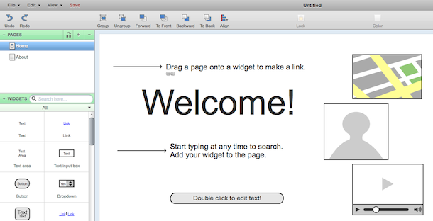
In terms of the main misstep, I disliked how the grids that may be added to the Mockingbird canvas cannot be extended or moved around—they must be left-aligned. Because so many designers/prototypers love their grid, I considered this a well-founded limitation.
Sencha
Sencha was the most IDE-like tool of the pack, providing me modern-looking and up-to-date components for my prototypes. Unlike some of its counter-parts, I found Sencha to have elements that I could actually see in a production-ready product, immediately making me want to use it.
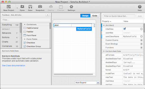
My main qualm, though, was how hard it is to iterate on designs. Deleting a component, for example, cannot be done with a tap of the backspace key; you’ll have to right click, hit delete, and go through a pop-up dialog confirmation box. Granted, this is nice if every move you make has dire consequences and you want to be sure that your actions are precise, but this is far from the case of prototypers. I would much rather prefer an immediate deletion and perhaps an undo button in case I falter. That way, not only can I quickly modify designs, but I’m still secure enough that I can return to an older state if necessary.
Axure
In a change of events, Axure was different from its competitors. Unlike the basic image-only prototyping features of Balsamiq and Mockingbird, Axure also offers an export to code feature, which translates the mockup to front-end HTML and CSS. This allows prototypers to get a jump start on the development of their application and also reflects one of our key goals in napkin to provide a similar export feature. Having this capability comes with the added bonus of allowing users to define further structure in their prototypes; Axure not only lets you design pages, but also provides the ability to handle mouse events on various elements. Responses to these events include opening links, setting text on panels, and more.
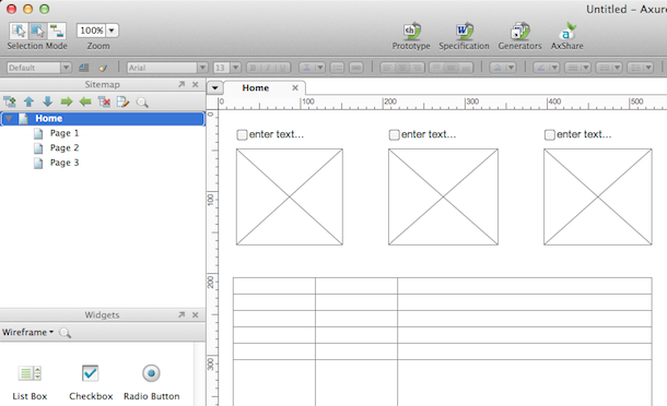
But my main disappointment stems from the inability to see these features in action—to “run” the prototype—without fully exporting the project. This seems essential when dealing with any dynamic elements to allow the user to easily judge what he/she wants and iterate quickly.
Illumination Software Creator
Finally, Illumination Software Creator took a different stance on prototyping applications with an uncommon interface; instead of providing components that users can add to a page, it allows you to create more of a mind map of your application’s flow. This was the main positive element I saw about Illumination, as it dared to deviate from the norm.
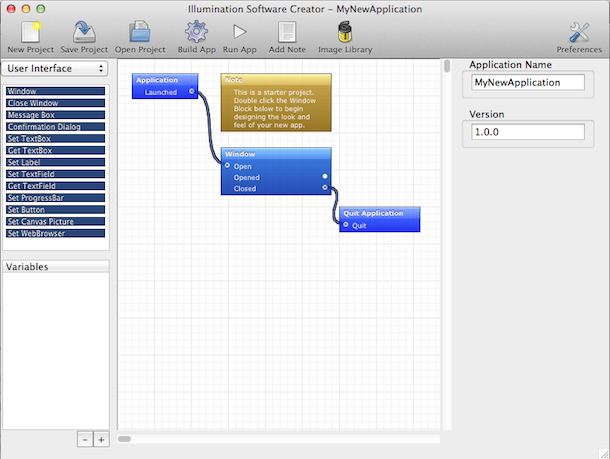
Yet one of my main issues was the inability of the application to use its space effectively. In order to edit the text associated with one of the mind map blocks, the user must move from the main canvas to the right sidebar, where a small text field is located. The rest of the right sidebar, which spans a whole column of the application, is left empty, just as some panels on the left sidebar extend fully even though they may contain little to no data. This space could be used more effectively, especially for help/documentation which seems to be lacking in the application, but is nevertheless left vacuous.
From Research to Concrete Ideas
With my thoughts and the comments that Jen procured from her research in mind, we set out to define some guiding principles when building napkin. The results follow:
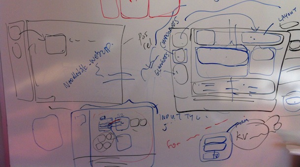
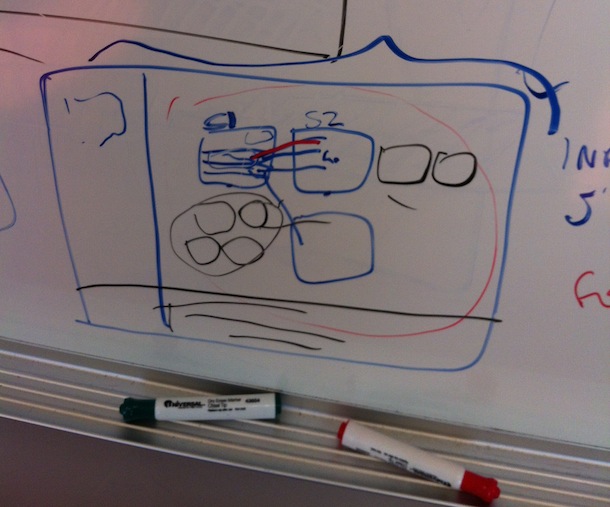
Couldn’t be clearer, right? Well, let me explain after we zoom in:
This is our tentative project page. Ignoring all the random scribbles, it essentially contains a grid of prototypes, each of which we call a “screen.” These could each represent a page on a website, more detailed parts of one larger prototype, or perhaps just placeholders for what is to come, as defined by the user; that is, the project page provides an overview of what the user has created. For now, we plan to just place these screens in a non-sortable grid, but are curious to see whether users want more customization. One of our main thoughts deals with whether or not users would like to arrange these screens in any way they wish, making the project page act more like a canvas. To keep it simple, though, we’ll begin with a simple grid listing. Next up is the screen-specific page:
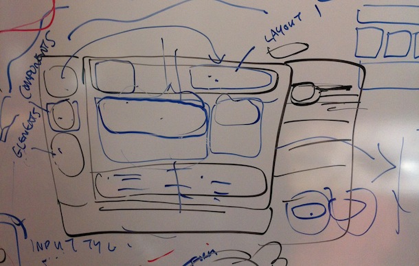
In the middle, we have one of a few predetermined layouts, from which the user can select his/her preference. These define key high-level decisions, including where the sidebar and main body are located and how many columns the prototype has. Not only that, but this layout consists of multiple drag-and-drop areas which are fashioned in a grid-like setting, ready for “components”—forms, authentication systems, generic sections, etc.—to be attached to them. These possible components are located in a list in the left hand sidebar. When a component is dragged and dropped into one of the grid squares, it is immediately focused, at which point the sidebar changes from presenting components to presenting what we call “elements”—sub-sections of a component, such as an input field for a form or a button in a section. If the user clicks away from the component, the sidebar returns to its previous state, acting in a contextual manner. In this way, the user is presented only what matters to him/her at the current moment of the prototyping process, eliminating confusion from complex interfaces. Finally, there is a comments section in the right sidebar to allow for feedback on the design in an effort to promote quick iteration.
What Next?
One of the most important things that we’d like to keep in mind throughout this process is that decisions change. Our ideas might seem sound now, but we could easily run into obstacles or unseen consequences. To truly put our plan to the test, we need to create prototypes and see if what we have in mind can be transformed into a well-representative application or if it becomes lost in translation. So, now that we’ve delved, at least preliminarily, into the prototyper’s mind, it seems that what we have to do next is, well, prototype! I hope to have you along for the ride.