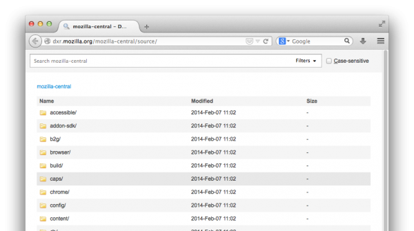
After months of hard work by talented Mozillians, both paid and volunteer, DXR’s UI overhaul branch has hit production! With more efficient workflows, support for multiple trees, and improvements in discoverability, it makes searching Mozilla’s codebases more fun and takes a big step toward the retirement of legacy tools.
What’s new?
Improved flow. The old design forced you into a choice upfront about whether you’d be browsing or searching. That splash screen is gone, replaced with useful information: the top level of the source tree.
If you want to browse, browse; search, search. In addition, multi-tree support is polished and proven, and new trees are coming soon. Finally, breadcrumbs are integrated more smoothly into the workflow; it will soon be a one-click matter to limit search to the folder you’re browsing.
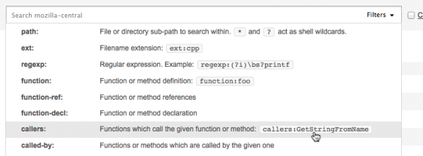
Filters upfront. We now expose and document all 27 search filters in a ubiquitous drop-down menu.
Previously, we showed only about 6, and even those were available only via the Advanced Search panel, which didn’t appear until you had already entered a search and hit Return—search-as-you-type didn’t cut it. Take a look: DXR knows some tricks you weren’t aware of.
Real parsing. There’s an honest-to-goodness query parser now! You can express quotation marks without doing backflips, and the quoting behavior of regexes is unified with that of the other filters. Any filter’s argument can be quoted with ether single and double quotes, and, in case you need both at once, they can be backslash-escaped. For example…
- A phrase with a space:
"big, small" - Quotes in a plain text search, taken as literals since they’re not leading:
id="whatShouldIDoContent" - Double quotes inside single quotes, as a filter argument:
regexp:'"wh(at|y)' - Backslash escaping:
"I don't \"believe\" in fairies."
Furthermore, we have plans to simplify the selection of filters. You’ve said you don’t care, most of the time, what kind of identifier you’re looking for; identifier names are pretty unique. Thus, we plan generic “id” and “ref” filters to save your brain cycles. We’ll also reduce redundancy and make some things shorter and more memorable. See our sketch on the wiki, and don’t hesitate to scribble your feedback on it.
Better URL handling. The URL is updated in place as you search, so all your searches are bookmarkable and shareable, whether you hit Return or not.
Even more. The case-sensitive checkbox has an accesskey. The search field no longer autofocuses, making it easier to use arrow-key scrolling or type-to-select. Table rows present easier click targets. Infinite scrolling is more anticipatory. The JS has been completely rewritten. And everything looks prettier, to boot.
Thanks to everyone who has contributed their feedback and expertise to this release, not only to the UI but also to the back-end improvements that went into production while it was cooking. Special recognition goes to Schalk Neethling for his front-end magic; Nick Cameron, who has been making things better all over the stack; and James Abbatiello, who keeps adding new filters and chasing down analysis corner cases. It’s a fun project to hack on, with something for everybody. Join us!
More is always to come. Known issues are here. File anything else you see.
Happy searching!


Schalk Neethling wrote on
: