Note: This post was written by, and details the work of, Matt Ternoway.
As a designer and self described brand junkie, I obsess over the fine details that create consistency in a brand. Things like logo placement, kerning, breathing space, etc. So what do I do when given the task of creating one-off, one of a kind weekly graphical Facebook posts that range from everything from quirky feel good posts like International Ninja day, to serious topics surrounding privacy and spying issues…doing this all while still maintaining that ever so important consistency needed to build a brand? Basically forget everything I learned in design school, and think back to my art school days…this is going to be fun 🙂
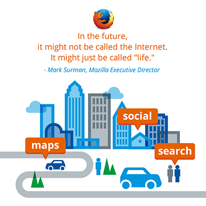
I will admit I didn’t have much of a plan when I started the task back in April, I was really just enjoying the ability to get very creative. Each week our Social media team would pass along some awesome/crazy ideas and have me visually interpret them…International Talk like a Pirate Day?? This is a thing. See.

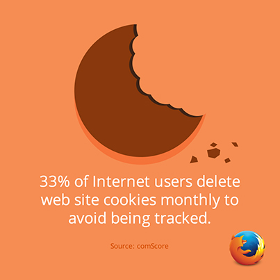
After a few months I found myself getting into a rhythm…inadvertently I started to create a few loose perimeters in which I could draw from to create that consistency I mentioned, but hopefully not at the expense of uniqueness. One being color, as we know color can be the strongest aspect of a brand. You don’t need to go much further than Firefox…that blue and orange burns in your memory. As beautiful as that color combo is, it can get repetitive fast in the confines of social media. This lead me to explore a wider range, even just playing with saturation levels within those two colours i found that each post could take on that one-off uniqueness I was looking for but still say that it is Firefox.
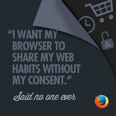
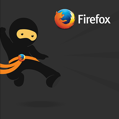
Another perimeter which began to evolve, was inspired by some of the key words that I feel define Mozilla and the Firefox brand, words like, playful, approachable, warm and soft. My goal was to create posts that reflect these words closely. I knew that even our ‘darkest’ posts like the ‘No One Ever’ series still had to have an approachable touch to it. I found myself working with a combination of greys as opposed to black to achieve the right mood…I think this gave the posts a softer matte look. I carried this approach over to one of the more recent posts; International Ninja Day. At first I was trying to go for something perhaps a bit too sinister for Firefox with this concept. In the end I felt I needed to tone it down and play up the playful fun factor. This is what came out of it. A non threatening yet highly skilled ninja 🙂
Those are a few thoughts behind the process. Perhaps this time next year I may have a few more. I am looking forward to seeing where we can take these and how they will evolve. Hope you enjoy.
(Again, all of the above is from Matt Ternoway. Thanks Matt!)
No responses yet
Post a comment