What the grayscale challenge taught us about phone addiction
There’s a lot of talk these days about how addicted we are to our screens. At Mozilla, a few of us tried our own experiment to see if turning our phones to grayscale would change how we interact with our tech. What follows is a conversation among two Mozillians after going gray for a week — Tim, a design practitioner, and Daniel, a brand strategist.
Daniel: The skies over San Francisco are gray, per usual this time of year, as have been our phones for the past week. What did you think? Was the New York Times onto something when they said going gray was a-ok?
Tim: I think they might be, but not everything is so black and white. I was excited to try this experiment. I’m not sure I’ve been so excited for something so seemingly dull before. Grayscaling definitely had the effect of boring up the phone experience for me. In the interest of full disclosure, I should mention I’ve been working on de-intensifying my relationship with my phone for a little while now. For instance, about six months ago I disabled notifications for Facebook and Instagram, and was quickly wondering why it took me so long to do so.
I didn’t do the same for Twitter, not necessarily consciously, but because I think because I didn’t feel compelled to the way I did for the other networks. It could be that I was receiving fewer useless notifications from Twitter. It also may be that because Twitter can be kind of tedious, or that they haven’t successfully designed their experience to be as addictive, that I feel time passing while I’m on Twitter and can self-regulate there more than I do on other platforms. Also it’s a source of news for me, and I also follow a lot of funny people on there, so rather than seeing posts that give me a case of the fomos, I get to read some jokes and stay informedish (I also have other sources for news).

Daniel: That’s how I am with YouTube. I like to watch nerdy cycling videos—don’t judge me, Tim!—but after going to grayscale I almost completely stopped. Seeing these vids in black and white muted the experience of watching dudes in bright-colored lycra flying down a mountain, and I didn’t end up going down the rabbit hole as much. YouTube is so good at leading you into the next piece of content. They design it to auto play the next video within seconds and this can turn my 10-minute distraction into a one-hour veg session. I know I should have more self-control but it’s rough out here.
Tim: I’m like that on Instagram sometimes, succumbing to the black hole. I read that some people check their phone 150 times per day and while that’s not quite me, I certainly find myself reaching for my phone by default a lot of the time, especially after posting something that I think is the coolest photo ever—everyone loves collecting their likes! After going to grayscale my experience changed. On Instagram specifically, I found myself using the service less, and when I did use it, I noticed that I was more focused on the composition of images than I had been.
I also posted less, since I wasn’t sure what the photos I would post would look like to most people. I saw the real thing—a beautiful vista, for example— and took photos of it, but I wasn’t sure the image would accurately reflect my intent or impression. Typically I post a black and white photo from time to time, but usually because that choice is informed by a mood that I felt the scene was conveying already. So whether it’s because it felt artificial or because I didn’t want to post something that other people could see more accurately than I could, I did not post. More disclosure: I’ve never thought as much about my Instagram posting habits as I am right now.
Elsewhere on the web, I noticed typography and layout more, and I realized I may have been taking a lot of cues from color before. On the Washington Post app for instance, and in most newspapers, really, there are often some big, ugly ads. Their gaudiness is a signal to me that I don’t even need to slow my scroll, go right past them. But when everything was leveled out in grayscale, suddenly that sort of image began to almost blend into the content, and the links that are interspersed in articles that go to related content started to feel more like part of a weirdly laid out article.
Daniel: I felt like I was in the movie Pleasantville, the one with Reese Witherspoon where they are trapped in a black and white world. I have old fashioned sensibilities but even for me it was a lot to get used to. I thought I missed the familiar blues and greens of my iPhone, but when I switched back to color they seemed loud to me and incredibly distracting. Here’s another thing that was unexpected: I stopped online shopping as much. I’ve been in the market for a new pair of boots — every modern man needs at least 4 pairs — but they don’t look so shiny, rough, and tough on my phone without the color. So maybe going to grayscale would save me not just piece of mind, but also a few bucks?
Tim: I asked myself how many people already see the whole world like this by default. I guess about 8 percent of men are colorblind (women are much less likely to be colorblind) and I was thinking about what that might be like. As a designer, I depend heavily on color to tell visual stories and drive people to a certain action. Without that tool, I’d likely be focusing a lot more on other aspects of design. Maybe it will make my composition stronger. UX designers often use grayscale wireframes to build out the flow of a site or app. Logo designers often build a mark in black and white before adding color in order to evaluate form. Eventually though, they tend to add color.
Daniel: I know we agreed to try it for a week, but I’m staying with grayscale. It’s working for me. I don’t reach for my phone as much. My video consumption is way down. I’ve got more cash in the pockets of my Levi’s. These are good things. Heck, maybe I’ll even start leaving my phone out of the bedroom, something I’ve been saying I would do since I got my first iPhone. I think the blue light is ruining my sleep, even more than my old restless dog. What about you?
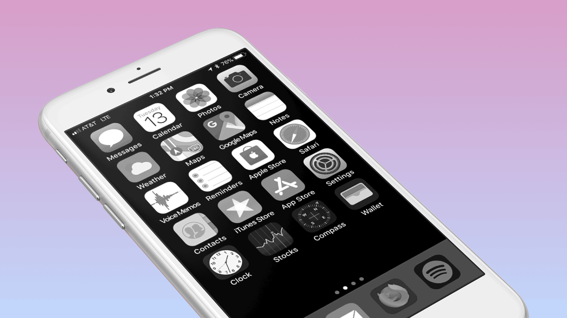
Tim: I’m torn. Color is great for a lot of things, like visual cues. Is the time I saved not using social media wasted looking for the right app because they all sort of look the same in grayscale? Not quite, but I did putter about more on my home screen. I found that apps with bold, high contrast icons were easier to spot quickly. That said, when I turned color back on, wow, my home screen looked gross, like these radioactive greens and oranges were just yelling at me. After the experiment, I enabled the ability to quickly turn color on and off, and I still use the grayscale mode sometimes. I want to want to have it on more. Maybe that’s the first step.
Daniel: I know, I know, but the fight for my finite attention is real, and I need to be honest about how much I’m glued to my devices. I’m going to be following the research on what’s happening with social media and device addiction. I’m super interested in the work of Tristan Harris’s Center for Humane Technology. Let’s see if they can influence Big Tech to stop designing for addiction and instead for responsible use. Any other tips for our readers?
Tim: For anyone reading along and wanting to spend less time using your device, this is a great first step, I recommend you give it a shot, and it’s much easier with a friend!
If you’re interested in trying out grayscale, this Lifehacker article has the steps for iOS and Android. And if you’re a commitment-phobe there’s a tip for triple-tapping your iOS home button (for those of you with home buttons) to toggle color on and off. Let us know in the comments about your experience.