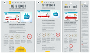
This is the third in a series of four posts on different approaches to mobile web development. Previously, we covered what it means to be mobile friendly and the Separate Sites strategy.
As a reaction to the problems associated with the Separate Sites approach, a relatively new idea (which is actually quite old) is growing in popularity: ditch user-agent detection, and instead make your page respond on the client-side to the browser’s capabilities. This approach has come to be known as Responsive Web Design.
The Good
Though it wasn’t initially proposed as method for creating mobile sites, Responsive Design has recently gained a lot of attention as a way of taking some first steps towards mobile-friendliness in lieu of a separate mobile site. With this technique, you may address two of the three goals of mobile web development:
- Presentation – Using a flexible site layout paired with CSS media queries, you can make your site look as good as possible no matter what size the user’s screen is.
- Content – By altering the content based on browser features detectable via JavaScript, you can tailor your message to the user.
There are some really nice aspects to this approach. Since it does not rely on user-agent detection, it is more resilient and future-proof than the Separate Sites approach. For simple sites, it can also be significantly easier to implement and maintain than other options.
The Bad
This approach isn’t without its limitations, though. Because content must be altered on the client-side with JavaScript, only minimal content changes are encouraged. In general, things can get very hairy very quickly if you are trying to code two separate sets of JavaScript to work with the same DOM. This is a big reason why web apps do not tend to adopt this approach.
Giving your existing site a responsive design is also going to involve a rewrite of your styles if the you are not sporting a flexible layout already. This could be a blessing in disguise, though; making your site’s layout responsive could be a good opportunity to modernize and clean up your site’s CSS.
Finally, since you are adding code to your scripts and styles, performance may be worse than the Separate Sites approach. There is not really any way around this, though a thoughtful refactoring of your scripts and styles might actually save a few bytes in the long run.
When it is Right to Choose This Option
As mentioned above, since content changes can be difficult, this means that when taking this approach you will not be able to give users a strikingly different experience on mobile without a significant increase in code complexity. That said, if the desktop and mobile versions of your site are going to be very similar, then this approach is a great option. It is well-suited to document-centric sites which have a primary use case that is consistent across devices, like product pages. You may notice that the examples below are all blogs or portfolios!
Examples
Though it is not as popular as the Separate Sites approach, there are more and more websites employing this technique every day. Luckily, since all the code is client-side, if you’d like to see how a site technically implements this approach, it is as simple as visiting the site and clicking “View Page Source.” Here are a few examples:
- http://teixido.co/ – one of my favorite responsive designs, also pictured above!
- http://adactio.com/journal/1696 – also a good article to read, with its own links to examples
- http://thinkvitamin.com/
- http://stephencaver.com/
- http://hicksdesign.co.uk/
Despite being a relatively young approach, there are already some emerging best practices. For example, if you are designing a site from scratch with this option in mind, it is usually worthwhile to create a small-screen design first, so that the constraints of mobile are with you from the beginning. It’s also great to use progressive enhancement for your styles instead of hiding elements of your existing site with media queries. This way, older browsers that might not support media queries will still show the proper layout. An excellent presentation on the merits of this method is available here.
Next Week
There’s got to be a middle ground between completely separate sites and one-site-fits-all, right? Luckily, we can combine server-side and client-side techniques to form a Hybrid Strategy, to be discussed in the next post.
Danny Moules wrote on
: