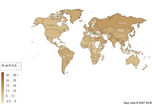
Last week, we looked at which regions have shown the fastest and slowest adoption rates of Firefox 3.5. Asa had a great idea to expand on this analysis – why not visualize it through a global map to more easily see if there are any overarching patterns across particular regions?
So, we took our Firefox usage data from the past week, uploaded it to IBM’s manyeyes project (which we previously mentioned here), and created the following visualization. The image below shows Fx3.5 adoption by region. You’ll notice that there seems to be relatively more dark shaded areas around Russia and Asia.

If you want to explore this visualization further, you can visit the manyeyes page or simply click on the “interact” button below. You’ll notice that with the drop-down menu near the upper left-hand corner, you can select the Firefox version — Fx2, Fx3.0, or Fx3.5 — you’re interested in viewing stats for. This should also come in handy for detecting regions where Fx2 usage is still significant (which we previously explored here).
Would you like to see this type of data updated regularly? Would seeing it trended over time be helpful? Let us know.
Jon G wrote on
:
dave wrote on
:
anon wrote on
:
Donnie Berkholz wrote on
:
Peter GG wrote on
:
cuz84d wrote on
: