People who personalize Firefox like their Firefox better. However, many people don’t know that they can, and for those who know it isn’t particularly easy to do. So a few months ago, we began rethinking our entire add-on discovery experience—from helping people understand the benefits of personalization, to making it easier to install an add-on, to putting the right add-on in front of people at the right time.
The first step we’ve taken towards a better discovery experience is in the redesign of our Add-on Discovery Pane. This is typically the first page users see when they launch the Add-on Manager at about:addons.

Add-on Discovery Pane before Firefox 48
We updated this page to target people who are just getting started with add-ons, by simplifying add-on installation to just one click and using clean images and text to quickly orient a new user.

It features a tightly curated list of add-ons that provide customizations that are easy for new users to understand.
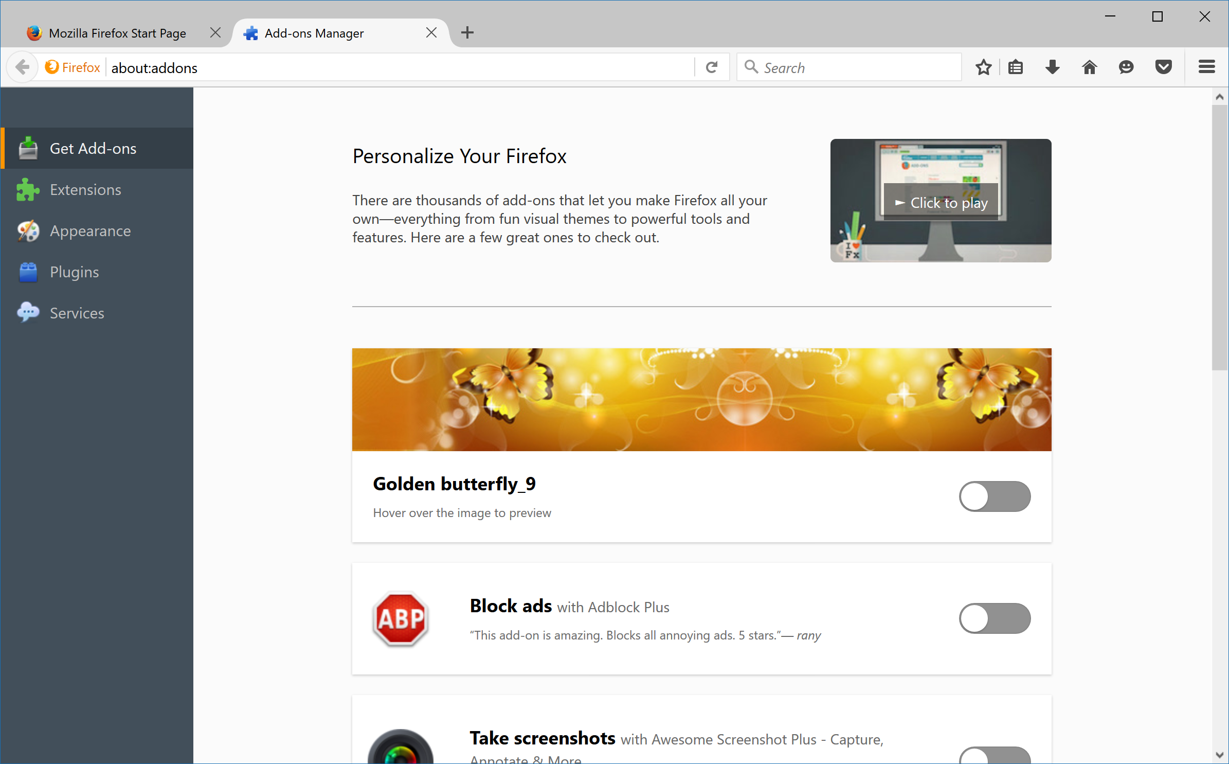
Add-on Discovery Pane starting with Firefox 48
We started with a small list and collaborated with their developers to ensure the best possible experience for users. For future releases, we will refresh the featured content on a more frequent basis and open up the nomination process for inclusion.
Our community of developers create awesome add-ons, and we want to help users discover them and love their Firefox even more. In the coming months, we are going to continue improving the experience by making recommendations that are as uniquely helpful to users as possible.
In the meantime, this first step toward improving the Firefox personalization experience will land in Firefox 48 on August 1, and is available in Firefox Beta now. So download Firefox Beta, go to about:addons and give it a try! (You can also reach this page by going to the Tools menu and choosing “Add-ons”). We would love to hear your feedback in the forums.
Joe Ertaba wrote on
Scott DeVaney wrote on
Charles wrote on
Charles wrote on
Markus Jaritz wrote on
Raymond Hill wrote on
Scott DeVaney wrote on
Ragnar wrote on
Ricky Smith wrote on
Markus Jaritz wrote on
Noitidart wrote on
Raymond Hill wrote on
Noitidart wrote on
Markus Jaritz wrote on
Lee John wrote on
Markus Jaritz wrote on
Ben Cato Malkenes wrote on
Markus Jaritz wrote on
dommy wrote on