
Designing a telemetry collection with Glean
(“This Week in Glean” is a series of blog posts that the Glean Team at Mozilla is using to try to communicate better about our work. They could be release notes, documentation, hopes, dreams, or whatever: so long as it is inspired by Glean.) All “This Week in Glean” blog posts are listed in the TWiG index).
Whenever I get a chance to write about Glean, I am usually writing about some aspects of working on Glean. This time around I’m going to turn that on its head by sharing my experience working with Glean as a consumer with metrics to collect, specifically in regards to designing a Nimbus health metrics collection. This post is about sharing what I learned from the experience and what I found to be the most important considerations when designing a telemetry collection.
I’ve been helping develop Nimbus, Mozilla’s new experimentation platform, for a while now. It is one of many cross-platform tools written in Rust and it exists as part of the Mozilla Application Services collection of components. With Nimbus being used in more and more products we have a need to monitor its “health”, or how well it is performing in the wild. I took on this task of determining what we would need to measure and designing the telemetry and visualizations because I was interested in experiencing Glean from a consumer’s perspective.
So how exactly do you define the “health” of a software component? When I first sat down to work on this project, I had some vague idea of what this meant for Nimbus, but it really crystallized once I started looking at the types of measurements enabled by Glean. Glean offers different metric types designed to measure anything from a text value, multiple ways to count things, and even events to see how things occur in the flow of the application. For Nimbus, I knew that we would want to track errors, as well as a handful of numeric measurements like how much memory we used and how long it takes to perform certain critical tasks.
As a starting point, I began thinking about how to record errors, which seemed fairly straightforward. The first thing I had to consider was exactly what it was we were measuring (the “shape” of the data), and what questions we wanted to be able to answer with it. Since we have a good understanding about the context in which each of the errors can occur, we really only wanted to monitor the counts of errors to know if they increase or decrease. So, counting things, that’s one of the things Glean is really good at! So my choice in which metric type to use came down to flexibility and organization. Since there are 20+ different errors that are interesting to Nimbus, we could have used a separate counter metric for each of them, but this starts to get a little burdensome when declaring them in the metrics.yaml file. That would require a separate entry in the file for each. The other problem with using a separate counter for each error comes in adding just a bit of complexity to writing SQL for analysis or a dashboard. A query for analyzing the errors if the metrics are defined separately would require each error metric to be in the select statement, and any new errors that are added would also require the query to be modified to add them.
Instead of distinct counters for each error, I chose to model recording Nimbus errors after how Glean records its own internal errors, by using a LabeledCounterMetric. This means that all errors are collected under the same metric name, but have an additional property that is a “label”. Labels are like sub-categories within that one metric. That makes it a little easier to instrument, first in keeping clutter down in the metrics.yaml file, and maybe making it a little easier to create useful dashboards for monitoring error rates. We want to end up with a chart of errors that lets us see if we start to see an unusual spike or change in the trends, something like this:
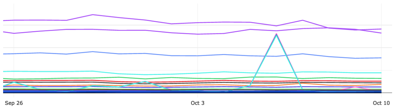
We expect some small amount of errors, these are computers after all, but we can easily establish a baseline for each type of error, which allows us to configure some alerts if things are too far outside expectations.
The next set of things I wanted to know about Nimbus were in the area of performance. We want to detect regressions or problems with our implementation that might not show up locally for a developer in a debug build, so we measure these things at scale to see what performance looks like for everyone using Nimbus. Once again, I needed to think about what exactly we wanted to measure, and what sort of questions we wanted to be able to answer with the data. Since the performance data we were interested in was a measurement of time or memory, we wanted to be able to measure samples from a client periodically and then look at how different measurements are distributed across the population. We also needed to consider exactly when and where we wanted to measure these things. For instance, was it more important or more accurate to measure the database size as we were initializing, or deinitializing? Finally, I knew we would be interested in how that distribution changes over time so having some way to represent this by date or by version when we analyzed the data.
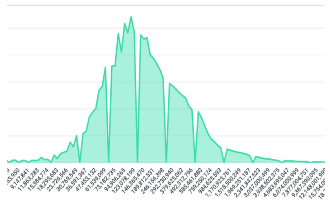
Glean gives us some great metric types to measure samples of things like time and size such as TimingDistributionMetrics and MemoryDistributionMetrics. Both of these metric types allow us to specify a resolution that we care about so that they can “bucket” up the samples into meaningfully sized chunks to create a sparse payload of data to keep things lean. These metric types also provide a “sum” so we can calculate an average from all the samples collected. When we sum these samples across the population, we end up with a histogram like the following, where measurements collected are on the x-axis, and the counts or occurrences of those measurements on the y-axis:
This is a little limited because we can only look at the point in time of the data as a single dimension, whether that’s aggregated by time such as per day/week/year or aggregated on something else like the version of the Nimbus SDK or application. We can’t really see the change over time or version to see if something we added really impacted our performance. Ideally, we wanted to see how Nimbus performed compared to other versions or other weeks. When I asked around for good representations to show something like this, it was suggested that something like a ridgeline chart would be a great visualization for this sort of data:
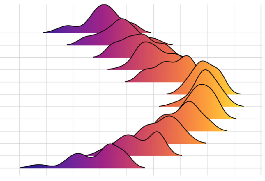
Ridgeline charts give us a great idea of how the distribution changes, but unfortunately I ran into a little setback when I found out that the tools we use don’t currently have a view like that, so I may be stuck in a bit of a compromise until it does. Here is another visualization example, this time with the data stacked on top of each other:
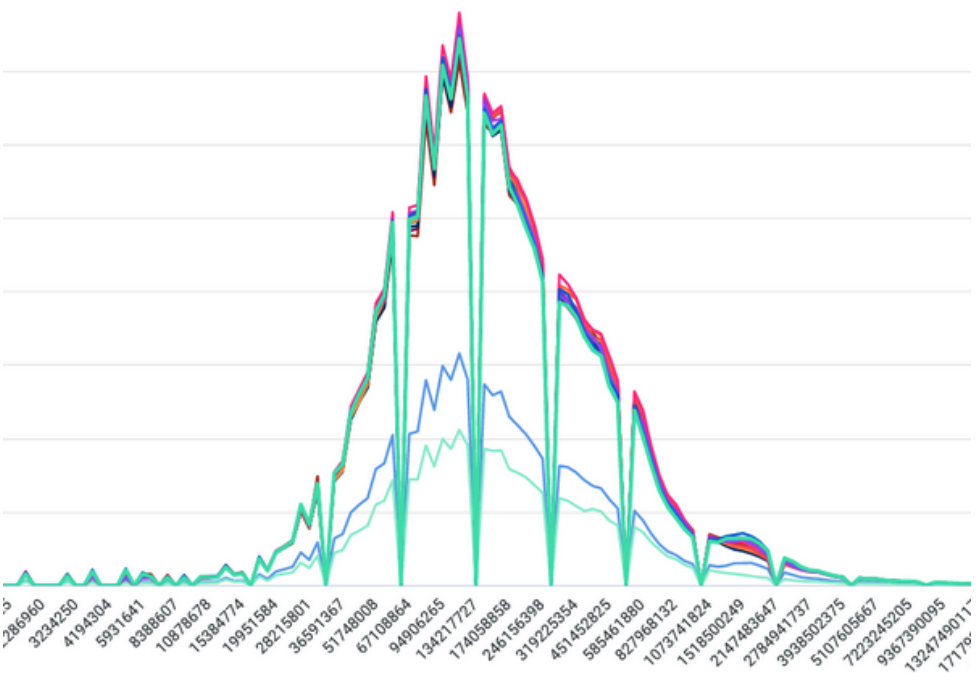
Even though something like this is much harder to read than the ridgeline, we still can see some change from one version to the next, just picking out the sequence becomes much harder. So I’m still left with a little bit of an issue with representing the performance data the way that we wanted. I think it’s at least something that can be iterated on to be more usable in the future, perhaps using something similar to GLAM’s visualization of percentiles of a histogram.
To conclude, I really learned the value of planning and thinking about telemetry design before instrumenting anything. The most important things to consider when designing a collection is what are you measuring, and what questions will you need to answer with the data. Both of those questions can affect not only which metric type you choose to represent your data, but where you want to measure something. Thinking about what questions you want to answer ahead of time allows you to be able to make sure that you are measuring the right things to be able to answer those questions. Planning before instrumenting can also help you to choose the right visualizations to make answering those questions easier, as well as being able to add things like alerts for when things aren’t quite right. So, take a little time to think about your telemetry collection ahead of instrumenting metrics, and don’t forget to validate the metrics once they are instrumented to ensure that they are, in fact, measuring what you think and expect. Plan ahead and I promise you, your data scientists will thank you.