Improving the Firefox Experience – 84,000,000 Users at a Time

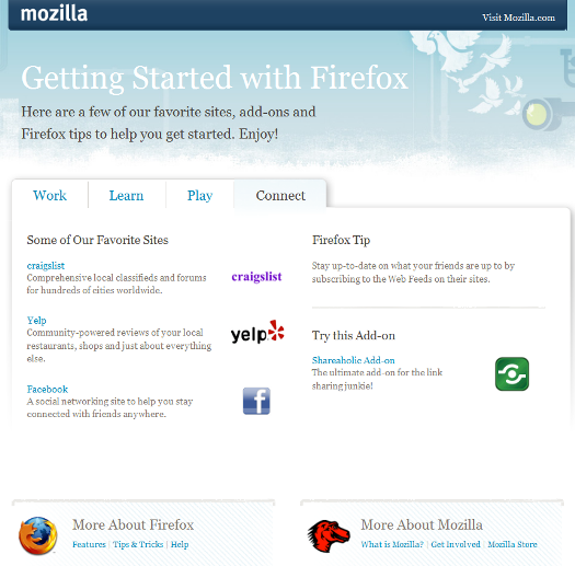
When we recently shared an overview of the traffic to www.mozilla.com, we noted one item that stood out – the relatively high volume of traffic to the Getting Started page.

getting_started_page_v2

Digging into the data, we wanted to understand the typical user experience with this page.  In other words, why do users come to it?  How do they get to it? What are their expectations of the page?  Do they find the page helpful or confusing?  Considering these questions, we arrived at a startling finding…

  • Approximately 90% of the traffic comes from the bookmark toolbar (image below) and about 10% arrives via the featured link on the firstrun pagebookmark_toolbar_v2
  • Ok, that fact alone isn’t surprising, but what is surprising is this:
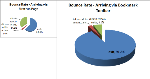
  • The users clicking through via our firstrun page showed a 63% bounce rate on the Getting Started page (bounce rate means the visitor immediately leaves the site upon viewing a particular page)
  • The users clicking through from the bookmark toolbar showed a whopping 92% bounce rate!

Why is this such a big deal?

The Getting Started page saw more than 24 million visitors last month (all locales), and in each instance of a visit, the user is making a conscious decision to visit the page.  To put the scale of this number in perspective… of all “user driven” traffic at Mozilla.com, only the main Firefox product page comes remotely close to matching that traffic volume.

Of the total group of 24 million visitors, the cohort of visitors arriving via the bookmark toolbar was nearly 22 million strong.  In other words, 22 million users exhibited that 92% bounce rate.  To boot, we know from the other cohort of visitors (those arriving via the firstrun page), that the bounce rate doesn’t have to be that high.  Here is a breakdown in visitor behavior for the just the en-US version of the page (1 million visitors make up the first pie, 10 million in the latter, hence the scale difference):

bookmark_toolbar_v4

If we made changes to Firefox and to the Getting Started page in such a way that lowered the 92% bounce rate to 63% (within the realm of possibility), that would equate to an improved experience for 7 million users each month.  Extrapolating to an annual impact – that’s 84 million users that could be positively affected.

Where do we go from here?

First, we need to determine the root of the issue.  Should “Getting Started” reside in the Firefox bookmark toolbar?  Or should we be focusing on the page itself?

Assuming we leave the browser as-is, it would behoove all of us (myself included) to consider radical solutions for better meeting the expectations of users visiting the Getting Started page (remember: these users are proactively choosing to visit this page).  Please leave a comment.  I’m eager to work towards a solution, and ultimately, towards a better experience for tens of millions of Firefox users.
12 responses

  1. Kurt wrote on :

    Maybe I’m missing something but where are they going to after arriving at the “Getting Started” page? Are they clicking on a link there, typing in an address, opening a bookmark? What are they doing on the “Getting Started” page.

    I’m also interested to find out how much the traffic lessons to that page when Firefox 3.1 ships with the mozilla favicon.

  2. kkovash wrote on :

    Kurt,

    great question. we’re able to tell if someone either A) clicked on a link on the page, or B) exited mozilla.com. “A” is represented by the red and green slices in the pie charts. Overall, the most popular links on the page are the “More About Firefox” and “More About Mozilla” areas at the bottom of the page (represented by the green pie slices). I’ll plan to post a heat map of the page to make this more clear.

    Ken

  3. matt wrote on :

    “These users are proactively choosing to visit this page”

    Ken, what’s the evidence for this?

    With 125M users clicking in the browser 100-1000 times per day, and reasonable assumptions on how often users aim badly, it’s likely that many of those are unintentional visits.

    Note that it’s the only button on the default bookmark toolbar that takes you to a new site rather than just changing chrome.

    I know I’ve done it before, usually when trying to hit the Delicious button. But I imagine the most common cases are users trying to hit the home button or location bar. Do you have any data on how often users do that?

    I guess my suggestion would be that you should consider expiring it from the default toolbar after Firefox has been installed for some amount of time.

    Or just try moving it one space right, where it should hopefully attract fewer clicks.

  4. Eric wrote on :

    This may not be terribly convincing, but perhaps users are clicking the button accidentally when they go to type something in the location bar? It is the first button under the bar in the screenshot, and would explain the massive bounce rate.

  5. David Teller wrote on :

    My personal deduction is that 90% of users are Windows users. They are used to clicking on “Start” to do anything, so “Getting started” seems the logical thing to do when on the Internet.

  6. blufive wrote on :

    Putting on my “naive user” hat for a moment, my first thought on seeing a button labelled “getting started” is that it’s going to take me to some sort of quick-start “here’s a quick tour of this software you’ve just installed”. Something like “[tabs|awesomebar|places|addons] are great, here’s how to use them and what they can do for you.”

    The page shown above is manifestly NOT that sort of page. In fact, apart from the “recommended add-on” and tip (which both get minor billing) it’s just a big link-list.

    IMO, This page should be about how to use FIREFOX. At the moment, it’s mostly about how to use THE WEB.

    People who are consciously switching from another browser know all that stuff, and we’re missing a golden opportunity to introduce them to the very features that we hope will make Firefox itself “sticky”.

    People who have been “voluntarily” switched by a techie friend/relative for security reasons (“Dad, you’re clueless about net security, so I’m giving you a browser that at least locks the doors for you”) are probably coming here because their “howto use the intarwebs for dummies” magazine only talks about IE and they can’t figure out how to do anything. Again, we’re missing a golden opportunity to help them use the browser and curse less at their offspring for foisting this oddball *thing-they-don’t-understand* on them.

  7. blufive wrote on :

    To summarise what I think the core problem is: the content of this page is probably radically different from what the user is expecting (big usability no-no). So, we need to either change the page to better reflect their expectations, or change their expectations (e.g. by changing the button text).

  8. Staś Małolepszy wrote on :

    “The users clicking through from the bookmark toolbar showed a whopping 92% bounce rate!”

    I’ve had a theory on this, but I would never have thought this was possible before yesterday, when I saw a friend of mine doing exactly that.

    In Fx 3.0 we don’t have a “New tab” button (it will be added in 3.1). So to open a new tab, a user can do a couple of things:
    * Ctrl+T
    * File > New tab
    * Ctrl-click (or middle-click) on a random link on the current website
    * Ctrl-click (or middle-click) on an item on the bookmarks toolbar

    Suppose you don’t use keyboard shortcuts a lot (like this friend of mine). “File > New tab” is just not quick enough, and clicking a random link on the currently viewed page is, well, too random. The links are placed in different places on different pages and are styled differently, so you’d have to analyze the page and its layout every time to find them. The solution to this are the bookmarks on the bookmark folder, and by default there are three: Recently visited pages folder, live bookmark (also a folder) and… ta-da! the Getting Started page. It’s been there from the very first launch of your browser, so it’s basically a part of the chrome. It’s always in the same place, of the same size and the same formatting. A perfect prosthesis of the functunality that we didn’t provide in 3.0. Just middle-click on it to open a new tab!

    This fits well in the observed data. People coming from the First run page are interested in the Getting Started page (bounce rate of 63%). People coming from the bookmarks toolbar just use this page to open a new tab (92% bounce rate).

    I will be curious to see the same data after the 3.1 release, which will add the “New tab” button next to the right-most tab.

  9. Tom wrote on :

    I tend to agree with the “mistake” thesis argued by several other commenters above. If the bounce rate is that high, it’s likely that people are 1) aiming incorrectly and accidentally clicking on the bookmark, or 2) misinterpreting what the “getting started” bookmark actually is.

    As such, it’s not clear to me that changing the landing page will have a significant effect one way or the other on the bounce rate from that bookmark.

  10. Mark wrote on :

    If I download a new application and click on a bookmark called “Getting Started” I expect to get a walk-through of some of the coolest/most useful features of the application. “How do I best use the application?”

    The resources presented have very little to do with Firefox. I see no value. I close the page.
    Show me a video walk-through of bookmarking a page and then using the awesomebar to get to it. Or at the very least a graphical walk-through.

    We need to answer the question of what does the user expect when they voluntarily click a link/bookmark labeled “Getting Started”. Clearly they’re not getting anything close to it or anything very attractive/valuable to them or they would stay.
    Let’s help them “get started” with Firefox, not the internet.

    On a sidenote, I think we should assess user perception of the current icon being used. I know it’s not ‘doing it’ for me anymore.

  11. Gordon P. Hemsley wrote on :

    I agree with many who have already posted. The “Getting Started” page needs some work. Either you move the “Our Favorite Sites” section out of prominence and add in some tips on how to learn, work, play, etc. with Firefox itself, or replace that page with a graphical walkthrough of using Firefox for the first time and save that page as the next step for those who have mastered the basics.

    Also, I think you should re-filter these results to eliminate those who stayed on the page less than 5 seconds, which should eliminate the visitors who came from accidental clicks or pseudo–new tab button usage.

    (Incidentally, the comment form on this blog is atrocious. Where can I complain about that in more detail?)

  12. ChrisJF wrote on :

    I think the problem lies in the content of the page itself. I think the getting started page should be a sort of tutorial on Firefox. You know, educate the user on why the Awesome bar is Awesome and what addons are and how to install one.