Interacting with One of the Web’s Most Popular Pages

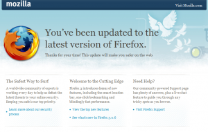
By far the most visited page across Mozilla’s web sites is the “whatsnew” (or update) page.  Each time there’s a release (e.g., 3.0.6), users automatically get updated to the latest version of Firefox, and as part of that process, the user’s browser shows the following page:

heatmap_whatsnew_page

So, what makes us think this might be one of the most visited pages on the web?  Here are some numbers for the 3.0.6 associated page:

  • We’ve seen a total of about 90,000,000 page views (all locales, over the past ten days or so)
  • About 36,000,000 visits to the en-US locale version

The next question is:  How do users actually interact with this page?

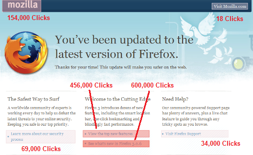
To answer this, we looked at a heat map of the en-US page version.  You’ll see across the different places users can click, we’ve seen about 1.3 million total clicks.  That translates to a click-through rate of about 3.6%, which seems pretty good to me.  The other thing that stands out is the relatively high concentration of clicks in the middle section – “View the top new features” and “See what’s new in Firefox 3.0.6”.
whatsnew_heatmap_forblog2

Does anything else stand out to you?

14 responses

  1. Dan wrote on :

    OK I’ll answer. Surely out of 90 million page views there were more than 18 clicks on the “Visit Mozilla.com” link?

    Although, how can you possibly tell whether a user clicked on that link rather than the big Mozilla link on the left given that they both link to the same place?

  2. Richard wrote on :

    Yep. The difference between the number of clicks for the two top links is… umm… significant.

    Having a logo in the top left corner that links to the main home page has been standard practice for as long as I can remember.

    Perhaps people are unsure what is meant by “Visit Mozilla.com” – surely they’re already on Mozilla.com? And if they don’t know they’re on Mozilla.com already, perhaps they think the link will take them off site?

    Just thinking out loud.

  3. Anon wrote on :

    Well considering you almost always get a 404 on nightly builds it’s nice to be reminded what it’s supposed to look like 😉

  4. Tomer wrote on :

    Can you give us deeper statistics from this view? I am really wish to know how many active users there are separated by each country (not only by locale, as some prefer en-us even in other countries).

  5. David Tenser wrote on :

    Relatively few people need support, which is a good sign of the health of our product.

    But the one thing that obviously stands out is the difference between the “mozilla” logo link and the “Visit Mozilla.com” link in the top nav. I’d like to know why the difference is so radical. I am guessing that the main reason is because people tend to look more on the left side than the right side. It would be easy to verify this with a simple A/B test that switched place of those two items.

    Another reason could be the relative visibility of the mozilla logo vs the thin text link. I’m guessing these two reasons combined is closer to the truth, but the placement is likely the most important reason.

    Another observation is that people seem to be interested in what changed with the new release. Considering that only 3.4% click on something, I think we might want to make the what’s new stuff more prominent to increase that total clickthrough number. The more people that reads about what’s new, the more people are going to find out more about Mozilla in general.

    Your thoughts, Ken?

  6. David Tenser wrote on :

    Another interesting experiment would be to shuffle around the three blocks and see how that affects the clicks. Maybe “The Safest Way to Surf” would get less clicks than “Need Help?” if those two were placed on opposite sides?

  7. Daniel Einspanjer wrote on :

    I think the amount of people wanting to see information regarding features would warrant some multivariate testing on ways to bring more of that information directly to this page in order to engage more users. Maybe a top 5 bugs fixed and a top 5 features added or something..

  8. kkovash wrote on :

    David,

    good thoughts! a few things I’m thinking:
    – I would describe the 3.6% click rate as healthy
    – If users are far and away most interested in knowing about new features, why not showcase a few of Fx’s top new features directly on this page (i.e., not make users click through to find what they’re looking for)?
    – I’m looking into some pathing reports to see what happens *after* users click on those two popular links. Early indications are that these users may be coming away disappointed.

    Ken

  9. Havvy wrote on :

    If there are only 18 clicks on that link in the top right corner, would it not be best to remove it?

  10. AJ Kohn wrote on :

    What stands out to me first is the click distribution between left and right hand side of the page.

    This isn’t exactly ground breaking given the amount of eye-tracking studies out there these days.

    However, the 18 versus 154,000 is far more of a discrepancy than i would have expected.

    Also of interest is that the ‘hero’ messaging is about safety. “This update will make you safer on the web.”

    And the left most content block (where the majority of eyes will scan) is about safety. Yet … they weren’t interested in safety.

    Instead, users were interested in cutting edge features and what was new in this version.

    This might point to a different marketing message for the next update surrounding new features. Perhaps the way to communicate the safety message is by putting it in the cutting edge features.

  11. Gordon P. Hemsley wrote on :

    Chances are people receiving this message have just upgraded from one point release to another, so they already know that they on “the Cutting Edge”. They’ll want to know what’s new in this 3.0.x version, versus the one they previously had. Why is it the link that they’d be most interested in is the lowest link on the page? It should be right under the “This update will make you safer on the web.” line…!

  12. Gordon P. Hemsley wrote on :

    Oh, and one other thing:

    As for the link with only 18 clicks, it is standard muscle memory to click on the top-left logo on a website to bring you to the home page. You don’t need an additional link somewhere else telling you how to do that. There should be a search box or something in the top-right corner, not a duplicate link.

  13. Speech bubble=name? wrote on :

    I’m one of the people who’s clicked on “See what’s new in Firefox 3.0.6”, but I stopped when I realized that it doesn’t tell you what’s new in Firefox 3.0.6 since 3.0.5; it tells you what’s new in Firefox 3 since Firefox 2. That was not what I expected.

  14. wintah wrote on :

    Personally I think that there isn’t anything wrong with the “This update will make you safer on the web.” message. This information justifies to the user the need for the point update. At least it does to me. So most of the users may be quite happy with this information, others may want to find out specifics and/or what else has improved.

    I would love to see a box saying something like ‘In addition to this, this update contains these improvements’. Or something like that…