Firefox is Green

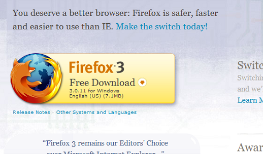
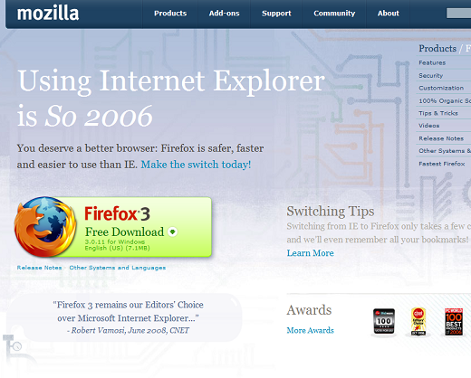
We recently ran a week long A/B optimization test at www.mozilla.com where we rotated in a few different colors of the Firefox download button.  (You may recall that we’ve previously conducted one prior multivariate test on the Firefox product/download page… check it out for some historical context.)  For this current test, here was our existing page and download button:

fx_control

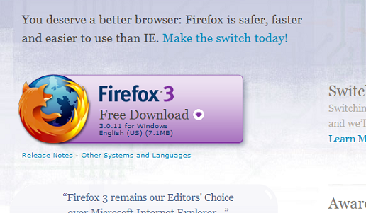
Within this page (the green download button was our “control” color), we randomly rotated three other colors of the download button – blue, purple, and orange/yellow:
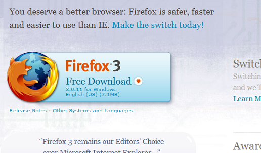
fx_blue

fx_purple

fx_yellow

The results are below.  The difference between a 76.5% conversion rate and a 77.3% conversion rate is a 1% lift, i.e., the percentage change between those two percentages.  So, what does this translate to in terms of Firefox usage?  Assuming we see about 500K daily downloads at www.mozilla.com, a 1% lift translates to nearly 2 million marginal, or incremental, downloads annually (i.e., 2 million potential new Firefox users we would have otherwise lost).

color_results

We’re already running the winning button color, so we’re now looking forward to future optimization testing (e.g., a download button quadrupled in size, an octagon shaped download button, a button centered within the page, etc.) to see if we can actually gain a 1% lift (or ideally a 5%+ lift), and in the process, improve our site experience for millions of new Firefox users.

Lastly, I want to thank John Slater, Laura Mesa, Monique Johnson, Stephen Donner, Neil Lee, Jeremy Orem, and Alex Buchanan for making this initiative happen.
13 responses

  1. Ken Saunders wrote on :

    That’s all really cool and fascinating.
    Nice work!

  2. Pino wrote on :

    I suggest replacing that quote, dating June 2008. A year ago Google Chrome was not even there yet, and IE7 was the latest version of IE. With the rapid evolvement of browsers, a year old quote is very outdated.

    It surprises me btw how high the ‘conversion rate’ is. I don’t know how this compares to other sites, but the fact that 3/4th of the people visiting downloads seems a real good achievement.

  3. Alex Faaborg wrote on :

    >I suggest replacing that quote, dating June 2008.

    I believe that text is only served to IE6 users, although I could be wrong.

    Is there any indication that different colored buttons would perform better or worse in different locals? I know green has a pretty universal connotation of go due to the need for mostly standardized traffic interfaces, but there might also be a cultural component.

  4. mark wrote on :

    >I believe that text is only served to IE6 users, although I could be wrong.
    ———
    I can confirm that. Recently cleaned house, reformatting my PCs and reinstalling everything. Firefox shows a different page to IE users (the one pictured above) and Chrome users.

  5. AndersH wrote on :

    > I believe that text is only served to IE6 users […]

    Using IE7 (and clearing the accept-languages header) I also get redirected to that page from getfirefox.com, but then again IE7 was released in 2006 ( http://en.wikipedia.org/wiki/IE7 ). Let’s just hope the page is not served to IE8 users.

  6. Gervase Markham wrote on :

    I think this may be related to the fact that “big and green” is becoming the standard for download buttons. I don’t know whether we drove this trend or rode it, but it’s there. download.com uses green, for example.

  7. Cultural Multivariat wrote on :

    Interesting finding especially that everyone seems to be advocating red buttons as all times winners. Any comments on that? Did you consider testing a red button?

    Similarly to Alex, I would also be interested if there are geographical/cultural differences in colour preference.

  8. KatieK wrote on :

    I’m surprised you tested the purple button – it looks so out of place. I’d love to see the results of a multivariate test including the button text, headline and testimonial – segmented by browser.

  9. Andrew wrote on :

    The green seemed to be the most inviting to me. Blue looked like an unstable and unreliable button. Purple was intimidating. Orange actually looked decent but it looked too much like the Firefox icon.

  10. Elizabeth wrote on :

    Well,I believe all this tests shows that more people are looking at Firefox as an alternative browser 🙂 The purple colour looks out of place. Yes, the green is inviting

  11. Retnuh66 wrote on :

    This might just be me being used to installing add-ons, but the green to me looks more like a button I can just press and it automatically does everything for me. Even though I know it doesn’t, it just give me the impression of being much simpler and easier.

  12. bill wrote on :

    Sounds a little bit like the sort of thing invasive adverts on the web try to do. Gradually refining the design in order to make people click, irrespective of the content. Is this really the way Firefox wants to gain market share?

  13. NomadDNA wrote on :

    Did you run chi square tests to see if these findings are statistically significant?

    Are there other variables that might explain this 1% increase?

    Is it possible that there was no *scientifically* significant explanation for this small increase in conversions?