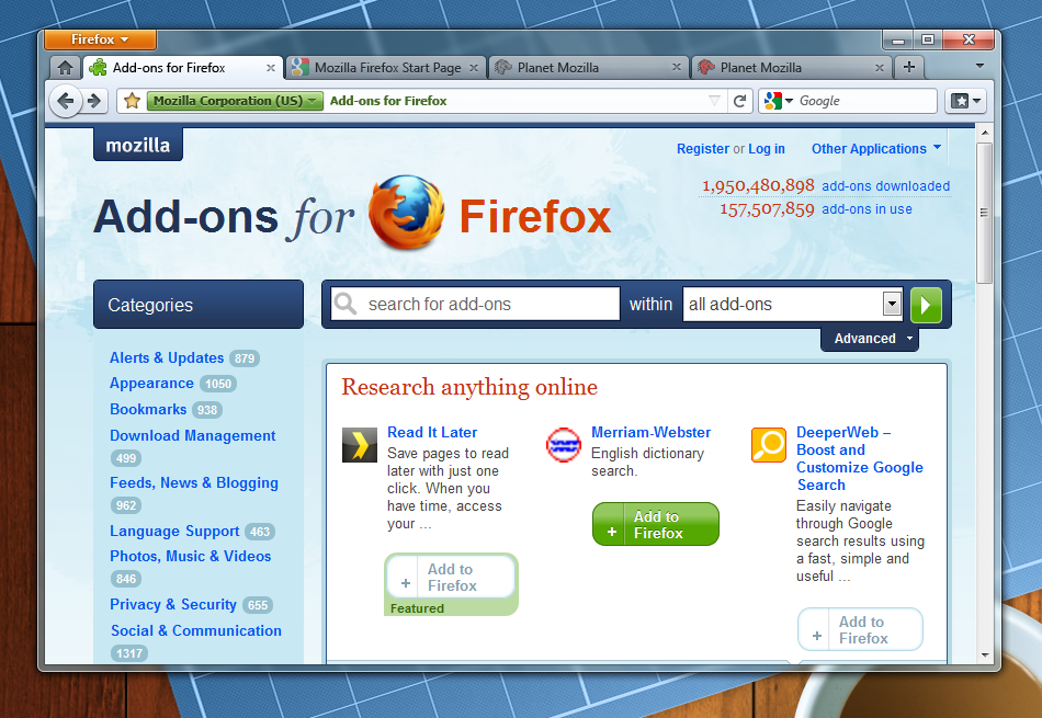
Last month, Mike Beltzner shared an early product plan for the next version of Firefox with the Mozilla community and presented our vision for Firefox 4. A big upgrade coming with Firefox 4 is the new theme project: creating a new, sleek, and simpler default theme for the browser. The UX team has been working tirelessly on this – streamlining and modernizing the user interface, particularly on Windows, given the aesthetic changes introduced by Vista and Windows 7.

Note: Plans May Change.
Metrics and Test Pilot have been doing what we can to help guide the UX team as they create an optimized design. A few months ago, Test Pilot released the Menu Item Usage Study, from which we gained valuable insight into how users interact with the menu bar. And a few weeks ago, we released the Main Window Usage Study to capture the remaining major UI elements of the browser, and provide more data-driven recommendations.
Today, we’d like to present some initial findings from this study. Like previous Test Pilot studies, the main window study ran for 5 days and covered Firefox versions 3.5 and up. The sample consists of 9,667 users who have opted into the Test Pilot program AND opted to submit their data.
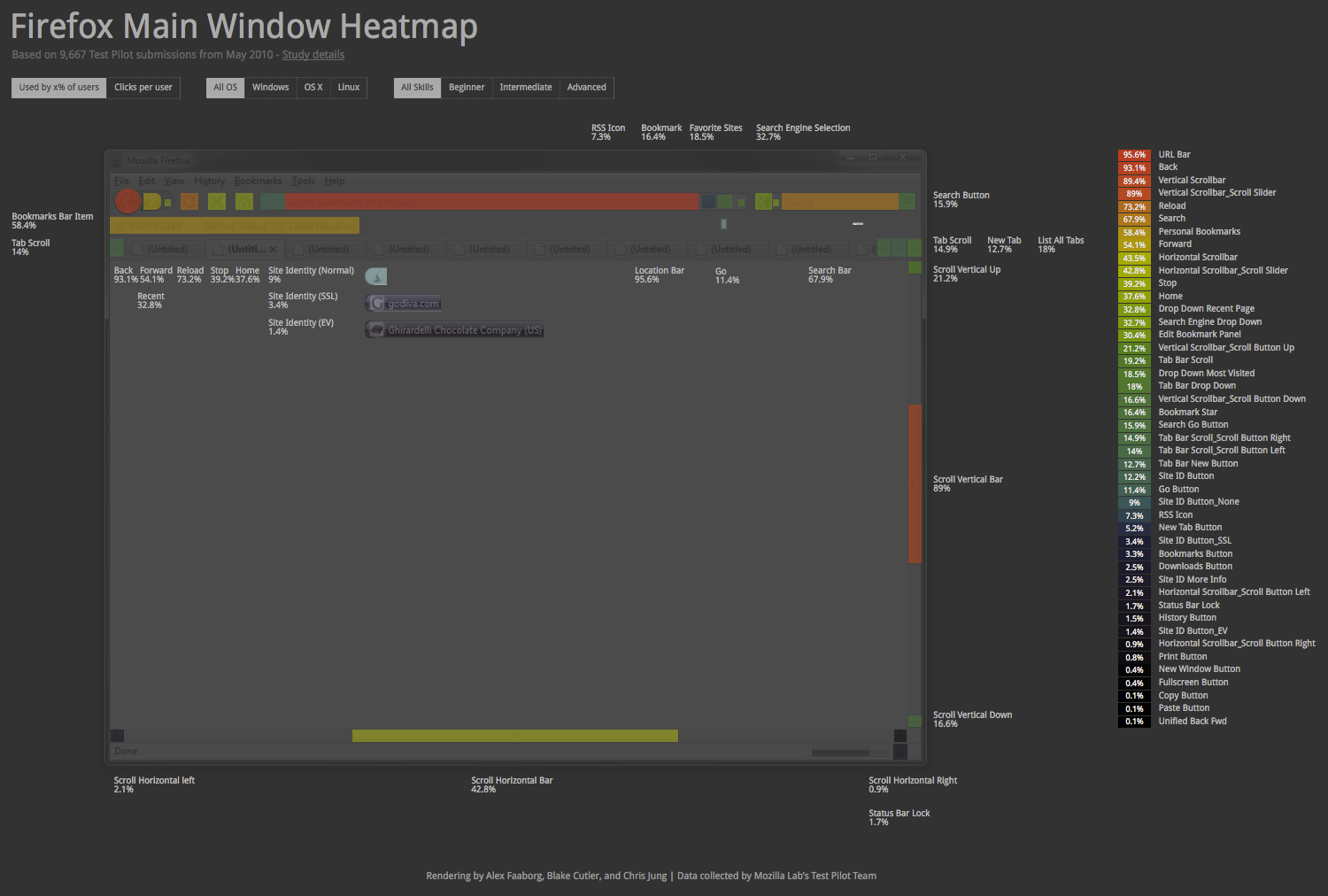
We usually display study results in charts and graphs on this blog, but for this study, we were inspired by the work of principal designer, Alex Faaborg, and came up with a slightly different kind of visualization. Back in March, Alex created a heatmap to visualize the menu study data (his post is also a great example of how the UX team is using Test Pilot data to inform design decisions). Overlaying the actual UI and putting the data in context was really useful, so with his help, we expanded on the idea and constructed this interactive, web-based heatmap for the main window study:
Currently, the heatmap can display the usage data in two ways. Selecting ‘Used by x% of users’ displays the percentage of users who clicked each UI element at least one time, and ‘Clicks per user’ is simply the frequency click count for each item, divided by the number of users in the sample (we normalize for sample size to make comparisons across the different subsets more meaningful). The first approach is useful because it mitigates the effect of outliers, since each person who clicks an item counts only once, whether they clicked the item 1 time or 25,000 times. The obvious drawback is that this metric fails to capture intensity of use, which ‘Clicks per user’ does capture.
You can also choose to examine specific subsets within the sample; there are selectors to display breakdowns by OS and by self-reported computer/web skill level. Unfortunately, you cannot combine these subsets yet; that is, while you can look at data for just Windows users or for just Advanced users, you cannot look at data for the subset of Advanced, Windows users. Our sample is too small for such sub-setting right now, but we’ll add this ability as soon as our sample size increases.
Be sure not to miss the table to the right of the heatmap – it lists all the UI elements in descending order and also outlines the color spectrum. In addition, if you are viewing data for a subset, the table will show the differences between the currently selected subset and the other related subsets to make comparison easy (the differences for the ‘Used by x% of users’ filter are simply one subset minus the other, the differences for the ‘Clicks per user’ filter are in percentage change).
We’ll discuss results more thoroughly in future blog posts, but here are a few findings that immediately jumped out to us. As always, these findings apply to our sample of Test Pilot users only, and we realize this sample is not likely representative of the population of Firefox users as a whole. Furthermore, its important to remember that usage data like this is only one part of a rigorous design process, and that it alone will not dictate any design decisions.
- The Back button is used far more often than any other navigation element (by which we mean the Back, Forward, Reload, Stop, and Home buttons). 93.1% of study participants used the Back button at least once, and on average, each user clicked Back 66.2 times over the 5 days – that’s 3x more clicks than the Reload button, 10x more than the Home button, and over 30x more than the Forward and Stop buttons!
- Of all items that are not in the Firefox main window by default, the New Tab Button (Navigation Toolbar) is the most commonly used, both by % of users and frequency count. Looking at click counts, the New Tab Button (Navigation Toolbar) is a more popular way to generate new tabs than the New Tab Button (Tab Bar) that is located in the tab strip by default. The New Tab Button (Navigation Toolbar) is also more often used than the default UI elements Bookmark Star and RSS Icon by click count.
- Another conspicuous result is the disparate use of the scroll arrows in comparison to the scroll slider. This holds true for both the vertical scroll bar and the horizontal scroll bar; while 89% of people used the vertical scroll slider, only 21.2% and 16.6% of people used the up and down arrows. And although 42.8% of users used the horizontal scroll slider, only 2.1% and 0.9% clicked the left and right arrows to scroll.
Besides putting the data in a spatial context, another benefit of this visualization is that it is easy to reuse, update, and improve. We plan to add more data, more breakdowns, and the ability to synthesize multiple subsets in the near future. We also want to improve the robustness of our findings by filtering out certain extensions (e.g. some users have the Google Toolbar and might be searching through that channel instead of the integrated search box), and by increasing our sample size.
In addition, the heatmap will be updated over the course of the Firefox 4 beta program. Hopefully, this visualization will help us understand how the various UI changes affect user behavior, and ensure that these design decisions are in fact improving the product for our (beloved) end-users. Look for these updates soon!
Thanks again to Alex Faaborg, and to all Test Pilot users for opting-in to provide us with the data. If you’d like to help us understand how people use Firefox and build a better browser, head over to the Test Pilot website to learn more and download the add-on. And as always, please feel free to download the raw data and supplement our analysis with your own!

Pino wrote on
:
Tiago Sá wrote on
:
Té wrote on
:
Christopher Jung wrote on
:
Té wrote on
:
Anonymous Coward wrote on
:
jmdesp wrote on
:
Bill Burcham wrote on
:
Ubu Walker wrote on
:
Christopher Jung wrote on
:
tomh wrote on
:
Elvin Elvis wrote on
:
Aidan wrote on
: