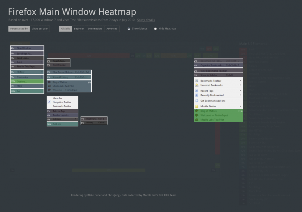
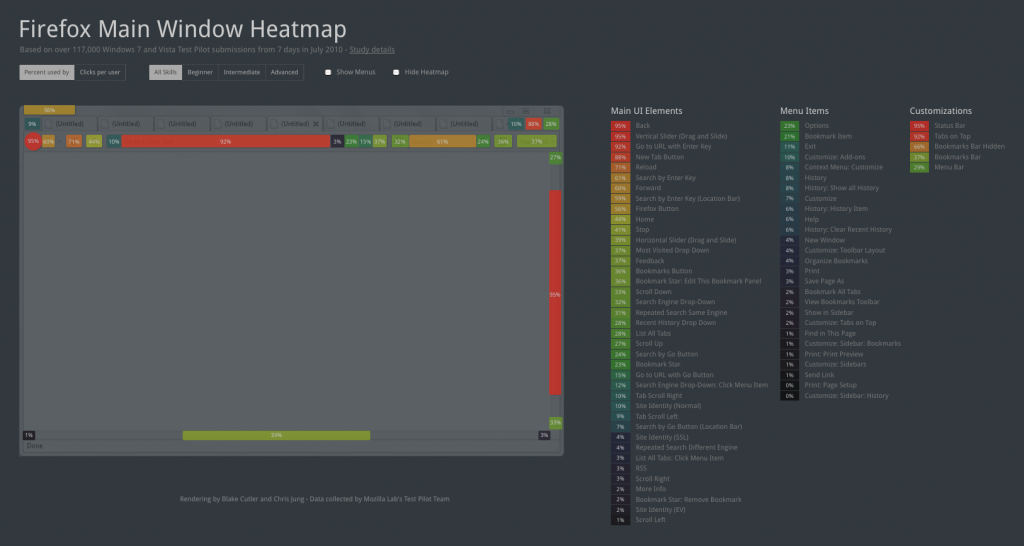
Last July, we presented initial analysis from our first comprehensive user interface (UI) study through an interactive, web-based heatmap. Many findings aligned with our expectations, but there were a few surprises. For example, only 12% of users clicked on the (tab bar) New Tab button and over 55% of users performed searches through the Location Bar.
Since then, we’ve introduced a major UI revision in Firefox 4 beta; tabs were moved on top, the Reload and Stop buttons were combined, and, more generally, the UI was simplified and streamlined.
Today, we’re assessing the impact of these changes through the first update to our heatmap. By intuitively presenting usability data on top of the Firefox UI, we aim to reduce speculation about Firefox usage and help designers make better informed product decisions, faster.
Here are just a few questions we can now answer:
1) Will users prefer tabs on top, or switch back to tabs on bottom?
2) Will Windows users smoothly transition to the combined Firefox menu button?
3) With fewer options to open new tabs, will use of the (tab bar) New Tab button rise?
4) Do advanced users interact with more of Firefox’s features, and, if so, which?
Heatmap Updates
Before I address these questions, let me briefly describe our heatmap updates. In addition to adjusting to the new UI, we:
1) Increased our sample size from just under 10,000 to well over 230,000 users (being integrated into the beta has its perks!).
2) Instrumented the combined Firefox menu button, doubling the number of UI elements items tracked.

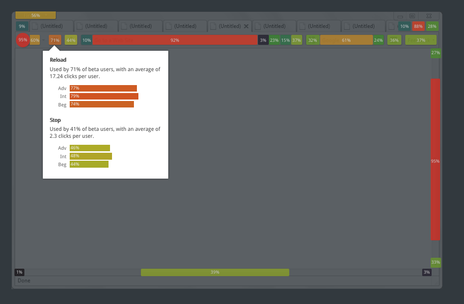
3) Added bar charts that compare stats for beginner, intermediate, and advanced users. To view these charts, hover over any UI element.

Analysis
Now, back to the questions.
1) Tabs on top: Initial analysis indicates that this move was well received by our users; 92% of users kept tabs on top for the majority of their browsing sessions.
2) Combined menu button: Collapsing the menu bar into a single button was one of most significant changes to the Firefox 4 UI. How did Windows 7 and Vista users react to the move?
The majority appear comfortable with this change, but 29.7% did switch back to the traditional menu bar. This relatively large number is not surprising because early betas included an incomplete version of the Firefox button. To access basic menu items, including Downloads, New Tab, and Start Private Browsing, users needed to revert to the traditional menu.
3) New tab button: In our first iteration of the Test Pilot UI study, we were surprised to see that only 12% of people used the (tab bar) New Tab button. But in this study, the New Tab button was the fourth most commonly used element, with over 88% of users clicking the button at least once.
This large shift can be partially accounted for by both the lack of a New Tab menu item in the Firefox button and the removal of the New Tab button from the Customize Toolbars pane. In early betas, the New Tab button in the tab bar was the only way to open a blank tab besides the keyboard shortcut “Ctrl + t”.
4) Tech level differences: The heatmap affirms many of the usage differences we expected to see across varying skill levels. More beginner users click on UI elements for common tasks that have popular shortcuts (e.g. Back, Forward, Bookmark Star). They also are more likely to use the Go button in the Location and Search Bars.
Advanced users, on the other hand, are more likely to use the Location Bar and search more frequently. They also are heavier users of the Tab Scroll arrows, the List All Tabs button, the RSS icon, and the Site Identity button — perhaps reflecting a better understanding of online security.
Conclusion
We’ve covered some basic findings, but are only beginning to dive into the data. For those that want to look at the raw numbers, we’ll post data samples soon (check back here).
As always, Mozilla does not make design decisions based on Test Pilot data alone. Despite increasing our sample size twenty-fold, our beta population is still not representative.
Additionally, quantitative data tracks how users interact the new UI, but now how they feel about specific design decisions. Aakash Desai has headed up some terrific work collecting qualitative data at input.mozilla.com. So far, users’ response to the new user interface has been exceedingly positive!
Notice any thing unusual in the data or have another take on our analysis? Please leave your thoughts in the comments!

Jan-Christoph Borchardt wrote on
:
John wrote on
:
Damian wrote on
:
Dan wrote on
:
Ankit wrote on
:
John Orford wrote on
:
yieph wrote on
:
jeff wrote on
:
Marc Vandenhende wrote on
:
Jonny wrote on
:
Mike wrote on
: