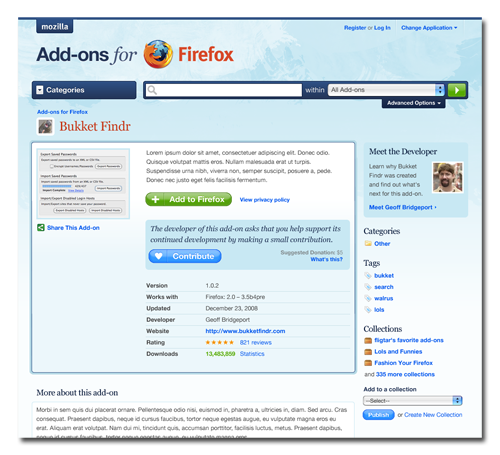
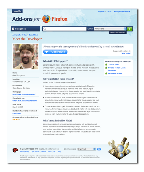
As promised, we’re showing you how things will look after we launch Contributions at the end of June. Our goal with this project was to help developers tell their stories about add-ons, and the first thing we did was redesign the add-ons listing page. Our goal with the page was to give developers a better way of showcasing themselves next to their add-ons.
Our eagle-eyed readers will notice a few things about this mockup:
- The look and feel of AMO has evolved. We’re currently working on a redesign of the site to make it more user friendly and a better reflection of how add-ons are an essential part of the lives of many Firefox users.
- There’s a “Meet the Developer” section which takes users into a page where they can learn about why a developer created an add-on and where they plan on going next.
- Tags will be introduced in the near future, which will help our users and developers explore and classify add-ons.
- And last but not least, the suggested contribution is present on the add-on page.
The Meet the Developer link goes to the following page, which should help developers explain the work they’ve put into their add-on and what features the contributions will help drive. Also, when users make contributions, they will be able to suggest additional features that they’d like to see. The information on this page, including bits like the average rating, will help users make an appropriate decision around contributing without feeling obligated to do so.
These updates will be available to all developers, not just ones who ask for financial support. Developers will also have a variety of ways to present contributions, and we’ll use developer and user feedback to determine which ones remain available after the pilot- so view this as a first step in a long evolution towards the best solution.
A big thanks to the fine folks at Clearleft for helping us with the redesign as well to the many developers who gave us advice and feedback on this feature. As always, please let us know what you think in the AMO Newsgroup or by posting a comment.
If you’re interested in participating in our pilot, please sign up.


Nils Maier wrote on
Brian wrote on
jQuery Lover wrote on
nicepaul wrote on
Ken Saunders wrote on
nothingelseis wrote on
LouCypher wrote on
Kempster wrote on
MASA wrote on