Following up on his initial analysis of Download Day pledge data, Ehsan Akhgari created a dashboard to visually interpret the data in real-time. The example below shows Poland as the tan-orange line and Brazil as the blue-teal line. I’m impressed!
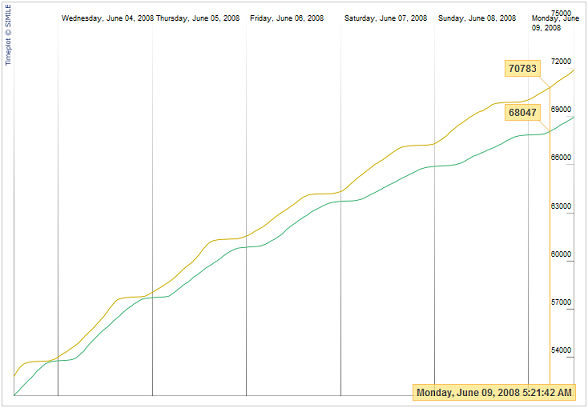
Following up on his initial analysis of Download Day pledge data, Ehsan Akhgari created a dashboard to visually interpret the data in real-time. The example below shows Poland as the tan-orange line and Brazil as the blue-teal line. I’m impressed!
John Slater wrote on
:
wrote on
:
zbraniecki wrote on
:
wrote on
:
Ehsan Akhgari wrote on
:
wrote on
: