Addition by Subtraction

With our first multivariate test, we set out to answer a simple question: which design elements drive downloads on the IE landing page? We didn’t know which elements were most effective, but expected each would help persuade visitors to ditch IE.

Our results are surprising! But before I share them, let me briefly describe our experiment design.

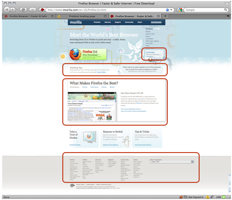
We focused on the 4 boxes highlighted in red. To test how each element contributes to Firefox downloads, we created 16 variations of this page, each containing a different set of elements. Note: rather than removing the entire footer, we simplified the footer, keeping the Privacy Policy, Legal Notices, and Report Trademark Abuse links.

Below, you can see 3 of the 16 page variations. Which do you think performed best?
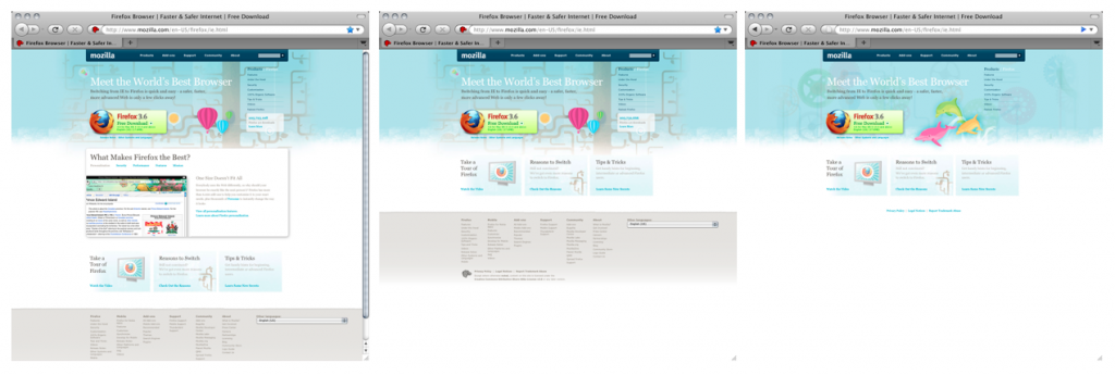
The title tipped it off, but only one element positively impacted the download conversion rate–the download stats box. The main features box, the deep footer, and the switching tips all drove conversions down.

The simplest variation (far right image) performed the best, increasing the download conversion rate by 2.3%, at the 99% confidence interval. This improvement translates to 1.7 million additional Firefox downloads per year!

Next up, we will run similar tests on our non-IE download page and on our localized pages. If we hit the same 2.3% conversion improvement across these pages, we’ll drive 5.4 million additional downloads per year! And, if just 25% of those downloads convert into daily users, we’ll have added as many users as we have in all of Argentina.

We’ll also explore why the simpler variation performed better. One hypotheses is that more users converted because the page loaded faster. Another is that Take a Tour and Reasons to Switch elements are more visible and more persuasive. Have other ideas? Please leave them in the comments!
25 responses

  1. Jon G wrote on :

    Yes, page speed matters, but most important is a single clear call to action. So the fewer distractions on the page from the primary purpose of getting the user to download, the higher the conversion rate.

    If you want to download numbers to go even higher, make the download button more obvious. You’re dealing with IE users here, people comfortable with the default and used to having their hands held. The bright green is a great color since it stands out, but it’s not ridiculously clear that that is the download button. A big obvious button that just says “Download Here” will get you even more clicks and even more downloads. Sounds stupid, I know, but it will work.

    I’d also recommend trying different colors for the download button – you’d be surprised what a difference it can make.

  2. Asa wrote on :

    Jon G, we’ve done color tests before and the Green consistently wins.
    http://blog.mozilla.org/metrics/2009/06/19/firefox-is-green/ was on this very blog last year.

  3. James John Malcolm wrote on :

    Google’s always going on about the speed of their pages and how shaving off milli-seconds can add milli-lions (har har).

    But the numbers box might also be providing some peer-pressure type push (e.g. “don’t be the shmuck who got left out”).

  4. nms wrote on :

    I think more and more software sites are beginning to notice that simple and clean always beats complex and cluttered. The users come for one of two reasons: they already know they want to download Firefox and only care about finding the download button; or they heard about Firefox and are interested but want to know more before they make the switch. Both users come for simple reasons that do no require cluttered and complex navigation and design. The needs of both types of users can be satisfied by a very simple page with some inviting colors and a limited number of graphics. I think if we observe the most successful sites, we will find that restraint in the design and implementation communicates better with the user. One effect of this restraint will be that the site will load faster. This gives the potential user a good impression of Firefox by demonstrating our attention to details and thoughtful planning. In the end though, I think that our best way of getting new users is by the countless of happy Firefox users telling their friends, family, and community. This is a really great thing we have – both the software and the community that supports and nurtures it – and we should share it with as many people as possible.

    Thank you all for making the web a better place to be!

  5. Tony Mechelynck wrote on :

    Maybe the simpler design was more attractive to the kind of people who hadn’t yet ditched IE? Or maybe users took longer reading the longer page, which resulted in a “likelihood per user” not very different, but reduced “minutes per download” (or increased “downloads per minute”)? We’ll see if the rate is the same on non-IE users, and if the rate stays the same after the dust settles down on the “browser choice” screen.

  6. Jeremy Brown wrote on :

    I agree with nms…clearing out the clutter had a big impact.

    Many people are coming to that page to find the download button; the more you add to that page, the harder it is to find.

    I also agree with Jon G that you should do further testing on the download button; it isn’t completely obvious that is a button (to you it may seem obvious, but I recommend testing that extensively).

  7. SilverWave wrote on :

    People like Dolphins Better than Balloons?

    No, its defiantly clutter or the lack of it.

    Try a “Great Big Arrow” pointing to the Download Button.

    _Really_

  8. Feross Aboukhadijeh wrote on :

    Interesting findings — though I can’t say that I’m completely surprised. Simple UI always trumps complex UI for “normal”, non tech-saavy, users.

  9. AndersH wrote on :

    If you add content that suposedly show off the great features of the browser, aren’t there a chance, people will return (or copy/paste the link from the still open IE window to the newly installed firefox windows) after they have installed the new browser? And that way driving up the page-views relative to the downloads?

  10. another_sam wrote on :

    I believe the focus of the user is divided by the number of elements in screen. So I suggest to reduce even more the number of elements in the screen.

  11. Brandon Harvey wrote on :

    If only for the sake of science, how about you extend the testing? You found an optimal result at one end of your continuum (“the simplest”) — so extend the continuum. Keep subtracting and see if it continues to pay off. To my eye, the page still has dozens and dozens of elements and a ton of visual information. So keep cutting.

  12. phil jones wrote on :

    Would be interesting to see if you have courage to test with a really simple page. (Eg. just a plain white screen with a download button.)

    I’d love to know at what point too little started having a negative effect on downloads. Can you go as basic as the original Google? Less?

  13. Ryan Doherty wrote on :

    Gotta agree on the button comments, it isn’t completely clear it’s a download button. The primary text says ‘Firefox 3.6’ and underneath ‘Free Download’. Would probably help to label it ‘Download Firefox’ and remove the platform/language/size info.

  14. Pasqualle wrote on :

    for IE users make an empty page with a button saying “Download”
    I bet you will have even better results.

    or you may try a different variation, with the following description next to the button: “Please click the Download button to install new software for your internet.”

    So it really depends what your goal is. Increase the download count or educate IE users..

  15. Crazy-EyE wrote on :

    I agree with AndersH to some extent. I think quite popular scenario is when user loads the page and starts reading additional info to decide if he really wants to download the program. It probably leads to clicking on links and navigating to other pages on the site. Finally he may return to the download page but his previous page view will count as “no download”.

    Also large gray footer is ugly 🙁

  16. Blake Cutler wrote on :

    @Crazy-EyE – our outcome variable isn’t whether visitor download from the IE page, it’s whether visitors download period (after having viewed IE.html at least once). For example, if a user visited our landing page 7 days ago but only downloaded Firefox yesterday and did so without hitting this landing page again, they will still count as a download conversion.

  17. IanW wrote on :

    Cool test, the results are what i would expect. People like being told what to do, sad but true. Calls to action are necessary anytime you want the user to perform an action. i would even add a test with “click here to download firefox” in addition to button color, size, etc testing.

  18. IanW wrote on :

    @blake – did you use any third party software for this testing or something you came up with? If third part, do you care to share what you used?

  19. Blake Cutler wrote on :

    @IanW – sure! After a thorough evaluation, we decided to use SiteSpect (http://www.sitespect.com/) and we couldn’t be happier with our choice. If you’re looking for a free tool, I’d try Google’s Website Optimizer.

  20. Mariscos wrote on :

    Great experiment , also dind’t expected that result, but that is how you learn to know well your visitors, nice one

  21. seslisohbet wrote on :

    Gotta agree on the button comments, it isn’t completely clear it’s a download button. The primary text says ‘Firefox 3.6′ and underneath ‘Free Download’. Would probably help to label it ‘Download Firefox’ and remove the platform/language/size info..

  22. mellaly wrote on :

    I’d love to know at what point too little started having a negative effect on downloads. Can you go as basic as the original Google?

  23. Tony Mechelynck wrote on :

    @Blake Cutler: How does the site know it’s “the same user” who comes back several days later? By the IP address? In my country, most users are connected via an ISP which forcibly cuts every connection after 36 hours: then it’s up to the user to reconnect — and get a different IP address. IOW, in my country a home user’s IP address never remains valid for more than 36 hours on end, and (depending on how long the user was connected before and on whether he turns the PC down when going to bed) it may be significantly shorter than that.

  24. Armeria Española wrote on :

    I totally agree with Sam in cuoted: “I believe the focus of the user is divided by the number of elements in screen. So I suggest to reduce even more the number of elements in the screen.”
    I think it is a big trend in web design that has to accelerate. We have to have in mind that the end user in average is a non technical, non experienced one.

  25. Mathias Bak wrote on :

    Nice test and nice blog! There are some problems with making the photos big.