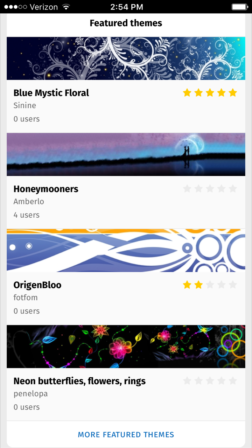
 The mobile version of addons.mozilla.org (AMO) recently debuted a new appearance. It’s not a complete redesign, but rather the start of an iterative process that will take months to fully transform AMO for mobile. The new look is also a preview of what’s to come for desktop AMO. Once the mobile design elements mature, we’ll apply the same concepts to desktop, likely sometime later this year.
“Parity between the two platforms is a high priority,” says Sr. Visual Designer Philip Walmsley. “We’re using mobile to test and learn what works, and uplifting that into the desktop designs. And anything new we discover along the way on desktop will be designed back into mobile, as well.”
Our main goal was to make browsing add-ons more intuitive and effortless. To that end, the new design presents content in a cleaner, more streamlined manner. There are fewer buttons to tap, but the ones that remain are bold and clear.


Illustrated in the images above, the homepage displays a subset of categories represented primarily though iconography… The density of information on an add-on detail page is more balanced now, with only essential information in clear view… and theme previews are bigger and screenshots more prominent.
There’s a bit more color, too. In general much of the aesthetic was in need of a modernizing overhaul. These recent changes are just the start. Plenty more to come. If you’re exploring the new AMO on your Android device and spot a bug, please feel free to let us know about it.
Eduard Braun wrote on
Ken Saunders wrote on