
Firefox’s visual appearance will be updated in version 89 to provide a cleaner, modernized interface. Since some of the changes will affect themeable areas of the browser, we wanted to give theme artists a preview of what to expect as the appearance of their themes may change when applied to version 89.
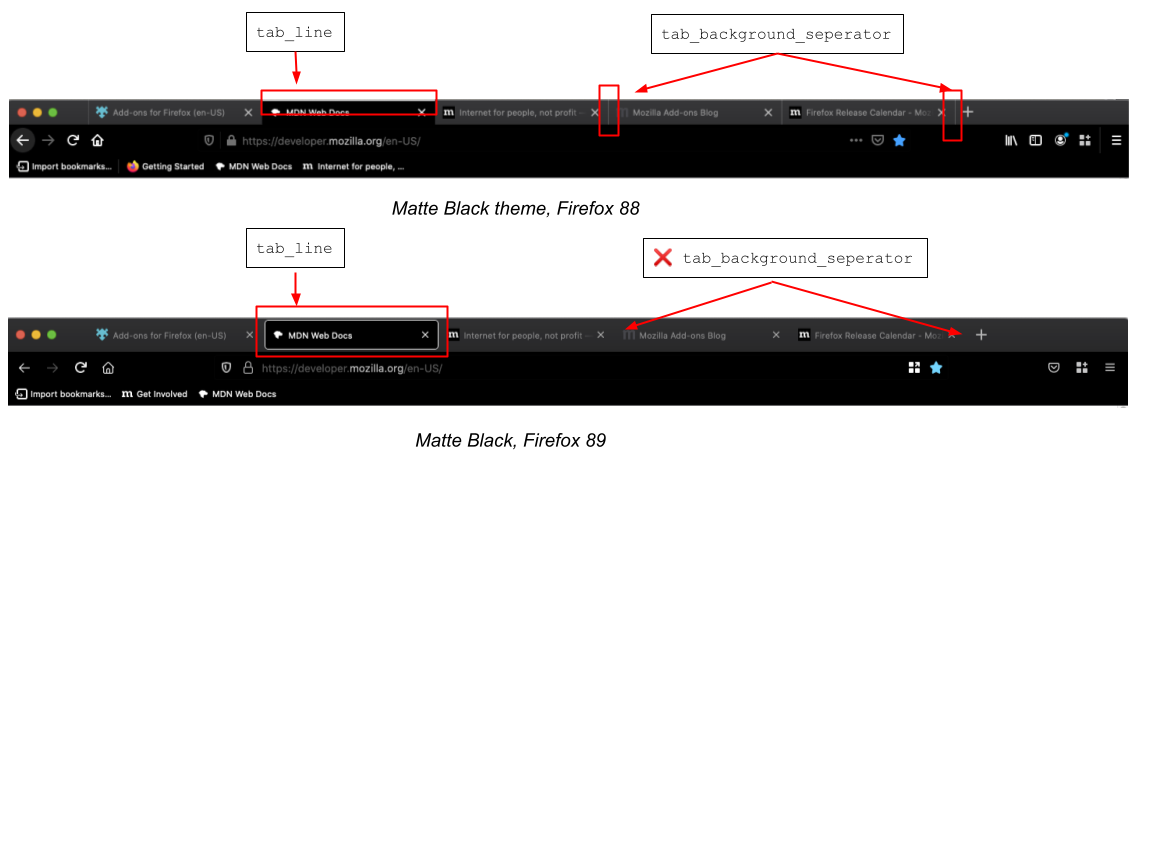
Tabs appearance
- The property
tab_background_separator, which controls the appearance of the vertical lines that separate tabs, will no longer be supported. - Currently, the
tab_lineproperty can set the color of an active tab’s thick top border. In Firefox 89, this property will set a color for all borders of an active tab, and the borders will be thinner.
URL and toolbar
- The property
toolbar_field_separator, which controls the color of the vertical line that separates the URL bar from the three-dot “meatball menu,” will no longer be supported.
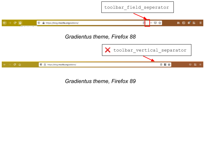
- The property
toolbar_vertical_separator, which controls the vertical lines near the three-line “hamburger menu” and the line separating items in the bookmarks toolbar, will no longer appear next to the hamburger menu. You can still use this property to control the separators in the bookmarks toolbar. (Note: users will need to enable the separator by right clicking on the bookmarks toolbar and selecting “Add Separator.”)

You can use the Nightly pre-release channel to start testing how your themes will look with Firefox 89. If you’d like to get more involved testing other changes planned for this release, please check out our foxfooding campaign, which runs until May 3, 2021.
Firefox 89 is currently set available on the Beta pre-release channel by April 23, 2021, and released on June 1, 2021.
As always, please post on our community forum if there are any questions.
BatPlan wrote on