How do the rules change when you design in the open? That is a question I asked myself many times as I prepared to join the Mozilla brand team back in November 2016. Having never worked in an open source company, I knew that I would need to prepare myself for a mental shift.
Brand design systems are often managed tightly by internal creative teams, with strict guidelines. The guidelines, are shared like canons, with outside agencies. At Mozilla, we pride ourselves on our relationship to a passionate community of volunteers who outnumber our employees 10 to 1. With this community, strict control doesn’t work, but we still need to provide a design system that includes their views and results in better designs. Here’s a conversation discussing the process with Yuliya Gorlovetsky, Mozilla’s Associate Creative Director and font expert Peter Biľak of Typotheque who helped with the font design.
Tools not rules
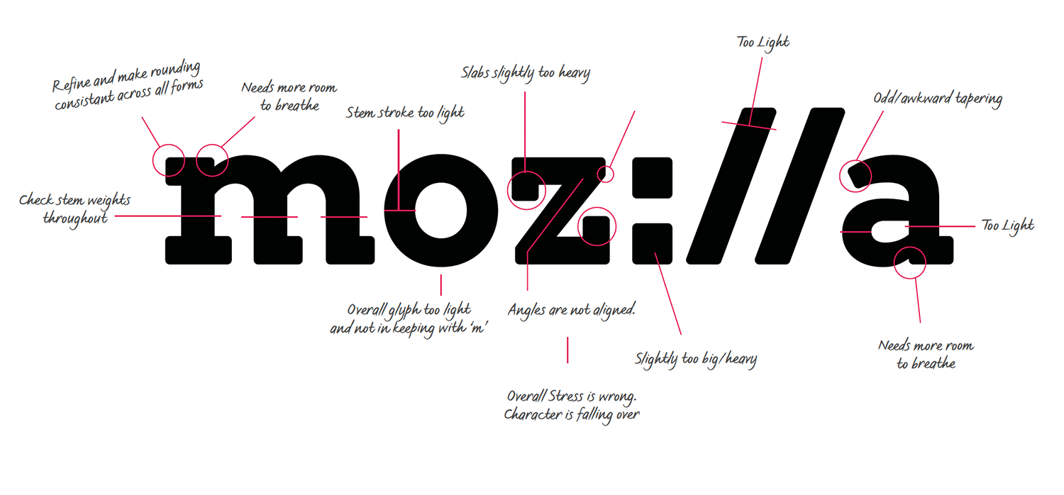
Logo refinement from Johnson Banks and Fontsmith.
Yuliya: When I joined the Mozilla brand team, the new identity was close to completion. The concept relied heavily on typography, and Johnson Banks had chosen a slab serif for the logo. Slab serifs are the less common and less well known serifs. They are often bold, sharper, and have strong personality. We saw an opportunity for Mozilla to build on this by creating a custom font to support the new identity system – a distinct typeface for the identity refresh that we planned to open source for all to use.
Jordan Gushwa, a Creative Lead at Mozilla Foundation, and I both agreed that adding an elegant yet flexible slab serif would help us refine the brand. It would allow us to design experiences that lead with typography and written messages, akin to experiences that you might find in lifestyle magazines or design publications when the opportunity presented itself. Mozilla is investing in content creation, as it becomes more important today to tell the stories about how we stay safe and connected on the web.
To develop the Zilla Slab, we worked with Peter Biľak and Nikola Djurek from Typotheque. We respected their work and valued their expertise in multi-language support. I remember that Peter was surprised during our first call when I said we were interested in Slab Serifs that would be at home in top notch magazines or web publications. He happily added those options to our font explorations.
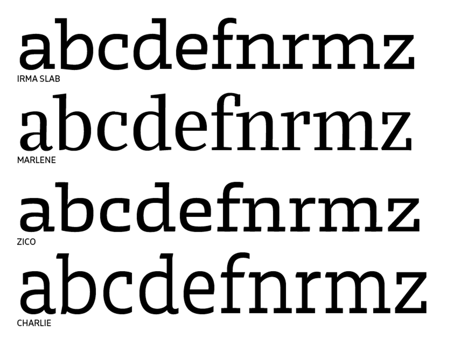
Peter: Slab serif typefaces, sometimes called Egyptians, are usually angular and robust in construction. They hint at a technological underpinning, with aesthetics that are characteristic of the early 19th century Industrial Revolution.
When Yuliya called us at Typotheque, the decision had already been made to use a Slab serif typeface. I wanted to understand the rationale and possibly consider alternatives. Quickly I came to understand that this was a well-informed decision, looking for less explored areas of typeface categorisation.
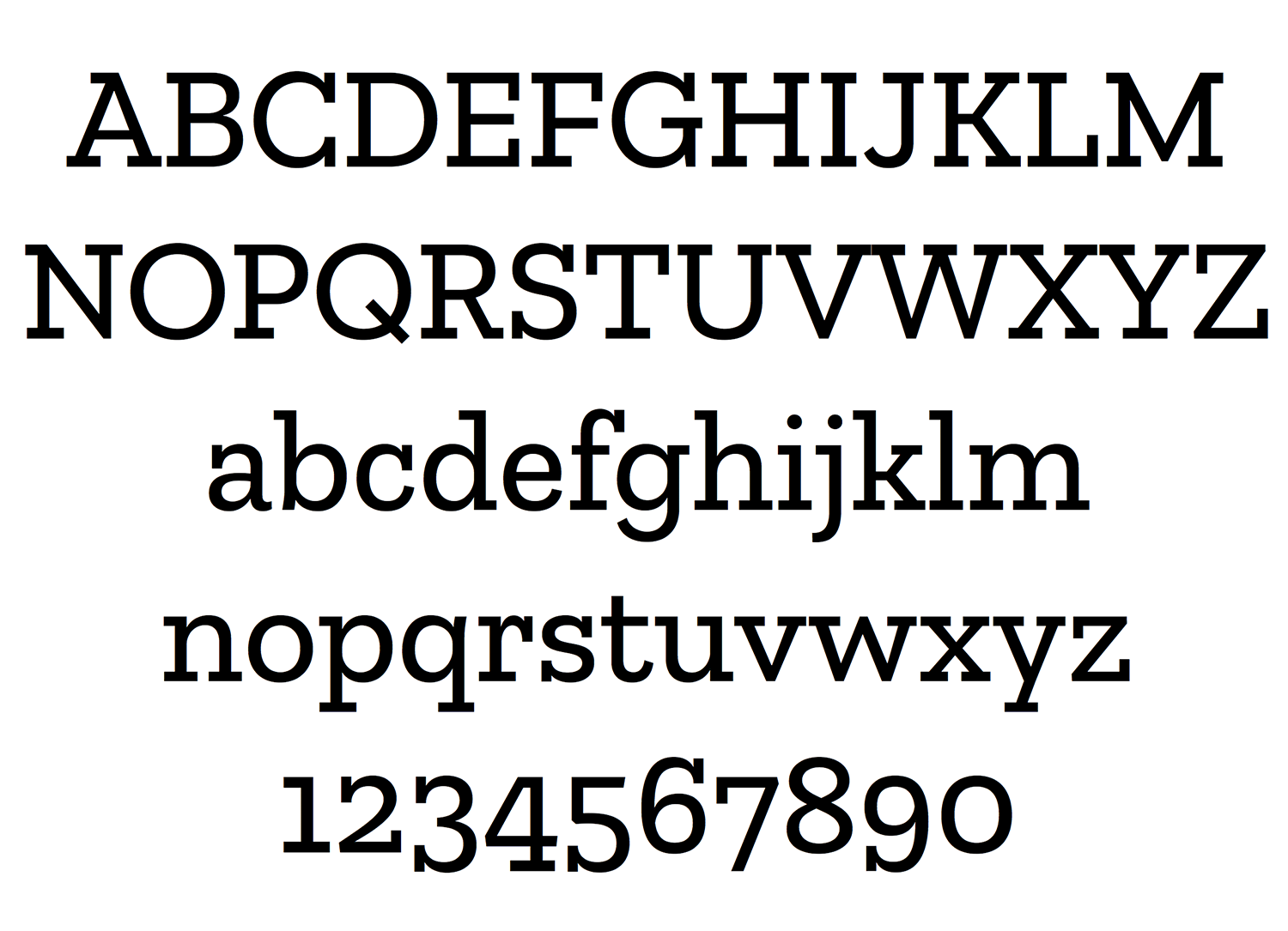
Yuliya: Peter pulled together multiple options of baseline slab serifs from his catalog and showed us how they could evolve to support our logo design needs. Looking for a font that could flex from display to body copy, we quickly settled on Tesla as our base font. Tesla had a good balance of original details but also the evenness that would support a variety of subject matter.
Getting into the details
At the start, the main focus was was on the logotype. Peter kept us accountable by illustrating the impact that the decisions we made for the logotype letters would have on the full font family. When showing different logo options, he would extract the letters from the logo and show how the different design decisions would show up in other letters in a typeface.
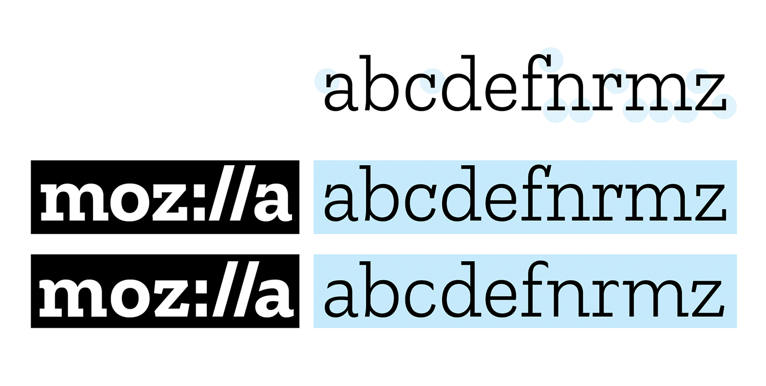
This way we could consider side by side, not only the logo, but the full typeface we would have. It was a hard line to walk. You want to just focus on the logo, because that is the combination of letters that will appear time and time again, but since we wanted the logo to connect to the font, we had to find a place of compromise. We needed to make decisions that equally supported both, the logo and the font. Most of the exploration played out in the three main letters: m, z, and a. It’s amazing how many people will ask if they can stop coming to meetings when you talk through 10 different ‘a’ options.
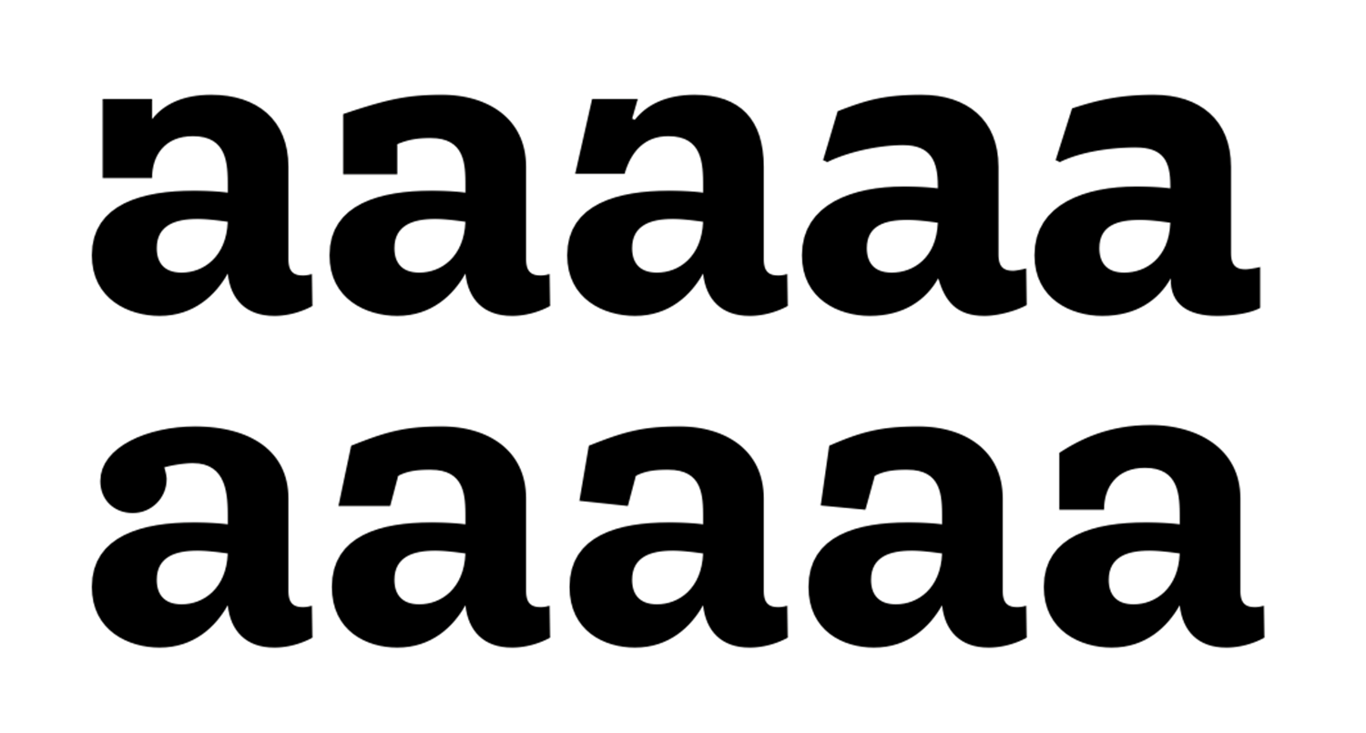
Peter: We looked at various Slab Serif models. Earlier models proposed by Johnson Banks, which were typical heavy geometric Slabs, and then we looked at Sans serif typefaces and considered turning them into Slabs. From our collection we looked at Irma Text Slab, Charlie, Lumin, Zico, before settling on Tesla Slab as a starting point. Perhaps too much detailed information here? Yuliya was intrigued by models that exhibited unusual traits — shifted axes of contrast of thick and thin strokes, based on cursive writing rather than geometric construction, or even an asymmetric serif structure. The lowercase ‘a’ is a more complex letter that provides clues to how other letters may look in a full exploration of the logotype. We wanted to bring an angled stroke to the top of the ‘a’, mimicking the slashes of the internet protocol. The other letters would then need to follow the same construction principles.
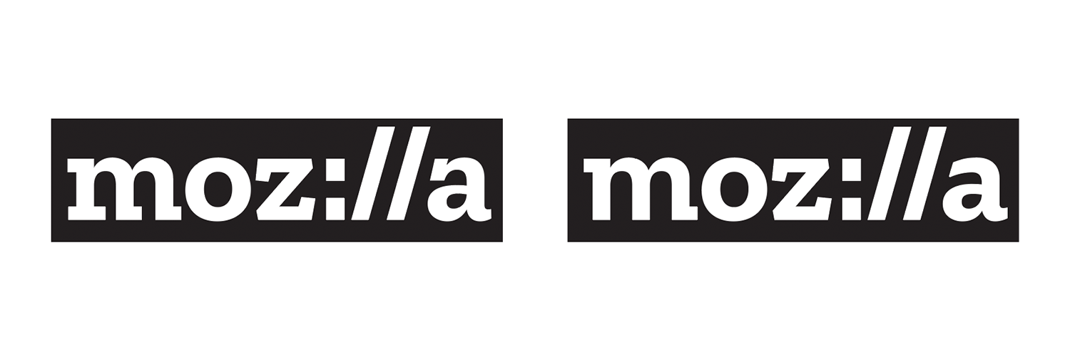
Yuliya: We were able to narrow it down to two design directions:
- A dressed down simplified slab font with a more geometric “a”. Geometric fonts are created from basic shapes, such as straight, monolinear lines and circular shapes. They lack ornamentation, and rarely appear with serifs. This “a”, that we considered, was more round, upright, and had no serif on the end.
- A more serifed font that had a more humanist “a” with a very pronounced serif. Humanist serifs are the very first kind of Roman typeface. The letters were originally drawn with a pen held at a consistent angle, creating a consistent visual rhythm. This “a”, that we considered, had a very pronounced two-level serif, that was tilted at a slight angle to respond to the “/” that came before it.
Peter: Most of the Slab typefaces are static and geometric in construction. “Static” refers here to the axis of contrast. When the axis is 0 degree, typefaces are usually described as static. When there is an angle, they became ‘dynamic’. We experimented with injecting more humanistic values into the traditional Slab model, with the help of more calligraphic stroke terminations, which not only improve legibility but create a more flowing rhythm of letter shapes.
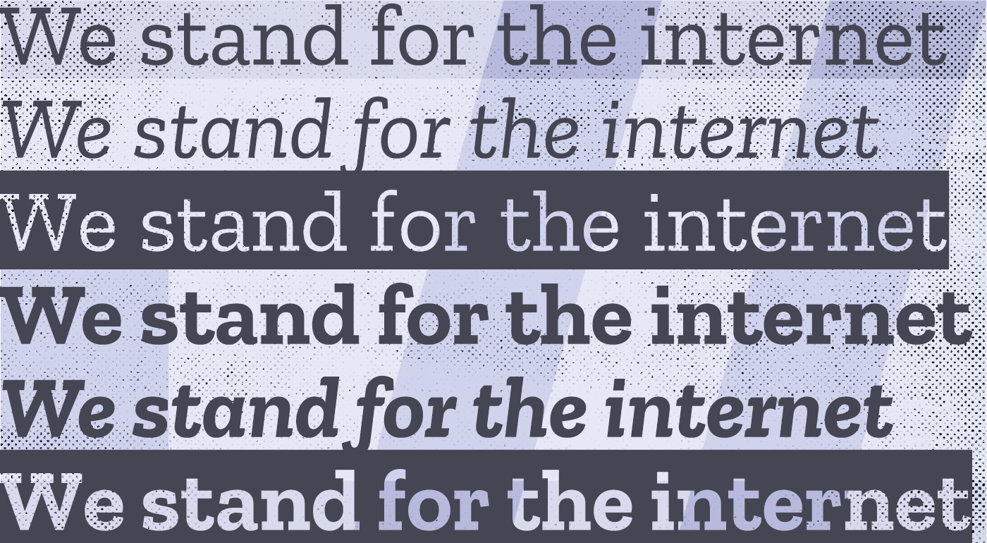
Yuliya: After much debate and 35 rounds of review, we had narrowed the directions down to 2 top choices. We then guerilla tested on folks, we showed the 2 directions to some folks within Mozilla, and some colleagues and friends outside of Mozilla and asked which one they gravitated towards and why. We also asked folks what emotions the different directions inspired in them. These conversation gave us the insight to proceed with the more humanist version, but to simplify the serif on the “a”. The result was an overall simplification of the font, which we lovingly call Zilla Slab. We think that Zilla Slab is a casual and contemporary slab serif that still has a good amount of quirk.
We launched the logo in the middle of January, and applied it to just a few assets; web headers, signage around the office and some print applications. After the launch, Peter and his team continued to work with us through the details of the full font family. Peter regularly shared the progress, which we in turn shared with many designers and fellow type enthusiasts across Mozilla. Turns out a lot of folks across Mozilla self identify as type nerds!

Sophisticated italics
Italics came next, and they are graceful and sharp. As a humanist slab, the Zilla Slab italics are closer to a true italics and add a softness to the overall typography system. There are moments when I’m reviewing work and I have to pause and stare at the curved slant detail in the v, w, x, and y of the italics letters.
Peter: Italics are generally not used for longer texts. The function of italics is to emphasise short passages, so they offer more space for expression. Since we aimed to make Zilla Slab a more affable typeface with humanistic elements, the Italics offered an opportunity to go fully in that direction. We based the Italic not on a slanted Roman, but on a cursive broad-nib writing style. Diagonals in italic often break the rhythm of writing, so we introduced curved diagonals that work well with cursive italic by maintaining a smoother flow.
Building in the highlight effect
Yuliya: Johnson Banks originally modeled the highlight effect for the identity system on the functional act of highlighting a piece of type with your mouse on a screen or within software, or code inspector.
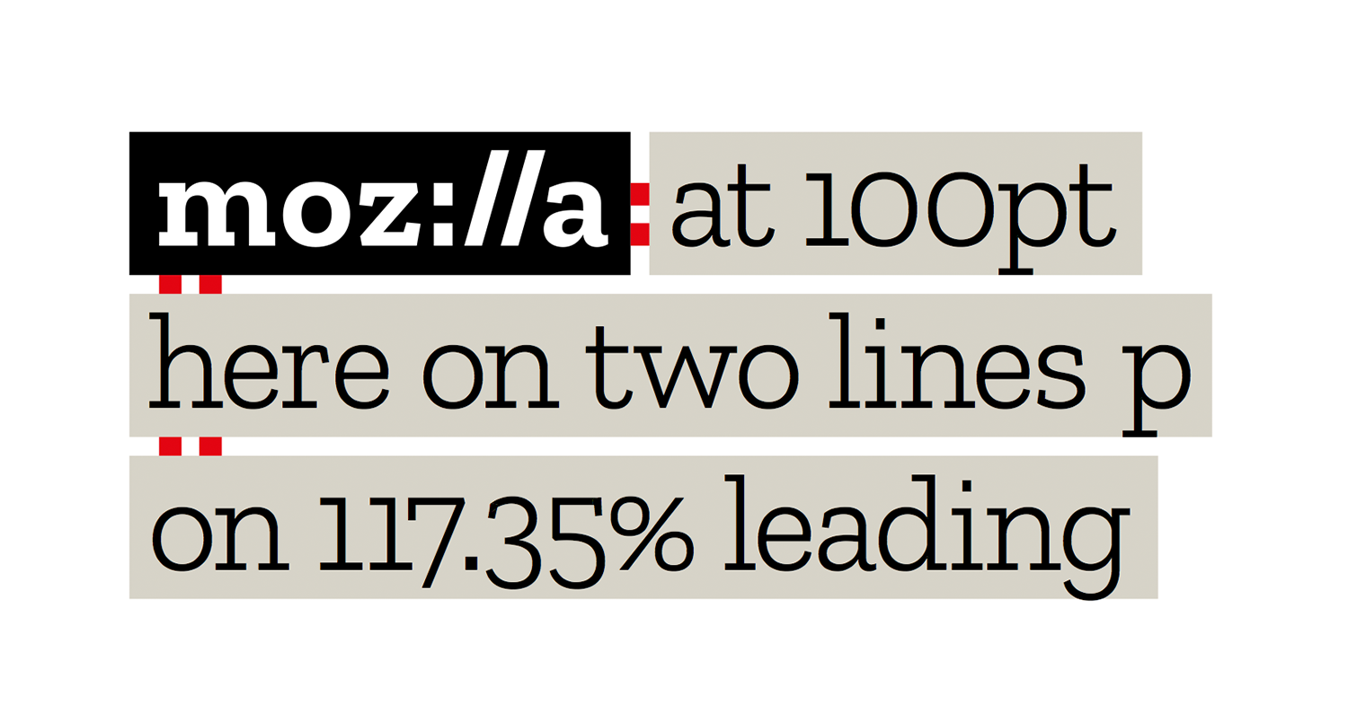
From the original guideline from Johnson Banks. The red rectangle is the size of the colon rectangle in the logo.
We continued to expand and ask people for feedback on the identity system internally. As we put it to use we quickly discovered that typing out the words and manually drawing out the highlight box to contain those letters not only took a lot of effort, but also created visual inconsistencies. Sizing the letters and the highlight box separately and having them come together in the same way time and time again, requires a lot of math and visual tuning. Following our idea of focusing on tools that enable people rather than rules that restrict, we asked Typotheque to create a true highlight version of Zilla Slab. The highlight weight would show the counter shapes between letters rather than the letterforms themselves. These additional weights of Zilla Slab make it easy for anyone to contribute to the brand identity and not to be limited by design software or design knowledge. Building the logic and rules into the font makes it a seamless part of the system.
Peter: Crafting a wordmark or a logo is usually a different process from developing a functional typeface. as Wordmarks can create more context specific design and brand solutions, which may not work well in a font. With Zilla Slab, we worked on a wordmark and the typeface at the same time, and had to anticipate how the wordmark features could be translated to other glyphs not present in the original wordmark. This extended possibly to other writing scripts.

Typing “Mozilla” in Zilla Slab Highlight Bold
Yuliya: The final touch on making the font a completely functional tool for the brand started by asking Peter if it would be possible to automate Zilla Slab so that it would be possible to type out the Mozilla logo using the bold highlight weight of the Zilla Slab. This would allow browsers and native applications to turn “Mozilla” automatically into “moz://a” in specific cases. This would free people from needing to place and attach a static image version of the file, and frees us from managing those files. A logo for an open source company, typed out in its open source font.
Peter: Since the Zilla font is used to create the new Mozilla logo, we included the OpenType substitution feature triggered by the Ligature function that replaces the ‘ill’ letters by ‘://”. This should only replace the “ill” when intended — not in a word ‘illustration’, but always in mozilla or ‘Mozilla’, for example.
Looking Ahead
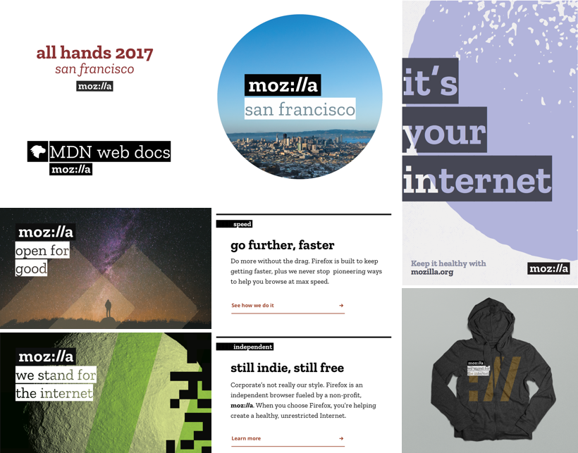
Design work from the design team. Special attribution to Patrick Crawford.
Over five months of development, as Peter’s team worked through the font details, our design team worked in parallel to test Zilla Slab in a broad range of design applications. It has proven to be as unique and flexible as we had hoped it would be. Zilla Slab has taken its place as the unifying component of our design system. After all, it’s through typography that we see language, and at Mozilla we all have a lot to say.
The roll out of Zilla Slab has also helped to unite our different design teams and give all of our Mozilla contributors a shared visual voice. We are launching Zilla Slab with support for 70 European Latin based languages, and we can’t wait to continue our work with Typotheque and localize it to additional alphabets.
This is one of our first shared tools within our identity system. We will keep adding more tools, writing about them, and designing these tools in the open with you.
Download Zilla Slab on Github or Google Fonts.




Dylan wrote on