Evolving the Firefox Brand

Say “Firefox” and most people think of a web browser on their laptop or phone, period. TL;DR, there’s more to the story now, and our branding needs to evolve.

With the rapid evolution of the internet, people need new tools to make the most of it. So Firefox is creating new types of browsers and a range of new apps and services with the internet as the platform. From easy screen-shotting and file sharing to innovative ways to access the internet using voice and virtual reality, these tools will help people be more efficient, safer, and in control of their time online. Firefox is where purpose meets performance.

Firefox Quantum Browser Icon

As an icon, that fast fox with a flaming tail doesn’t offer enough design tools to represent this entire product family. Recoloring that logo or dissecting the fox could only take us so far. We needed to start from a new place.

A team made up of product and brand designers at Mozilla has begun imagining a new system to embrace all of the Firefox products in the pipeline and those still in the minds of our Emerging Technologies group. Working across traditional silos, we’re designing a system that can guide people smoothly from our marketing to our in-product experiences.

Today, we’re sharing our two design system approaches to ask for your feedback.
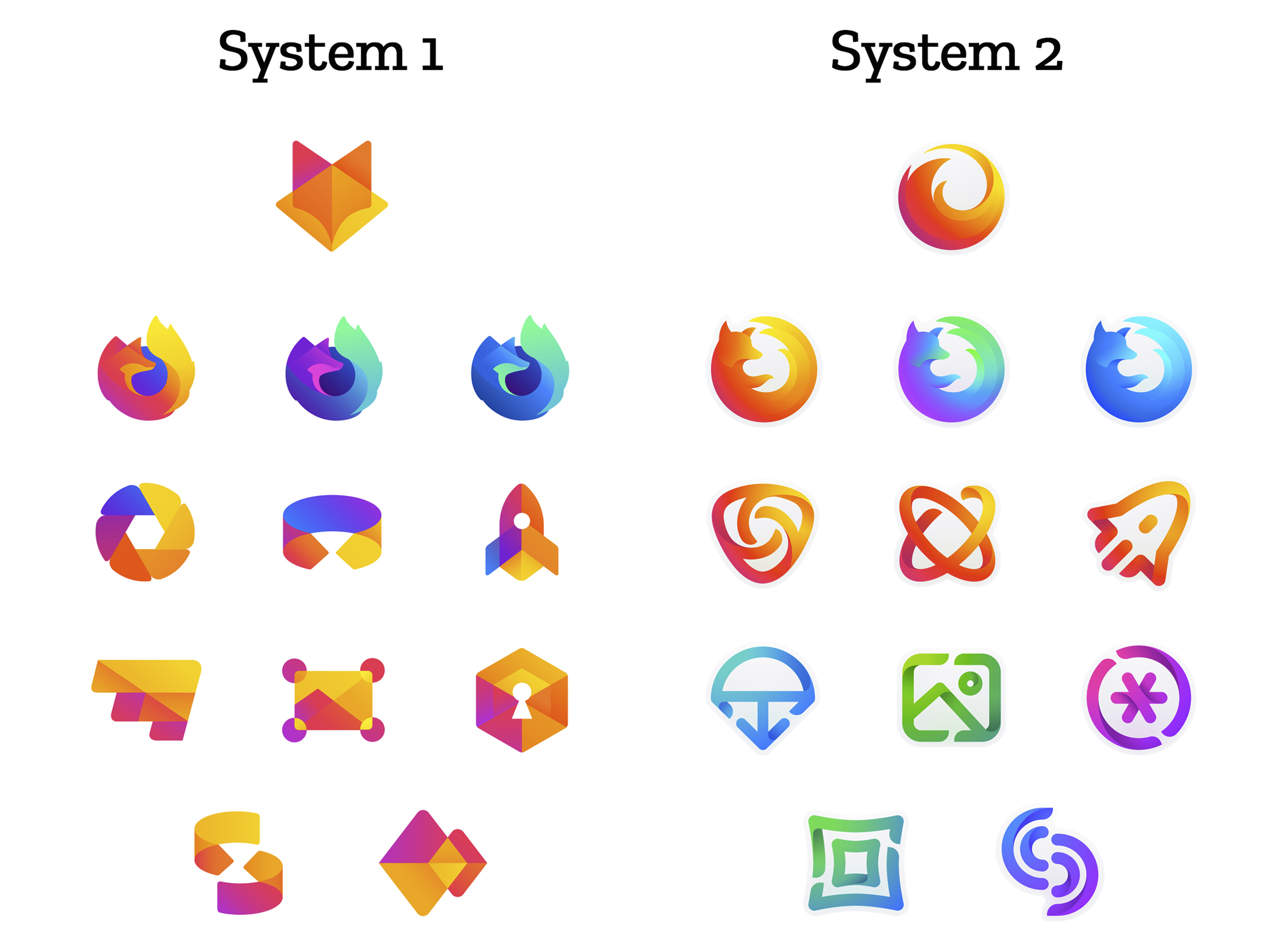
 

How this works.

For those who recall the Open Design process we used to craft our Mozilla brand identity, our approach here will feel familiar:

  • We are not crowdsourcing the answer.
  • There’ll be no voting.
  • No one is being asked to design anything for free.

Living by our open-source values of transparency and participation, we’re reaching out to our community to learn what people think. You can make your views known by commenting on this blog post below.

Extreme caveat: Although the products and projects are real, these design systems are still a work of fiction. Icons are not final. Each individual icon will undergo several rounds of refinement, or may change entirely, between now and their respective product launches. Our focus at this point is on the system.

We’ll be using these criteria to evaluate the work:

  • Do these two systems still feel like Firefox?
  • How visually cohesive is each of them? Does each hold together?
  • Can the design logic of these systems stretch to embrace new products in the future?
  • Do these systems reinforce the speed, safety, reliability, wit, and innovation that Firefox stands for?
  • Do these systems suggest our position as a tech company that puts people over profit?

All the details.

The brand architecture for both systems is made up of four levels.

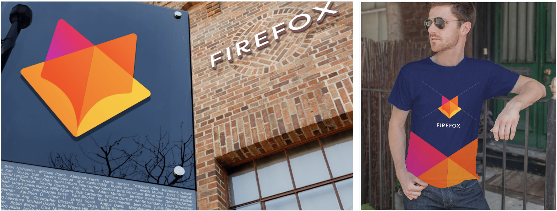
Each system leads with a new Firefox masterbrand icon — an umbrella under which our product lines will live.
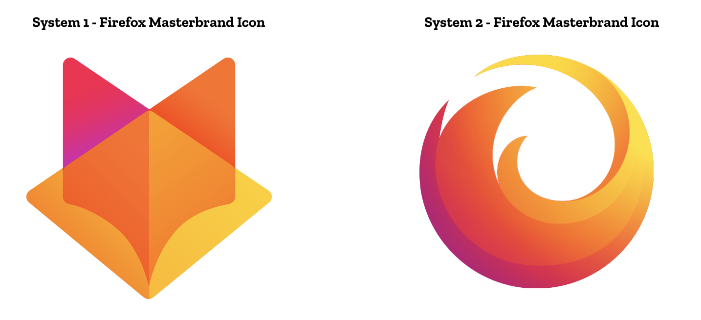
The masterbrand icon will show up in our marketing, at events, in co-branding with partners, and in places like the Google Play store where our products can be found. Who knows? Someday this icon may be what people think of when they hear the word “Firefox.”
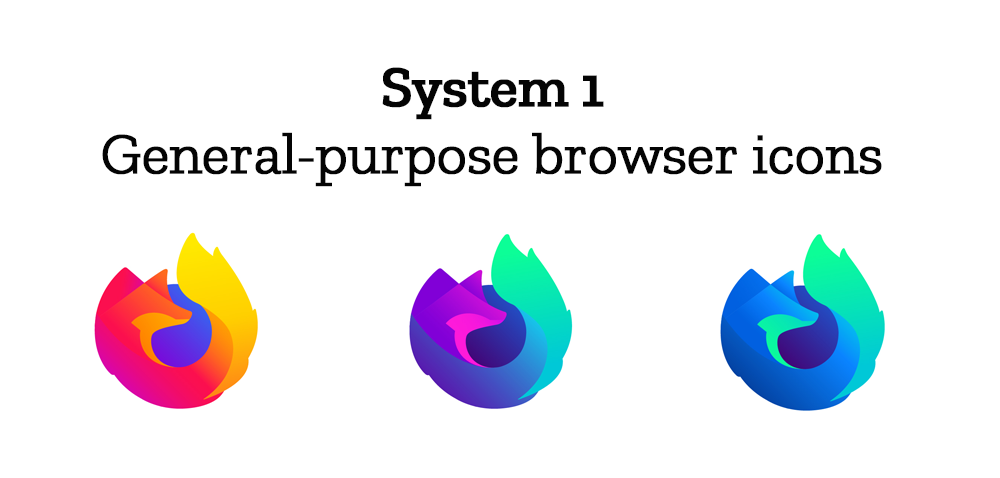
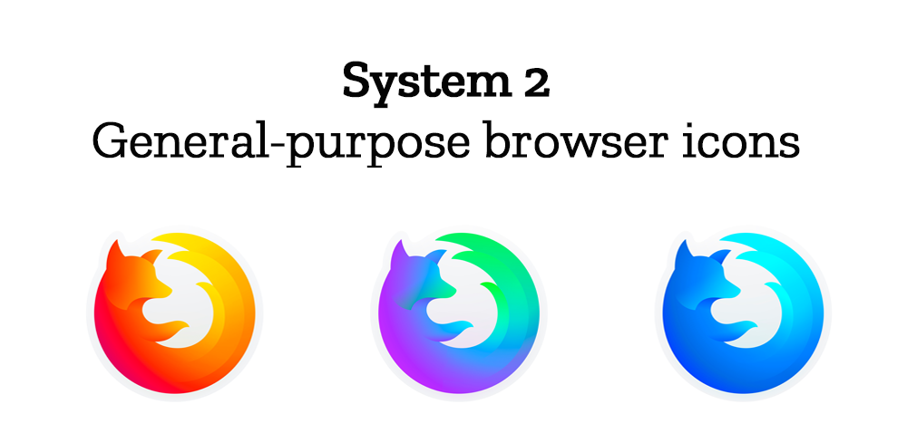
At the general-purpose browser level, we’re proposing to update our Firefox Quantum desktop icon. We continue to simplify and modernize this icon, and people who use Firefox tell us they love it. Firefox Developer Edition and Firefox Nightly are rendered as color variants of the Quantum icon.
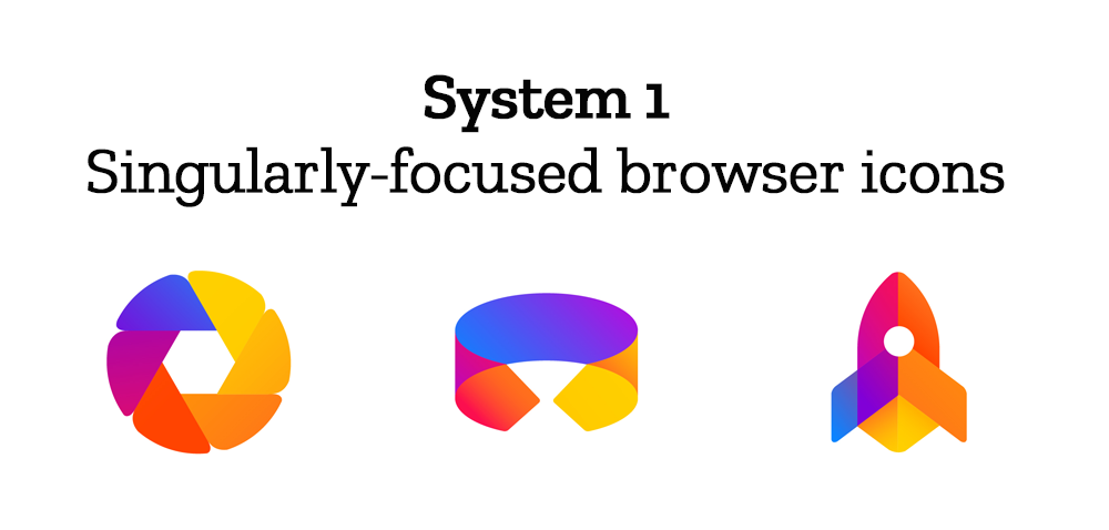
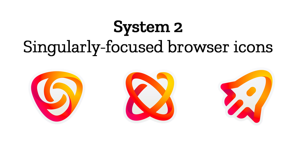
Browsers with a singular focus, such as our Firefox Reality browser for VR applications and our privacy-driven Firefox Focus mobile browser, share a common design approach for their icons. These are meant to relate most directly to the master brand as peers to the Firefox Quantum browser icon.

Finally, the icons for new applications and services signal the unique function of each product. Color and graphic treatment unite them and connect them to the master brand. Each icon shape is one of a kind, allowing people to distinguish among choices seen side by side on a screen.
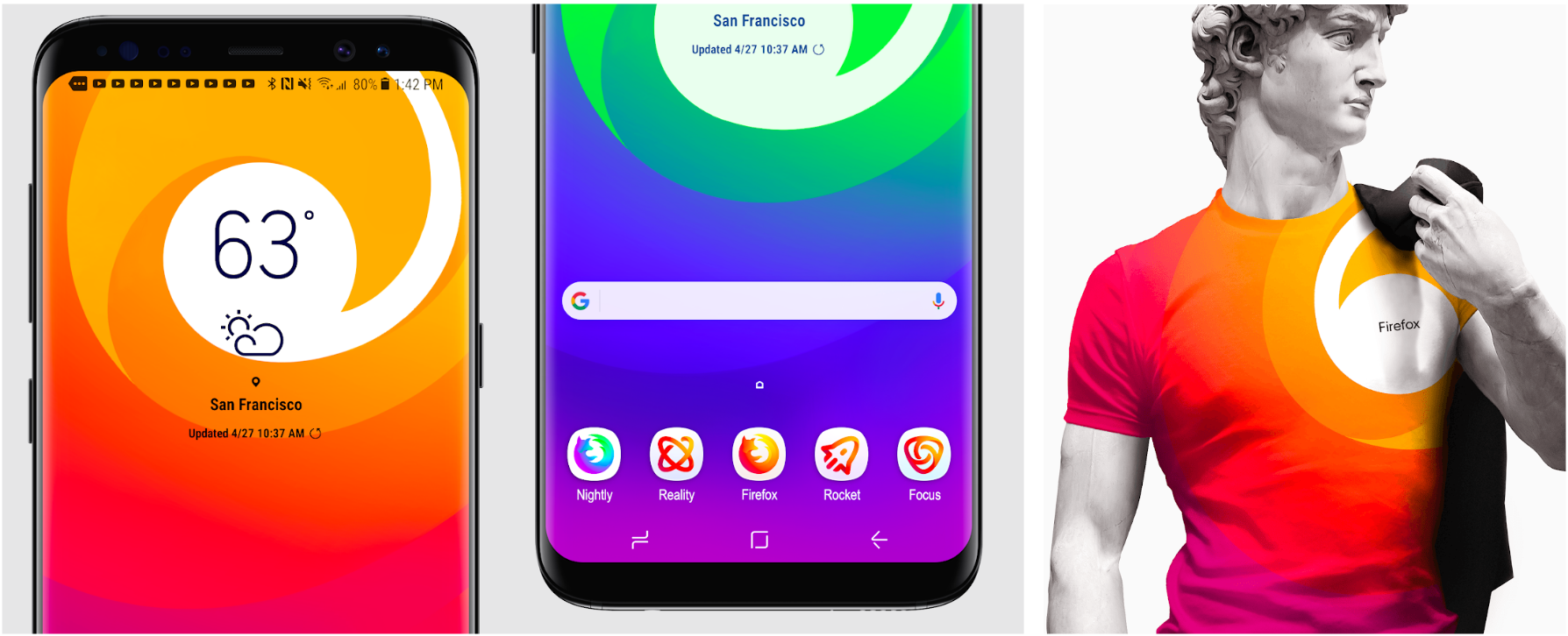
Still in the works are explorations of typography, graphic patterns, motion, naming, events, partnerships, and other elements of the system that, used together with consistency in the product, will form the total brand experience.

Read along as we refine our final system over the next few months. What we roll out will be based on the feedback we receive here, insights we’re gathering from formal user testing, and our product knowledge and design sensibilities.

With your input, we’ll have a final system that will make a Firefox product recognizable out in the world even if a fox is nowhere in sight. And we’ll deliver a consistent experience from an advertisement to a button on a web page. Thanks for joining us on this new journey.

Madhava Enros, Sr. Director, Firefox User Experience

Tim Murray, Creative Director, Mozilla

2,212 comments on “Evolving the Firefox Brand”

  1. Mehdi Sadeghi wrote on

    System 1 looks very much like a set of GitLab icons.

  2. Robin wrote on

    I like the outline approach of System 2

  3. Jeb Bush wrote on

    System 1 for me. It’s clean, modern, and cohesive.

  4. Jeremy wrote on

    The current icon for firefox is rather nice. It’ll be a shame to see it evolved into a more abstract form.

  5. A.J. Kandy wrote on

    1) The twisty ribbon motif is very “now” but may look dated in the near future.
    2) Similarly, gradients.

    From a functional standpoint, solid icons are easier to perceive as objects; outline icons tend to be perceived as text characters or take longer to recognize, particularly with additional elements of gradient, twist and shadow added.

    I like the bolder direction of System 2’s icon shapes generally, but I also think System 1’s solid object approach reads better.

    System 1’s masterbrand icon seems awfully close to Gitlab’s. I wouldn’t go down that path.

    There is a lot of recognition and brand equity built into the existing fox-swirl; I would try to bring clarity and timelessness to that icon with a more geometric approach, a la Chermayeff & Geismar / Paul Rand, that is recognizable at any size, printed in black, etc. (for instance, this guy: https://dribbble.com/george-bokhua)

  6. CK wrote on

    Master Brand:
    System 1’s doesn’t connect to me as anything Firefox/Mozilla related, tbh. it reminds me of Gitlab (Git hosting) and nothing else. The System 2 master brand logo feels more like a ‘catch all’, more generic Firefox logo.

    General Purpose Browser icons:
    I feel like System 2 is a better continuation of the Firefox logo, it’s missing the globe but keeps the shape and recognizable contour.
    I prefer this over the System 1, the issue there is, in my opinion, that the globe has gotten way too abstract (no details at all, what’s it going to represent?) and the distorted Fox doesn’t feel too good.

    Singularly focused browser icons & app icons:
    I like the design of System 1 better. Although I have trouble with both Systems in these categories, they don’t seem to match anything else with the overall brand / other browser icons besides the colouring. The logo for “Focus” / Firefox Focus may well be a product from a totally different company, I see no continuation, no connection to Firefox or Mozilla in this particular logo. The same goes as well with the other app icons, they look to… generic? The ‘dashed’ appearance (breaks within the lines) doesn’t really help.

    The Firefox logos in System 2 fill the space better (for lack of better terms) and use a three-stroke pattern with slightly differing colors, I’m not sure if and how this could be applied to the other icons but I guess it might also work instead of icons made out of thick outlines.

    1. William wrote on

      Hi CK – Have you taken a look at GitLab recently? They do way more than Git hosting- project and portfolio management, integrated CI/CD, application security testing, monitoring, etc. But, they don’t do browsers :) and I agree system 1 does look too much like the GitLab tanuki logo.

  7. D. Colin wrote on

    I prefer the logo with the fox face (system 1). It feels less cold and neutral than the other one.

    I like both version of the general browser icons. One thing that I find problematic with all the icons that are proposed is that it’s hard to decipher some of them. The mix of color aren’t really low vision friendly. #a11y

    Anyway, I’m eager to see the next iteration :). Keep up the good work!

  8. TriptoAfsin wrote on

    1st 6 of the icons from system 1
    2nd 6 from the system 2

  9. Alan French wrote on

    I think the masterbrand icon of system 1 resembles more Sauron’s helmet than Firefox. Clearly, the masterbrand icon of system 2 is a lot more recognisable. The system 2 browser icons are also lighter and friendlier. The system 1 browser icons are weighted down by the compact dark centre. On the other hand, all the other icons (focused and services) have a lot more visual identity in their system 1 versions. The system 2 icons are too thin and wiry, don’t resemble Firefox at all, and the different colours across apps and services prevent easy recognition. If system 2 apps and services icons were to be considered, they should at least stay all within the red/orange “fire” colour scheme. As it is, they fail to provide a strong, recognisable identity, while system 1 icons are instantly recognisable as part of one brand.

    Best wishes! AF

  10. Daniel wrote on

    The system 1 masterbrand icon looks too similar to the Gitlab icon.

    Apart from that I hate it when people waste resources on something as insignificant as this.
    Keep the icon as it is and do something that people will benefit from, like futher reducing the memory footprint of Firefox.

  11. anonymousNotanonymous wrote on

    System 1 but I don’t like the apps and services ones because they’re not recognizable things. And I don’t like any of System 2. They look noodly and kinda like the “One Laptop per Child” iconography.

  12. Nathan Hubbard wrote on

    As far as “screen-shotting and file sharing to innovative ways to access the internet using voice and virtual reality”, please build a browser without all of this stupid crap in it.

    Everything that isn’t needed to browse the internet should be an addon.

    I don’t care what you call your brand, just don’t damage the browser further.

  13. Steve wrote on

    For the Firefox masterbrand icon and the general propose icons i prefer System 2 and for everything else System 1

  14. Ekaterina Oblonskaya wrote on

    The system 1 masterbrand is dangerously close to Gitlab. And even if you want overall branding to change, can we please just keep the traditional logo for the main Firefox browser.

  15. svasta wrote on

    i generally like it. i think firefox also needs visual modernisation, not only tech one. i mostly prefer system 1 over sytem 2. i also mostly find the lowest level icons not good enough yet.

  16. Chris wrote on

    I realize that this is an industry-wide design trend, but… it’s so hard to tell what these icons are supposed to represent.
    The camera aperture icon in System 2 is so far removed from what it represents, that I couldn’t tell what it was supposed to be until I saw the System 1 version.
    I stared at System 1’s masterbrand for a while, pondering why it was a corner of a wall (that is curvy towards the bottom) behind a transparent piece of glass, before realizing it was supposed to be a fox face. It’s confusing, but at least it’s unique; System 2’s masterbrand is so similar to the Firefox logo that the rest of the icons look unrelated.
    The rest of System 2’s icons look like they’re from Samsung. But System 1’s colors are very pretty. I like the current Quantum Firefox logo’s orange-purple-blue scheme, and System 1 uses it well.

    Overall, I think System 1 is better.

  17. Yuri Gauze wrote on

    System 2. But, I believe that some icons should be exchanged between the systems

  18. Joel Collins wrote on

    I honestly think System 1, by a long way. The icons for system 2 look more generic and lack as much personality.

  19. Gopal wrote on

    The over all System 1 has the intuitive design with neat appearance. BUT the logo is similar to FireFox bike. 😒

    System 2 has same Firefox logo with the modern touch. BUT other icons aren’t as lovely as system 1

    Live Long FireFox! Loving it since 2005

  20. Rishi Anand wrote on

    System 2 designs are much better for their relative simplicity. Besides some of the system 1 designs are associated with other projects, AFAIK.

  21. Judd wrote on

    The gradients in System 2 are half-arbitrary, mixing intentional cues with ‘filler’ gradients. I’m inclined to say System 1 is a simpler and more powerful design language. It allows for more flexibility as trends in colorways and styling evolve over the next ten years.

  22. Richard Brummel wrote on

    I really don’t see the need for either set of the changes and would have hoped that Mozilla would use the resources in continuing to make great products. You have a great, recognizable brand. Don’t mess with it.

    1. Jerald Vinikoff wrote on

      I agree with Richard Brummel.

      1. Chris wrote on

        I agree, too.

  23. Leon Robinson wrote on

    Nothing intuitive about any of it, who cares.
    Don’t screw with what has been working.
    Longtime Seamonkey user.

  24. Md Enzam Hossain wrote on

    I like the master icon of the first set a lot.
    The first set of icons looks cohesive, like they belong in a group.
    The second set of icons looks fun, but the app icons at the bottom doesn’t looks cohesive to me, the colors doesn’t reflect Firefox enough.

  25. Ryan Spooner wrote on

    System 2 for the first two categories (master icon and browser icons) combined with System 1 for the other two categories. The System 2 ones for new apps and services just don’t seem to fit the theme. Just my $0.02 :)

  26. Alex wrote on

    System 2

  27. Andre wrote on

    System 2 FTW

  28. Sam wrote on

    I’m all for rebranding, but I’m concerned that the system 1 masterbrand looks too much like the gitlab logo. When I look at it, all I can think of is gitlab. Regardless of this point, I’m in favour of system 2.

  29. Vitor Santos wrote on

    I loved the system 1 icons.
    In my opinion, is more familiar with Red Fox and Mozilla Foundation brand.

  30. Caskin wrote on

    How about a 3rd option, these do not feel like Mozilla

  31. Ahmer Jamil Khan wrote on

    They both look great, however System 1 looks more modern, and slightly better than System 2.

  32. Paul Tincknell wrote on

    The Firefox icon needs the detail to remain visually relevant when very small (favicon, taskbar, etc.), so the browser set from “system 2” is more relevant than those of “system 1.” However, the remaining icons/logos from “system 2” are cartoonish and way too simplistic to be of interest, nor do they connect visually as a family to the browser set – and the “masterbrand” is too abstract to be visually meaningful. So between the two, the “system 1” set with the “system 2” browser icons would be the best choice for maintaining consistency with the past, having enough visual detail to be rendered small (and remain recognizable). Best advice: don’t stray too far from the past; you can break a brand easier than build one.

  33. Steffen wrote on

    This one is easy. System 1. It’s overall just the better looking one. System 2 looks like a bunch of stickers that I can’t take seriously, even though the quality is high. Problem is, System 1 is in a while different league.

  34. Nehemoth wrote on

    System 1 Masterbrand Icon
    System 2 General Purpose
    System 2 Singularly
    System 1 Apps Icons (definitely I would change the colors like system 2)

  35. Bob wrote on

    I like all from “System 1” except “masterbrand icon”, I prefer “masterbrand icon” from “System 2”.

  36. Paul H wrote on

    I liked the second set best.

  37. Eitan Isaacson wrote on

    I love all of these designs.

    We have a problem where our developer edition and nightly logos are two similar and rely on nuanced color to distinguish one from the other. People who are color blind will have a hard time.

    Our current logos have some additional elements that help people tell them apart, but these new simplified designs do not.

    Check out what it looks like in a color blindness simulator..

  38. Kevin wrote on

    System 2 icons look like they are from an obscure icon pack on google play store. I really like the System 1 icons they have way better personality than the other set of icons. As for the Masterbrand icon, i personally prefer the the Fox head icon over the default browser icon. But it boils don to the brand recognition. Right now the default browser icon can be recognized by pretty much anyone. But the Fox head will take some time to get familiarized with . Going for forward if the focus will be developing different apps then the Fox Head will be a better choice

  39. lucia wrote on

    system 1 is more modern and looks more cohesive.

  40. Semih wrote on

    System 2 icons are better. But masterbrand icon of system 1 is super!

  41. Sophie wrote on

    I love the system 1 Masterbrand icon!
    I think that the system 1 browser icon is better than the system 2 browser icon because it keeps the blue and overall color scheme that I associate with the browser. I think that removing the overall color palette from the browser icon would be a huge loss.
    Overall I like system 1 more than system 2. I think that sticking with a warm palette for the new apps and services helps tie the brand to the existing known browser brand. I find the range of color in the singularly focused browser icons in system 1 to be distracting. The blue could either become warmer towards purple or the use of purple/magenta could go away so that the blue stands out more.

  42. Kevin Macaulay wrote on

    I prefer the system 2 but the “singurlaly-focused browser icons” secssion with other colours. “Singurlaly-focused browser icons” from system 1 are beatiful too.

  43. spikespaz wrote on

    I do not like the System 1 icons. The half-low-poly design looks too plain and it isn’t majestic like a fox should be. The System 2 icons are better in that regard, however they would look strange on differently colored backgrounds. There needs to be something in the middle. And by that note, the current icons for Quantum, Nightly, and Developer Edition fit the bill. Perhaps even keep the blue gradient circle in the new System 2 icons? I like the design of the current icons of a fox encompassing a world. I don’t think it really needs to change, and I would like to see some icons for the other apps and services based off of the design of the current Quantum icon.

  44. Kevin Davis wrote on

    I love System 1, however, the “masterbrand” icon seems a little too close to Gitlab.

  45. Tristan Young wrote on

    I prefer icon set #2, however I’m not a fan of either. If the old firefox icons were kept, I would feel most happy.

  46. David Imel wrote on

    I really like the system 2 brand icon but I much prefer the system 1 icons for everything else. Just my two cents!

  47. Theo Rulko wrote on

    Hello!

    I love the design and the curvy modern aesthetic with vibrant colours. They feel friendly and fresh. I strongly prefer the first system, as I feel that the icons fit better together, wheras in the second system they all fit together except the Quantum/Nightly/Developer icons, which do not seem like they share a design aesthetic and stand out. Additionally, I like how the ‘master’ logo is not the same as the quantum/developer/nightly logos in the first system, making the overall brand feel broader than just those three browsers. However, I really love the paw on the fox, as I feel that it is one of the most endearing qualities of the current logo, and I would love if the paw were added back to the new logos.

    Theo

  48. Moreno Valerio wrote on

    Well, I do like some changes. But please, don’t change the logo to something like the system 1. Firefox is about the world, and a Fox (like flame) running around it. To put only the fox head, is to mischaracterize, to disfigure the firefox brand. Something that always comes to my mind when I think about Firefox is the circle Fox. That should be it.

  49. John Doe wrote on

    System 1 all the way! More unique and memorable

  50. Aaron Abassi wrote on

    I like the system 1 look better.

More comments: 1 2 3 4 41