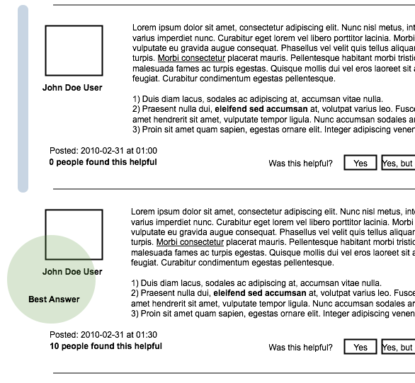
Based on some feedback to the last design, we’ve come up with an alternative concept for the forum redesign. While it has many of the same features as the last one (users will still be able to vote on individual posts in a thread as well as have a button to say “I have this issue too” ), there are a few changes:
- There are no longer two distinct areas for discussion vs solutions. Instead there is a chronological order of posts. (Like a traditional forum.)
- The most useful post in a thread will be highlighted rather than shifted to the top to prevent breaking up discussions.
- Posts by the original thread author will also be highlighted.
You can see these in the mockup below:

Here’s the rationale for these changes: When we looked at a sampling of solved threads, we found that the vast majority (30-to-1) were solved in one or two replies. This seemed to suggest that the benefit of bubbling up the top solutions was small since there weren’t many solutions for forum users to sort through. On the other hand, a chronological ordering would simplify the user interface and may promote discussion and community building between contributors.
Please give us your feedback on this design/mockup. What additional features would you like to see, what would you like to see done differently?
The mockup also shows a three-tiered voting system for posts with “this was helpful”, “this was helpful but didn’t fix my problem” and “this wasn’t helpful”. Please let us know what you think of it.
Roland Tanglao wrote on
Tobias Markus (“Tobbi”) wrote on
E wrote on