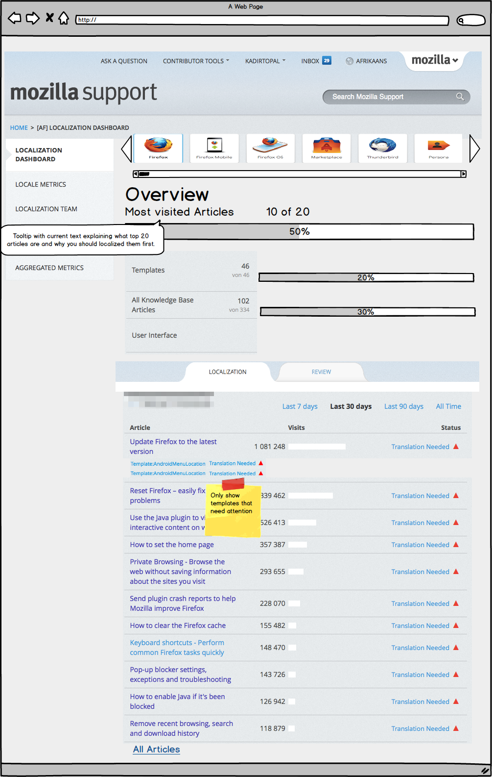
The localization dashboard is going to see major changes soon to make sure that it is as simple and focused on the tasks at hand as possible. We need your feedback to make sure we are making the right decisions. If you are using the L10n dashboard and want to take part in the discussion, please had over to the following bug, have a look at the attached mockup, and leave your comment: https://bugzilla.mozilla.org/show_bug.cgi?id=939832
The following is a quick summary of what changes we are making and why.
One of the biggest strength of the platform that SUMO is built on is the fact that localization has been one of the key design components. We created several localizer personas when we designed Kitsune and had them in mind when we made decisions early on. One of those decisions was to create an L10n dashboard that would present all the data that localizers might need to get their job done.
Since the early SUMO was rather small and focused on a single product, the L10n dashboard worked pretty well. Since then however, we have increased the scope of SUMO and added several more products and more functionality. The L10n dashboard grew organically during those times to cover more products and functionality.
Now seems like a good time to take a look at the tasks that localizers are faced with today and bring the the L10n dashboard into shape again. Rosana and I started that discussion with one thought: The L10n dashboard should answer one question and should do that as good as possible: “What should I be working on next”.
The current L10n dashboard present a lot of data, but unfortunately not all of it is relevant or actionable. While that data should still be accessible, it doesn’t make sense to present it as prominently as we are doing today. Having the one question in mind we cut back a lot of unnecessary information and came up with a streamlined, simple interface that bundles information and presents only things that localizers need at any moment. When we printed the current L10n dashboard out, it took covered 4 full pages, the current proposal can fit onto a single page.
Here you can see a mockup of our proposed L10n dashboard:

To summarize the changes we made:
- The product picker that is currently a drop down becomes a visual product picker. The product icons should be rather small though, to make sure people can see as much of the L10n dashboard above the fold as possible.
- The overview section is slimmed down by removing the “administration” articles and the explanatory text. We oversize the progress bar for the top 20 articles, so that updated articles lead to visible changes. The logic of orange -> green stays the same. We then remove the explanatory text and add it to the overview section items as tooltips. The now free space is used for bigger progress bars.
- The actual content section is separated into Localization and Review
- The Localization tab has a list of articles that need attention, where need attention is defined as “needs translation, needs update, and needs immediate update”. The list is ordered by most views in the last 30 days. Thus we are doing away with all other lists on the L10n dashboard.
- Each article in the “needs attention” list shows below it the templates that are included in the article that need attention. Same rules for “need attention” as before.
- The review tab has a list of top 20 articles needing review with a link to all articles needing review. The templates are listed the same way as on the localization tab, only templates that need review or “need attention” are listed.
If you want to take part in the discussion, please had over to this bug and leave your comment there: https://bugzilla.mozilla.org/show_bug.cgi?id=939832
We need your feedback to make sure we are making the right decisions with these big changes.
Thanks!
Kadir
Swarnava Sengupta wrote on
Ashickur Rahman wrote on
Rabbi Hossain wrote on
Kadir Topal wrote on
Jefferson Guimarães wrote on