Evolving the Firefox Brand

Say “Firefox” and most people think of a web browser on their laptop or phone, period. TL;DR, there’s more to the story now, and our branding needs to evolve.

With the rapid evolution of the internet, people need new tools to make the most of it. So Firefox is creating new types of browsers and a range of new apps and services with the internet as the platform. From easy screen-shotting and file sharing to innovative ways to access the internet using voice and virtual reality, these tools will help people be more efficient, safer, and in control of their time online. Firefox is where purpose meets performance.

Firefox Quantum Browser Icon

As an icon, that fast fox with a flaming tail doesn’t offer enough design tools to represent this entire product family. Recoloring that logo or dissecting the fox could only take us so far. We needed to start from a new place.

A team made up of product and brand designers at Mozilla has begun imagining a new system to embrace all of the Firefox products in the pipeline and those still in the minds of our Emerging Technologies group. Working across traditional silos, we’re designing a system that can guide people smoothly from our marketing to our in-product experiences.

Today, we’re sharing our two design system approaches to ask for your feedback.
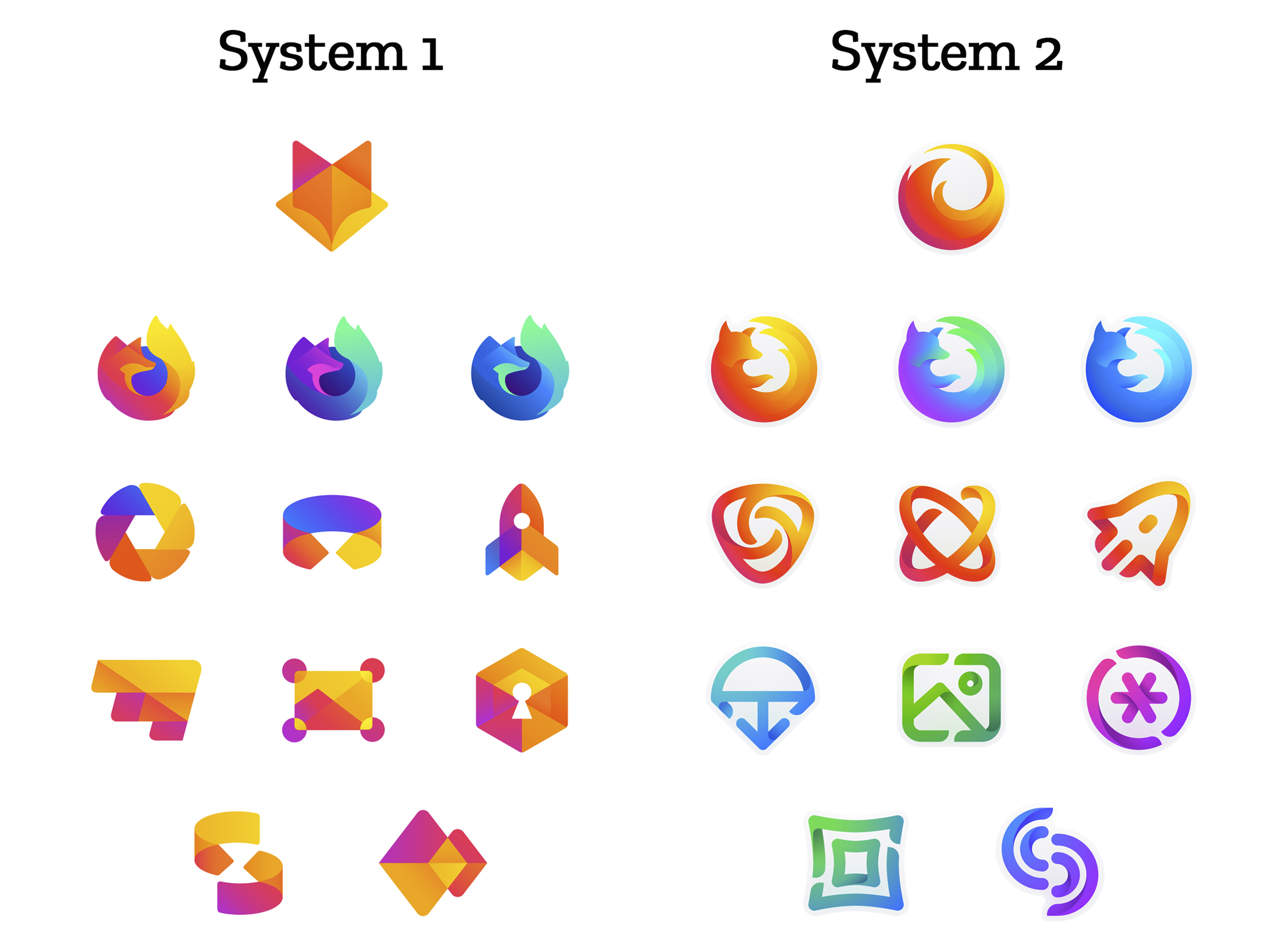
 

How this works.

For those who recall the Open Design process we used to craft our Mozilla brand identity, our approach here will feel familiar:

  • We are not crowdsourcing the answer.
  • There’ll be no voting.
  • No one is being asked to design anything for free.

Living by our open-source values of transparency and participation, we’re reaching out to our community to learn what people think. You can make your views known by commenting on this blog post below.

Extreme caveat: Although the products and projects are real, these design systems are still a work of fiction. Icons are not final. Each individual icon will undergo several rounds of refinement, or may change entirely, between now and their respective product launches. Our focus at this point is on the system.

We’ll be using these criteria to evaluate the work:

  • Do these two systems still feel like Firefox?
  • How visually cohesive is each of them? Does each hold together?
  • Can the design logic of these systems stretch to embrace new products in the future?
  • Do these systems reinforce the speed, safety, reliability, wit, and innovation that Firefox stands for?
  • Do these systems suggest our position as a tech company that puts people over profit?

All the details.

The brand architecture for both systems is made up of four levels.

Each system leads with a new Firefox masterbrand icon — an umbrella under which our product lines will live.
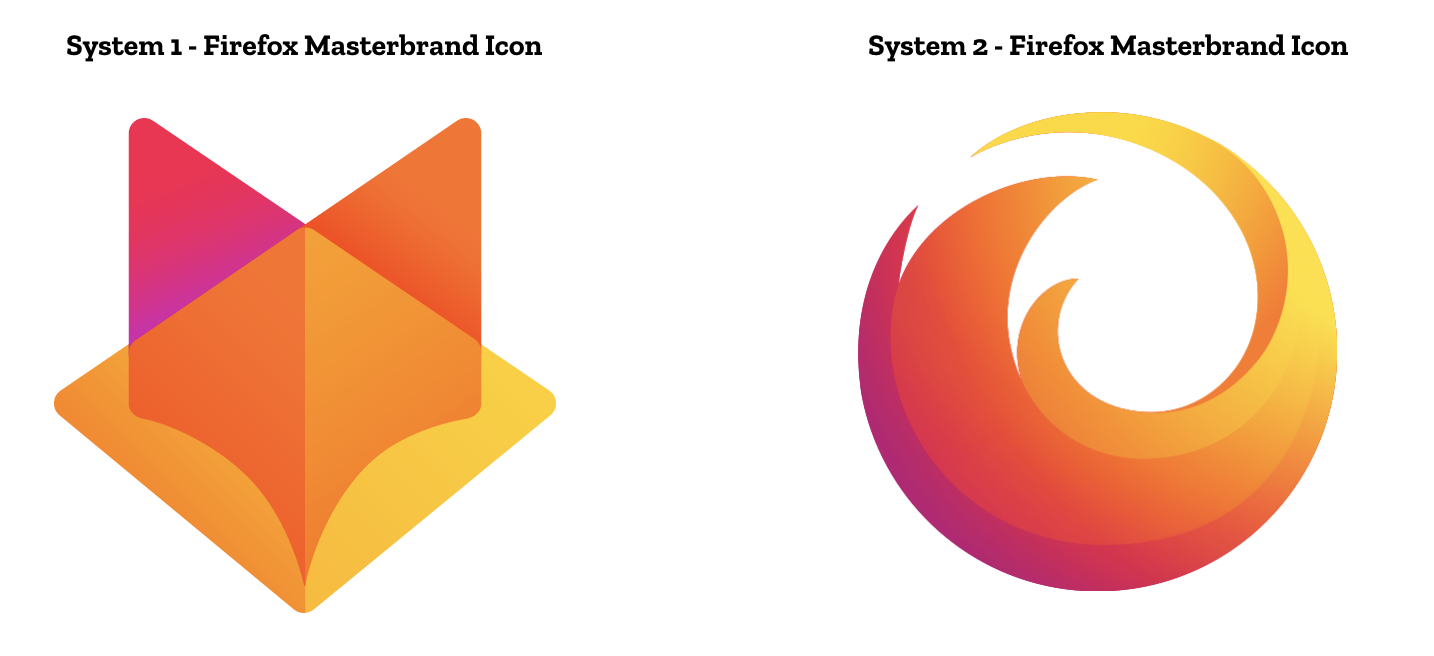
The masterbrand icon will show up in our marketing, at events, in co-branding with partners, and in places like the Google Play store where our products can be found. Who knows? Someday this icon may be what people think of when they hear the word “Firefox.”
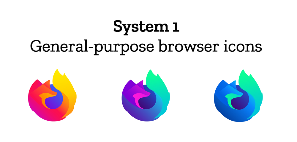
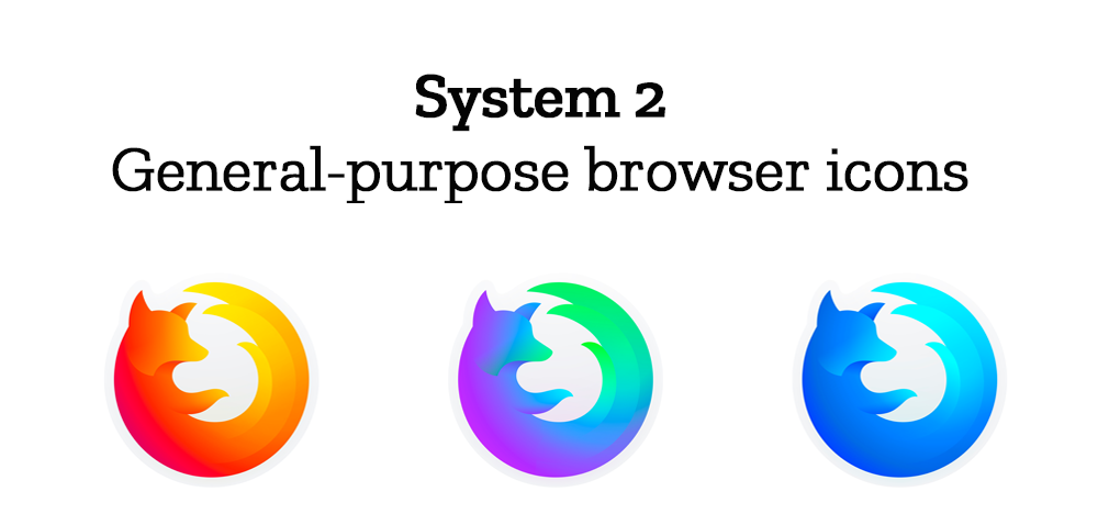
At the general-purpose browser level, we’re proposing to update our Firefox Quantum desktop icon. We continue to simplify and modernize this icon, and people who use Firefox tell us they love it. Firefox Developer Edition and Firefox Nightly are rendered as color variants of the Quantum icon.
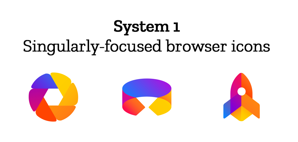
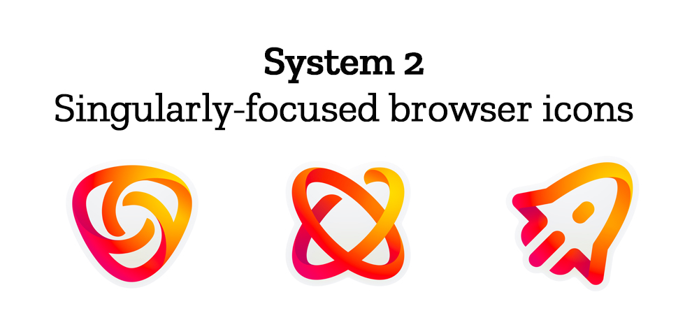
Browsers with a singular focus, such as our Firefox Reality browser for VR applications and our privacy-driven Firefox Focus mobile browser, share a common design approach for their icons. These are meant to relate most directly to the master brand as peers to the Firefox Quantum browser icon.

Finally, the icons for new applications and services signal the unique function of each product. Color and graphic treatment unite them and connect them to the master brand. Each icon shape is one of a kind, allowing people to distinguish among choices seen side by side on a screen.
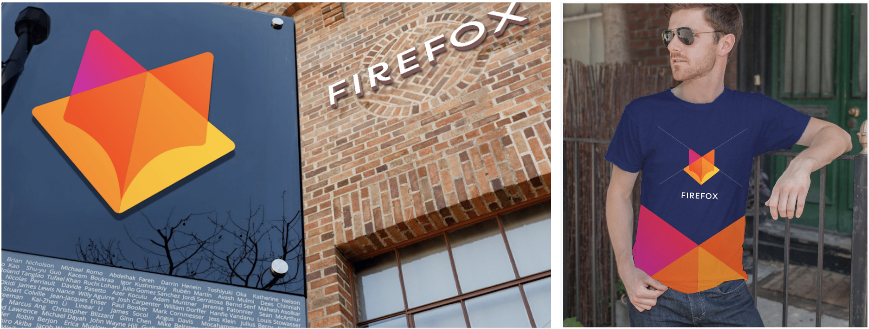
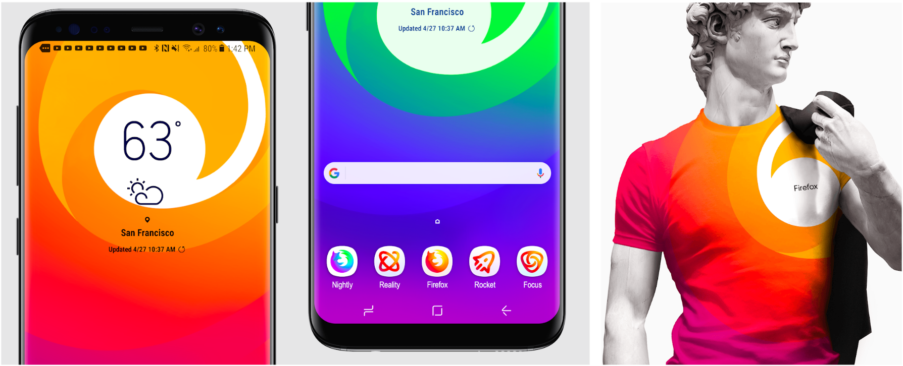
Still in the works are explorations of typography, graphic patterns, motion, naming, events, partnerships, and other elements of the system that, used together with consistency in the product, will form the total brand experience.

Read along as we refine our final system over the next few months. What we roll out will be based on the feedback we receive here, insights we’re gathering from formal user testing, and our product knowledge and design sensibilities.

With your input, we’ll have a final system that will make a Firefox product recognizable out in the world even if a fox is nowhere in sight. And we’ll deliver a consistent experience from an advertisement to a button on a web page. Thanks for joining us on this new journey.

Madhava Enros, Sr. Director, Firefox User Experience

Tim Murray, Creative Director, Mozilla

2,212 comments on “Evolving the Firefox Brand”

  1. Tyler wrote on

    So, I’m not a big fan of the non-Firefox icons in the Design group 2, but I love the Firefox browser icons there. The non-Firefox icons look childish and cheap.

    I’d prefer group 1, with the browser icons from group 2

    1. Vandrey wrote on

      Me too! Group 1 with Group 2 browser icons.

      1. Adrian wrote on

        Me too!

      2. Scott Ryan wrote on

        I agree! The combination of the two is the best option.

        1. José Zapana wrote on

          I also agree that group 1 with browser group 2 is the best so far

          1. Julia wrote on

            It was one of the first i thoughts I had as well…

        2. Paul Alcock wrote on

          Absolutely agreed

          1. Ronaldo wrote on

            Agree with Tyler.

      3. Camile wrote on

        Totally agree:

        System 2 browser icons with System 1 app icons.

        1. Malcolm wrote on

          System 2 with system’s 1 browser icons. Don’t drop the tail-flame and globe!

      4. Merlin Duff wrote on

        Yes, a blend of the two feels most right.

        System 2 masterband icon, System 2 for the general-purpose browser, System 1 for the singularly-focused browser icons (although the colour palette here strikes me as surprising), System 1 for app & service icons.

      5. rere wrote on

        Same here !

    2. Tony wrote on

      I’m with Tyler on this. Ditto.

    3. Bernhard wrote on

      I completely agree with that. The browser icons are nice, but other than that I hope those ones are going to be re-thought (or canned).

    4. Romain wrote on

      +1

      1. Sheng wrote on

        ++1

    5. Olaf wrote on

      +1: I’d also prefer System 1 with browser-icons of System 2.

    6. jolt2bolt wrote on

      I feel the same way. I love the designs if system 1 except the browser ones. I love the sytem 2 browser icons. I feel the system 1 es better representing the colors that mozilla uses.

    7. eih wrote on

      I was here for writing the same ideas. +1

    8. emil wrote on

      Exactly what I was going to say, group 1 + browser icons from group 2.

      And while I do kinda like system 1’s masterbrand icon, I argee with other people that it looks too much like Gitlab’s logo. So I would also go with system 2’s masterbrand icon.

    9. Bdm wrote on

      Yap, agree

    10. Margo Williams wrote on

      Ditto ditto ditto!

    11. Gee wrote on

      Exactly. Design 2 main icon as well as general purpose look very good and solid. The System2 dont look good at all.

      keep in mind that android allows icons to be other than the boxes, squares (iphone, samsung). I would og for icons that do also look good when seen without any box around (like the main browser icons). System2 does not fulfill this requirement at all.

    12. Jeff wrote on

      +1. The main system 1 icon looks almost exactly like the Gitlab one, and for my fuddy-duddy two cents, is too great of a departure from heritage. But maybe they want the departure. But the confusion with the Gitlab icon should be a big red flag.

      1. Sylvain wrote on

        I thought the same, the main icon in System 1 is too similar to the Gitlab one!
        But I still prefer the style of System 1 icons.

    13. Jeremy wrote on

      I second this.

      1. Sactocat wrote on

        System 1
        great work

    14. Alejandro wrote on

      I agree with this too. I think it’s the best combination.

    15. George Tzikas wrote on

      +1

    16. Chris wrote on

      Same! +1

    17. Gert wrote on

      for me as well.

      Although the first generic icons with the circle could be nicer if the purple part is bright red. as it would then be a stylized representation of the ff logo.

    18. Matt wrote on

      Same here. System 1, with the browser icons from system 2.

    19. Khanti wrote on

      Totally agree: Group 1 + Group 2 browser icons.

    20. A. wrote on

      The same here: if I were forced to choose among these two sets, I’d choose System 1, but with the fluid and roundish fox for the general-purpose browser icon from System 2. (The fox icon in System 1 has too many angles and edges.)

      On the other hand, I find that no set of icons gives the user the slightest clue about what the corresponding application is supposed to do. What are “Reality” and “Focus”, and why are they well represented by those icons depicted above? Why is the idea of secrecy well represented by an asterisk inside an interrupted circle? If I were Mozilla, I would run a competition and ask for better results, as it has been successfully done for the current logo (“moz://a”).

    21. Peter wrote on

      Agree with the above, system 2 for the general purpose browser icons (although I think the _current_ fox for the browser with less “hair” would be preferable). For the brand, I’m split between the two – I like the new “head-on” fox, but the nostalgic in me feels the system 2 brand feels more like home (coming from someone who used Phoenix 0.1).

      The rest of the icons, definitely system 1. Apart from the main brand and the general purpose browser icons, the rest of the system 2 icons look like utter crap to be blunt. I’m not really sure what some of those icons are for (both system 1 and 2), and more or less all of them are just “graphics” (apart from focus, reality and rocket in system 1 maybe) with no real clue as to what they’re meant to symbolize.

      1. Vincenzo wrote on

        +1

      2. Mat wrote on

        +1

    22. A Purohit wrote on

      Agreed with the above!

    23. Daniel wrote on

      +1

    24. Jason Carter wrote on

      System 2 Masterbrand and General Browser, System 1 everything else

      1. AG wrote on

        Agree with Jason Carter.

      2. Antoine wrote on

        Same for me

      3. Nick wrote on

        +1

      4. gorn wrote on

        System 1 with system 2 masterbrand. If the browser icons come from 1 or 2 – i do not care that much. System 1 is much more coherent – system 2 does not make it look like one brand.

    25. Daniel wrote on

      Definitely group 2 for browser icons, but for the rest I’m not happy to choose one of them. I think they’re too coloured, like for games or something…

    26. Lucas Rodrigues wrote on

      Yesss, exactly what I was thinking

    27. Adam wrote on

      This is the way to go.

    28. Dread Knight wrote on

      +1, just what I wanted to suggest as well.
      Wish this blog was using disqus though xD

    29. Garett wrote on

      I agree with Tyler as well.

    30. Gabe wrote on

      Agreed.

    31. Kostas wrote on

      Totally agree!!!
      I prefer group 1, with the browser icons from group 2.

      1. Anthony wrote on

        Same here, group 1 with browser icons from group 2 !

    32. Nick wrote on

      Came here to post this exactly, system 1 with the browser icons from system 2 would look best.

    33. Fabian Winder wrote on

      Agree to that too

    34. Ovidiu wrote on

      ditto

    35. Mark wrote on

      Same

    36. Greg wrote on

      I’ll agree with this as well. I like the system 2 masterbrand and browser icons but system 1 is better for the rest. I’d be okay with the system 1 masterbrand though.

      I’ll also add that having just the head and tail on the system 1 browser icons feels very wrong, like it’s a weird tadpole/sperm creature. While having the paw isn’t necessarily essential, it serves as a good marker for conveying a sense of the body, which is. I know the trend is toward simplifying logos, and I find losing the blue interior for the planet works better than losing the paw and any sense of the body. The circular outside and sharp angles also gives it a much cleaner look than the softer system 1 design, which looks mushy by comparison.

    37. Oscar Diaz wrote on

      Same here, Browser icons in group 2 feel right: the necessary amount of shapes, but the icons are missing something, is in the line approach? coloring?… something that is well executed in group 1…

      Group #1, with browser icons from Group #2, is the way to go!

    38. Joseph wrote on

      Remember that these aren’t even close to the final designs. I definitely see the “cheap” aspect of them and I certainly would be with you if these were the final designs, but as these are extremely early designs I would hesitate to dismiss system 2

      1. Daniel wrote on

        I totally agree.
        I immediately fell in love with the master brand and the desktop browser icons of system 2, because they look more grown-up than their counterparts. Without the globe, they also look evolved.
        The other icons are beautiful too, they just need to be more distinct.

        1. Amir wrote on

          Agreed.

    39. Greg wrote on

      Agreed.

    40. Alexina Paiement wrote on

      I’ll agree, however I like the masterbrand icon and think that could be used for the browser icon too.

    41. jstvz wrote on

      +1

      System 1, with browser icons from system 2.

    42. Inna wrote on

      I agree as well. Prefer group 1 with the browser icons from group 2.

    43. Marian wrote on

      Yes, browser icons from system 2 look better.

    44. CaneMint wrote on

      +1 here

    45. Emanuel wrote on

      Ditto with Tyler!

    46. Enrique Cue wrote on

      I also like browser icons nº2 including Firefox masterbrand icon.
      I think Masterbrand 1 is a nice icon, but not for Firefox.
      For the apps, I prefer nº1.

    47. liam wrote on

      +1

    48. Jed wrote on

      Exactly what I was going to say!

    49. John wrote on

      Same

    50. Kevin wrote on

      +1

    51. JaviPérez wrote on

      +1

    52. flux_capacitor wrote on

      System 1 Masterbrand is a masterpiece of design. Use it, and use it for the browser icon too! Bold move!

      If you prefer small steps, System 2 browser icons are better though.

    53. Pascal Lessard wrote on

      System 1 with System 2 browser icons : I was going to post the exact same thing.

      Although, when all is said and done, both systems browser icons are good, so I could live with both. I love the fact that the fox is looking forward in both submissions, giving a feel of determination (or even pride). In the current logo, the fox is looking away, as if shy or sad for the lost past (“sorry to be here”, he seems to say).

      As for the main logo, the System 1 is genius. It says “Fox” clearly, but in a new way. The System 2 main logo is once again a nod to the past. Nothing wrong with the past, but the message that I feel moz:lla wants to send is that “this is a browser that’s relevant today and in the future”. And while it’s not good to ditch the past, a different logo sends the message that Firefox is nimble. Besides, this is exactly what Firefox was, historically : a break from the old, heavy Mozilla Dinosaur.

    54. STrRedWolf wrote on

      I have to agree with the split, where group 1 gets the majority, but group 2’s browser icons are better… but not all the way there. I would use group 2’s browser icons with the blue “world” used in group 1.

    55. Omri wrote on

      Agree completely. System 1 without the GitLab logo, and the browser icons in 2 are better, too.

    56. Etienne wrote on

      I agree to that, group 1 with browser icon of group 2.

    57. Hiromi Ohta wrote on

      Yes, me too. +1

    58. Human wrote on

      Definitely agree on the Firefox icons. Group 2’s are much better and keep the essence of Firefox’s previous logo much more intact than group 1. I don’t much like the browser icons in either group though. Maybe a few from each are okay, but neither group is a clear winner, but group 2 is a bit worse for me.

    59. Evan wrote on

      I agree

    60. MCE wrote on

      What Tyler said. System 1 looks much better, more modern and sleek… except for the general purpose browser icons – those look like chunkier/clunkier foxes compared to the System 2 versions.

      I also liked the System 1 masterbrand icon, until I saw GitLab’s logo. That’s not gonna work.

    61. Bella wrote on

      Same here, I prefer System 2 Masterbrand and general browser, System 1 everything else.

      System 2 Masterbrand retains the unique and familiar feeling of Firefox. System 1 is nice, sharp, but in its geometric style, way too generic and similar to what is out there already.

      System 2 general browser icons are perfect, they are smooth, symmetrical, not too crowded, they have a good flow anatomically and they look updated to a modern feel but retain the Firefox unique theme. System 1 general browser icons look too small next to the rest of the pack, anatomically the curling of the fox looks forced and cramped, and with the circle there they look too crowded.

      System 1 single browser and apps icons have better colors, are more contrasting as stand-alones and more unified between all of them. And they go together with the Masterbrand and general browser icons from System 2 better, because optically they have about the same weight, whereas System 2’s rest of the icons in that line style look out of place and too thin and also very bland and generic.

    62. Kotty wrote on

      My thoughts exactly! I like the System 1 icons more except for the browser icons.

    63. Tom wrote on

      I agree! The browser icon from group 2 looks nice, but for the rest group 1 icons look better :)

    64. Martin wrote on

      Me too! Group 1 with Group 2 browser icons.

    65. Michele Beltrame wrote on

      The main browser icon, in my opinion, should be the one of Group 2: it doesn’t change the previous logo so much to make it difficult to recognize, and it’s beautiful. Also, the general purpose browser icons.

      I’m not so sure about the new app and services icons in that group, they’re a bit too different. However, the main browser icon is what really matters, so I’d go for Group 2 definitely.

    66. Sebastian wrote on

      I agree. I like the icons from group 1 more. But for the masterbrand and the browser icon, I prefer group 2, the swirly logo is cool.
      The other one really does remind me too of GitLab.

    67. Nik wrote on

      I agree with Tyler

    68. Guillaume wrote on

      I totally agree ! :)

    69. Torbins wrote on

      I fully agree with Tyler. In overall, System 1 is better, but with browser icons and main icon from System 2.

    70. Denis wrote on

      Yep.
      Me too. Exactly like that.

    71. Walter R wrote on

      Agreed!

    72. Andy Barnes wrote on

      Totally agree with Tyler.

      Prefer browser icons from group2 (including master brand), and everything else from group 1.

    73. Félix wrote on

      I’d prefer group 1, with the browser icons from group 2 >>> yes me too +1

      Thank you for the opportunity to provide feedback. It’s a good way to feel part of the Firefox project.

    74. Seb wrote on

      +1

    75. Nicolò P. wrote on

      I agree with the fact that the “System 1” icons are better but their general-purpose browser icons have some problems. I think the problem of the “System 1” general-purpose browser icons is the fact that the fox’s head seems to be unnaturally squashed downwards and the tail develops too vertically creating an ovalized optical effect. Another small problem with all “System 1” icons is, in my opinion, the excessive use of magenta. I tried to make some quick approximate changes to the first general-purpose browser icon of the “System 1” based on my taste.

      1. Nicolò P. wrote on

        Sorry, I forgot the link.

        https://ibb.co/fpsDwK

    76. Karatek_HD wrote on

      I think so too!

    77. Andrew wrote on

      I agree

    78. Lucca wrote on

      This was my thoughts exactly. Also it was the first comment I saw. Coincidence? I don’t think so. :D

    79. ZeroAurora wrote on

      +1

    80. Tasos G wrote on

      +1 for this!!!

    81. Gabriel wrote on

      Definitely, Group 1 with Group 2 browser icons.

    82. Luxor wrote on

      +1

    83. Sk1N wrote on

      +1

    84. Dina Michl wrote on

      Loving System 2 Firefox Masterbrand Icon, you cannot lose the identity you already created with the tail, it’s too well executed to leave behind please! I really like System 2 General-purpose browser Icons for the same reason.
      I like System 1’s Sigularly-focused browser icons and Icons for new apps & services. This is tough though, the design language will need to be refined to look more unified, but great start!

    85. guimp wrote on

      my thoughts exactly

    86. Kevin Collins wrote on

      Agree, Group 1 with Group 2 browser icons

    87. Matas wrote on

      I’d definitely prefer icon-set System 1 with master-icon from System 2.

    88. Naveed Ahmed wrote on

      +1

    89. John Kim wrote on

      I give props to both Systems, but System 1 looks far more modern and eye-catching. System 2 looks like a cheap knock-off of an icon pack. System 1 masterbrand icon is lit btw! bb

    90. Ryan Thompson wrote on

      I am certainly with this guy.

    91. Deon wrote on

      Thump up

      I think the same. Group 2 is better look and fresh

    92. Richard wrote on

      I was about to say the same :)

    93. Victor wrote on

      Good idea ! It’s perfect : Group 1 with Group 2 browser icons

    94. Natacha wrote on

      Same opinion.
      Good luck with the brand architecture, I’m in the middle of one so I know it can be tough (but super inspiring as well)

    95. Elodie wrote on

      I will say the same, I’d prefer group 1, with the browser icons from group 2 which is really really lovely and seems more to feet the spirit of firefox, in my mind.

    96. 0cool_f wrote on

      +1 can’t agree more, this is the first thing I thought

    97. Ondřej Bárta wrote on

      +1 Came here to say just that 👆

    98. Guilherme wrote on

      Exactly. +1.

    99. Bianca wrote on

      Exactly what I think, too!

    100. Ali wrote on

      I agree!

    101. Paul wrote on

      I think in the same way. Full quote. System 1 bit with System 2 general-purpose browser icona.

    102. Joshua Smith wrote on

      I agree as well. System 1 has the strongest identity, but it is diminished by the clunky feeling of its browser icons. I feel it would be best if the dynamic beauty of the browser icons in System 2 could be incorporated.

    103. Antoine wrote on

      Totally agree

    104. Goudie wrote on

      One comment says everything. +1 !

    105. Norbert wrote on

      Yes! First system with 2nd system’s Firefox logos is the best option. Icons in the first look more solid which I like, but I also like silhouettes idea on the second icons though.

    106. David wrote on

      Yup, exactly my thoughts. The app icons from group one (1) are too amazon-ish and don’t feel unique. I think fresh and different when I think Firefox so the icons should convey that.

    107. Kevin S wrote on

      I agree with Tyler – Group 1 but with the group two browser icons. The white middle is better.

      Great work though – looking sharp!

    108. Maqbool wrote on

      Yup Group 1 for sure

    109. Daan wrote on

      Same. +1

    110. Sudeshana wrote on

      Exactly

    111. Alexander White wrote on

      I agree

    112. Brandon D’Souza wrote on

      Same here, system 2 browser icons with the rest of system 1

    113. Jack wrote on

      Agreed! System 1 is way better for the most part but the browser icons of set 2 are way better.

    114. Kloten wrote on

      Absolutely agree with Tyler!

      I prefer style of group 1 icons, but i think, that browser icons from group 2 are better.

    115. Nicolas Kirchner wrote on

      Agreed too ! I love the system 1 masterbrand icon (it reminds the gitlab icon but not so much, it’s not confusing), the sticker will proudly appear on the hull of my computer. This change of logo shows the revival of Mozilla, with Rust, Quantum, and all that sexy stuff coming. Chrome had this image of modernity, to Firefox to steal the show

      The masterbrand logo of system 2 is too neutral and without energy, and the new-app icons look out of context. The orange ones from system 1 are way better.

      On the other hand, yeah, I prefer the general-purpose browser icons of the system 2, those of the system 1 look a bit childish.

    116. Ashley wrote on

      Yes, agreed. System 1 but replace the browser icons with system 2.

    117. Weronika wrote on

      I think exactly the same!

    118. Crolug wrote on

      Agreed. Although I would differentiate DE and Nightly color patterns a little bit more as well, to be more easily distinguishable.

    119. Stirling wrote on

      Completely agree.

    120. bldr wrote on

      +1

    121. Anh wrote on

      Count me in! I would just switch the three Firefox icons on system 2 to system 1.

    122. Isaac wrote on

      Me too! Icons need to be easily identifiable, and that is the right combination to do so.

    123. Arthur wrote on

      Totally agree. Main logo and Browser icons looks better on 2. But the other icons looks better in 1

    124. Chris wrote on

      I’m with Tyler on the choices!

    125. Jan wrote on

      the same!

    126. Marlon Matus wrote on

      The same, group 1 but Firefox browser logos from group 2

    127. Nick wrote on

      I feel the same .

    128. helter985 wrote on

      This! +1

    129. Arkajyoti Pal wrote on

      Me too! System 1 with System 2 browser icons would be a great combo!

    130. Fabian Künzel wrote on

      Agreed

    131. Judie wrote on

      Agree with Tyler, also.

    132. Todd Crull wrote on

      Mostly agree. However, I think the System 1 Browser icons DO have merit and look more distinctively like a Fox. The System 2 Browser icons could be perceived simply as any dog (non-hound… pointy ears). Maybe take out the colored circle background. Simpler. I’m also a fan of the System 1 Browser “foxtail”. Again, more distinctly fox.

    133. Vuskaal wrote on

      +1

  2. Sylvia van Os wrote on

    I’m honestly unhappy with the system 1 masterbrand style, because it looks way too much like GitLab’s logo. Sadly, beyond that, I don’t really feel strongly for either type.

    1. Toby Evans wrote on

      Totally agree – very close to Gitlabs logo.

      I really prefer the rest of system 1 icons though. Just take the browser icons from system 2 and you’re done I recon.

    2. Olivier Eblé wrote on

      +1 on the “way too much like GitLab’s logo”.
      Anyway, Except for the general purpose icons, I really prefer the 2nd option.

  3. Jake Price wrote on

    Really great logos, I love them. I probably sway more to System 2, but both are superb. Look forward to seeing how the brand develops.

  4. jens1o wrote on

    The first one is really fancy! :) Really looking forward to it.

  5. Aru S. wrote on

    I feel like the System 1 masterbrand icon bears too-close a resemblance to GitLab’s.

    1. Bruno Garci wrote on

      I just thought the exact same thing… it’s just too close to Gitlab’s identity

      1. Travis wrote on

        Agreed – first thing that popped into my head was “Gitlab”.

      2. Ben wrote on

        +1

        I really like the System 2 logos. They communicate all the new features and services while still being immediately recognisable as Firefox.

    2. Christopher wrote on

      Came to say the exact same thing – System 1’s main icon is far too similar to GitLab’s.

      I prefer the Firefox logos of System 2, but prefer the other icons from System 1.

    3. John Dill wrote on

      Came here to say this. I think that newer icons should be made in the same visual style as the current Firefox icon, in fact.

    4. Jordan O wrote on

      100% When I first saw that I thought firefox and gitlab were making some sort of partnership

    5. Michele wrote on

      Same

  6. Marlena Jones wrote on

    I Like – System 1 Master Icon, System 2 general-purpose browser icons, System 1 Singularity-focused browser icons, & System 2 Icons for new app & services.

    1. Emanuel wrote on

      Exactly what I thought. +1

  7. Steven wrote on

    System 1 all the way, for sure. I say this mostly for the consistent use of the Firefox color palette, which results in icons that are near-instantly recognized as a Firefox app / service, but also come across (to me at least) as more clean and intuitive.

    1. David wrote on

      I agree completely.

    2. Jim Murphy wrote on

      Agreed, System 1 for sure. It must be a fox!

    3. Creative Spirit wrote on

      Agree, System 1 all the way. However, the Masterbrand icon from System 2 and General purpose browser icon again from System 2 are much better in flow and creativity,
      System 1 Masterbrand is too geometric and uninspiring

    4. André wrote on

      Agreed

  8. Markus wrote on

    I prefer the look of System 1. It feels more „unified“, and the „sharp“ and „edgy“ look is more modern (imo).
    However, I don‘t like the masterbrand icon. It‘s hardly recognisable as a fox.

    1. Al wrote on

      I completely agree. I prefer system 1 as a whole, but really prefer the system 2 masterbrand icon.

  9. matteo wrote on

    Even if I like the Masterbrand icon of the first version, I think the n.2 looks much better: it’s more balanced, readable and versatile.
    Anyway, great job!

    1. Vio wrote on

      Totally agree!

    2. Adam wrote on

      I think the no.2 looks much much much better, more elegant and professional.

  10. Sammay wrote on

    Cool!
    I like the browser icons from Style 2, they retain the legacy. All other icons from Style 1 look best to me, but they can have more variations in color.

  11. Arty wrote on

    Really like the icons from System 2 better, but the way the colours are used in System 1 tie the brand together better. So System 2 with a colour scheme similar to System 1 seems like the way to go. Otherwise, System 2 seems like the way to go.

    1. Angela wrote on

      I’m with Arty.

  12. Ian wrote on

    If I were to pick one, it would be System 1, though I would hope that icon refinements would lead to slightly more delicate features. System 2 unfortunately reminds me of the iconography of Microsoft Office for Mac 2013, or looks like the design philosophy of a mid-2000’s anti-virus company (i.e., a brand whose product/service is so vague that even they have difficulty showcasing it to the general public, so it becomes a series of coloured waves). Overall, my other additional concern is that System 1 orbits too closely to Instagram’s colour scheme, and would be improved by finding an alternative to the blue and violet hues. System 2’s overall colour scheme is simply too diverse; by the time you get to the icons for new apps & services, they seem totally irrelevant to the original brand.

    My biggest concern is with the Masterbrand icons, because, to me, neither captures what Firefox is. System 1 is all fox, and System 2 is all fire. But System 1’s Masterbrand icon is still light years ahead of System 2’s in my affections; System 2’s is just awful. If System 1 could add even a hint of fiery elements, I think it would be a big win.

    I have no issue with the Firefox Quantum logo as it is — I think it’s gorgeous, actually. The general purpose browser icons of System 1 are similar, yes, but are far too clunky. The proportion of the internal “ball” (what used to be the globe) seems off compared to the fox band, and the entire icon seems like someone pinched it from the top to bottom. The System 1 icons are still the real winners, but could do with some messing around with proportions.

    Overall, this is really exciting!

    1. Andrew Tatge wrote on

      I’m inclined to agree Ian’s first paragraph, though I like the System 2’s firefox browser icons and System 1’s app icons.

      A lot of System 2 app icons remind me of MS Office 2005 with the soft curves, false depth (deeper than System 1 anyway) and abstract shapes. System 1’s polygon construction reminds me of certain computer games.

      If you did another iteration ;) I would like to see some of the color variety and depth within each system 1 app icon turned down a bit.
      (Does that become too Alphabet/Google-y?

      Some of system 2’s icons are much easier to parse quickly in grayscale (the rocket, the picture frame). I prefer them to the more complicated System 1 variants.

      At risk of embarrassing myself, System 2’s asterisk (security?) icon makes me think of Kurt Vonnegut’s depiction of a certain body part. I had the same reaction when Pentagram Studios redesigned Rotten Tomatoes logo—I was really surprised nobody called it out. Perhaps nobody else makes this association [shrug].

  13. Asif Youssuff wrote on

    Love the work happening here.

    Will say I strongly prefer System 2 from what has been posted here. Keep up the great work!

  14. Sashin wrote on

    I’m not sure if this view helps you much at all, but I like everything in the new designs. They look really, really cool.

  15. Altitude wrote on

    Well, one can think that for an open-source technology company, system 1 masterbrand logo really is too close to Gitlab’s.

  16. Matthew Ames wrote on

    I like both, and I like them for completely different reasons. I like System 2 from a desktop and mobile application standpoint. They look great as icons, and would fit in well with any device.

    However System 1 looks like it would be really awesome on merch, just like the T-shirt picture in the post.

    It would be a shame to ditch one style in favor of the other, when each has its clear advantages.

  17. Bob White wrote on

    Leave it alone.

    1. Kelly Rush wrote on

      HEAR HEAR!!! That said, I prefer all of System 2. Nothing in System 1 makers any sense to me.

    2. vic wrote on

      I agree with this the most. I actually liked the icon better before quantum.

  18. Jose wrote on

    They’re all beautiful but the System 1 brand logo is too similar to Gitlab’s logo so I’d go for System 2.

    1. Anon wrote on

      That’s the first thing I thought of too.

  19. Alex wrote on

    The first Masterbrand logo looks like the Gitlab logo.

    1. Trevor wrote on

      I came here just to say this exact thing.

  20. Robin wrote on

    Not sold on either of these really.

    System 1: ***

    Main icon looks almost like a book and equally unsatisfyingly almost like a fox’s face. In silhouette it doesn’t look like anything much.

    Browser icon is a solid refresh on the existing one. At least the head and tail are distinct organic shapes.

    Focused icons are okay. It’s a good colour scheme.

    System 2: *

    Main icon says nothing. Browser icon looks melted. Focused icons are a cute ‘mobius strip’ motif (which feels like it should be a continuation of something from the main icons) that is a little distracting. Very ‘telecoms company’ style and colours. (Looks like branding used by Three, Sky and BT in UK)

    I hope this process works out better than the one that resulted in the drunken holiday tattoo that is the current “Moz://a” brand identity.

  21. Gabriel wrote on

    Hi there ! 👋🏻
    I really like the openness of the process.

    Though I’m kind of attached to the three Firefox icons currently used + the Firefox Focus icon, I’d like to share my view on the two systems shown here.

    I really like the two masterbrand icons. I find them very refined and both represent Firefox to me, though the one in system 1 strangely reminds me of Gitlab too.

    I find the system 1 general purpose browser icons a bit too childish, as opposed to the refined icons we currently have. The system 2 general purpose browser icons are more mature to me.

    And for the other icons, I can see the bond inside system 1 but the icons for specialized browser + other apps in system 2 feel very misplaced next to the masterbrand and general purpose browser icons.

    Thanks again for sharing the process with the community !

    Gabriel

  22. Marek Järve wrote on

    I personally feel like System 1 would be better. It’s bold and simple, while remaining familiar and recognizable.

  23. Manish Goregaokar wrote on

    The System 1 logos look like very much like the GitLab logo.

  24. Kiko Herrschaft wrote on

    I prefer System 2 for the following reasons:
    1 – The icon for the browser resembles better Firefox. The fox / flame around the globe is such a powerful image that I, as a designer, would avoid changing it too much.
    2 – I think this “sticker” style creates a better identity for the brand’s product groups. System 1 icons, on the other hand, may look like any other non-Mozilla apps.
    3 – I think the empty spaces express better Mozilla’s openness and transparency

    1. Pamela wrote on

      Thank you Kiko Herrschaft !

      I read exactly what I was thinking

      As a Designer, my vote goes to System 2

    2. Otto Richter wrote on

      Especially the master brand icon should not be changed to something else than the fox and the flame in my opinion.

  25. Thomas H. wrote on

    While I like both of them, System 2 looks much more visually enticing to me with its modern flat look, and seems to fit better with internet-related software.

  26. Devin wrote on

    The round master brand logo from System 2 looks like Firefox. The altered GitLab logo from System 1 is going to cause confusion, I think.

  27. Jason Fuller wrote on

    I think revamping the ‘fox’ for the master brand icon is a mistake, and instead you should revamp the T-rex in ‘System 1’ style

    General purpose Browser icons, all look good, I have no preference.

    Singularly Focused Browser icons: None of these reflect back onto the brand in an obvious way other than the coloring (and even then it’s not very obvious); it’d be nice to add a firefox tail or t-rex arm or something to them. While I prefer system 2 styling, the non-spaceship icons aren’t distinct enough from one another in System 2; if left unchanged, system 1 would be a better choice.

    Apps and services: System 1 icons all look the same when quickly scanning / don’t allow one to quickly identify each product from the other due to the overuse of similar coloring. System 2 icons, while a bit easier to distinguish from one another, are so abstract, that it’s difficult to figure out what type of product the icon might be representing. Thus I find both System 1 and System 2 apps and services equally unpleasant, and hope they are reworked.

  28. gurdulilfo wrote on

    Interesting news. Exciting, I would say. To answer your questions:

    – Do these two systems still feel like Firefox?
    Yes, both of them look like Firefox. The first one more so. If I saw the last five icons on the second system, I would not recognize them as part of Firefox family.
    – How visually cohesive is each of them? Does each hold together?
    I think the first system is more cohesive. The second system looks like 2 (or maybe even 3) groups of icons.
    – Can the design logic of these systems stretch to embrace new products in the future?
    I think the second system had more room in this regard since it is not as cohesive as the first one. It would allow more color vairation, etc.
    – Do these systems reinforce the speed, safety, reliability, wit, and innovation that Firefox stands for?
    Not sure, really. Probably the second system is better in this regard.
    – Do these systems suggest our position as a tech company that puts people over profit?
    I think the first system is a bit better, but I don’t see an emphasis on “people over profit” in either, to be honest.

  29. Hugo Leisink wrote on

    The System 1 fox head looks a bit like Gitlab’s logo.

  30. Rafael wrote on

    I think that the main icon set from the first system is really cool and artistic.
    But the additional apps and services icons are really confusing. On both systems there are icons that you could associate with a similar application, and there are other icons that doesn’t really tell anything.

    By this idea, even the main icons on both cases are a little confusing.

  31. Jason wrote on

    The system 1 main logo looks just like the GitLab logo.

  32. Neil J wrote on

    I think rebranding is dangerous and will lead to confusion and loss of “market share”. I think Mozilla for the foundation and Firefox for the browsery things is the right idea. If you want to make special browsers, something along the lines of “Firefox VR” would be okay. I love Firefox and have for a long time, please don’t change the name because some board member is bored.

  33. Tara Vancil wrote on

    Wow, great start!

    My immediate reaction is that system 1 departs from the friendly and welcoming feeling that the Firefox logo has always evoked. I think system 1 is fantastic and I won’t be disappointed if it’s chosen, but it feels more edgy-database-startup than friendly-browser-project.

    1. Chris Nason wrote on

      Exactly! I was struggling to put my thoughts into words, but you nailed it!

  34. Lily wrote on

    System 1 is cohesive, but the masterbrand and new apps & services icons are ugly.
    System 2 is not cohesive, and all the icons are ugly.

  35. Jeremiah Lee wrote on

    System 2 is the clear winner for me.

    System 1’s masterbrand icon is generic. The fox could be any company or product. System 2’s masterbrand icon keeps the iconic Firefox tail, the detail that if left is still identifiable as Firefox today.

    The System 2 general purpose icons are better. Foxes have legs. They’re not snakes, as System 1 suggests.

    The icons for new apps and services are weak in both systems. They both feel very generic. System 2’s icons have the advantage of being easier to discern at a smaller scale. The System 1 icons just become uniform little color blobs.

    1. Jacinta Cruz wrote on

      I, completely, agrre with Jeremiah Lee!

      I would like to see a system more cohesive and uniform in all the details (lines, shapes, colors, etc.), that brings us back to an unique and singular identity.

    2. Falippou Yoan wrote on

      I am ok with this. Création work!

    3. Kurt wrote on

      x2 on this comment.

  36. Emre Bilal Aydın wrote on

    I love System 1.

  37. Larry Beckham wrote on

    The current Firefox Quantum Browser Icon is perfection. Only thang I change is the word, Quantum, drop it in the next version.

    Anything else is not Firefox. Cut all ties to the name Firefox if it is NOT the Firefox Browser.

    Do not give this subject a lot of time and energy. Concentrate on making the Firefox the safest and most standard browser in the world. Comply to the spirit and the letter of the W3C standard and elimination all bugs you can as soon as can. That is the Prime Directive. All else is a secondary priority.

  38. Andrzej wrote on

    I prefer System 2 because it is more similar to the current logo, thus more recognizable.

  39. Jeffrey Marraccini wrote on

    I do like System 1. Sometimes it is good to be bold. Thank you for all you do, Mozilla Team!

  40. rugk wrote on

    Why yet another Firefox icon? I still enjoy the current one of Firefox Quantum and it looks great while staying close to Firefox origin’s/origin icon(s). And it has not been so long ago, where they’ve been updated.
    While I understand you may need more icons for Firefox VR and stuff like that, I don’t want to loose that current great Firefox logo by that, i.e. does it need such a whole redesign?

    As such, I really like the first version more, as it is closer to the origin icon. (the first line with the Firefox stable/dev/nightly icons). I’d even say the Firefox stable/dev/nightly icons of System 1 looks really great.
    As for the other’s listed below, I can hardly imagine what products they should belong to.

    I also like the first masterbrand icon. I can see the fox in it, so that’s nice, I don’t know where it should be used, as you have the real “Firefox” icons in the line below, but well… it “feels like Firefox”, at least.
    I mean, you explain, you may use it in marketing or so, but if there are too many icons for one Firefox that may confuse too many. At least if “Firefox” is still named “Firefox”, but there is then “Firefox – as the one, where all Firefoxes belong to” and “Firefox – the one, you know from desktop”. So you have the same name for the “group” and for the “single Firefox”.

    As for the second version:
    * In both the masterbrand and the Firefox icons, the holes do not look good. Maybe it’s just that emptiness there (the “hole” in the middle), where you totally expect the existing Firefox icons to have something.
    * Basically the Firefox icons look like the Firefox icons, but just the background removed. They really just look like the monochrome ones you already have (i.e. https://design.firefox.com/photon/visuals/product-identity-assets.html#icon-as-glyph), but with color, obviously. That is not very existing, i.e. it’s more something one would already/may actually have seen.
    * As I know get what the icons should mean: The one in system 2 for Firefox VR really just looks like the Atom editor.
    * Generally the v2 icons look very generic and could be used in a web font/as web icons for any project.
    * When you see the Firefox logos nearby the masterbrand one really looks similar, but basically it just looks like a “simplified [bad] copy” of the Firefox icon. It just says nothing and is, as the others, too generic. It has nothing “foxy”…
    * The System 2 “new apps & services”: The top left one, is that an alien or an umbrella? Sorry, but that’s what i see there. The same icon in System 1 is just some bars. No idea what this is supposed to mean…

    More notes about System 1:
    * There is a hard cut between the Firefox icons and the icons for other browsers/apps. I do not really see how they belong together visually.
    * I like the Firefox Nightly image, e.g. It is lightened from the bottom and has a nice 3d effect as I know from the current icons. Maybe you need some 3d models instead of simple icons ;) (maybe one wants to see the icons in Firefox VR).

    Generally, the three categories all are very separated:
    * line 1 (Firefox icons) are Firefox-style in both versions
    * line 2 (existing browsers): In v1 it has purple, in v2 it has “small” lines; both effects, which are not in the other icons
    * last lines (new products): v1: flat, also getting generic e.g. with the one with 2 layered diamonds;

    I.e. if you take them in this order, there is no strong “vertical connection” between them. It looks as if they were designed line by line… ;)

    —-

    Now as for the marketing/merch stuff at the bottom:
    * The t-shirt at the top right looks quite good. One can clearly see it is photoshopped and maybe the contrast is a bit high , but basically I like it.
    * The top left one also looks good. I really seem to like that icon…
    * As for the bottom ones, however, I have no idea what it is/I see no connection to Firefox at all. I mean, these may be nice gradient desktop images, but they could’ve been designed by anyone and look like they are one of these ones shipped by default by phone manufacturers/Android or so.
    Also, especially in the orange versions, I mostly just see a big white quote sign. So if they belong to some orange “Quote of your day” website, they would fit.
    * As for the nightly image in the middle, I least know that it should represent Nightly, because of the colors; but only because of the colors, which I know. Otherwise – from the part that can be seen – they just seem to be the same “quote” as the others.
    * In the middle image there are also the app icons in smaller versions with a background: And they look boring. It’s just the same color anywhere, just some orange, no 3d effects. The most existing one of these is still the Nightly one, but it’s also very flat, which is not the style of Firefox current icon. Also, generally, the light parts there seem to blend over into the background, as they are just too light.

  41. Miguel O. wrote on

    Yo I want those mobile wallpapers, those look gorgeous!

  42. bussdriver wrote on

    As one of the named volunteers on HTML5, I’m not your ordinary user. I do send 100s of new firefox users per year. I am NOT pleased with all these wasteful actions of mozilla over the years; the technical groups have been doing great work and mozilla’s MDN is a wonderful creation of it’s own which does not get enough attention.

    Where are the marketing …or better yet, the psychologists to curtail such foolish changes? You DO NOT mess with an established brand identity unless you are Internet Explorer (lipstick on a pig renamed “Edge” may fool many users but they still choose Chrome.)

    Stop trying to justify your jobs with pointless and harmful exercises under the excuse of evolution, which BTW, is about adaptation to survive. An visual identifier is nothing like that… unless your a horse needing to confuse predators by adding confusing stripes… in which case, here you WANT to be recognized and caught so you do not change it.

    HTML5 is more than old web. The planet is learning that; your browser is merely the gateway to it. You might do better than to change the logo to an html5 logo… Silly phone apps which WRAP sites are the current trend anyway. Are those apps powered by Firefox? nope. They should be and your logos will not be visible. Perhaps you should look into better app frameworks and designing tools for those… or more hooks into and out from the browser.

    1. Vladimir Krstic wrote on

      Pointing this out for years now, Mozilla has one of the worst design/UX team in the space. Doing some work just for the sake of doing it. Not evolving but overhauling constantly. Guys are slaves to the trends. Adding another “master” brand on the top of Firefox brand is silly, stupid and naive. Firefox’s position in the space is weakened enormously in the last seven years, what should we do? Let’s water down brand recognition, it should help!

      Mozilla’s rebranding was poorly executed, a pure artistic exhibition not a brand design. It didn’t do much of a damage though since Mozilla brand isn’t the one keeping it sustainable and competitive. Firefox is the one keeping the organization sustainable.

      Instead of improving Firefox UX you are wrapping it in five different products that can easily be combined in Firefox itself. Why? Because Google and Facebook are shipping five single purpose pilot apps per month (of which all five die in a matter of months)?

      To repeat me Mozilla is a slave of the trends without a clear vision. Sad for Mozilla’s devs and tech writers from MDN who are doing an amazing job!

  43. Michael wrote on

    This is so bad that I won’t even recognize anything. I know after quantum this horrible trend of bright colors and flat design is taking over, but what even is all this? There is no reason to butcher everything and paint it all the same color for the sake of rebranding.

  44. Hans Kokx wrote on

    Most immediately, I like option 1 better than option 2. They ALL feel like they’re heavily Instagram-inspired, though. Also, I like option 2’s master logo better than option 1’s.

    1. Ioannis wrote on

      Totally agree

    2. Creative Spirit wrote on

      Same for me. System 1 is better except for it’s master icon and generic browser icons

    3. Canta Dadlaney wrote on

      Couldn’t agree more.

  45. Bryan wrote on

    The general purpose icons from 2 need some more touching because I like them better at system 1; the Fox should have the same shape as it always has been.
    To a lot of users, if not most users (including me), Mozilla=Firefox and Firefox=Mozilla. The main logo should be a derivation of the famous round Firefox, so I would choose system 2.
    Also I’m not really a fan of the multiple colors so maybe stick with orange as much as possible?

    1. Creative Spirit wrote on

      Yes! My thoughts exactly.

  46. Luis Felipe Lino wrote on

    Both systems are visually amazing congratulations to the designers that worked on these project but system 2 seems more aligned and easy to identify with the Brand.

    Adicionally the icons from system 2 looks more modern and clean.

  47. Bob James wrote on

    At the highest level, I don’t understand why Mozilla is trying to remove the animals and the heart – the fox – from the brand. Feels like betraying the values and brand identity in a fundamental way. Beyond that, other than the fox-like icons, every other icon feels unattached to product. One looks like an atomic symbol? Another is a snap on wristband? Please… don’t abandon the Fox. :)

  48. Luis Felipe Lino wrote on

    Actually I would choose System 1 masterbrand icon with all others icons from system 2.

    Masterbrand from system 1 looks powerful.

  49. Emily wrote on

    I initially posted this on another site in response, but I thought best that it should go here as well:
    System 1 looks good because the icons are friendly and inviting, and readable.
    Since you are still tweaking the logos, please don’t go too simplistic, because otherwise the logo will lose its personality and feel cold and utility corporate-like. To me your brand is all about openness, inclusiveness, and friendliness. A friendly looking fox with personality in its design is better at implying the above than a plain swirly. I don’t want to see serious and stuffy corporate symbols when it comes to the Firefox brand.
    Some might interpret the first system as too cutesy-cute and emoji-ish, but to me that system is on a better track in terms of personality than the rest.
    Thank you for showing us your ideas. Please post how the the development is going. I’m very interested.
    By the way, are you going to sell merchandise to the public? That picture of the guy wearing the shirt with the logo made me think that you would.

  50. Enjel wrote on

    I like System 2 more. It has sharper, more defined shapes with strong visual distinction between each icon.
    System 1 is not okay, everything looks like a blob and they are not immediately distinguishable. System 1 too uniform for the items to be recognizable at a glance. The visual compositions of the icons in System 1 is also too dense. More variation in the colors for System 1 would be good.

    I think System 2 is much more promising direction considering both set’s current incarnations.

More comments:1 2 3 41