Evolving the Firefox Brand

Say “Firefox” and most people think of a web browser on their laptop or phone, period. TL;DR, there’s more to the story now, and our branding needs to evolve.

With the rapid evolution of the internet, people need new tools to make the most of it. So Firefox is creating new types of browsers and a range of new apps and services with the internet as the platform. From easy screen-shotting and file sharing to innovative ways to access the internet using voice and virtual reality, these tools will help people be more efficient, safer, and in control of their time online. Firefox is where purpose meets performance.

Firefox Quantum Browser Icon

As an icon, that fast fox with a flaming tail doesn’t offer enough design tools to represent this entire product family. Recoloring that logo or dissecting the fox could only take us so far. We needed to start from a new place.

A team made up of product and brand designers at Mozilla has begun imagining a new system to embrace all of the Firefox products in the pipeline and those still in the minds of our Emerging Technologies group. Working across traditional silos, we’re designing a system that can guide people smoothly from our marketing to our in-product experiences.

Today, we’re sharing our two design system approaches to ask for your feedback.
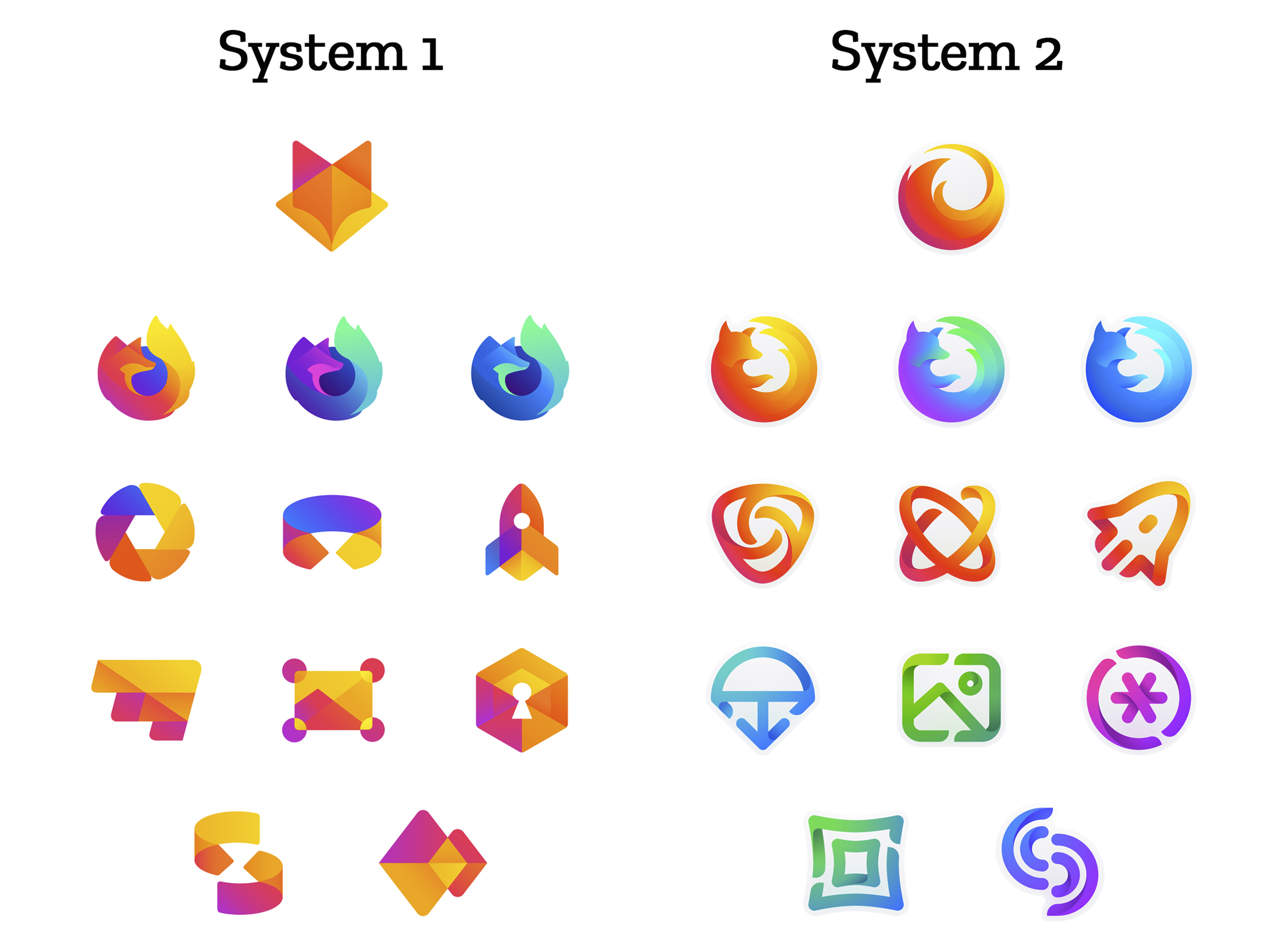
 

How this works.

For those who recall the Open Design process we used to craft our Mozilla brand identity, our approach here will feel familiar:

  • We are not crowdsourcing the answer.
  • There’ll be no voting.
  • No one is being asked to design anything for free.

Living by our open-source values of transparency and participation, we’re reaching out to our community to learn what people think. You can make your views known by commenting on this blog post below.

Extreme caveat: Although the products and projects are real, these design systems are still a work of fiction. Icons are not final. Each individual icon will undergo several rounds of refinement, or may change entirely, between now and their respective product launches. Our focus at this point is on the system.

We’ll be using these criteria to evaluate the work:

  • Do these two systems still feel like Firefox?
  • How visually cohesive is each of them? Does each hold together?
  • Can the design logic of these systems stretch to embrace new products in the future?
  • Do these systems reinforce the speed, safety, reliability, wit, and innovation that Firefox stands for?
  • Do these systems suggest our position as a tech company that puts people over profit?

All the details.

The brand architecture for both systems is made up of four levels.

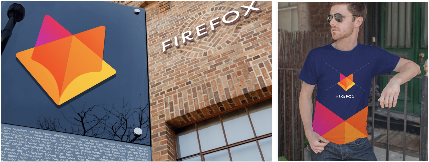
Each system leads with a new Firefox masterbrand icon — an umbrella under which our product lines will live.
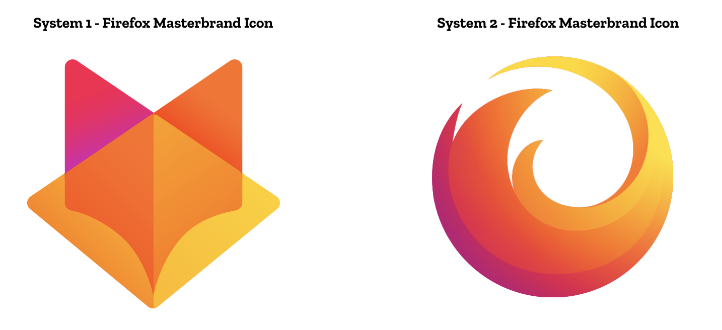
The masterbrand icon will show up in our marketing, at events, in co-branding with partners, and in places like the Google Play store where our products can be found. Who knows? Someday this icon may be what people think of when they hear the word “Firefox.”
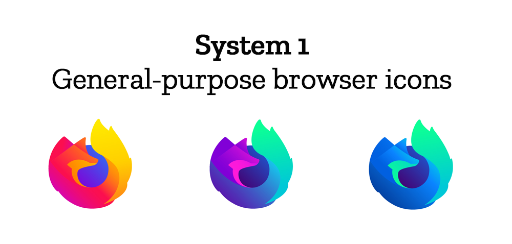
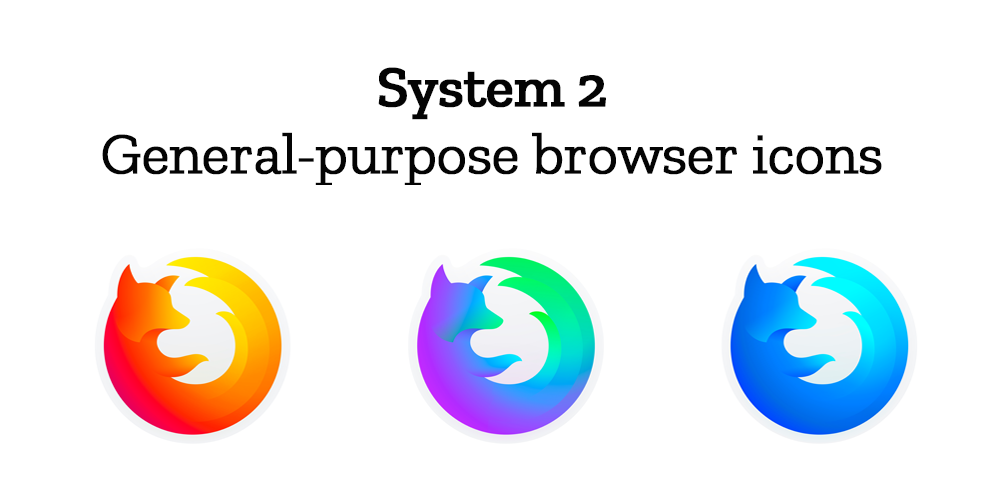
At the general-purpose browser level, we’re proposing to update our Firefox Quantum desktop icon. We continue to simplify and modernize this icon, and people who use Firefox tell us they love it. Firefox Developer Edition and Firefox Nightly are rendered as color variants of the Quantum icon.
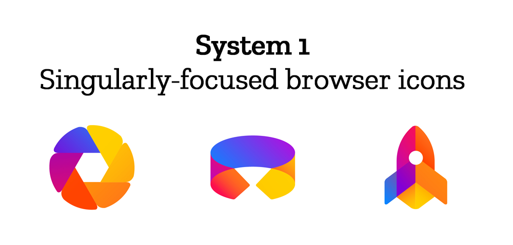
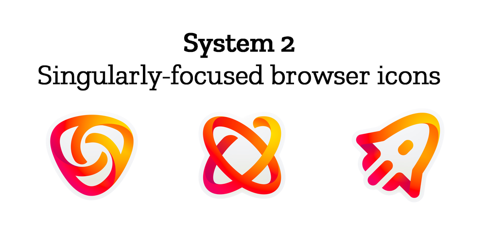
Browsers with a singular focus, such as our Firefox Reality browser for VR applications and our privacy-driven Firefox Focus mobile browser, share a common design approach for their icons. These are meant to relate most directly to the master brand as peers to the Firefox Quantum browser icon.

Finally, the icons for new applications and services signal the unique function of each product. Color and graphic treatment unite them and connect them to the master brand. Each icon shape is one of a kind, allowing people to distinguish among choices seen side by side on a screen.
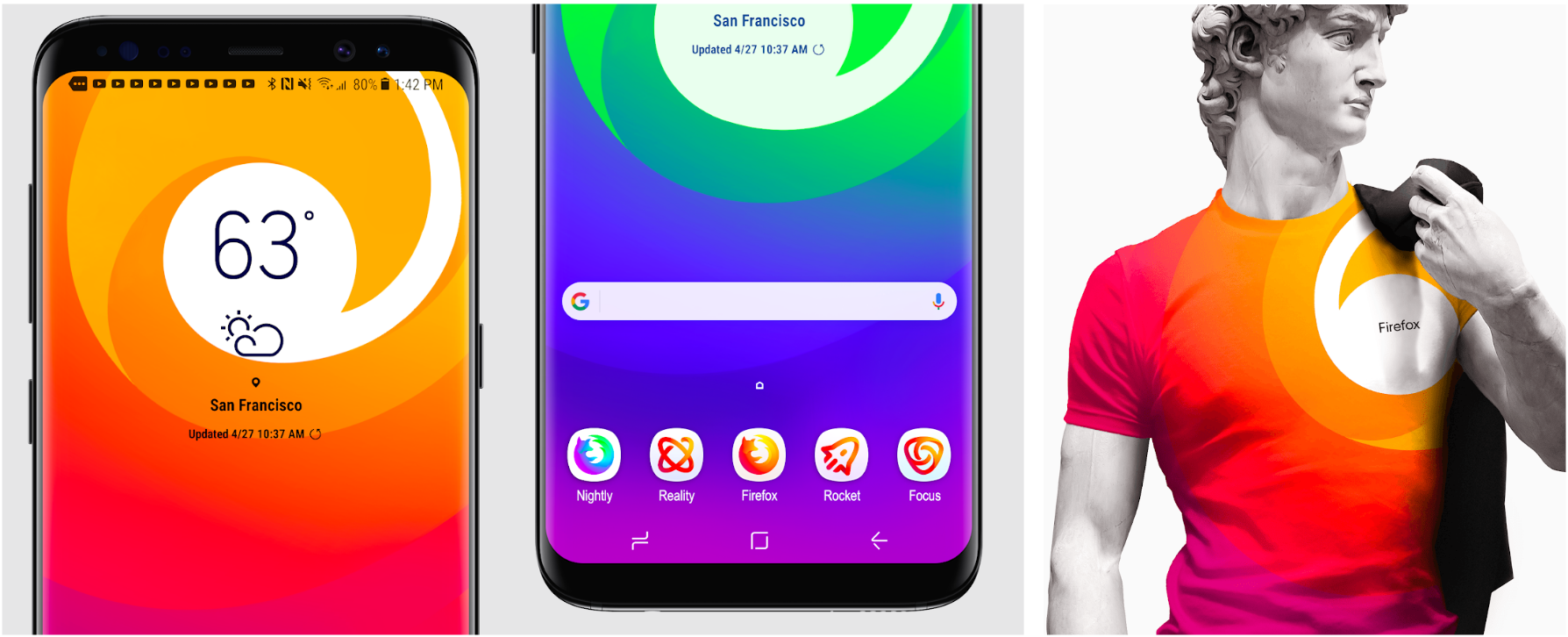
Still in the works are explorations of typography, graphic patterns, motion, naming, events, partnerships, and other elements of the system that, used together with consistency in the product, will form the total brand experience.

Read along as we refine our final system over the next few months. What we roll out will be based on the feedback we receive here, insights we’re gathering from formal user testing, and our product knowledge and design sensibilities.

With your input, we’ll have a final system that will make a Firefox product recognizable out in the world even if a fox is nowhere in sight. And we’ll deliver a consistent experience from an advertisement to a button on a web page. Thanks for joining us on this new journey.

Madhava Enros, Sr. Director, Firefox User Experience

Tim Murray, Creative Director, Mozilla

2,212 comments on “Evolving the Firefox Brand”

  1. Karen Florup wrote on

    I prefer system 1 overall since it keeps the fox identity for the main logo. The fox is lost on sysstem 2.

  2. Javier wrote on

    Sistem 1 with icons group 2

  3. Tom wrote on

    I’m totally happy with shapeless designs. The icons from System 1 are contemporary and great!

  4. Redoliver wrote on

    Love the masterbrand in system 1 but prefer all the other icons in system 2. You can’t really tell what they are in system 1.

  5. Trevin wrote on

    I personally really like system 1, the master logo just makes more sense to me.

  6. Greg B wrote on

    I much prefer System 2 icons

  7. Jesse wrote on

    I’d go with system 2.
    I like the evolution of the classic Firefox icon and I think it is still instantly recognizable. I agree with other and think system 1’s master brand logo is confusingly close to GitLab’s logo.

  8. Edgar Garcia wrote on

    I think System 1 is better than 2. The fox’s face is your logo guys, don’t lose that :)

  9. cesar daniel vega wrote on

    Yo Creo que para que firefox tenga mas usuarios el Logo es MUY IMPORTANTE!!!!! y estan Fallando en los Colores del Logo no en el lopgo en si. No son modernos (los colores) porque son los mismos de hacemucho tiempo y la mente lo asocia a algo no nuevo sino viejo El mismo firefox de sus comienzos porque dan aire viejo y no nuevo. Lo que esta fallando es esto porque he hecho preguntas a muchos usuarios y he preguntado una muy sencilla ¿que colores le pondrias a Mozilla Firefox en su Logo para que te llame a usarlo? y la respuesta basicamente mas relevantes fueron
    le pondrai colores mas Modernos y futuristas Como un estilo DARK oscuro, Negro con detalles anaranjados, o simplemente todo Negro Brillante con detalles en lila, Algo mas Futurista, en sintesis: ” Yo en mi Humilde Opinion” por lo que creo que va a llamar la atencion es cambiar de los Naranjs fuerted a logos donde prepondere mas los colores Dark, oscuros con algo de otro color que le de un Aire futurista.!!!”. Espero que tengan en Cuenta mi opinion. A la imagen que agregue le pondria mas Dark (la imagen es un simple ejemplo de lo que llama la atencion ) poro si quieren ma avisan y les por¡dria hacer un diseño mas como lo que pienso porque no tube de a¡hacer un ejemplo propio, esta que mande la tomé de internet. Gracias y un Saludo!!!

  10. Mariano wrote on

    System 1, without a doubt!

  11. Navharsh Kr wrote on

    System 2

  12. Beaver Fever wrote on

    can’t decide. I like both.

    The shape of the Firefox browser logo is better in System 2, but the colors are more vibrant in System 1.

    The rest of the icons in System 1 look very similar to each other and it’s difficult to tell them apart at the first nanosecond glance.

    In contrast, the rest of the icons in System 2 have more distinctiveness. Hmm… maybe I like System 2 more…

    I feel like a mash up of System 1 and 2 is in order!

  13. Damian wrote on

    System 1, becouse 2 looks like poor android icon pack, sorry :/

  14. Charles Koelsch wrote on

    System 1 is visually more appealing and cohesive throughout. It maintains a strong relationship between apps

  15. Toddo wrote on

    Definitely the System 2 Masterbrand Icon & the System 2 general purpose browser icons.

    I don’t really care for any designs from either System 1 or System 2 for the rest.

    Firefox Focus should continue to have a browser icon that looks like the general purpose browser icon. I have both Firefox & Firefox Focus on my phone, and use the browsers fairly interchangeably. Having Firefox Focus use a COMPLETELY different icon will be disruptive, and counterintuitive. As a consumer, I don’t think in terms of general purpose browser vs. singularly focused browser. A browser is a tool I use, and whether it’s Firefox, Firefox Beta, Firefox Nightly, or Firefox Focus, they all should have a similar brand logo.

  16. Magnus Högberg wrote on

    I prefer system 2, it looks lighter and cleaner.

  17. Guillermo Alvarez wrote on

    I’d pick Group 1.

    But if possible.
    Main Fox head logo, a mix of 3 browser logos; from group two.
    Other logos from group 2 look just too complicated, over worked. That’s why “Group 1” looks better, overall.

  18. Chad wrote on

    System 2 feels dated somehow. I much prefer system 1 overall. The only exception are the browser icons, where I prefer system 2.

    My only real criticism of system 1 is that the colors for the “new apps and services” are not diverse enough to really distinguish the products from one another because the shapes are all relatively similar.

  19. cesar daniel vega wrote on

    El System 1, Pero mas tonos Futuristas como el Negro de Fondo!!! es lo que he Preguntado y se quiere porque te llama a usarlo!!! mando imagen de ejemplo por los colores que me parecen mas Sobrios y no tan irritantes!

  20. George wrote on

    System #1 is like I see GitLab. Its confusing. So I reject the fox master-brand icon. I can’t really understand why you have to have two different icons one for master branding and one for browser? It should be one icon so I vote the browser icon of System #1 without the master branding icon. Let the fox with the tail be the master brand and browser icon at the same time. Don’t confuse people with many icons and logos.

  21. kusochi wrote on

    I believe there must be distinct silhouette and colour for each icon while still keeping the same look. This is the reason why I like the System 2. System 1 icons are stylish but in small resolution and in a hurry the icons might be too similar looking – especially the colours. For this ergonomical reason I prefer System 2 icons.

  22. Kate Roberts wrote on

    These are beautiful! Keep up the good work and let me know where I can get a teeshirt :)

  23. Zach Heise wrote on

    System 2 for your masterbrand (it immediately identifies Firefox as it has the same circular shape) but then System 1 for your Browser based icons, as it doesn’t lose the World in the middle of the Fox’s grasp. In general for the other ones, keeping with the warm red/orange/yellow tones as your theme should be key – moving to cool tones distracts from the brand.

  24. Pratik wrote on

    I prefer system 1 as all the icons are more symmetric to each other and gives a feeling of belonging to the same system family.

  25. Adam Stevens wrote on

    My gut reaction here is “yuk!” . I feel like someone is tinkering to satisfy an itch to design SOMETHING so someone can make their mark and/or justify their participation in a product. Rebrand exercises are high risk and must be targeted towards a specific goal in mind . The reasons given for the rebrand here are without solid logical justification by way of a comparative analysis. The mozilla team could just as well go on creating well designed cute animal icons (e.g. thunderbird, etc), and I don’t think it would make a material impact to the product perception.

    The team seems to just throw the justification out there as a quick preamble to excuse getting to the shiny sexy things they want to show people… but even these things arn’t anything more ambitious beyond iconography. A full design system (like google’s material design) has a fuller set of fleshed out areas that it gets applied.. I don’t see that addressed here.

    Additionally, from a business perspective, a rebrand potentially destroys what brand equity is built up with the old brand , and the new icons are either too abstract to usefully identify their purpose or too neon /toy like to look at and take seriously .

    With my general product management gripes out of the way, here are my specific criticisms of each set.

    System 1 suffers from an apparent abstract geometric lust akin to that displayed in video game art from quantum break or Deus Ex , without any clear purpose for that . Those styles typically are used as “sparkly visual effects”, but trying to make it the main course here fails in my opinion. Not to mention , the main brand looks suspiciously like gitlabs’ icon , confusingly. The icon set also suffers from a poor use of the color palette, all the icons look somewhat the same from a color perspective .

    System 2 is somewhat more thoughtful , but suffers, among other things, from a potential disaster of transparency , where it looks fine against white , but against any textured background would potentially look very jarring or disjoint. The designs are again too abstract for the average consumer , not making clear their purposes . The mail icon , for example , attempts to be skeuomorphic, but fails as a barely recognizable mail piece unless you look carefully .

    I could go on, but I’m not sure that there’s value in proceeding in this exercise.

  26. barbara Jean wrote on

    I much prefer System Two of the Firefox rebrand. The warm colors are great, and it has a more organic feel to it. The icons are more intuitive and easier to read on System Two as well.

    Thanks for listening
    Barbara Jean

  27. Kevin wrote on

    The System 1 Masterbrand icon is quite dated for 2018 and is too similar to other logos of startups and apps gone by. I much prefer the system two icons, the flat ribbon design of system 1 looks outdated now and will be ancient in a year.

  28. Brian wrote on

    I prefer system 1.

  29. HaaMed wrote on

    System 1

  30. Paul d’Aoust wrote on

    I prefer group 2 for sure — retains the existing Firefox branding that people are accustomed to, but makes it look fresh and exciting, showing that Mozilla aren’t stuck in the past.

    Am I the only one who thinks that the colour palette for the Firefox Dev channel icon looks an awful lot like the branding for https://holochain.org , whom Mozilla publicly hinted at a partnership with?

  31. Viswamurthy Pandarinathan wrote on

    Group 2 top one…i like that…

  32. Chris wrote on

    System 1 because it actually feels like a unified design scheme, and because it is a step forward instead of just an iteration of current designs.

  33. Francisco wrote on

    The current Firefox icon shows a fox with a fiery tail. Your new Masterbrand icons show a fox that is not on fire in System 1, and fire not on a fox in System 2. I really fail to see how this is an improvement. You have a fantastic icon and you’re considering a downgrade into minimalism for the sake of minimalism.

    If you insist on picking the lesser of two evils, I like System 1 more only because I like the calmer-looking fox’s profile more, plus the contrast between neck and face colors is much more appealing to me than the gradient from System 2

  34. Grant Dickinson wrote on

    I love the browser icons of the first one, but I don’t like the first logo…

  35. Cesar Sequeira wrote on

    System 1

  36. Adrian Byram wrote on

    I like the System 1 logos better. They seem more consistent in color and form.

    The System 2 logos — particularly those for the new apps — seem very hard to distinguish from each other. I find myself focusing on the lines in the logos, somehow thinking that they will convey information, whereas it is really the overall shape. The System 1 logos prevent this false belief by just presenting a solid form that has to be interpreted as a whole.

    (I’m speculating that we have learned to interpret lines within an icon as equivalent to strokes within a letter — and for letters it is the lines that convey the information.)

  37. Juan Cano wrote on

    System 2; better retain ‘fire’ over ‘fox’. Foxes are trendy now so the logo looks cool but in short time it will be out. Don’t mix system 1 with system 2, blasphemy.

  38. Chris Campbell wrote on

    I very much prefer System 1. More unified.

  39. Icenog wrote on

    I agree with others. Keep the iconic fox that is currently in use.

  40. anonymous wrote on

    Honestly, I like a mix of the two.

    The left most Firefox logo on the second row of #1 is iconic Firefox. You should keep those colors and put it on #2’s logo if you’re going to change up the logo.

    I don’t have any comments on the rest of your line as I don’t use anything other than Firefox now and then when I need to test something over Chrome. But that’s my opinion: Mix the two.

    Oh wait, I’d prefer the lock over the * icon. But yeah, combine the two and take the best from both and show that as option #3?

  41. Erik Usaj wrote on

    Do these two systems still feel like Firefox?
    No & Yes. Head and tail – yes.

    How visually cohesive is each of them?
    Colors seen okay. New products are not intuitive in meaning.
    Guideline “fil rouge” can be more present.

    Does each hold together?
    Yes. But can be improved. I like the concept of Fox’s head & tail.

    Can the design logic of these systems stretch to embrace new products in the future?
    Yes. But key elements need to be identified (colors, shape, style).

    Do these systems reinforce the speed, safety, reliability, wit, and innovation that Firefox stands for?
    For each culture concepts might differ. Speed = tail and fire could touch some common ground. Safety = colour, some shapes like lock/key.

    Do these systems suggest our position as a tech company that puts people over profit?
    Yes.

  42. Mustafa Kara wrote on

    Yıllardır iyi bir firefox kullanıcısı olarak şunları söylemeliyim. Tarayıcıda yapacağınız yenilikler bu gibi görsel şeylerle fazla meşgul olmamalı. Ama şunu demek istemiyorum. Hiç bir görsel yenilik getirmeyin. Getireceğiniz yenilikler tarayıcının performansı, stabil çalışması, kaynak kullanımı vb. yönlerde olmalı. logo gibi bir yeniliğin firefox’un ruhuna uymadığını düşünüyorum. Ve şunu söylemeliyim. Firefox Quantum projesi ile logoyu değiştirdiniz. ve bunu gerçekten beğenmedim. Beğenmemem logonun rengi, şekli veya başka bir şeyi ile ilgili değil. Tarayıcının özünden kopması, ilk günkü heyecanını kaybetmesi olarak yorumluyorum.Ben kendi fikrimce böyle bir yeniliğe gidilmemesi gerektiğini düşünüyorum. Ve benim gibi bir çok firefox kullanıcısınında bu şekilde düşündüğünü tahmin ediyorum. Yapacağınız bir ankette göreceksinizki benim gibi düşünen insanlar var.

  43. Branislav Banik wrote on

    1

  44. Hernan Daniel Merolla wrote on

    Do not change it, so it’s perfect

  45. Mustafa Kara wrote on

    For years I have to say this as a good Firefox user. Innovations in the browser should not be too busy with such visuals. But I do not mean that. Do not bring any visual innovation. The innovations you will bring are browser performance, stability work, resource usage, etc. It must be in the directions. I think that your innovation like logo does not fit the spirit of firefox. And I have to say that. You changed the log with the Firefox Quantum project. and I really do not like it. I do not like the logon color, shape or something else. I think of the browser as a loss of the essence, the loss of the excitement of the first day. I think that in my opinion, such an innovation should not be done. And I guess many firefox users like me think this way. You’ll see in a poll you have people who think like me.

  46. Giblets wrote on

    @mozilla you could redesign the Firefox logo, or you could spend money and effort on “promoting exclusively free software and open standards”.
    I see your new notes app for Android. Any chance of privacy respecting contacts and calendar apps and backend?
    Perhaps you could work with https://solid.mit.edu/ ?

  47. Mustafa kara wrote on

    For years I have to say this as a good Firefox user. Innovations in the browser should not be too busy with such visuals. But I do not mean that. Do not bring any visual innovation. The innovations you will bring are browser performance, stability work, resource usage, etc. It must be in the directions. I think that your innovation like logo does not fit the spirit of firefox. And I have to say that. You changed the log with the Firefox Quantum project. and I really do not like it. I do not like the logon color, shape or something else. I think of the browser as a loss of the essence, the loss of the excitement of the first day. I think that in my opinion, such an innovation should not be done. And I guess many firefox users like me think this way. You’ll see in a poll you have people who think like me.

  48. Christine Magnarelli wrote on

    LOVE system 1 with the fox look. I see so many references to web within it – a play icon (arrows), location icon, download type arrow, 3D diamond shape of webpages/files etc.

    And the colors are perfect!

  49. Brenden wrote on

    Thanks for letting people chime in on this design process! I loved reading about the development of your new identity and subsequently everyone’s feedback so far.

    My overall sentiment is that System 1 is better, except for the browser icons. System 1’s browser icons feel extremely wonky to me, almost like they’re unrefined sketches. I like the cleaner shapes and lines of System 2’s browser icons, and I think they could be incorporated into System 1 with some revisions.

    System 1’s masterbrand icon is nice; I easily understood the fox imagery, and I think it is an appropriately modern update. I don’t think it is as similar to GitLab’s logo as some are saying here; if some of the blue/purple from the other System 1 icons was brought in, that could perhaps help bring it further away from looking like GitLab.

    I will add that I like System 2’s masterbrand icon on a stylistic level—I’m a sucker for a nice swoosh, and it looks great on the shirt—but I think, for what its purpose is, it is lacking the identifiable specificity that System 1’s masterbrand has. And as some have said, System 2’s icons (besides the browser icons) feel slightly cheap, and the details could be lost when diminished in size.

    Best of luck to you with this rebrand!

  50. PhiliThunder wrote on

    Go for System 1. Looks really nice and professional. Maybe the general Browser icons from System 2.

More comments: 1 14 15 16 17 18 41