This article originally appeared on the AMO blog.
AMO is the central hub for developers to distribute their add-ons, and for users to discover them. It’s a workhorse of a site, serving as a publishing platform, online community, and marketplace where over 1 million add-ons are downloaded each month.
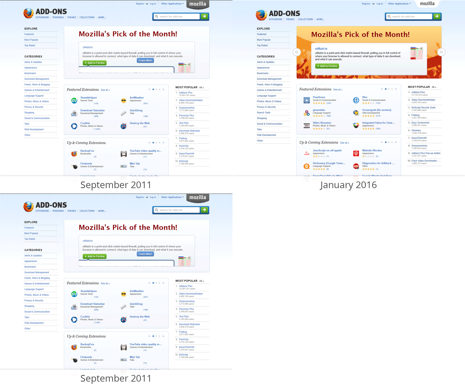
The current design has been in place since September 2011, with only minor design changes since. We’ve begun overhauling the entire site to modernize it and make it more reliable, but in the meantime we’ve done a quick visual refresh to bridge the gap until we finish the transformation.
The following design is scheduled to debut in Firefox 48, and will remain in place until the larger overhaul is complete:
We started this project by tweaking the existing CSS using the Firefox Page Inspector. This is quite easy and got us visible results for every adjustment we made. Every change we liked was then recorded in a userstyle using Stylish. Adapting style-elements from the Firefox for iOS website, this resulted in AMO looking more modern within hours.
This is the first of many improvements that we will bring to the user experience of the add-on ecosystem. Many of them will take some time to be created and implemented, but they will all have a strong focus on its users—both the developers of add-ons and the people using them.
For a preview of the new look, you can install this userstyle.


Michal Fridrich wrote on
Markus Jaritz wrote on