How we collaborated on a major redesign to clean up debt and refresh the product.
Introducing the redesigned Firefox browser, featuring the Alpenglow them
We just launched a major redesign of the Firefox desktop browser to 240 million users. The effort was so large that we put our full content design team — all two of us — on the case. Over the course of the project, we updated nearly 1,000 strings, re-architected our menus, standardized content patterns, established new principles, and cleaned up content debt.
Creating and testing language to inform visual direction
The primary goal of the redesign was to make Firefox feel modern. We needed to concretize that term to guide the design and content decisions, as well as to make the measurement of visual aesthetics more objective and actionable.
To do this, we used the Microsoft Desirability Toolkit, which measures people’s attitudes towards a UI with a controlled vocabulary test. Content design worked with our UX director to identify adjectives that could embody what “modern” meant for our product. The UX team used those words for early visual explorations, which we then tested in a qualitative usertesting.com study.
Based on the results, we had an early idea of where the designs were meeting goals and where we could make adjustments.
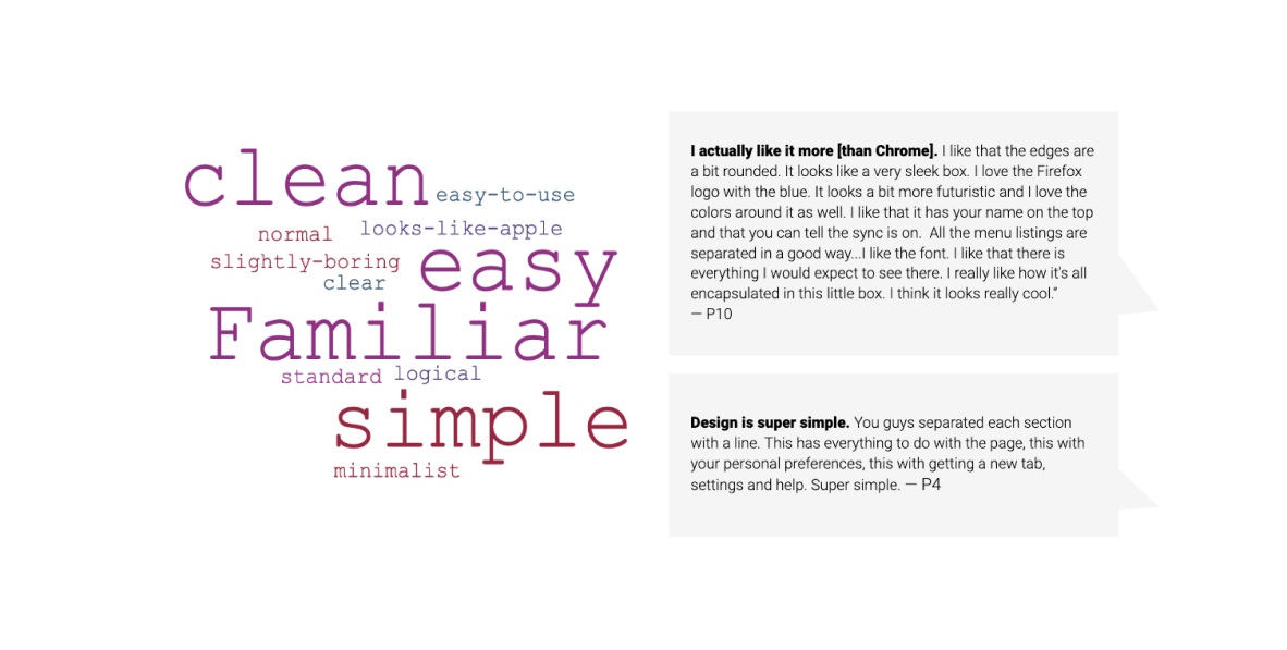
Sampling of qualitative feedback from the visual appeal test with word cloud and participant comments.
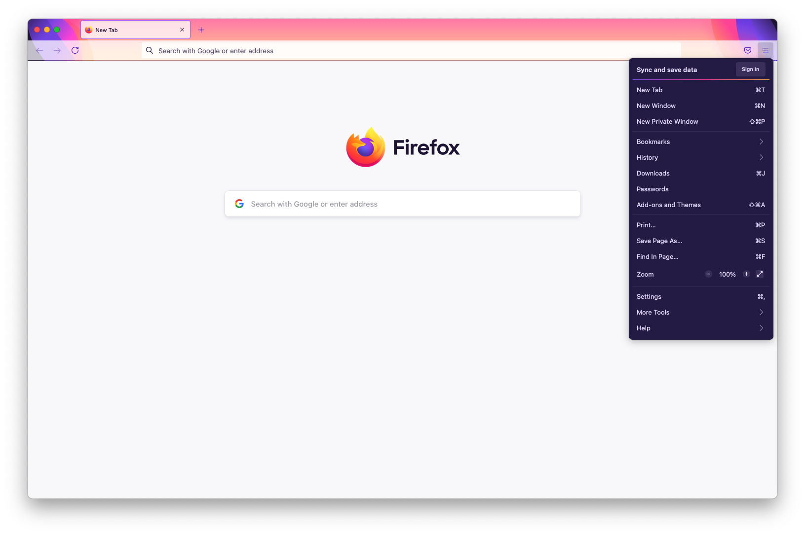
Improving way-finding in menus
Over time, our application menu had grown unwieldy. Sub-menus proliferated like dandelions. It was difficult to scan, resulting in high cognitive load. Grouping of items were not intuitive. By re-organizing the items, prioritizing high-value actions, using clear language, and removing icons, the new menu better supports people’s ability to move quickly and efficiently in the Firefox browser.
To finalize the menu’s information architecture, we leveraged a variety of inputs. We studied usage data, reviewed past user research, and referenced external sources like the Nielsen Norman Group for menu design best practices. We also consulted with product managers to understand the historical context of prior decisions.
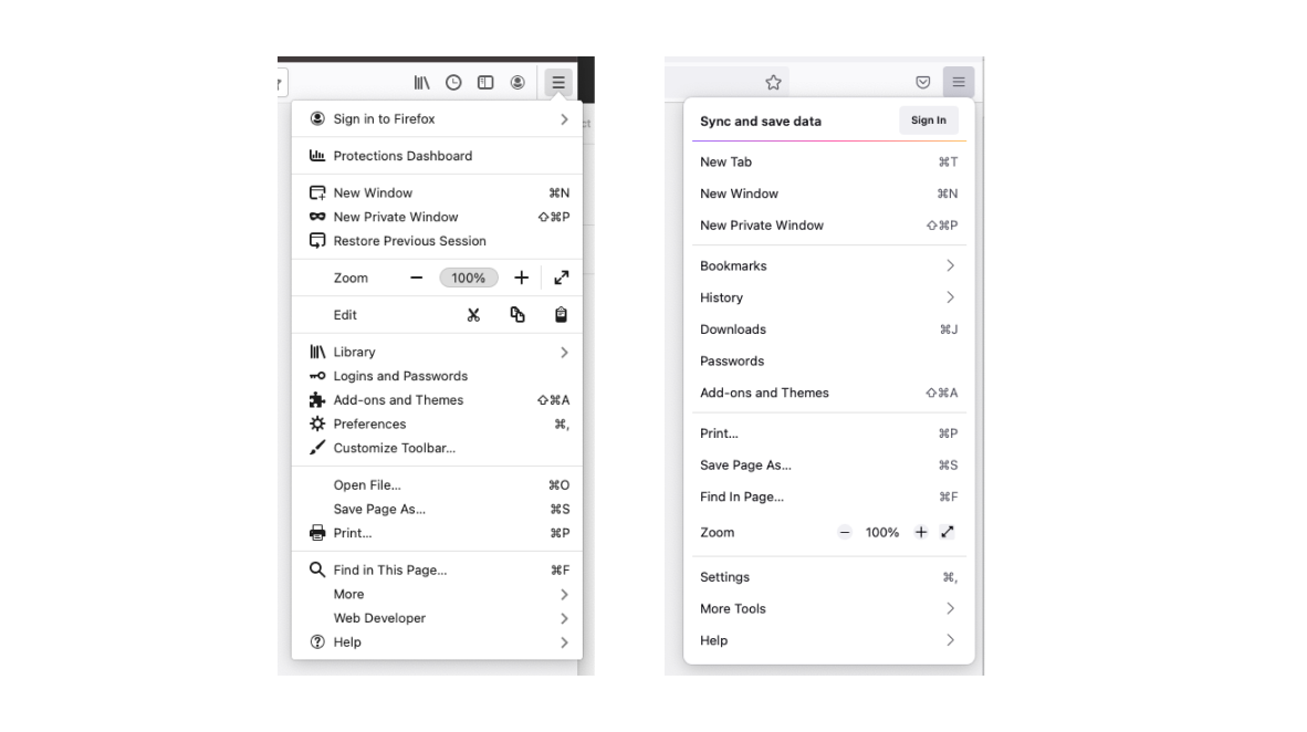
The Firefox application menu, before and after the information architecture redesign.
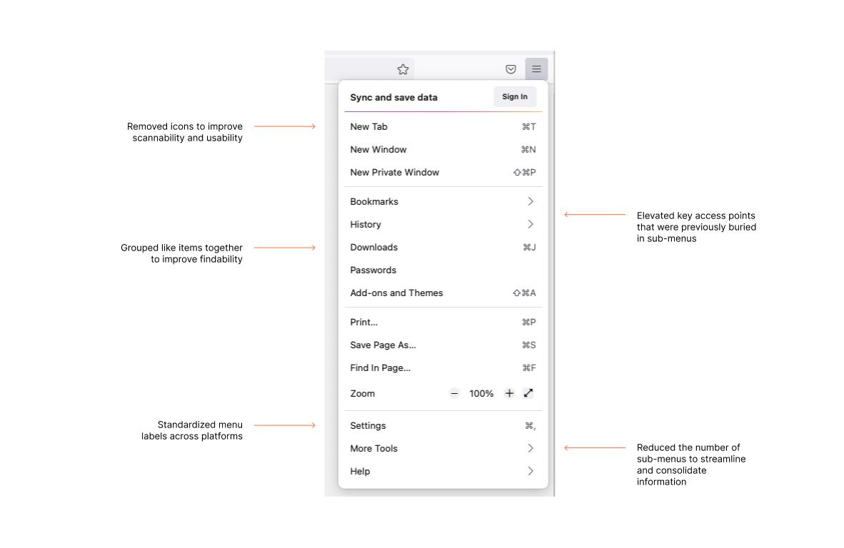
Changes made to the Firefox application menu include removing icons, grouping like items together, and reducing the number of sub-menus.
As a final step, we created principles to document the rationale behind the menu redesign so a consistent approach could be applied to other menu-related decisions across the product and platforms.
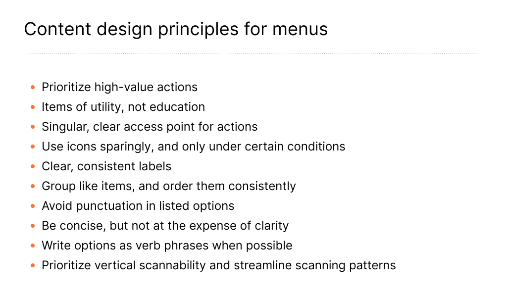
Content design developed these principles to help establish a consistent approach for other menus in the product.
Streamlining high-visibility messages
Firefox surfaces a number of messages to users while they use the product. Those messages had dated visuals, inconsistent presentation, and clunky copy.
We partnered with our UX and visual designers to redesign those message types using a content-first approach. By approaching the redesign this way, we better ensured the resulting components supported the message needs. Along the way, we were able to make some improvements to the existing copy and establish guidelines so future modals, infobars, and panels would be higher quality.
Cleaning up paper cuts in modal dialogues
A modal sits on top of the main content of a webpage. It’s a highly intrusive message that disables background content and requires user interaction. By redesigning it we made one of the most interruptive browsing moments smoother and more cohesive.
Before and after images of a redesigned Firefox modal dialog. Content decisions are highlighted.
Annotated example of the content decisions in a redesigned Firefox modal dialog.
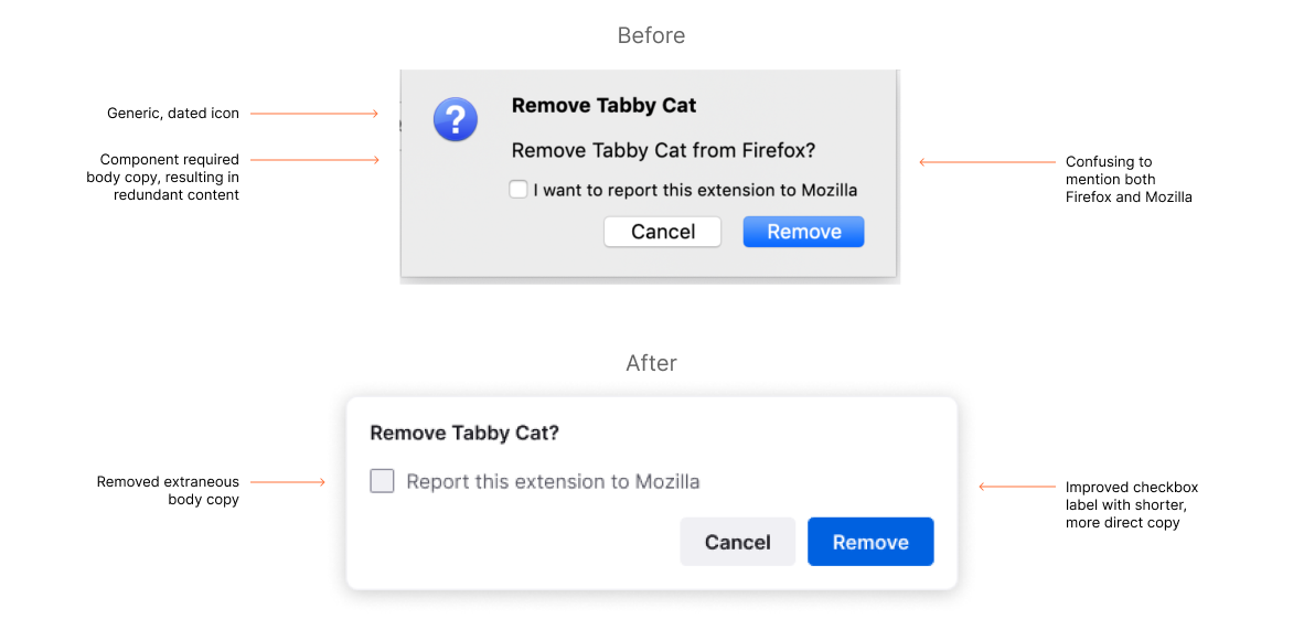
Annotated example of the content decisions in a redesigned Firefox modal dialog
Defining new content patterns for permissions panels
Permissions panels get triggered when you visit certain websites. For example, a website may request to send you notifications, know your location, or gain access to your camera and microphone. We addressed inconsistencies and standardized content patterns to reduce visual clutter. The redesigned panels are cleaner and more concise.
Before and after images of a redesigned Firefox permissions panel. Content decisions are highlighted.
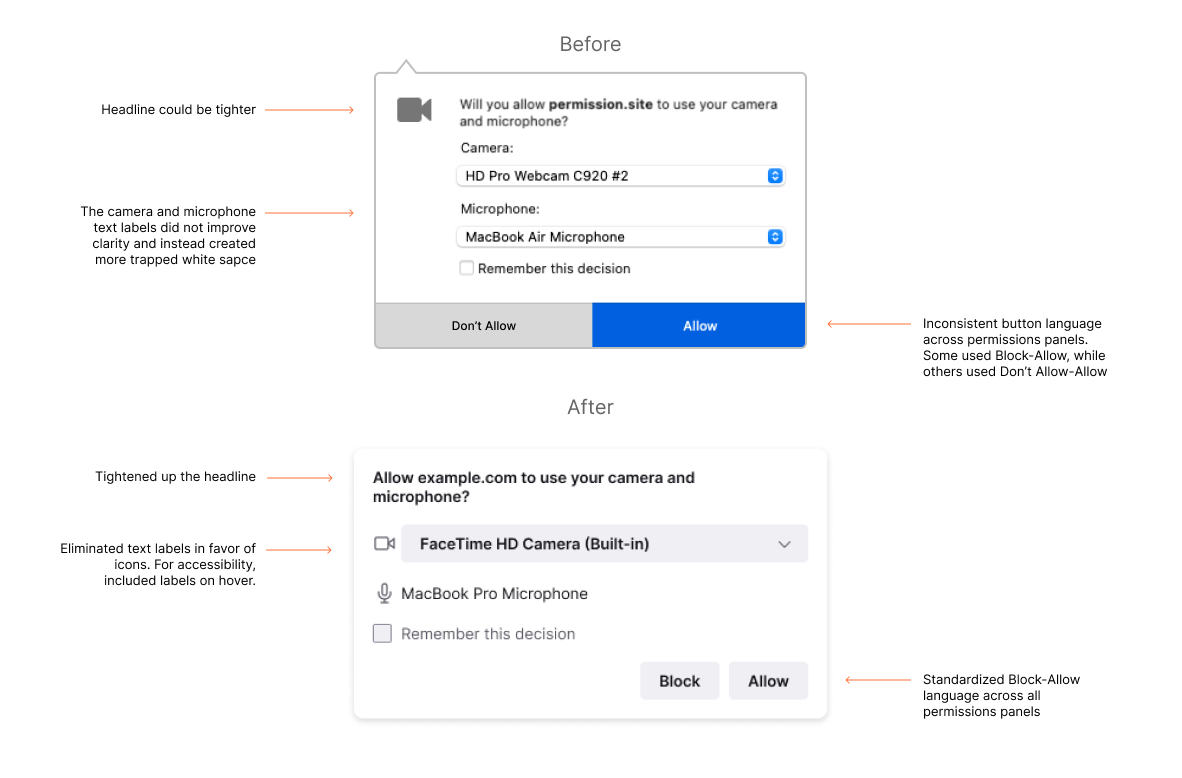
Annotated example of the content decisions in a redesigned Firefox permissions panel.
Closing thoughts
This major refresh appears simple and somewhat effortless, which was the goal. A large amount of work happened behind the scenes to make that end result possible — a whole lot of auditing, iteration, communication, collaboration, and reviews. As usual, the lion’s share of content design happened before we put ‘pen to paper.’
Like any major renovation project, we navigated big dreams, challenging constraints, tough compromises, and a whole lot of dust. Software is never ‘done,’ but we cleared significant content weeds and co-created a future-forward design experience.
As anyone who has contributed to a major redesign knows, this involved months of collaboration between our user experience team, engineers, and product managers, as well as our partners in localization, accessibility, and quality assurance. We were fortunate to work with such a smart, hard-working group.
This post was originally published on Medium.