Product teams working on Firefox at Mozilla have long been interested in helping people get things done, whether that’s completing homework for school, shopping for a pair of shoes, or doing one’s taxes. We are deeply invested in how we can support task continuity, the various steps that people take in getting things done, in our browser products. And we know that in our browsers, tabs play an important role for people carrying out tasks.
Task continuity model
In 2015, Firefox researchers Gemma Petrie and Bill Selman developed a model to explain different types of task continuity strategies, which are represented in the middle of the diagram below.
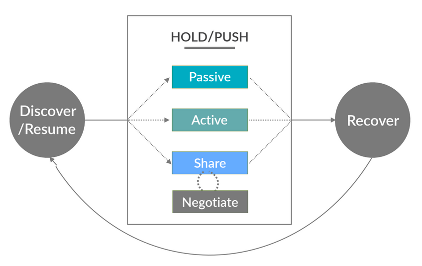
Passive strategies include behaviors like leaving a tab open, such as a page for a product that one is considering purchasing. Active strategies include actions like emailing a link, for example a link to a recipe to cook at a later time, to oneself. Share strategies might involve using social media to share content, such as a news article, with other people.
Fast forward to this year and the team working on Firefox for iOS was interested in how we might support task continuity involving leaving tabs open. We continued to see in user research the important role that tabs play in task continuity, and we wanted to explore how to make tab retrieval and overall tab management easier.
In most web browsers on smartphones, tabs are ordered based on when a person first opened them, with the oldest tabs on one end of the interface (top, bottom, left, or right) and the newest tabs stacking to the opposite end of the interface. This ordering logic gets more complex if a new tab is prompted to open when someone taps on a link in an existing tab. A site may be designed to launch links in new tabs or a person may choose to open new tabs for links. The new tab, in that case, typically will open immediately next to the tab where the link was tapped, pushing all other later tabs toward the other end of the interface. All of this gets even trickier when managing more than just a few tabs. This brief demonstration illustrates tab ordering logic in Firefox for iOS before chronological tabs using the example of someone shopping for a food processor.
Based on a trove of user research, the iOS team raised the following question:
Would ordering tabs chronologically in Firefox for iOS make it easier for people to stay organized and feel more in control of their tabs?
The team conducted user research, led by Elisabeth Klann, in April of this year to understand current tab behaviors and to evaluate a basic prototype of the concept of chronological tabs.
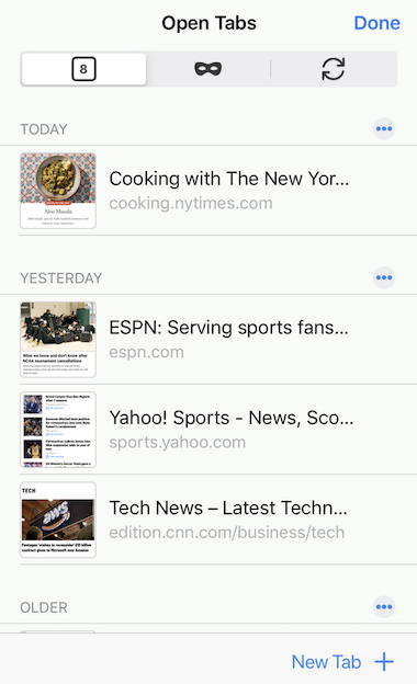
A screenshot of the prototype used for the concept evaluation in April 2020, showing a fictional set of open tabs in Firefox for iOS
We recruited 10 adult participants in the US, half of whom were already using Firefox for iOS and half of whom used either Safari or Chrome as their main browser on their iPhone.
What we learned from the first round of user research
From asking participants about their existing behaviors with browser tabs on their phones, the Firefox for iOS team was pleasantly surprised to hear participants describe the order of their tabs in terms of time. Participants fell into three categories in terms of their tab habits:
- “I keep it clean” when the participant generally tried to avoid clutter and closed individual tabs often
- “I keep forgetting” when the participant was not conscious of accumulating tabs and typically closed tabs in batches when the experience became cumbersome
- “I keep tabs open for reference…short term” when the participant was more strategic in leaving tabs open for a few sessions until a task was complete
All participants were able to discern the chronological ordering of tabs in the prototype and reported that the ordering was helpful, particularly the chronological ordering of the most recent tabs. It was important to participants that they be able to delete single tabs and batches of tabs, and we identified an opportunity for making batch deletion more discoverable in the UI. Following this round of user research, the team made numerous changes to the tab design, led by Nicole Weber, which were incorporated into a beta build of Firefox for iOS.
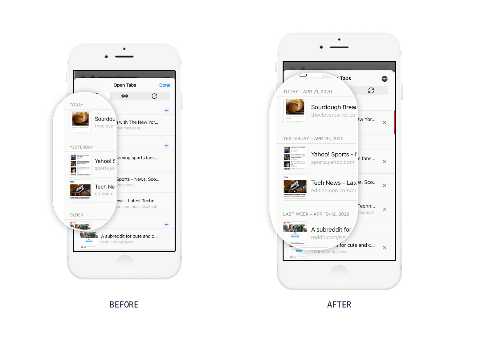
One change made after the concept evaluation was to attach dates to the “Today” and “Yesterday” categories of open tabs and to change the “Older” label to the more specific “Last Week.”
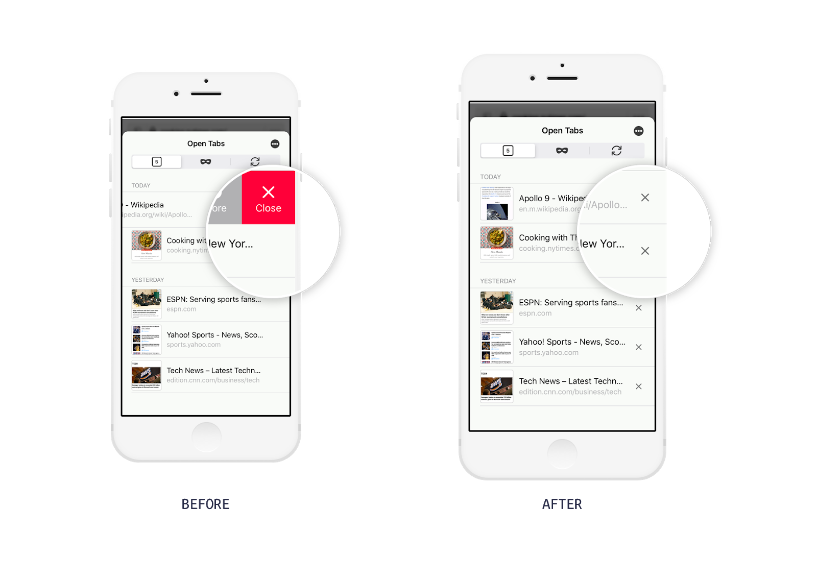
Another change made after the concept evaluation was to make the functionality for deleting a tab easier to access.
Continuing to learn with a beta build in a diary study
With the beta build, an early version of Firefox for iOS with chronological tabs and only available to research participants, the Mozilla team wanted to do another round of user research to understand the perceptions and utility of chronological tabs, this time in the real-world context with participants using their own devices rather than the pre-designed tabs of a prototype. We recruited 10 new participants, adults in Canada and the US and again a mix of people already using Firefox on their iPhones and people using other browsers.
Participants used the beta build of Firefox for iOS with chronological tabs as their primary iPhone browser for three days and answered a brief survey at the end of each of those days about their experience moving between web pages and of Firefox overall. Survey questions included:
- Did you use Firefox Beta to visit more than one web page today?
- Thinking about when you moved between tabs you were using today, was there anything particularly easy, difficult, and/or confusing about that?
- Did you revisit any tabs from yesterday or before yesterday? If so, can you please describe what you were doing and what it was like to revisit that older tab?
After three days, we interviewed participants to discuss their survey responses and overall experience with chronological tabs.
From the second round of user research, we learned that while the chronological order of tabs did not seem to break any workflows, it was the overall design of the tabs themselves — the thumbnail image, page title and/or URL, and date stamp in a list-like format — that made tabs more helpful than existing designs such as the undated, untitled, deck-like tabs in Safari on iPhone. One participant explained that the formatting of the tabs reminded her of tasks she wanted to complete. She said:
“So is it was this layout that kind of nudged me because I was going back to a page. And I was like, oh yeah, I went to that one, too. That’s right. And then I went back and did that task.”
Another participant also said, in going back to the view of all of his open tabs with the small images, he remembered the shoes he was shopping for the day before and his desire to return to that shopping. He returned to the tab with the shoes during our interview.
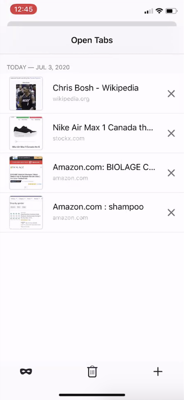
Participant C1’s open tabs in Firefox Beta, including a tab with a thumbnail of a shoe
There were instances, however, when the proposed design broke. A bug rendered some tabs unintelligible due to thumbnail images not populating. Also, several participants used enlarged text on their devices, a setting we did not anticipate that resulted in truncated tab titles and URLs. Participants for whom thumbnails were not populating and tab titles were truncated had a particularly difficult time discerning tabs. We also identified an opportunity, which we know is also an opportunity in the desktop browser, to make tabs more discernible in situations when a person has multiple tabs that look similar, particularly at thumbnail scale, like several Amazon pages or pages from different retailers all for the same product.
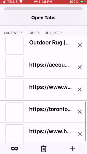
Participant C3’s open tabs in Firefox Beta with blank thumbnail images and truncated tab titles and URLs
While we are actively working on fixing the bug related to the thumbnail images, it was nevertheless helpful to learn about situations where the design fell short — the key takeaway being that the different parts of the design, the date stamps, the thumbnail image, the page title, and the URL work in concert to help people remember pages they have visited and the context for those visits.
Next: Setting out to understand if iOS findings carry over to other platforms
The team, led by Ashley Thomas, plans to continue work on chronological tabs, such as investigating how we can make tab meta data populate more reliably and planning user research to evaluate the proposed design on Android, tablets, and desktop. Some of the questions the team is excited to pursue in coming weeks include:
- Are there ways to improve further the accessibility of the proposed design?
- Will complex workflows common to larger form factors help us uncover new insights about chronological tabs?
- Is tab functionality most helpful when it is the same across platforms or might platform-specific designs better support task continuity?
- Are there other ways of sorting tabs that would support people’s workflows?
Thank you to the Firefox for iOS team and the many Mozillians, including people outside of the iOS team, who reviewed and provided valuable feedback on an early draft of this post.
Originally published on medium.com