Evolving the Firefox Brand

Say “Firefox” and most people think of a web browser on their laptop or phone, period. TL;DR, there’s more to the story now, and our branding needs to evolve.

With the rapid evolution of the internet, people need new tools to make the most of it. So Firefox is creating new types of browsers and a range of new apps and services with the internet as the platform. From easy screen-shotting and file sharing to innovative ways to access the internet using voice and virtual reality, these tools will help people be more efficient, safer, and in control of their time online. Firefox is where purpose meets performance.

Firefox Quantum Browser Icon

As an icon, that fast fox with a flaming tail doesn’t offer enough design tools to represent this entire product family. Recoloring that logo or dissecting the fox could only take us so far. We needed to start from a new place.

A team made up of product and brand designers at Mozilla has begun imagining a new system to embrace all of the Firefox products in the pipeline and those still in the minds of our Emerging Technologies group. Working across traditional silos, we’re designing a system that can guide people smoothly from our marketing to our in-product experiences.

Today, we’re sharing our two design system approaches to ask for your feedback.
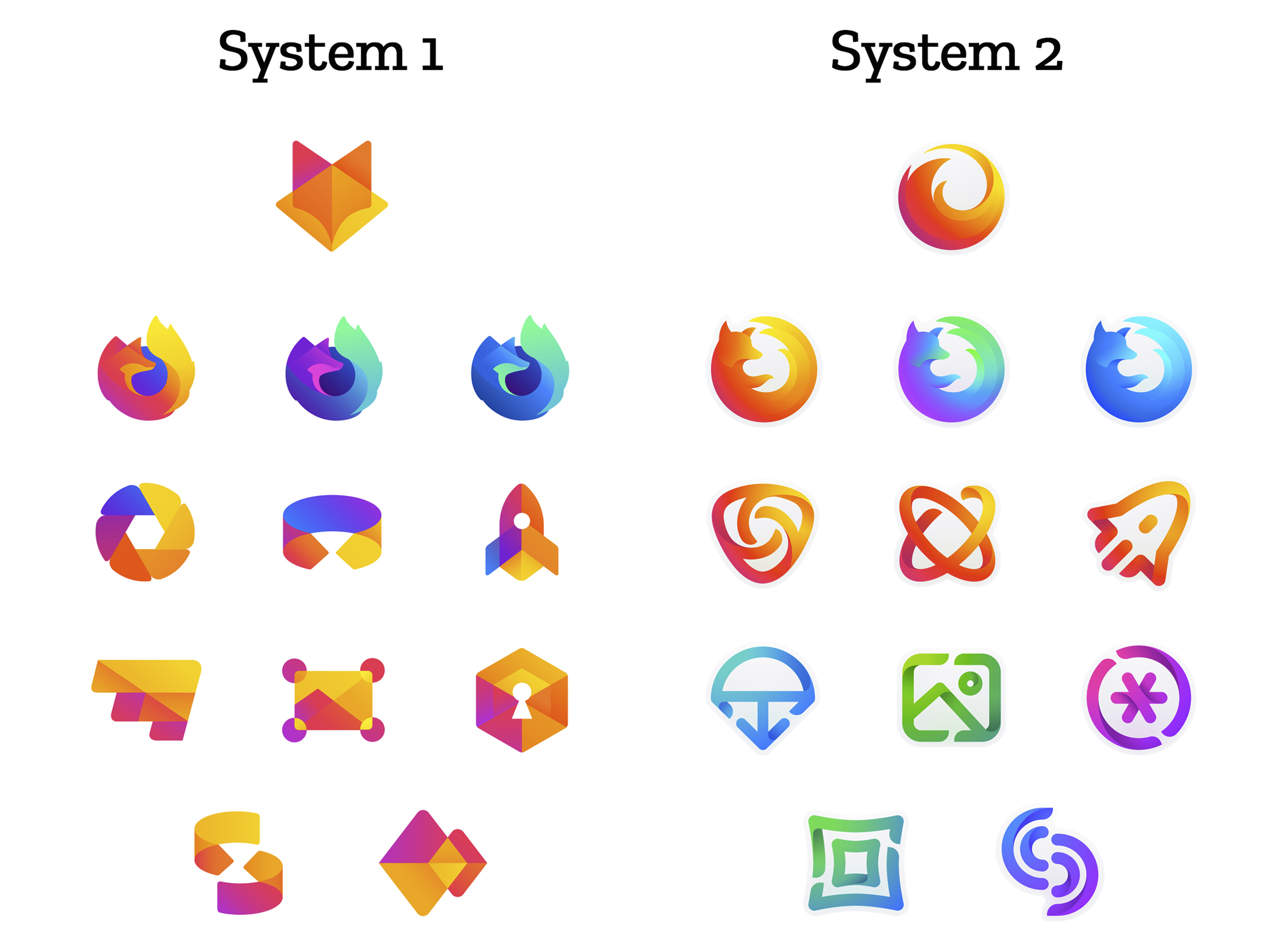
 

How this works.

For those who recall the Open Design process we used to craft our Mozilla brand identity, our approach here will feel familiar:

  • We are not crowdsourcing the answer.
  • There’ll be no voting.
  • No one is being asked to design anything for free.

Living by our open-source values of transparency and participation, we’re reaching out to our community to learn what people think. You can make your views known by commenting on this blog post below.

Extreme caveat: Although the products and projects are real, these design systems are still a work of fiction. Icons are not final. Each individual icon will undergo several rounds of refinement, or may change entirely, between now and their respective product launches. Our focus at this point is on the system.

We’ll be using these criteria to evaluate the work:

  • Do these two systems still feel like Firefox?
  • How visually cohesive is each of them? Does each hold together?
  • Can the design logic of these systems stretch to embrace new products in the future?
  • Do these systems reinforce the speed, safety, reliability, wit, and innovation that Firefox stands for?
  • Do these systems suggest our position as a tech company that puts people over profit?

All the details.

The brand architecture for both systems is made up of four levels.

Each system leads with a new Firefox masterbrand icon — an umbrella under which our product lines will live.
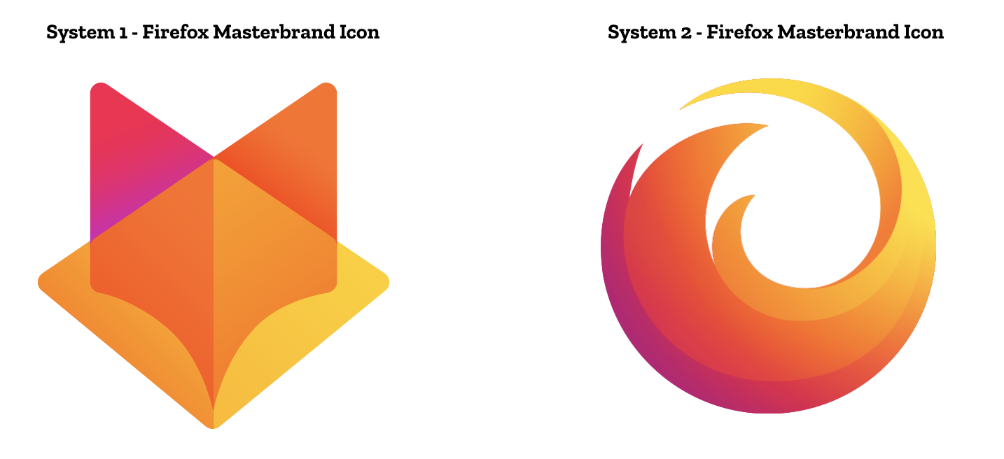
The masterbrand icon will show up in our marketing, at events, in co-branding with partners, and in places like the Google Play store where our products can be found. Who knows? Someday this icon may be what people think of when they hear the word “Firefox.”
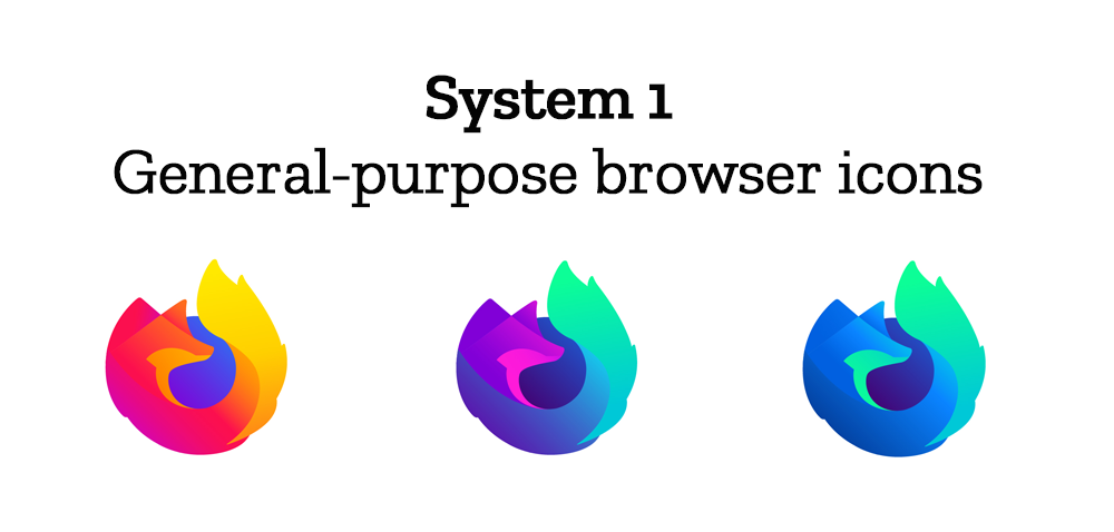
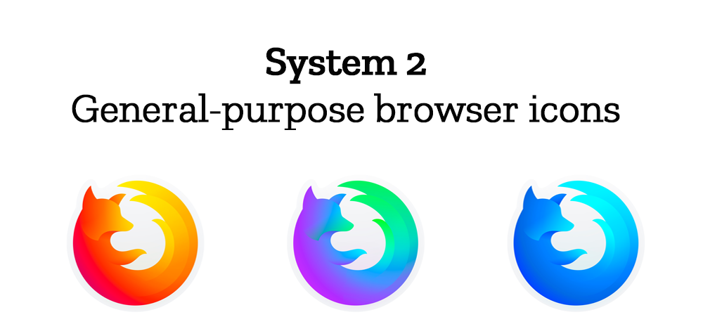
At the general-purpose browser level, we’re proposing to update our Firefox Quantum desktop icon. We continue to simplify and modernize this icon, and people who use Firefox tell us they love it. Firefox Developer Edition and Firefox Nightly are rendered as color variants of the Quantum icon.
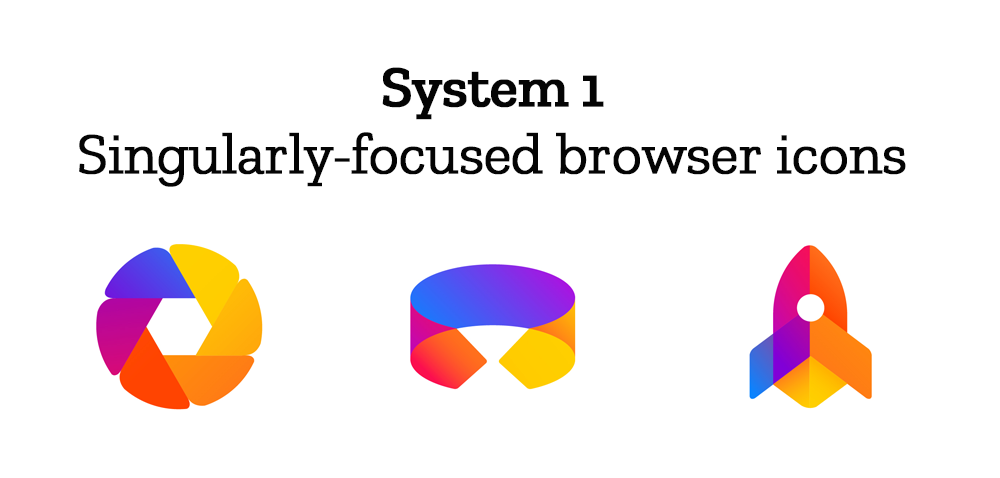
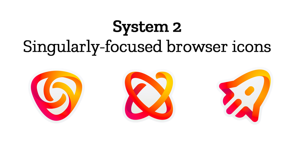
Browsers with a singular focus, such as our Firefox Reality browser for VR applications and our privacy-driven Firefox Focus mobile browser, share a common design approach for their icons. These are meant to relate most directly to the master brand as peers to the Firefox Quantum browser icon.
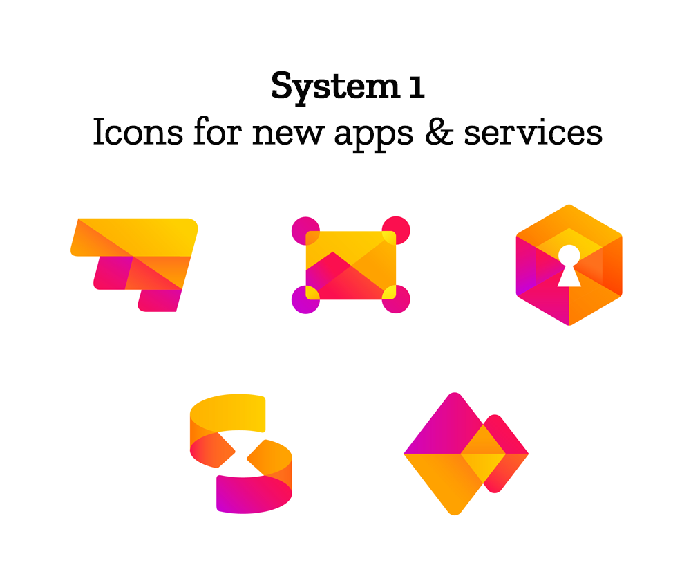
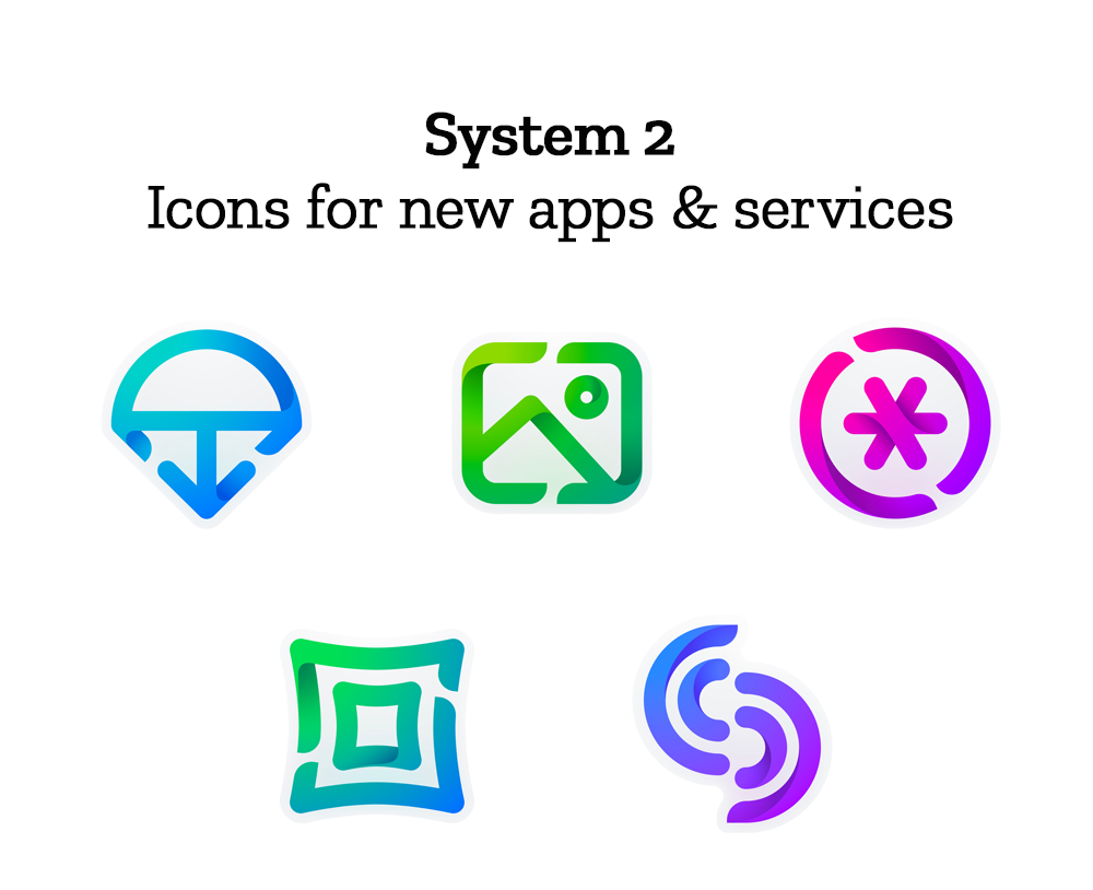
Finally, the icons for new applications and services signal the unique function of each product. Color and graphic treatment unite them and connect them to the master brand. Each icon shape is one of a kind, allowing people to distinguish among choices seen side by side on a screen.
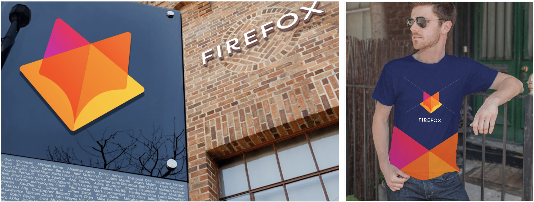
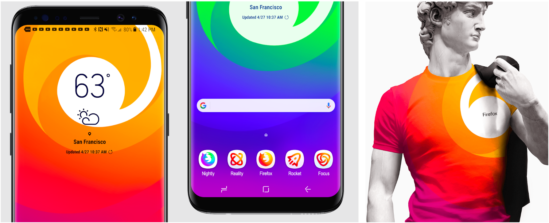
Still in the works are explorations of typography, graphic patterns, motion, naming, events, partnerships, and other elements of the system that, used together with consistency in the product, will form the total brand experience.

Read along as we refine our final system over the next few months. What we roll out will be based on the feedback we receive here, insights we’re gathering from formal user testing, and our product knowledge and design sensibilities.

With your input, we’ll have a final system that will make a Firefox product recognizable out in the world even if a fox is nowhere in sight. And we’ll deliver a consistent experience from an advertisement to a button on a web page. Thanks for joining us on this new journey.

Madhava Enros, Sr. Director, Firefox User Experience

Tim Murray, Creative Director, Mozilla

2,212 comments on “Evolving the Firefox Brand”

  1. Peoria Design Co wrote on

    I believe system 2 is the best fit . However the “icons for new apps and services” feels off. I believe they are too complex and don’t match the rest of the system 2

  2. Ralph wrote on

    Yeah…. not so much.

    I’m sorry, and I know I’m going to ‘get it’ for even suggesting this, but the thing is: none of these work.

    None of these say “Mozilla” to me. None of these say “Firefox” either — or anything fox-related for that matter.

    Going from there, we might as well drop the names ‘mozilla’ and ‘Firefox’ and go with something else, rather than trying to rebrand (and rebrand, and rebrand again after every few years).

    That’s not Mozilla, that’s not Firefox, that’s not a stable image and therefore nobody not a Chrome aficionado should want or need. (And even THEY still stick with a very close approximation of their very first icon!)

    So… yeah. It’s not like I can’t see the problem as outlined in this blog post. It’s not like I can’t understand how one might approach this by re-designing. I can even understand trying to distance oneself from one’s own past (deliberately or not) by, say, redesigning everything.

    But, and this is just my personal opinion on this particular matter: if it doesn’t *appear* to be a Fox, then it won’t be *recognizable* as a Fox and we might as well switch to Iceweasel instead.

    It shouldn’t be that hard to wrap some canine or other around something globe-ish or other using some arbitrary color scheme.

    Instead of people then wondering what the hey *those* funny icons are supposed to be doing there — and never once even clicking/tapping on them because ‘don’t-know-so-don’t-open’ they would instead be greeted with familiarity and would, without hesitation, continue to use Mozilla software in whatever form it might take on whatever platform.

  3. Michael wrote on

    No, and No.

  4. Hem wrote on

    I’ll go with System 2, as this show me more relevant and contextual story with the brand name.

  5. Jessman5 wrote on

    I like the System 1 fox and the other icons. I really love the colour of the System 1 browser icons but the shape of the System 2 browser icons.
    And please get me one of those fox tshirts please! <3

  6. Fabian wrote on

    I prefer the system 2 icons, because they are more lightweight to me, although I have to agree with some of my previous posters, that some of the other apps incons of system two, like the image one, look a little childish, because their purpose is somewhat too obvious.

    I really like the general browser icon of system two, because the fox seems to be heading somewhere, ready for exploring, fast, swift and strong.

    I’m not sure what to think of the master icon of system 2 because it does not have a message to me, it sure looks nice and fancy and resembles the swiftness of the fox, but because the fox is gone, something is lost and it looks a bit meaningless like something that is only chosen for looks and not meaning.

  7. Abdurrahman Mert wrote on

    System 2

  8. Andrey wrote on

    I like this variant.

  9. Erico Stein wrote on

    System 2. Both are cool, but the System 2 keeps the origin of our fox .

  10. Zero-ELEC wrote on

    The System 1 Firefox Masterbrand Icon just isn’t Firefox, though System 2’s general-purpose browser icons seem kinda… empty without what would be the world in the previous iterations of the browser logos.

    As for the other icons, the orange/red coloured focus speaks more to me of Firefox as a brand than the geometric shapes of System 1 and clean lines of System 2.

  11. Sankar wrote on

    I think System 2 looks better. However, it is slightly confusing to apprehend the functionality of the app through icons by just looking at it, I think the design has exceeded a bit beyond what a traditional mindset will comprehend. For example looking at pocket, it is slightly difficult to get used to it. I would have chosen something closer to traditional icons but appearing in a much better way ( Since I’m no designer, Can’t really translate the images in my mind to a pic )

    Personally, I think One logo should suffice the need of representing all Firefox functionality.

    In my mind, The firefox is a Blue fox ( Represent high temperature ) with a slight reddishness appearing on the tail. The eye is an icon of the app and the features are represented in the tail, sort of like peacocking. Sort of a much better-looking version of Windows 98 Logo, But with a fox minus window in it :)

  12. Chris wrote on

    I’m red-green colorblind, and I would have great difficulty distinguishing the Developer Edition and Nightly icons from each other were they not right next to each other, in both sets. I can tell the normal one apart from both of them easily, but people with certain kinds of colorblindness won’t be able to.

    System 1 is generally prettier to me, but for someone with slightly worse red-green colorblindness than I have, the red and orange and yellow would all bleed together, so they’d lose all the internal detail and just look like blobs. The whitespace in system 2 creates contrast that even the most severely colorblind people would have no difficulty with. I know that black and white printing isn’t a high priority these days, but e-ink displays could make something that looks good in 1-bit black and white more portable.

    If it were up to me, I’d pair the more aesthetically pleasing color scheme in system 1 with the high contrast in system 2, and add some white details to the general-purpose icons in whichever system you choose.

  13. Lintang wrote on

    System 1 logo (the fox head) with system 2 browser icons.

  14. Damien Albiser wrote on

    Hello,

    I prefer the system 2 with the masterbrand icon of the system 1, the whole system 2 kit seem to be more pure and light than the first one, but anyway designer made an excellent job for an brand i appreciate so much.

  15. Zeke wrote on

    Neither of these systems evoke Firefox to be honest. The only icons I’d recognize as Firefox by themselves are the main browser icons, but I find both options weaker than the current icon.

  16. Marcus wrote on

    I don’t like the Master-Icon of Group 1.
    The First thing I see there isn’t a fox, I can’t even say, what I see and 2 seconds later it remembers me of the Gitlab-Icon, so it wouldn’t be very unique.
    So I would Prefer the Master-Icon of group two.
    The Firefox-Icons are great from both groups, but group two obviously goes better with the Master-Icon of group two.

    For the rest, Group one for me has more “Firefox-Feeling”, Group two is ok, but I wouldn’t think of Firefox as first thing, when I see them.

  17. Esaumaya wrote on

    I think no.1 is the best, it’s like coming out of the box, why almost all browser logos have to be round to represent the earth (world), no.1 make the design look different, and sorry for design no.2 it’s like old logo with just eliminate the sphere of the earth, thanks & have a nice day all.

  18. Niko wrote on

    System 1 all the way, including for the general browser icons.

  19. Paolo wrote on

    System 1 with the master brand icon from system 2.

    The system 2 icons look like a neon lights video game and the system 1 master brand is unrecognizable.

    All the exercise looks a bit pointless, your spending too much time and money on this unimportant stuff again, think about the moz://a name change. Did it do anything valuable for you, something you can measure?

  20. Adrian Kalla wrote on

    System 1 masterbrand icon is pretty much identical to gitlab’s logo, so would cause a lot of confusion (and maybe gitlab suing mozilla…).

  21. Kolt wrote on

    System 2.

  22. Alessio Montemurro wrote on

    For me the best is System 1. The Firefox main icon is beautiful congratulations to designers 👏🏼

  23. Graffedias wrote on

    Icons are quite abstract and bring a feeling of confusion to the user.

  24. M. Edward (Ed) Borasky wrote on

    System 2, hands down!!

    1. Way too much orange in system 1.
    2. The icons with open space in them work well in a “high-contrast” version.

  25. Dmitry wrote on

    Masterbrand 1 is too much GitLab :(

  26. sashimo wrote on

    all 2. i am looking for legibility and recognition on smaller screens like mobile screens. I think this is more given with system 2.
    but especially the Masterbrand Icon has to stay the firefox. otherwise you’d have to change the brand into foxhead.

  27. Dawid Procner wrote on

    System 1

  28. lars dars wrote on

    system 1

  29. Chris wrote on

    System 1

  30. Maimuna Khan wrote on

    System 1 with General Purpose Browser Icon of system 2.

  31. george.n wrote on

    I had to give both some time to get accustomed to, to see which stuck. Unfortunately, both are a fail for me.

    System 1 – On first look, the geometric style felt slick but quickly it started looking more like symbols you can buy off of stock sites. The colors are just OK. That was it for me, it killed it.

    System 2 – On first look, well “fresh” is the operative word here but slowly it also morphed into non original style and design. ‘Bejewelled’ color scheme and subtle details of yesteryear (web *.0) are tired and old.

    In both cases, it’s a fail. The essence of what makes a good brand design good is just not there. In the least, there’s absolutely nothing identifiable of the brand beside System 1 & 2’s browser icons, everything else, is generic and weak.

  32. Bart wrote on

    Sorry, but this is bad. Any first-year design student will tell you that 1) logos should work in black and white / high contrast, too. But more importantly, 2) this will look so dated within 2 years: extreme use of highly saturated color gradients on every single surface.

    But more on a philosophical level: It isn’t that great to cram everything into the Firefox brand. Originally, the brand was Mozilla, and Firefox, Thunderbird, and Seamonkey were clearly defined products.

    And this now ties back to each of the “master logos”:

    They really don’t have all that much to do with the sub-logos of each system. As I read it, there is a master logo, then there is row 1, and then there is the rest within each system – without these groups having much in common.

    Honestly, I’d first and foremost look into updating the current FF and TB logos in a cool and non-everybody-is-doing-it way. Then I’d come up with a new brand for the other stuff and give it a separate master logo in line with the other ones, plus a nice set of sub-logos.

  33. Marek Lukáš wrote on

    Well, in my opinion:
    * browser: 1 >= 2
    * singularly-focused: 1 > 2
    * new apps: 1 < 2

    In words, the icons for new apps in the System 1 are hard to distinguish. Lack of colors and overall lack of distinguishing features make them all look kinda the same.

  34. alex wrote on

    Only 2

  35. Blamo wrote on

    There’s a strong resemblance between the first logo and the logo of GitLab.

  36. jean-philippe garcia wrote on

    System 1
    is more coherent & intuitive

  37. Andrey wrote on

    System 1, of course!

  38. Satrio wrote on

    System 2 all the way!

  39. Jenna wrote on

    Group 1 with Group 2 browser icons <3

  40. Vitaliy wrote on

    I like second group. It looks very cool.

  41. Thorolf wrote on

    I prefer System 1 with system2 general browser icons

  42. Martin Scharnke wrote on

    System 1 has a unified pallette that helps create identity; I think this is significant.
    It is the absence of consistency in pallette that makes System 2 very weak by comparison.
    Aesthetically, the style of system2 is a mish-mash also: the use of thin line-drawing for all but the general-purpose browser icons gives mixed messages.

  43. Bram Deprins wrote on

    I would go with The masterbrand icon from system 2 and the general-purpose browser icons from system 1 without the blue globe in the middle. Use the white space in the middle from G-P icons system 2, so the shape of the fox is better recognisable. Also use the tail from system 2. Keep with system 1 for all the other icons, especially the color palette. Good luck!

  44. MrDev023 wrote on

    System 1

  45. Gaurav wrote on

    I prefer the System 1 masterlogo over the System 2. It’s fresh and foxy.

    The System1 browser logos however don’t seem to carry the masterbrand logo. I wish they did.
    Right now they look more or less a flattened out version of the current browser logo.

    The other app logos of System 1 look impressive and unqiue but I think they can be improved to look sleeker and clearer (simpler in colour scheme).

    System 2’s app icons appear more agile and sleek. But they also look familiar, maybe because of their resemblance with popular app icons and colour schemes.

    I’m not a designer.

  46. Les wrote on

    System 1

  47. Rachel wrote on

    System 2, please. System 1’s masterbrand is too radical a departure and the extra whitespace in Sys. 2’s icons will make them easier to distinguish in smaller sizes.

  48. Sergei wrote on

    I’d prefer System 2 as a whole system. Or if it’s possible to mix i’d choose Group 1 with Group 2 browser icons.

  49. Andrew Markison wrote on

    System 2 for me feels more fluid and dynamic and I definitely prefer this version. The symbol of the fox tail is enough to communicate the brand in my opinion. I do like the idea of interpretation of the fox in System 1, but it feels rigid to me. With System 2 I feel like you capture the feel of motion that one experiences in an internet experience.

    With both systems I find the Singularly-focused browser icons problematic. I don’t immediately understand what they represent, which may or may not be a problem. But they also seem to break away from the style and design of the Masterbrand and the general purpose browser icons. They don’t feel harmonius to me or part of the same system. Regarding System 2 the weight of the Masterbrand is definitely more filled and heavy out than the rest of the icons. The character of the widening and narrowing of the lines present in the masterbrand is completely missing which I think would bring more cohesion to this system.

    In short. I think System 2 succeed much more, but the individual icons don’t fit cleanly yet.

  50. Alex Birkett wrote on

    This looks great!

    System 2 master-brand, general purpose & singularly focus icons. System 1 icons (with some additions of colour!)

More comments: 1 22 23 24 25 26 41