Evolving the Firefox Brand

Say “Firefox” and most people think of a web browser on their laptop or phone, period. TL;DR, there’s more to the story now, and our branding needs to evolve.

With the rapid evolution of the internet, people need new tools to make the most of it. So Firefox is creating new types of browsers and a range of new apps and services with the internet as the platform. From easy screen-shotting and file sharing to innovative ways to access the internet using voice and virtual reality, these tools will help people be more efficient, safer, and in control of their time online. Firefox is where purpose meets performance.

Firefox Quantum Browser Icon

As an icon, that fast fox with a flaming tail doesn’t offer enough design tools to represent this entire product family. Recoloring that logo or dissecting the fox could only take us so far. We needed to start from a new place.

A team made up of product and brand designers at Mozilla has begun imagining a new system to embrace all of the Firefox products in the pipeline and those still in the minds of our Emerging Technologies group. Working across traditional silos, we’re designing a system that can guide people smoothly from our marketing to our in-product experiences.

Today, we’re sharing our two design system approaches to ask for your feedback.


How this works.

For those who recall the Open Design process we used to craft our Mozilla brand identity, our approach here will feel familiar:

  • We are not crowdsourcing the answer.
  • There’ll be no voting.
  • No one is being asked to design anything for free.

Living by our open-source values of transparency and participation, we’re reaching out to our community to learn what people think. You can make your views known by commenting on this blog post below.

Extreme caveat: Although the products and projects are real, these design systems are still a work of fiction. Icons are not final. Each individual icon will undergo several rounds of refinement, or may change entirely, between now and their respective product launches. Our focus at this point is on the system.

We’ll be using these criteria to evaluate the work:

  • Do these two systems still feel like Firefox?
  • How visually cohesive is each of them? Does each hold together?
  • Can the design logic of these systems stretch to embrace new products in the future?
  • Do these systems reinforce the speed, safety, reliability, wit, and innovation that Firefox stands for?
  • Do these systems suggest our position as a tech company that puts people over profit?

All the details.

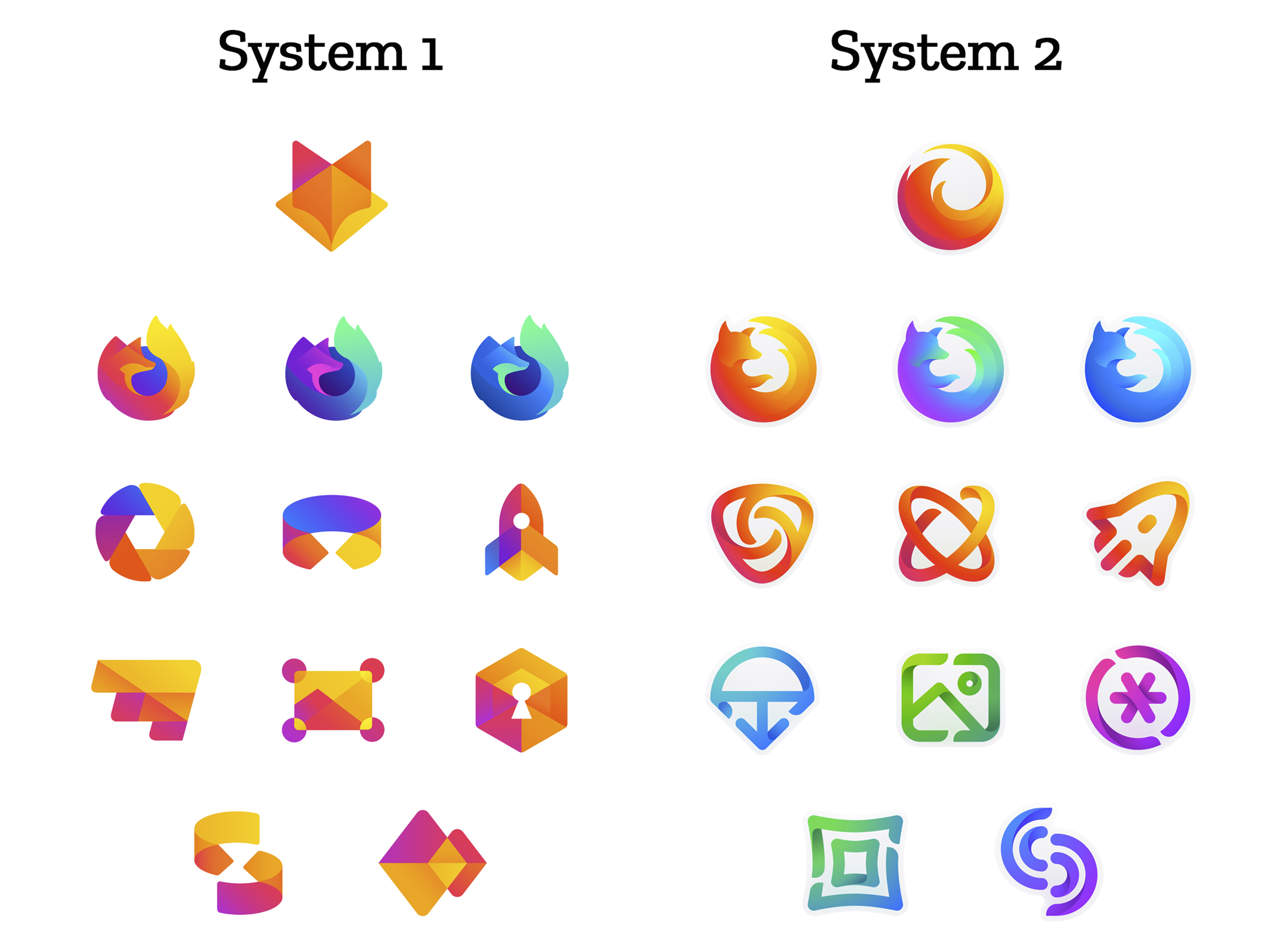
The brand architecture for both systems is made up of four levels.

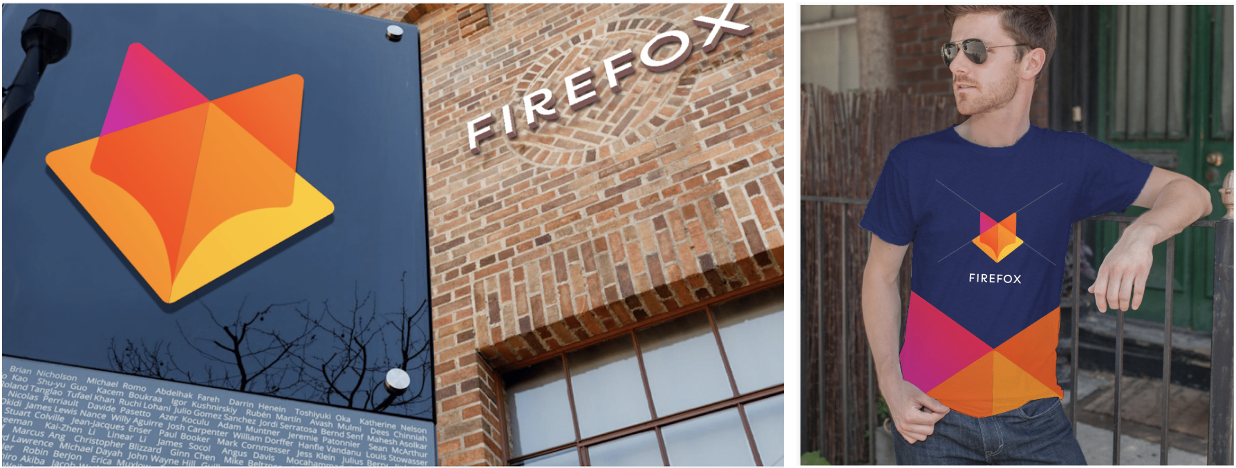
Each system leads with a new Firefox masterbrand icon — an umbrella under which our product lines will live.

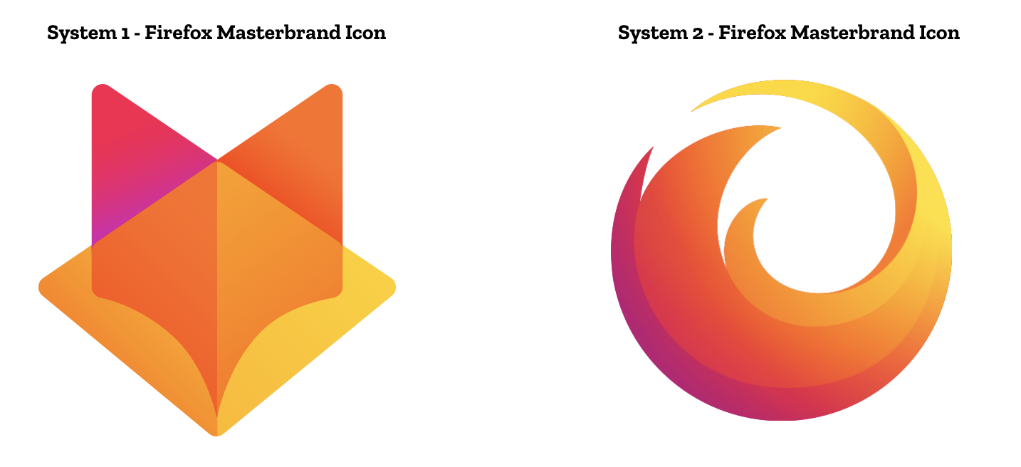
The masterbrand icon will show up in our marketing, at events, in co-branding with partners, and in places like the Google Play store where our products can be found. Who knows? Someday this icon may be what people think of when they hear the word “Firefox.”

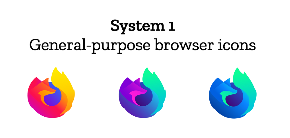
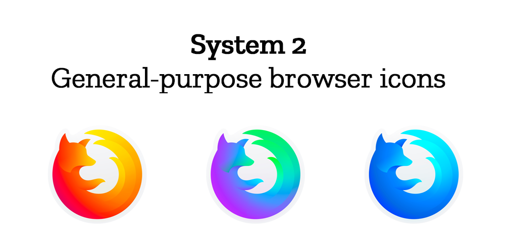
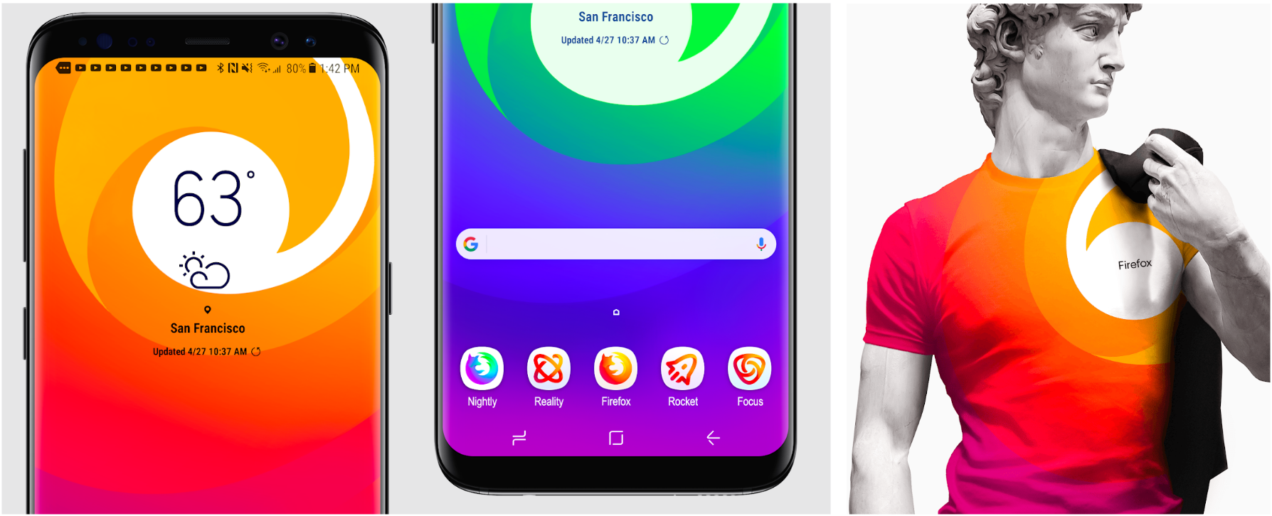
At the general-purpose browser level, we’re proposing to update our Firefox Quantum desktop icon. We continue to simplify and modernize this icon, and people who use Firefox tell us they love it. Firefox Developer Edition and Firefox Nightly are rendered as color variants of the Quantum icon.


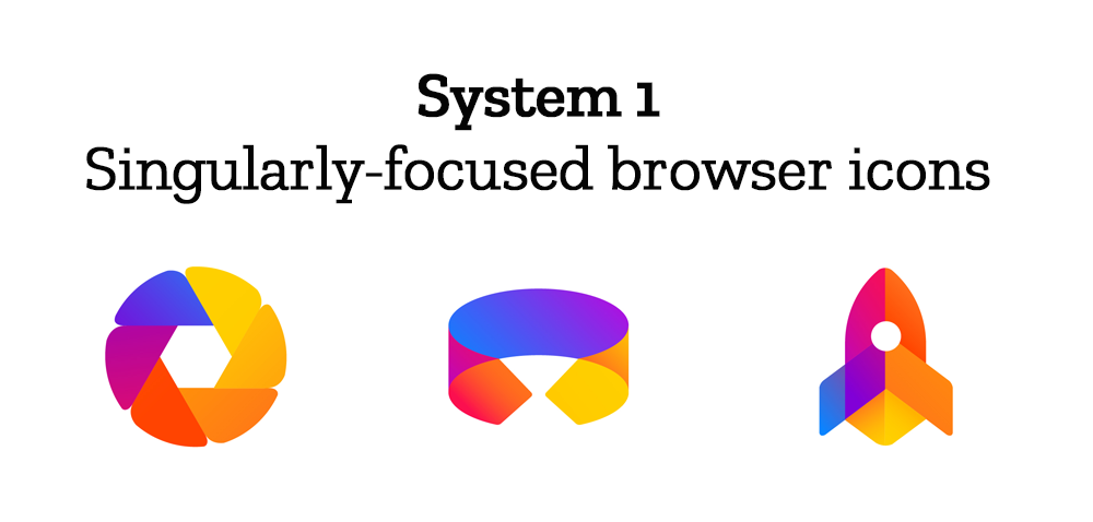
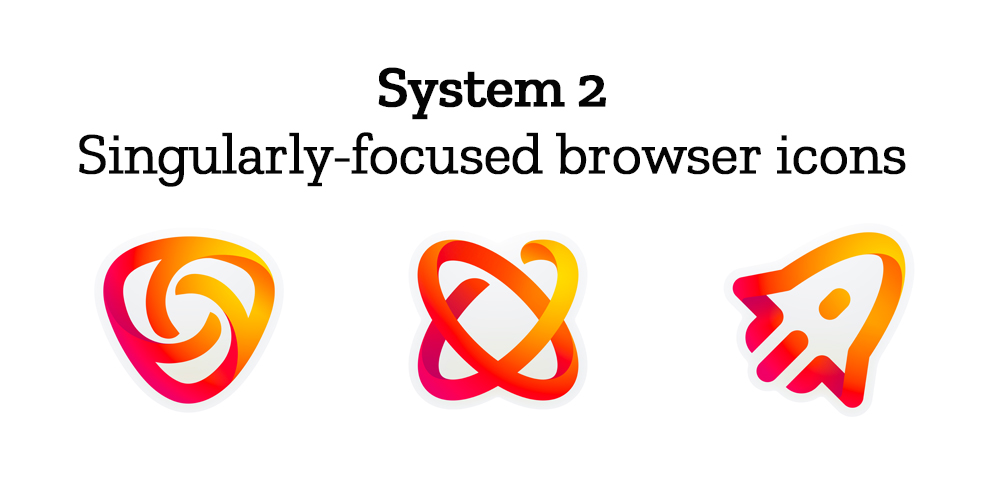
Browsers with a singular focus, such as our Firefox Reality browser for VR applications and our privacy-driven Firefox Focus mobile browser, share a common design approach for their icons. These are meant to relate most directly to the master brand as peers to the Firefox Quantum browser icon.

Finally, the icons for new applications and services signal the unique function of each product. Color and graphic treatment unite them and connect them to the master brand. Each icon shape is one of a kind, allowing people to distinguish among choices seen side by side on a screen.

Still in the works are explorations of typography, graphic patterns, motion, naming, events, partnerships, and other elements of the system that, used together with consistency in the product, will form the total brand experience.

Read along as we refine our final system over the next few months. What we roll out will be based on the feedback we receive here, insights we’re gathering from formal user testing, and our product knowledge and design sensibilities.

With your input, we’ll have a final system that will make a Firefox product recognizable out in the world even if a fox is nowhere in sight. And we’ll deliver a consistent experience from an advertisement to a button on a web page. Thanks for joining us on this new journey.

Madhava Enros, Sr. Director, Firefox User Experience

Tim Murray, Creative Director, Mozilla

2,212 comments on “Evolving the Firefox Brand”

  1. PierreG wrote on

    Hello,

    I vote system 1.

    Thanks

  2. Marc wrote on

    I really dislike the attitude of all companies that do this, let alone ones of this stature. Grow some balls, believe in your creative agency, if you don’t, get someone that you do.

    Redesigning a company’s brand identity is a serious, delicate and complex process that must be taken with great care. By putting the entire affair in the public eye, not only undermines the passion, the expertise and the valuable time of the creative agency, but leaves itself open to a whole host of weird observations, dislikes and daft comments. If you’re not confident with the presentation, go back to the agency and get them to re-design and re-pitch.

    Gap, Pepsi and Sony tried a similar approach, lets just say it didn’t work out.

    This isn’t the ‘xfactor’ or ‘somebody’s got talent’. If you’ve got the right team working on your brand, leave it to them to demonstrate your vision.

  3. Aayla wrote on

    I prefer the version 2 set as a whole, but I don’t like that the icons use different color schemes. It feels like the more cohesive option would be to use the same color scheme throughout, like the version 1 set does.

  4. Albert Freeman wrote on

    Definitely System 2 – it retains a semblance of the curled fox logo. System 1’s master brand too closely resembles Gitlab.

    The rest of the icons, both System 1 and 2, don’t really do anything for me. Neither set says anything particular about the product – they’re generic, except for the one that I think might be the VR icon.

  5. Sandy wrote on

    I choose system number 2. Because user interface is good, simple logo, and good looking

  6. Fillipe Anderson de Oliveira Alves wrote on

    The second group is beautiful, clean, modern and preserve the essence of Mozilla! The fox icon of first group is cool but your group of icons is not very cool.

  7. Renato P wrote on

    System 1 with System 2 general-purpose browser icons.

  8. Christian Lim wrote on

    In my opinion :
    System 1 for Masterbrand
    System 2 for General-Purpose Browsers
    System 2 for Singulary-Focused Browsers
    System 1 for Icons of new apps and services

  9. Francesco wrote on

    Number 2

  10. Bor wrote on

    System 1 with System 2 Browser Icon

  11. Steve wrote on

    While the new designs are quite cool, I still love the detailing and uniqueness of the original firefox logo. Why try to replicate the Google/Apple-esque (and virtually everyone else) designs.
    Stick with what makes Firefox unique and create icons in the same illustrative style.

    That being said, I think that set 1 is far better. The fox symbols actually work pretty well with the front leg omitted from them, while retaining the feel of the original pretty well.

  12. Alberto wrote on

    System 2 for Masterbrand Icon.
    System 1 for everything else.

  13. Matteo Loro wrote on

    I really love both systems even if I highly prefer the first one.
    The only exception are for the General-purpose browser icons, for those I prefer the one from System 2, more nice and clean.

    I really, really, really love the T-Shirt with the system1 logo, I WANT IT!!!! :)

  14. Carlo Bertini wrote on

    Group 1

  15. Nabih wrote on

    Icon from system 1 seem like Gitlab logo… I’m not fan. I prefer system 2 it’s more elegant.

  16. Carlos Reyes wrote on

    System 1 !!!

  17. Christian Paul wrote on

    I prefer the icons of system 1 with the exception of the master brand (looks too much like GitLab) and the Firefox logos. System 2 is much more recognizable as a fox and a redesign of what has been there before.

    Also, I feel that none of the new systems fit Mozilla’s new black and white tech design.

  18. Bianca de Moraes wrote on

    System 2!!!

  19. Ravindu wrote on

    I think geo fox logo setup is better than fox tail logo set up beacuse it is like a previous logo . So in my opinion geo foc is the best 👍👍👍

  20. Marcela wrote on

    I vote system 2. The browser icons from group 2 are amazing!

  21. Mathaus wrote on

    The System 2 remember me more the Firefox history :)

  22. Francesco wrote on

    System 1 is definitive better

  23. Donato wrote on

    I prefer group 2 icons, easier to recognize.

  24. LPGomes wrote on

    System2!

  25. Daniel wrote on

    To be honest, I prefer the current Firefox logo to both the designs. The reason being that, both the sets contain icons too abstract, and design language too over used. The current Firefox logo is both unique and easy to spot from the thousands of other logos, and also signifies the Internet as being “the world”. Design 1’s fox looks too much like GitLabs, and shaped a bit too childish with the roundedness and asymmetry in the browser icons. And Design 2’s just looks like the Mac version of MS Office.

  26. Luke wrote on

    I do prefer System 2

  27. Vinicius Almeida Feiten wrote on

    I prefer the Firefox icons in group 2 and the non-Firefox group 1

  28. Turan wrote on

    System 2

  29. David S wrote on

    I choose the System 1 :)

  30. alex wrote on

    I really like the minimal soft type look that’s going on here, The color palette for the non Firefox icons in system 1 is a little tiny bit jarring to me though. Personally I prefer system 2 since it has a more cohesive color story.

  31. BATANOV wrote on

    Basically, i like the 2nd one, because its more dinamic form.

    But, unfortunately i think both ideas aren´t fair enough with the concept of “FIREFOX”. Foxes are very smart and speedy animals in nature, and these graphics are “statics”. Plus, its realated with “World Wide Web” market, where the Infos are extremally fast, equal the foxes in natural, scaping from the hunters. So, we have here 2 fundamentals envolving the fast/smart/speedy, “infos like foxes” but i can´t see this ideas in the logos, specially, in the main shapes. This happened because of the new propose of the Mozilla like you´ve said, but i think this is the core of the brand: fast & Smart.

    Here some suggestion that could help to understand what I mean.

    1-Let’s imagine a group of foxes concentrated in a prey.
    2- Foxes working fast for different preys
    3- fire trails

    Thanks for your attention!

  32. s.sajad wrote on

    main icon system 2
    other icon system 1

  33. Charlie wrote on

    For the new brand designs, I have a strong preference for System 2. The designs within it convey sufficient similarity to the current logos for backwards recognition, and are also more simple and elegant in their design. My impression of what Mozilla wants to convey is speed and efficiency in the overall browsing experience. The icons and imagery in System 2 relay those intentions very well. Particularly the main brand logo design, which is just the traditional Firefox design simplified to a nice whoosh-y swirl.

  34. Louise wrote on

    I prefer System 1, all the way through. I don’t care for any of the linear “open” icons. Agree with others that they don’t look ‘buttoned up’ / professional. Good luck!

  35. Cescapo wrote on

    +1

  36. Camden Narzt wrote on

    I too would prefer group 1, with the browser icons from group 2.

  37. Tiki wrote on

    Definitely Group 1 , classic style, but with that 2018s touch, amazing

  38. Nicolas Rappa wrote on

    System 2!
    I like how it works from the point of view of simplicity, minimalism, colors and how they play from neuromarketing with organic round shapes! Anyway … be it one or another option I will continue using firefox!

  39. ftt wrote on

    I’d definitely prefer System 2 Firefox Masterbrand Icon because it at least looks like Firefox!

    As for focused and app icons, they are all so abstract, I wouldn’t guess what they were supposed to mean.

  40. Kharlo Catig wrote on

    I love the System 2 icons in all aspect. The trademark that Firefox made in the minds of people is still there. The System 1 Masterbrand icon is quite similar to other logos and looks like a girl with a ribbon :-) while System 2 is really nice and the Firefox identity is stil there. For the other icons, System 1 looks a little bit of childish and for my own opinion, one will notice more of the color instead of its function. The system 2 icons has a thin structure which expresses more details and it highlights more of the function while the color fits perfectly. Hope it helps. :)

  41. Austin wrote on

    I prefer the color usage of system 2, there are distinctions and can be easily told apart from a quick glance. System 1 icons with System 2 color scheme is what I would choose, so system 3?

  42. Nicolas wrote on

    I really prefer the 1st system.

    I find it more coherent, it has a deeper identity. I like the fact that the masterbrand has a significant visual difference from the productline visuals, while keeping the fox as a common thread that pulls you back to “yeah, I know where I am”.

    Full icons also catch the eye more than the unfilled ones in system 2.

    Only thing is the blue/violet inside of the foxes for the browser icons, it… disturbs me a bit.

  43. Mona wrote on

    System 2 Masterbrand is fantastic.

  44. Denny wrote on

    I prefer system 2! Especially because the system 2 browser has a much “cleaner” fox look than the one from system 1.

  45. Helaine wrote on

    system 1!!

  46. John wrote on

    I strongly prefer the silhouettes presented in System 1; they seem far easier to rapidly distinguish, and more visually distinct from each other. Relatedly, I feel the overlapping geometric color work strengthens the silhouettes in System 1, but to my eye the color styling obscures the silhouettes in System 2.

  47. Sayed wrote on

    System 2 please. I will not forgive Mozilla if they choose browser icon from system 1. They look painfully simillar to icon of some other browser.

    1. Pieter Kip wrote on

      Please call it by it’s name, we all know that name

  48. Adam wrote on

    I prefer System 1, with the exception that I like how the new apps each have their own color in System 2. I think that should be adapted to System 1.

    I think System 1 is more similar to the original FireFox brand and feel more unique and less generic. I think the system is clear and flexible.

  49. Eric shepherd wrote on

    So… I recognize these are well crafter icon concepts and that a lot of work went into them. Nonetheless, I’m not a fan of these courses. If I had to choose, I’d say to go with the system 1 icons, but I hope a serious rethink happens. I’m not fond of cryptic, abstract icons that don’t clearly evoke the specific app or function you’re looking for. I already have enough icons that look newly identical… All those icons with the same colors in various abstract patterns would make finding what I need more difficult than needed.

    Hopefully feedback will steer the designs in another direction. One just as skillfully crafted but a little less arcane.

  50. Marcos Caballero wrote on

    I’d vote for System 1

More comments: 1 32 33 34 35 36 41