Categories: General

Route One: Protocol 2.0

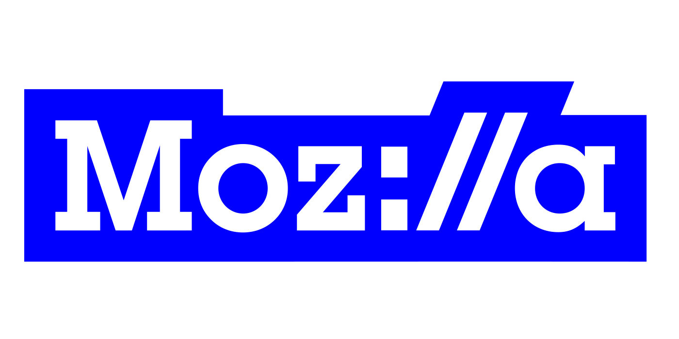
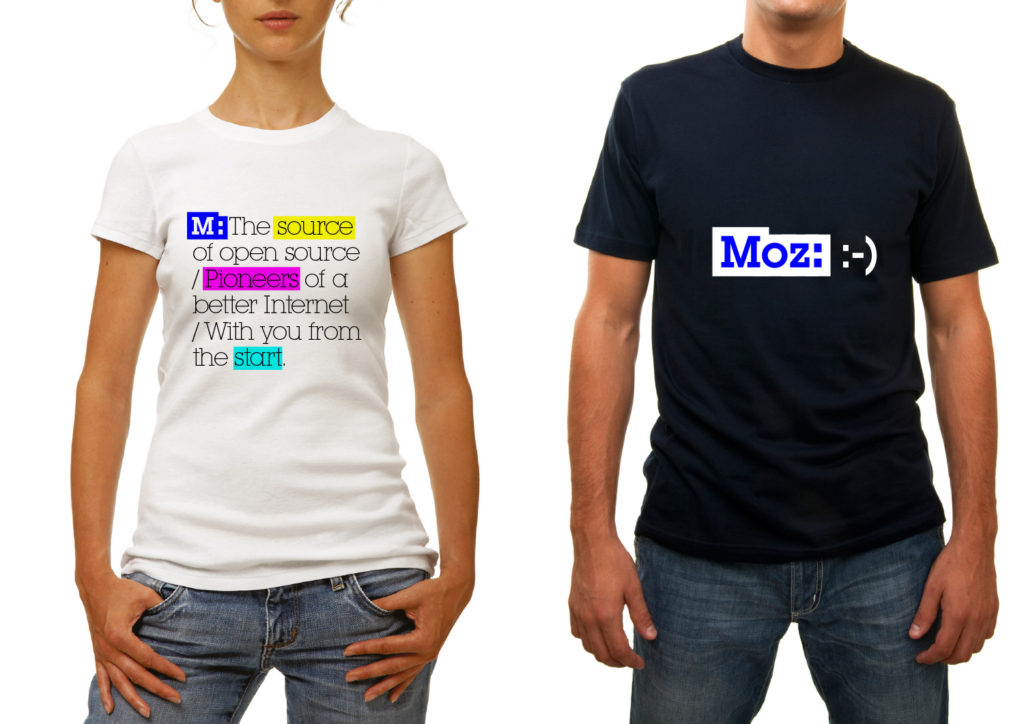
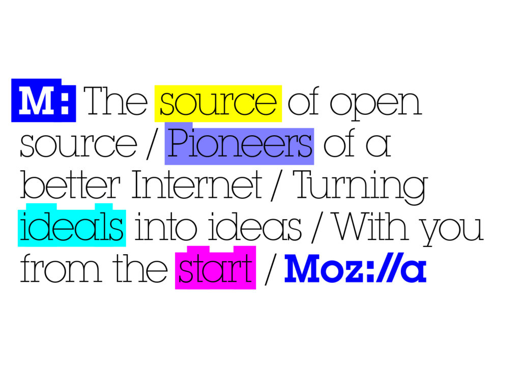
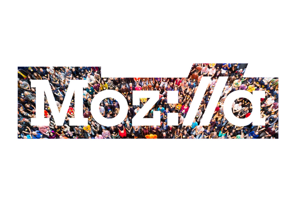
Protocol is a strong contender from the first round of ideas that we’ve continued to work on and improve. By putting the internet http:// protocol directly into the word – Moz://a – it creates a type-able word mark, and by doing so alludes to Mozilla’s role at the core of the Internet (and hence the ‘Pioneers’ positioning).

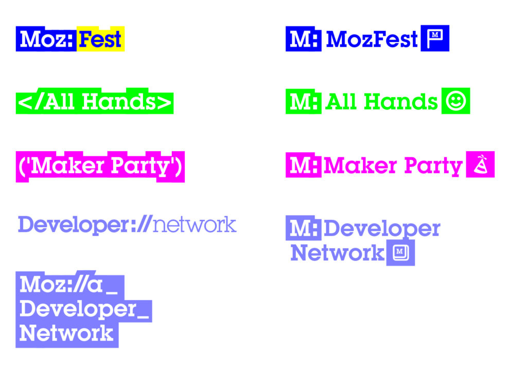
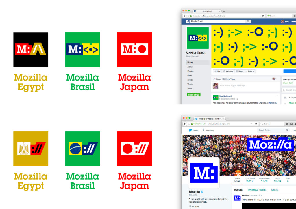
We’ve been strengthening the typography from the first round and looking at ways to expand the graphic language out across a typographic and pictogram language. We’ve also enhanced the blue to reflect the palette of the early Web. Here’s an early exploration:

mj_tm_Moz_Nashville_edits for new pics.key

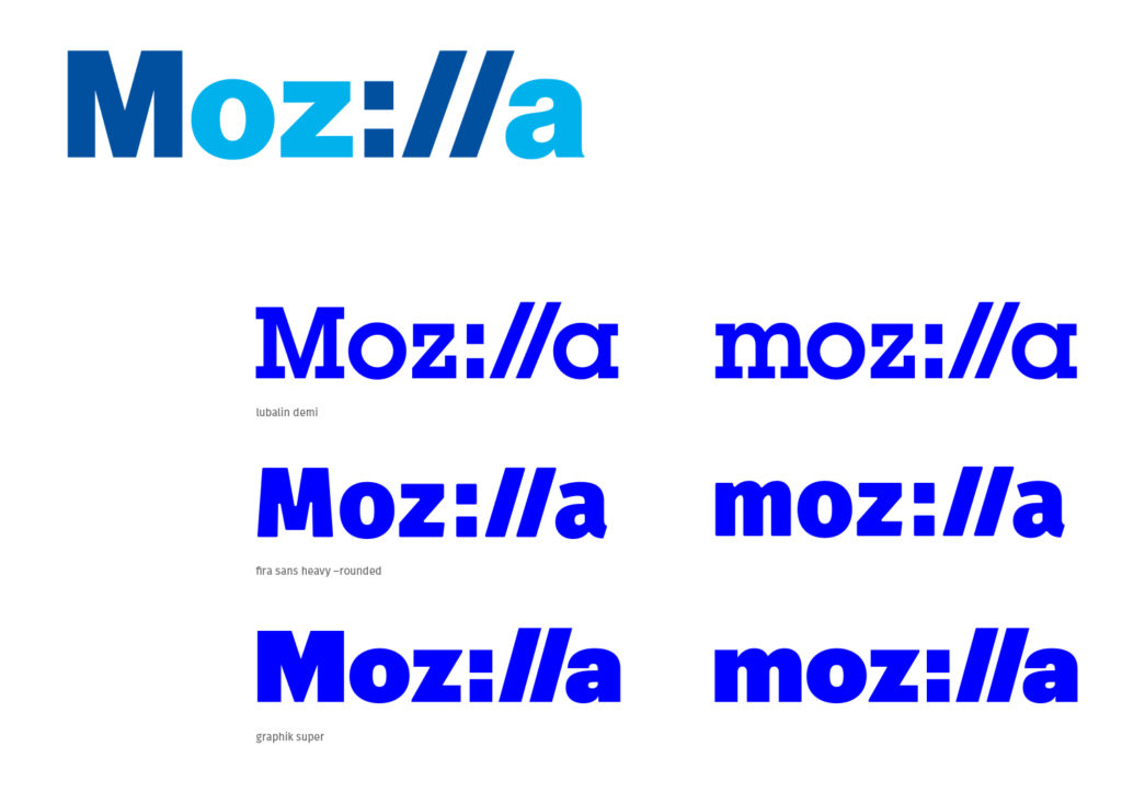
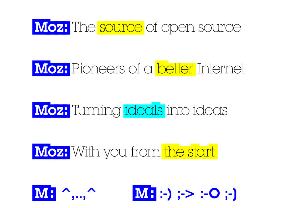
We’re also experimenting with a thought that some of the characters in the mark could swap in and out, randomly, pulling fonts characters or emoticons from a local computer or the web itself. A freaky thought, but could be great.

protocol_master_logo_2


protocol_type_swap

jb_mozilla-sept_c_protocol_3jb_mozilla-sept_c_protocol_4jb_mozilla-sept_c_protocol_5jb_mozilla-sept_c_protocol_6jb_mozilla-sept_c_protocol_7jb_mozilla-sept_c_protocol_8

40 comments on “Route One: Protocol 2.0”

  1. Josh Triplett wrote on

    This is even better with the thorough design treatment and variations. And the typeable nature also makes it *open* in a way that none of the others are: anyone who can type can recreate it to some degree of approximation, which makes it easy to recreate in HTML and CSS, or many other treatments. That allows numerous variations on a theme.

  2. Gervase Markham wrote on

    There seems some, but not very much, recognition that protocol names are always lower-case. You are going to irritate a lot of geeks if you go with a capital M :-) Fortunately, I really don’t think the capital is necessary for the design.

    I also like variants where the slashes are a bit more vertical than the standard typography of most fonts; making it look more like a word will still keeping that protocol vibe.

    Is there a reason we couldn’t at least see what this looks like with the existing font for the mozilla wordmark? If it looks OK, that would be a great way of keeping some continuity while evolving the look.

    Gerv

    1. Scott Hays wrote on

      I believe in this instance you can get away with the capital M, and I believe it is better served to use it here in order to establish it as a brand and make it more readable. With the “://” mark, you need something to increase readability.

    2. Alex wrote on

      The capital M reminds me of BASIC … Back in time when geeks were uncool :) …
      https://en.wikipedia.org/wiki/BASIC

  3. Chris H-C wrote on

    Better than the original protocol treatment. I like the serifs and the blue! I, too, like that it can be typed.

    It puts a heavy emphasis on the technology, specifically Web-tech, aspects of Mozilla’s mission. This is both good and bad, and I can only assume it’s a deliberate choice.

  4. Adam Roach wrote on

    I find this direction to be too overtly nerdy for Mozilla’s mission, at least as long as Firefox is front-and-center as bringing the Internet to the masses.

    This logo ties what we’re doing to a technical underpinning that, frankly, most of Firefox’s users aren’t going to understand or care about. It’s kind of the opposite of inclusiveness: it’s a call out to our small slice of tech-savvy followers, to the exclusion of the majority of our user base.

    I’ll also point out that we find protocol schemes to be sufficiently ugly that we hide them from users by default. It would seem kind of odd to take something we’ve decided is worth hiding in normal use and center our brand around it.

    1. Tim Murray wrote on

      Thanks for raising this concern, Adam, which has been voiced by others as well. Although the Internet’s largest corporate players have made it unnecessary to use “https://” to find a website through a search window, and have hidden this language from view using bit.ly and the like, the link is the critical language by which anyone can find anything online. (Please forgive my lack of technical language here.) Where many corporate entities would prefer that people remain in their proprietary silos, we believe that users of the Internet should be able to go wherever they want. The URL is still the primary unit of the Internet, and using this language in our brand identity might demonstrate how important we think inter-connectness still is. What do you think?

      1. Patrick Finch wrote on

        I agree with Adam. “https://” is an historical artifact for most people (most browsers on mobile devices already suppress it in displaying a URL). This path seems to lead us to having a visual identity less well adapted to the current world than our existing one. It certainly isn’t suggestive of being forward-looking, or of caring about users’ experience, or as Adam points out, of being inclusive. I worry that we find the visual joke so appealing that we lose sight of what it actually conveys.

        1. liuche wrote on

          I also agree with both Patrick and Adam – Mozilla is currently tied very tightly to its browser product, Firefox, but Mozilla actually stands for privacy and security and user choice and openness of the web. If you talk to the product and UX teams at Mozilla, or the leadership, it should be pretty clear that this branding would actually be a regression in the direction that Mozilla is trying to move.

      2. Michael Comella wrote on

        Will we have the opportunity to put the branding in front of non-technical users to see how they feel about it? I think this form of feedback could reduce concerns while avoiding speculation. :) Specifically, like Adam, I’m also concerned that being too technical could alienate our user base.


        To take a step back:

        “the link is the critical language by which anyone can find anything online.”

        This is true – but will it always be? I believe the URL wasn’t designed with user friendliness in mind. If we designed a user-friendly solution to navigating the web, will the URL become a technical detail like IP addresses today?

        “Although the Internet’s largest corporate players have made it unnecessary to use “https://” to find a website through a search window,”

        Many users have already replaced URLs with a(n accidentally) more user-friendly option: search (even for simple URLs like facebook).

        If we incorporate a protocol into our branding today, will it feel like representing “Save” with a floppy disk tomorrow?

        1. Tim Murray wrote on

          Thanks for the perceptive questions, Michael. These are important things to consider with regard to Protocol, and trends are notoriously hard to predict (or to shape). We will be putting these four design directions with some modifications through global consumer testing this week in five markets, directed at the target audience for Mozilla that we identified earlier this year. We’ll also be circulating a survey to Mozillians and through the Mozilla Developer Network. Respondents will be asked to rate individual designs against brand attributes for Mozilla. Analysis and cross-comparison of these surveys will provide further data that will likely influence our recommendation for a final route. We’ll post a summary of the results on the blog. Thanks again.

  5. Gabriela Owens wrote on

    I’m not a huge fan of how the word highlights dip or rise in height (Pioneers, ideals, start) to match the lettering, I think a uniform highlight would look much better

    1. Paul Nilrach wrote on

      I was thinking the exact same thing.

    2. Paul Tincknell wrote on

      I agree entirely. I also agree with a previous commentator that the capital “M” is unnecessary. And finally, I think one font-family should be used, not the mix of serif and sans-serif. I personally would vote for sans-serif, as it is more contemporary, easy to read, better when bold, and is what most of the web defaults to. So: moz://a. Shorter versions should refer to the :// as in m:// or moz://.

  6. Wil Clouser wrote on

    I liked this idea too, but I can’t help but remember that we (and all major browsers) dropped the protocol from the URL bar in 2011. The protocol is becoming more and more obscure making this seem more like a throwback than a leap forward (similar to how our dino-head logo is viewed today).

    1. Rabimba wrote on

      I was just thinking this, even though I liked the idea

  7. Tanzeel Khan wrote on

    This one is better than others in the list. Its simple and it itself defines what is all about. One thing that I didn’t like is the color. I know the color represents technology but I feel like there is something missing, may be typography or something. :)

  8. Jess wrote on

    This one is my favourite as a wordmark, but when but when you start to integrate it with Mozilla projects (Maker Party, MozFest) it does get a bit confusing.

    For wordmark I prefer Protocol, but for overall branding I think Dino is the most coherent.

    1. Cameron L. wrote on

      Agreed.

  9. Moz://a wrote on

    I find this one is awesome! It is simple, easily understandable and a bit “geeky” ! Keep up the good work ;)

  10. Joel Richardson wrote on

    This direction is exciting. It’s energetic, youthful, nods to the past, and is a fresh take on Modernism. This direction does what it claims to do. The emoji may need some more work, but they’re still an awesome part of the direction.

    As far as the “we dropped the protocol from the URL bar” argument, this is a point that is more relevant for developers than the public at large. It’s a somewhat esoteric observation. Even if you were to accept the notion that kids in 5+ years won’t have any idea what that is referencing, the treatment still effective. The effect is not so much that it appropriates the protocol as it appropriates coding languages and web specific type treatments in general (that’s why the emoji work). I think that more and more kids will be learning coding as time goes on, and this reference will not be lost on them.

    1. Nora Zimerman wrote on

      I’d tend to agree with Joel here. For the non-developer public (like me) this is a simple, obvious, fun solution. I says what it is without complications.
      love it!

  11. Potch wrote on

    The block outline on the lettering really makes this for me. That said, it’s very opaque for people who aren’t familiar with the “protocol” symbolism, and lots of browsers are moving away from even showing the protocol portion of the URL!

    It appeals to me as tech geek, and typing “Moz://a” is fun, but it might be inaccessible to people who care about our organization for non-technical reasons (think advocacy, etc.)

  12. Aaron wrote on

    This is my second favorite. Probably even more so than the Dino. I think it just needs some refinement on the type. The “://” part of the wordmark should probably match the width of the rest of the mark, making it more cohesive. I feel like the emoticons is a great idea on the applications and should be used more, maybe even introducing some code lingo into applications too. Good stuff guys

  13. Brad Werth wrote on

    To me, this doesn’t seem to solve the problems of our current wordmark. I’m not a fan. If we do go with this, and want our customers to resonate the logo to the protocol in the browser bar, then it feels to me that we should use the same font that’s used in the browser to cement that connection.

  14. Stephen Nixon wrote on

    ===
    Possible CSS bug: for me, the containing the gif of letters swapping out has a height of 0 once the page loads, making it disappear. This happens for me in both Firefox and Chrome, which is a bummer, as it is one of my favorite aspects of this route. Maybe it’s a small glitch in your CSS? I think maybe a clearfix or something could help it? (screenshot attached)
    ===

    I LOVE THIS. Flexible, just clever enough (but not too clever), looks dignified yet quirky.

    I think maybe it would be stronger if the color palette were limited just a tad … things start to look a little less bold and unified when secondary and tertiary colors are used, like magenta, cyan, and lavender.

    Somehow, the Lubalin type looks fresh and exciting to me in the wordmark but starts to feel a little more dated in the light use on merch, etc. Maybe it would be good to limit Lubalin to the wordmark, and use something like Fira for brand applications? After all, Lubalin won’t work well on web interfaces, and especially not in a light weight.

    Overall, I was excited enough seeing this that I had to leave a comment. Excited to see where it goes from here!

    ScreenShot2016-09-20at8.48.21AM

  15. joe mama besser wrote on

    definitely the designer’s ‘aha!’ moment direction – and certainly very clever, but not yet visually resolved to be the basis of an identity system.
    one interesting play could be to pull the :// asset out, rotate it 90° clockwise and use it as the god-dino-zilla character – colon is the eyes, slashes are the mouth. you’re welcome.

  16. Steve Fink wrote on

    I generally like it. I think it’s a bit too uneven and would prefer a simpler font. I like the font changing goofiness. I dislike a plain “M:” as a short form; it does not suggests a connection to Mozilla (or the Web or anything else.)

    The fact that protocols’ visibility is declining doesn’t particularly bother me. It just means we’re associated with the unseen stuff that comprises the Web. And even if you’re someone who has never seen a protocol in a URI, there’s obviously *something* distinctive going on there, and that’s enough even if you don’t bother to find out what it is.

    I just wish it had a little more flash to it, like the flame.

    And given the “zilla” part of our name, I do kind of miss a tie-in to dinosaurs. (At least, the strength/dominance characteristics of dinosaurs.) But that’d be too much to pile into one thing, I suspect.

  17. stephanie wrote on

    definitely the best route – the others have no where near as much appeal….speaking from an outsiders perspective. It’s grown up but fun and relatable

  18. Enrico wrote on

    Protocol was my favourite from the first batch, and now it looks even better.

    I like the font choice: it’s most appropriate as a “protocol”. It’s a pity Fira doesn’t work that well, but I guess there’s not much to do about it…

  19. Martha wrote on

    I’m coming to this discussion late, but the fact that an web company’s logo is type-able is pure genius. I think the flexibility and relevance of this concept makes it the winner. Maybe M: could turn into a new protocol? Or at least some kind of viral marketing campaign.

  20. Sebastian wrote on

    Still like Moz://a best. :) Makes me happy every time I can just type it down. I must say I almost liked the first iteration better. The gaudy colours are not my taste I must say. The uneven border takes some getting used to but I think it could work.

  21. Jack wrote on

    This looks like a cool design. Simple and elegant. However, I would prefer lowercase M over the uppercase.

  22. alex b wrote on

    Hi, I think this route is the best, as it makes sense (with Internet). The fact that Moz://a is type-able is fun, but potentially confusing – how do we actually write it? Think of people that were not exposed to the brand. Apart from this problem, the logo is perfect, and the problem can be mitigated by NOT writing the name in this form ever, in text. Just use the logo in graphical form, and write the name normally in any text reference.

    Regarding the colors – the logo should use only one color – as brand color (think Coca Cola is red, Hertz is orange, IBM is blue). The color choice should be based on brand differentiation (not taste, some psychological association etc.) – use the color that’s not used by your competitors – just map them on a color wheel and choose from what’s left. Explorer (and Safari) are blue, so bye-bye blue. Chrome is rainbow, but you see red first (and Opera is red) so no red, too. But Firefox is orange, and orange is not used by anyone, so… keep the orange!

  23. Paal Dracup wrote on

    In my opinion, by far the better choice. It’s versatile and easily recreated in text form for those who should want to type it out. Brilliant; I like it a lot!

  24. Gonzalo Burnfield wrote on

    I think this is the best one, but I don’t like the typography, it’s just looks old, I liked more the original protocol.

  25. Seburo wrote on

    Hi

    I love this concept!

    Its quirky, fun and flexible. The colour palette feels bold, but also very clam. Undecided whether I prefer the previous iteration of this one, I think that they both work well.

    The only (small) change I would make the statement text, it is too thin. Whilst the statements may be bold, the typeface needs to be for people to easily read them.

    This is still my preferred option. Keep up the great work.

  26. André Jaenisch wrote on

    I’m not a designer, so an update about the openness of the used font would be appreciated.

    As alex b stated in https://blog.mozilla.org/opendesign/route-one-protocol-2-0/#comment-2790 I’d welcome a suggestion with an other colour. I enjoy orange :-) Maybe reddish or browny.

    Lubalin looks too angular/edge to me. I’d prefer graphik super I think. The trailing “a” does not point outwards the wordmark … Its “o” looks like a donut though …

    This one is my favourite. In opposite to Dino 2.0 I can imagine it is applicable on different use cases: On websites, as FavIcon (which is, what many people will see of a website these days), on shirts and cups.

  27. Robert Kaiser wrote on

    This is clearly the #2 design for me (after the dino). I think even non-technical users will understand what it alludes to even if they don’t have to type those “weird” protocols usually – and it speaks to web literacy.

    The typeface(s) and color(s) IMHO still need work, I don’t think that the intense blue is a “Mozilla color”, but esp. the static outline with changing fonts and similar concepts sounds like an interesting path to follow.

  28. amanda wrote on

    Love it! It is own-able, iconic and relevant. Easily understood, bold and simple.