Categories: General

Route Two: Flame

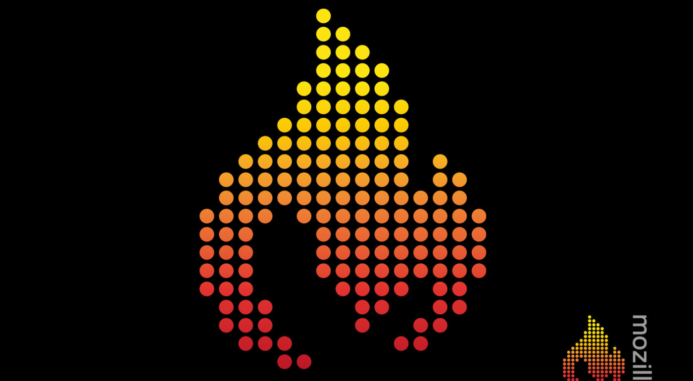
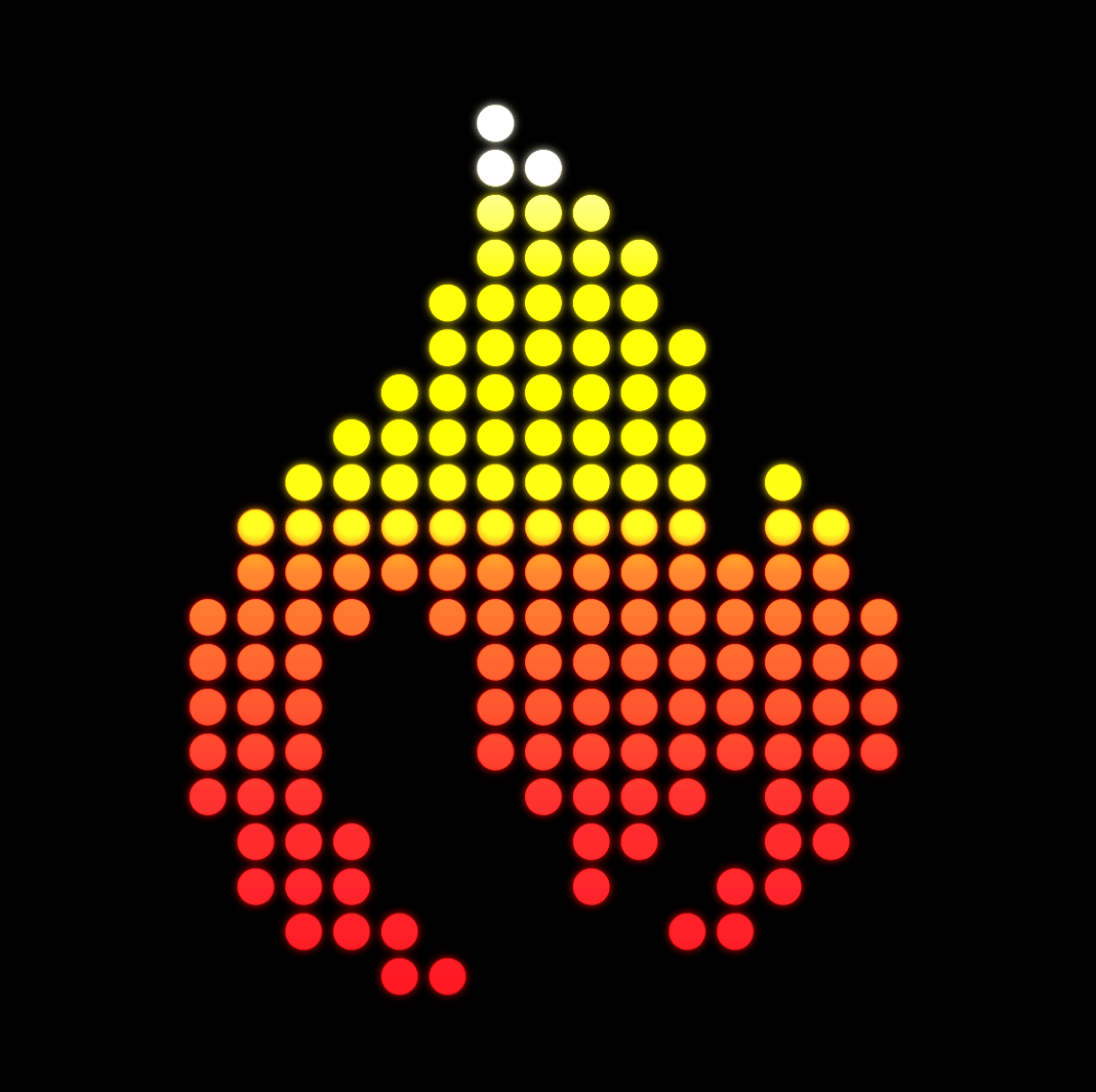
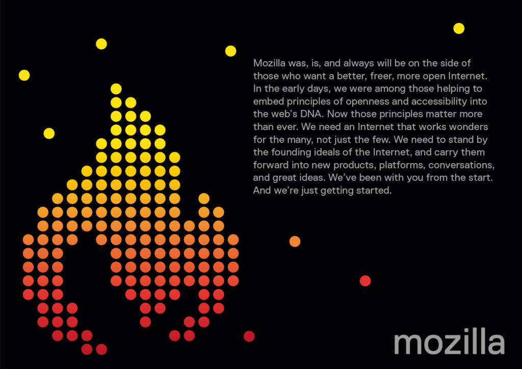
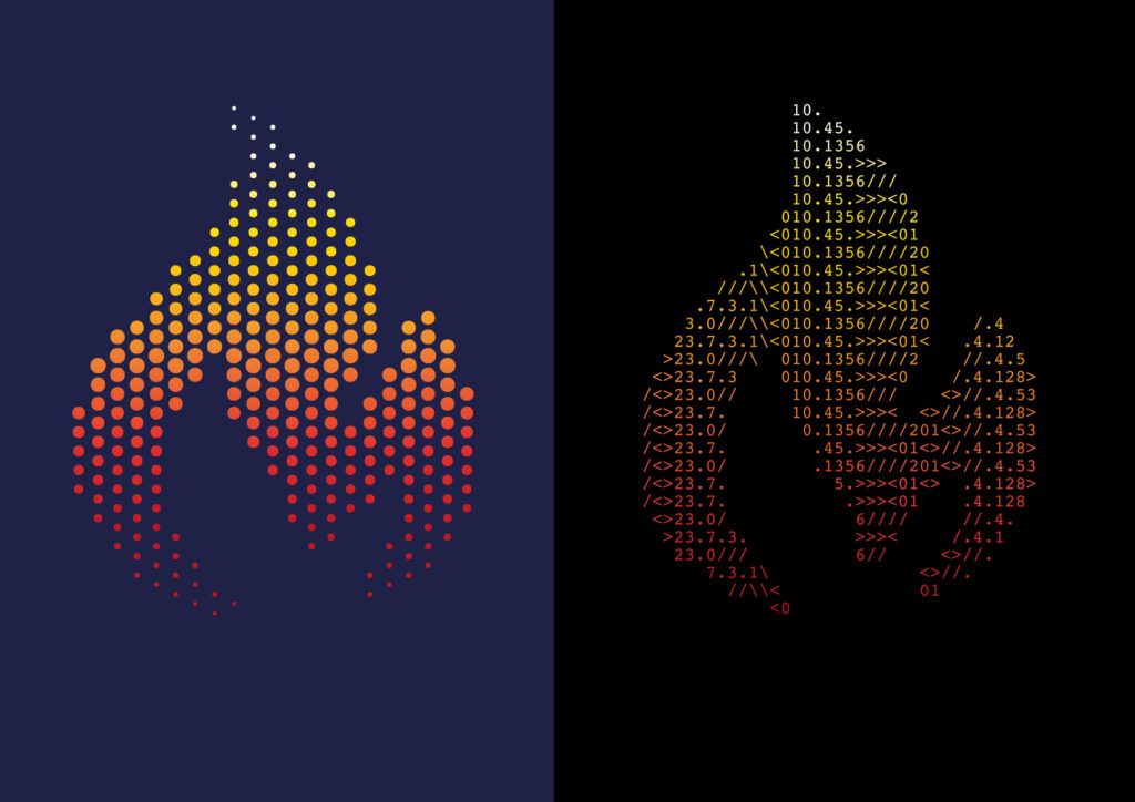
This is a completely new direction. Whilst rooted in the ethos of the ‘Pioneer’ thinking it also crosses over into the ‘Taking a stand’ narratives. We started to think that a flame could be a powerful symbol of Mozilla’s determination to remain the beacon for an open, accessible and equal internet for all, and something that a community gathers around for warmth.

As we started to experiment with flame symbolism, one simple design won through which simply merges an ‘M’ and a flame. After some experimentation, we think a dot/pixellated form for this idea work nicely. It animates nicely, and might even be dynamically generated with lightweight code.

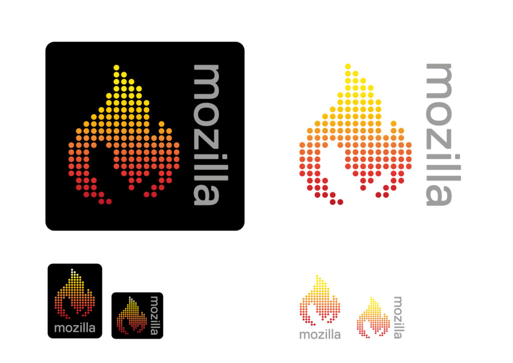
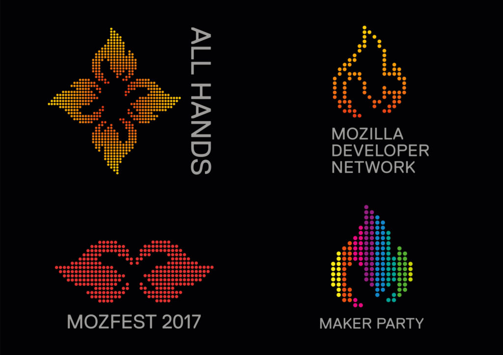
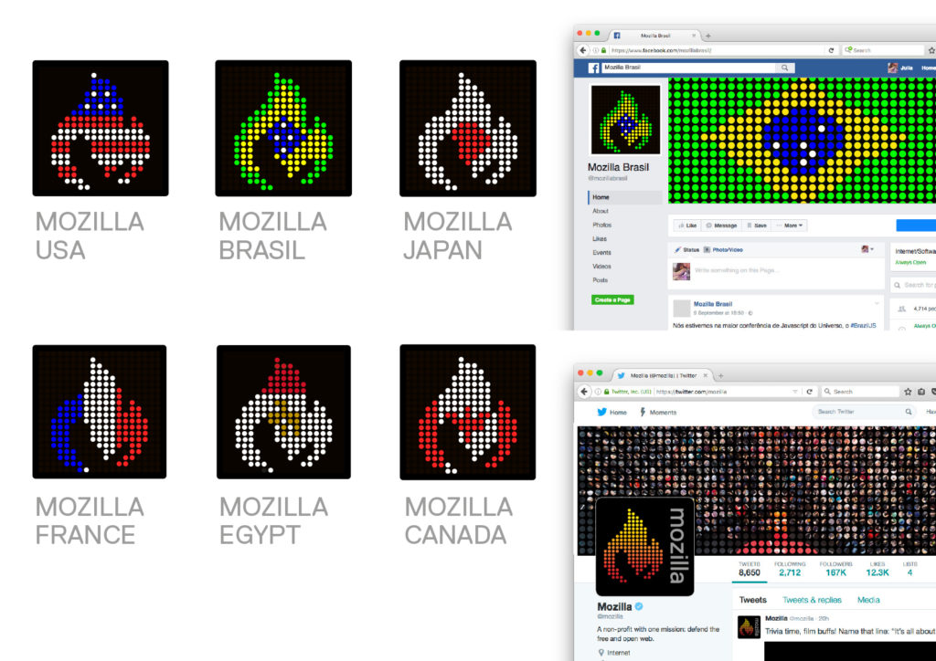
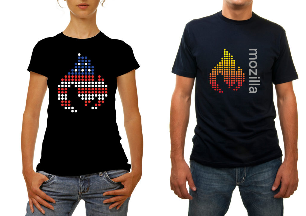
Here are some key slides showing applications out to sub-brands, community designs and merchandise.

flame_flicker

jb_mozilla-sept_d_flame_2jb_mozilla-sept_d_flame_3jb_mozilla-sept_d_flame_4jb_mozilla-sept_d_flame_5jb_mozilla-sept_d_flame_6jb_mozilla-sept_d_flame_7


Save

24 comments on “Route Two: Flame”

  1. Gervase Markham wrote on

    I can see this working. It’s neither the best nor the worst idea. The fact that it draws our organizational logo a bit closer to the Firefox logo and its design language has both pros and cons. I think we want Mozilla to be more than just Firefox – but it’s useful if we can leverage Firefox name recognition into an understanding of Mozilla. So…

    Gerv

  2. Benjamin Smedberg wrote on

    I like the fact that the flame is related to the Firefox logo, but distinct.

    I personally didn’t see the “M” at all. After reading the explanation, I stared back at it and “found” the M if I looked hard enough, but I really doubt that it’s going to come across to most people. Maybe that’s ok, like the hidden arrow in the fedex logo?

    Other brainstormy thoughts:
    * Variants of the logo which show that Mozilla is community by making the dots photos of people.
    * Does this logo still look like a flame when it’s black-and-white/monochrome?
    * My daughters would really love a sparkles/bling version of this!

    1. Gervase Markham wrote on

      There’s an M? :-|

      1. Paul Tincknell wrote on

        Really? There is an M? 😕
        When I think of Mozilla I think of open source, privacy, and user flexibility – none which connote a flame. I think this one is a miss.

  3. Chris H-C wrote on

    I’m still trying to see what we’re trying to say with the negative space under the flame. It doesn’t occur to me to see the ‘M’ in the flame itself.

    It also isn’t too encouraging that this design requires a wordmark to explain it. If Mozilla were to become a globally-recognized brand so that our symbol is enough to evoke the entire concept (see Starbucks, and a certain hamburger joint starting with M) then it’d be okay… but Mozilla, by dint of its mission, will likely never be that visible.

    In my mind we need a brand that doesn’t need explaining. It can benefit from explanation and thought and consideration, but it _must_ stand on its own in its constituent parts.

  4. Merowinger wrote on

    Definitely my favourite.

  5. Brad Werth wrote on

    Very strong, but the “M” doesn’t come through. That may not be a problem since the flame connects back to our most well-known product via fire and the orange color. Once established, the flame will be recognizable and distinct and is very appealing on its own. This could be a design that bridges what we have to what we want to have. I like it a bunch.

  6. Li wrote on

    My favorite. It has legs and I think a long future with flexible options.
    Li MN

  7. Tyler Netees wrote on

    I feel as though the wordmark needs to be integrated into the icon. I’ve loved all the designs so far, and this is my first comment. Keep doing what you do, JB!

  8. Steve Fink wrote on

    I would never have seen the M had I not known to look for it.
    Other than that, I kinda like it. For me, it’s between this and Protocol.

  9. Me wrote on

    This is really good! The flame could be more clearly in M-shape, but otherwise this is really good. This is the best of all I have seen in this process ( and I work as 3d designer/ animator so I guess I know something).

  10. Will wrote on

    I really like this one. It is way better than the retro looking “fireworks” design. It’s appealing and as shown would be easy to be made to fit for certain occasions, sort of like the google doodle. This would give people something small and interesting to come back to, to see what is new today. I think the idea already mentioned of a version where it’s made up of people’s faces would be cool.

    This is a design that I could get behind and is still modern without looking overly retro, and simplistic like the rest of them. The color stands out from the black and is still rather recognizable.

    If the hidden M was a little more distinct it could add a bit to it where companies have a “hidden” meaning in their logo and so it gives added, free publicity for Mozilla.

    If there were a version adding some slight depth to the flame it could look better. A sort of just right amount. Not enough depth to make it distinctly 3D but at the same time it is not quite flat either. That probably will make it look a lot better.

  11. Aki Sasaki wrote on

    I think this is my favorite. The circular pixelation could be one version, and there can be other variants. It ties to the ‘spark’ theme before. There’s a subtle M, but you don’t have to know it’s there, as long as the word ‘Mozilla’ is next to it or overlaid (AT&T’s logo is recognizable, but doesn’t have an A in it; MasterCard doesn’t have an M, BMW and Mercedes have no B or M in their logos; I think the logo doesn’t have to have an M in it.)

    Also, the 4 entrants in this round are much improved over the first round; well done!

  12. Enrico wrote on

    The logo itself is very nice and the animation is cool, but I cannot see the ‘M’. Moreover, I think would not recognize it immediately as Mozilla’s.

  13. H.D.Ozkan wrote on

    I think this one is the best among all others. I am not a graphical designer or a tech junkie, but just a simple internet user who has been loving Mozilla for a long time. Therefore I can not make technical comments, but can only comment by heart… I used to love that old fox and definitely will miss him. On the other hand, this design remains the colors of the old foxie. Those red, yellow and orange shades remind the old design and provide an emotional link with the past. It makes easier to accept and internalize the innovation. I found other designs much more “tech focused” and in my opinion blue/ green shades put distance between the brand and users. Flame design creates a “warm” feeling with the color & shape, plus it still remains the tech perception by the dotted/ pixelled look. Conclusion : Go for the Flame (or the future versions, derived from this initial design) I loved it! :)

  14. Arjav Mehta wrote on

    Most balanced option out there.. my favorite.

  15. Sam wrote on

    I very much like this one, I think it’s certainly stronger than any of the original seven concepts and the strongest of these four.
    The symbolism in the flame is wonderful. It’s a shining light. The flame brings people together. The flame is open and bold. The flame is warm and bright. And how could you miss Mozilla FIREfox? (I know Mozilla is trying to differentiate itself from Firefox, but this connection’s not going to confuse anyone).

    The logo is very nice to look at, and stands out. I like that there’s still some of the red in it, though it’s not afraid to expand it’s pallate. The circular pixels give a modern touch without coming off as too geeky or too cold. The logo is warm and inviting, while hinting at power. It’s flexible, able to take on any color while still keeping it’s form and distinctiveness.

    I saw a few people say they didn’t see the M in the logo, but I liked it before I noticed anyway.

    I like this design. The warmth, the flexibility, the uniqueness, and it just looks good. I would also definitely wear it.

    Also one more thing:
    Why not keep the current typeface for the wordmark? I can’t see a reason not to. It’s a very readable font and it’s been part of the wordmark for a while. Personally I think you should keep the typeface, but either way this design route is fantastic.

  16. RicosPaper wrote on

    This is the one

  17. Seburo wrote on

    Hi

    I must admit that I am 50/50 with this one. I too did not see the “M” and feel that Gerv makes some good points about the connection to the Firefox logo.

    Personally I think that the logo is a little inflexible. Once we have zoomed into one of the dots at the start of a video, or recomposed the flame out of Mozillians faces, it could be a little restraining.

    But this is still not a bad design and a like the implied symbolism of many coming together to make something.

  18. Adrian Gaudebert wrote on

    This is by far my favorite. There are several reasons for that:

    1. It relates to existing things that carry values I like for Mozilla. The Firefox logo of course, which is already a very well esteemed brand, but it also makes me think of the Olympic flame and the original values of the Olympic games.

    2. I see Mozilla as a fire, I definitely agree with the notion of it being a “beacon” and a “warm place to gather around”. In my mind it plays well with our notion of community.

    3. Mozilla is also fighting, for the Open Web, for freedom on the Internet, for net neutrality, etc. The flame is a good symbol of such things.

    Also, I really like the sub-brands you are showing here. They look far better than all the others I have seen so far.

  19. Mathieu L. wrote on

    I really like it too, and agree with Adrian feedback. The derivations are awesome too!

    There is one subtle little thing that bothers me unconsciously: it reminds me a lot the logo of the French National Front. But I think we can learn to «unsee» that.

    67px-Logo_FN.svg_

  20. André Jaenisch wrote on

    I assume, most people won’t recognise the “M” in the flame due to too few negative space in the middle of the flame. The middle part of the letter does not come through.

    Regarding the sub-brands. All hands looks like a flower. MozFest like the wings of an angel.

    I like the ASCII-Art in https://blog.mozilla.org/opendesign/files/2016/09/jb_Mozilla-sept_D_flame_7-1024×724.jpg :-)

    Other than that, I would not pick this one as Mozilla’s new brand.

  21. Robert Kaiser wrote on

    First, I love the colors. That said, I wonder if the flame metaphor will make some people think that Mozilla is burning down everything else. That said, it feels good if we are to be a candle in the dark and even if our Manifesto and other messages spread like a flame – as long as it’s not a scorched earth thing.
    I’m also not sure how unique flames are as logo imagery. so that probably needs a deeper look.

  22. amanda wrote on

    A bit generic, not really unique to Mozilla making it hard to own as a brand. Definitely better options in the top 4