Categories: General

Route Three: Burst

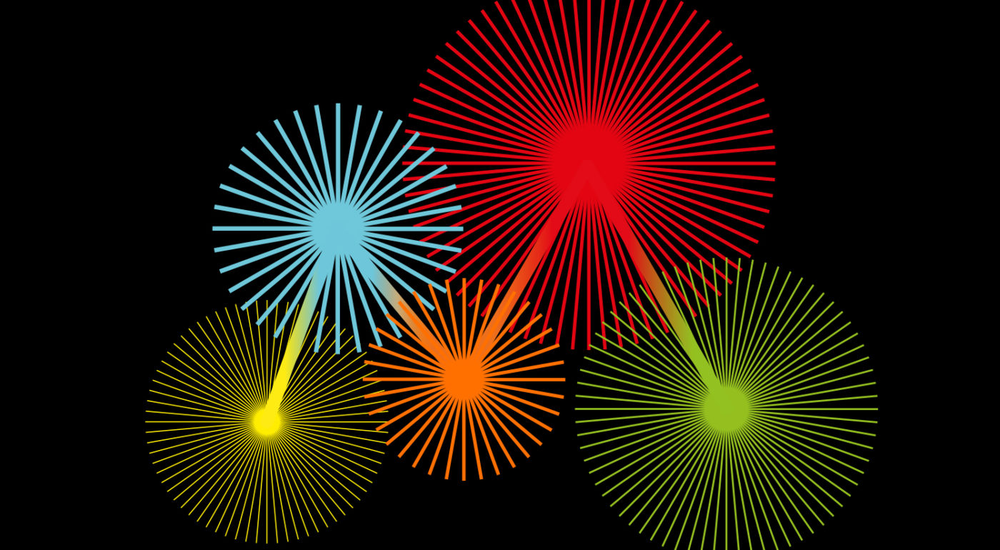
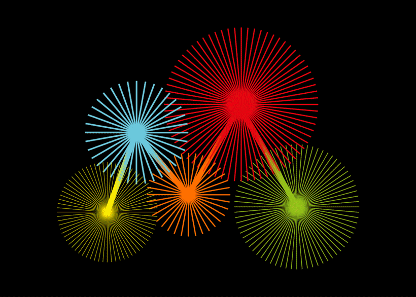
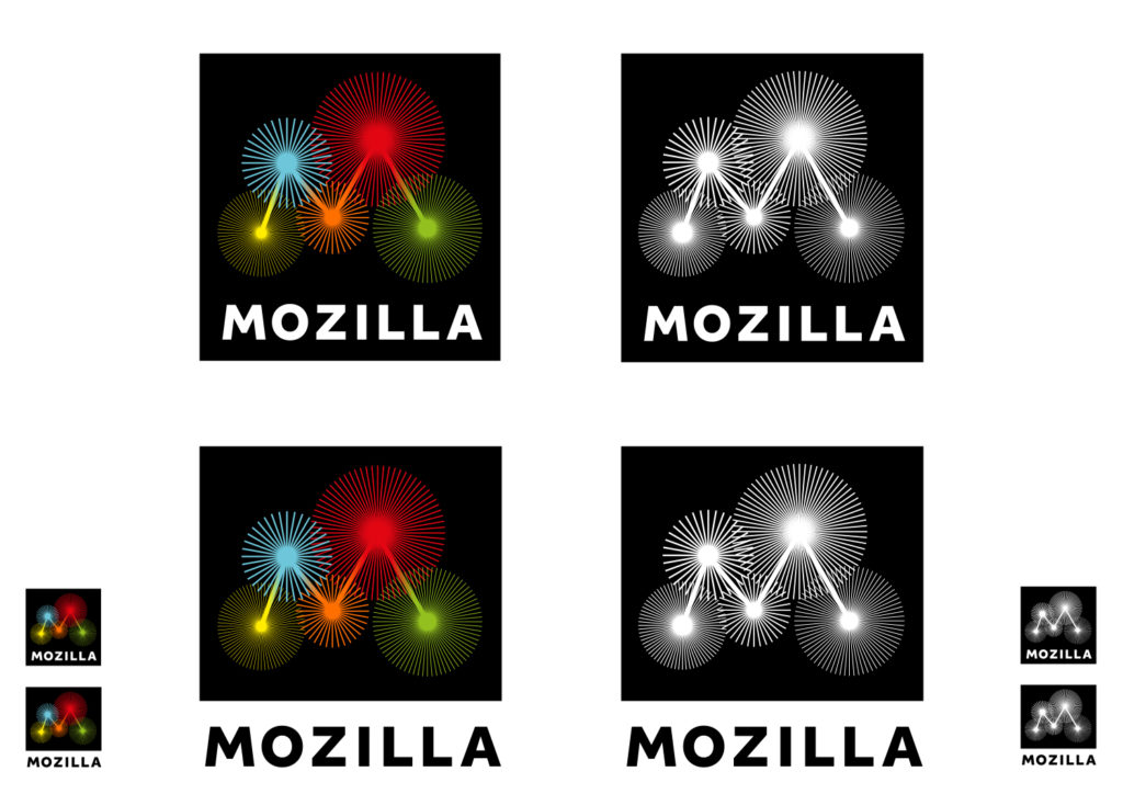
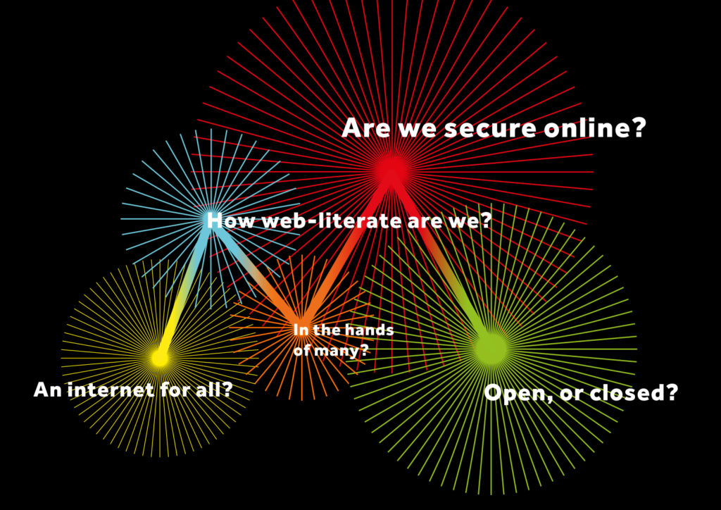
This route has stemmed from two trains of thought – firstly a new narrative direction where we have been actively considering Mozilla’s role in recording and advancing the health of the Internet. Visually we’ve been investigating data-led ideas and classic internet imagery, whilst not forgetting some of the thinking of ‘Wireframe World’ from the first round.

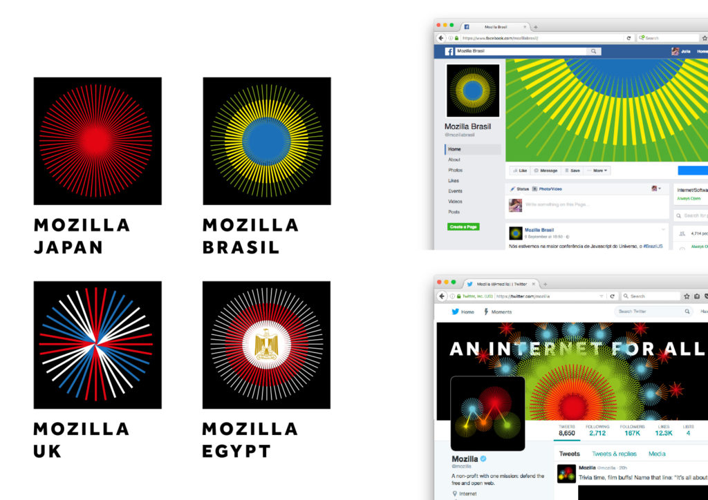
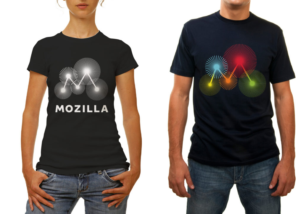
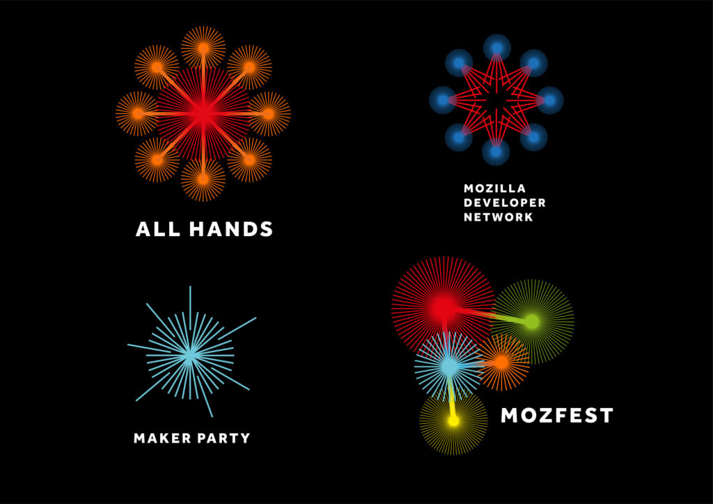
As we looked harder at data sources we realised that five was a key number: Mozilla is collecting data around five key measurements of Internet health as we type (and you read), and there are five nodes in a capital ‘M’. So we combined the two thoughts.

This creates a very beautiful, almost fragile idea that we know has great potential in online and animated forms. It also lends itself well to a set of interlinked images for Mozilla’s many initiatives.

burst_rotating


jb_mozilla-sept_b_burst_2


jb_mozilla-sept_b_burst_3


jb_mozilla-sept_b_burst_5jb_mozilla-sept_b_burst_6

jb_mozilla-sept_b_burst_4
 

28 comments on “Route Three: Burst”

  1. Gervase Markham wrote on

    “Mozilla is collecting data around five key measurements of Internet health as we type (and you read)”

    That’s pretty ephemeral, TBH :-) It could be six next month. I think this is the weakest of the four ideas, possibly because these design ideas could be used by almost any company which could find some link to the number 5. Five blobs could be arranged into a number of different letters.

    Gerv

  2. Benjamin Smedberg wrote on

    I’m skeptical that this could translate down into small sizes well. Even your small examples here lose their starburst lines and appear to be gradient circles.
    When I see this, the thing I think of is “interconnected”. Which isn’t bad, but seems pretty different from what you’re talking about.

  3. Chris H-C wrote on

    Not feeling it.

    I don’t like the moire patterns generated by the starbursts as you scroll the image or just at different zoom levels. It’s busy, and doesn’t seem to say too much.

    Maybe this is just a misstep on our way to a better design, but I’m not 100% sold on the narrative, either, so I’m not sure.

  4. Patrick Finch wrote on

    I can see this presents a number of implementation challenges, but capabilities advance here all the time (does anyone remember the time when it was a best practice to have a logo that reproduced as well in black and white as in colour?).
    I find this the best of the concepts. It is suggestive of a distributed technology organisation. The vibrant colours are somewhat jarring. It challenges me. It’s different. It invites inquiry. It’s confident, modern and daring.

    1. Peter wrote on

      Amen, the idea is good it has thousands of combinations. Narrow it down, maybe far-right node should always stay the same, so you have something like an anchor or mainmenu if you want. And the flimmery parts on small screens, just take fewer lines? Atom-models look nice, too ;)

  5. Teradyne Ezeri wrote on

    This one honestly hurt my eyes as I was scrolling by the design on my laptop. It also doesn’t feel like “Mozilla” in anything but a corporate sense. The explanation can change that, but it still doesn’t feel like something I’d like to see Mozilla use for branding.

  6. Merowinger wrote on

    Not bad.

  7. Aaron wrote on

    Cool! Works much better as black and white. Why are there different number of spokes on each node? Maybe if they were simplified, less spokes, equal amount on each one may lead to a really good mark.

  8. Brad Werth wrote on

    Moire-y and it looks like a mobile puzzle game on pause. Doesn’t read as an “M” without the Mozilla underneath it, which makes it feel like the text is doing the heavy lifting.

  9. Steph W wrote on

    Concur with the “hurt my eyes” and the ephemeral link to the number 5. That being said, like the “M” being more obvious and something that could stand on its own and be recognizable at some point. Still least favorite of the four.

  10. Steve Fink wrote on

    Thou Shalt Not Use Single-Pixel Lines. They creep, they crawl, they glimmer, and that’s not even counting the hazards incurred by rotation and angles.

    (Sorry, this says nothing about the general concept, only the above realization of it.)

  11. Martin Cartwright wrote on

    Awful

  12. Enrico wrote on

    I confirm that scrolling along this logo creates weird (and unpleasant) optical distortions. I have a hi-res screen, so the issue is not linked to screen resolution but to the lines being far too thin.

    Apart from that, I don’t particularly like this concept. Maybe it would improve much with some refinement.

  13. Paul Tincknell wrote on

    Just no. It takes too much space, and does not incorporate the total name.

  14. Sam Whited wrote on

    If I were to glance at this logo without context in passing (eg. it’s on someones t-shirt, an icon on my phone, on an advertisement), I would not think it was a logo; I would just see an interesting pattern (that looks good, but doesn’t look like a logo). There’s nothing to make me think it’s supposed to be an “M”, and the huge number of fine lines is a bit overwhelming and will probably get lost at small sizes, eg. a phone screen, an icon, an avatar.

    This is a nice looking design, but a definite no in terms of branding.

    1. Scott Hays wrote on

      It would become a logo and brand through use.

  15. smorgasbroed wrote on

    No bullshit talking here, this approach is bullshit from every perspective. It simply does not work … throw this away now before people even start thinking about favicons, app icons and whatnot in small size … arrrrrrrrgh how could you even dare to consider this ….

  16. Scott Hays wrote on

    What about without the bursts? Keeping the bright, gradient nodes, but eliminating the lines?

  17. Sebastian wrote on

    I don’t see it. As was said the bursts are moire-y even on normal resolutions. Without the bursts it just looks like a misshapen “M” with strange gradients. In the animated version I can see the dithering in the gradients.

  18. Chris wrote on

    I hate it! The logo is too spiky, bloated and inelegant. It looks like some kind of a flash test animation. It also creates moiré patterns which aren’t easy on the eye, not to say aggresive.
    And all that “2deep4me” philosophy behind it? Five circles symbolize blah blah… Give me a break, it’s cringeworthy.

  19. Brian wrote on

    For all of the reasons people hate this, I love it. I like the Moz://a one as well but that reminds me of spending a week trying to get an MS DOS program to run. This one makes me feel free. Yes it shimmers and yes it is amorphic and yes it is vague, yes yes yes. In all honesty it reminds me of the Phish Lemonwheel logo, and I went to that show, at an abandoned air force base, it SCREAMS peace. If the last decade was branding your company as the next coming of Chic fil A, I think people will gravitate to peace.

  20. Gordon Clark wrote on

    I like this design series best. A minor improvement could be to space the gears out and he them actually working. It implies the coordination all all factors to increase the value to the whole

  21. Seburo wrote on

    Hi

    Whilst bright and colourful, this one does not feel like a brand to me. It would always need a word mark and may just be seen as a pattern.

    I appreciate that a lot of creative time and effort went into it, but I am still not quite sure whether it is moving, or it is a really clever optical illusion.

  22. Michael Axinn wrote on

    I found this to be the most attractive and eye-catching. Having read the other comments I can see that it defies many of the rules that designers hold dear. But it speaks to the future, which I think is a crucial consideration here. It defines Mozilla as multi-faceted, a machine in which the different parts work together. As far as I can see, none of the brands specifically embody the principles you’ve outlined:
    The Pioneers
    Taking a stand
    The maker spirit
    The Health of the Internet
    But this one at least tells Mozilla is the sum of different parts.

  23. André Jaenisch wrote on

    Aside from what was said already …

    Why is “Are we secure?” or “Open, or closed?” more important than “In the hands of many?”?

    You described of being inspired by data-driven design (DDD). The bursts are inspired by a bubble chart (https://en.wikipedia.org/wiki/Bubble_chart) in my opinion. Larger bubbles mean more important?

    I know, it is meant to shape the M, but from a DDD point of view, I’d ask why those nodes are interconnected in that special way, too.

  24. Robert Kaiser wrote on

    The idea sounds interesting to me, but visually, still as in animations, it gets very hard to look at and very confusing in the eyes to me. I don’t find much in the actual design that could be explored further without being annoying/confusing/straining on the eyes. Sorry. Maybe if it would not have tons of lines competing with each other in my brain, it could lead to something.

  25. Gemma wrote on

    I’m not sure if this is a good thing or a bad thing but I look at this and immediately think fireworks. The colours (to me) don’t really imply “internet” or “technology” more like a child’s play toy. However I do like the white logo, so maybe stick to one colour or two shades of the same colour on the black if possible. I commend the designers from going against the norm but this may be too far.

  26. amanda wrote on

    Worst of the top 4 options. It’s not iconic, or own-able as a brand, and it’s too complicated to be understood.