Categories: General

Route Four: Dino 2.0

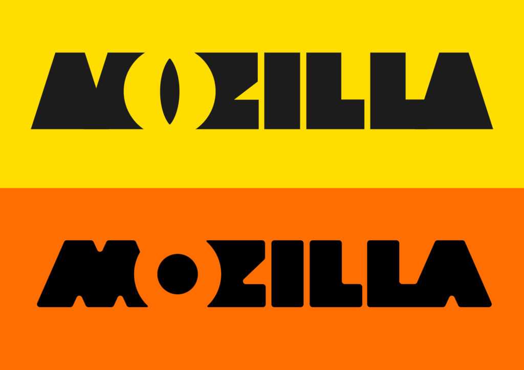
Comments from the first round on ‘The Eye’ route confirmed a suspicion that the typography might suggest something we didn’t intend, so first we looked at ways to make this creature more approachable.

mj_tm_Moz_Nashville_edits for new pics.key


The, we took a step back and looked again for ways to hint at a ‘zilla (whilst not being too specific), and create the basis of a wide-ranging design scheme. After weeks of experiments and simplification, Dino 2.0 emerged.

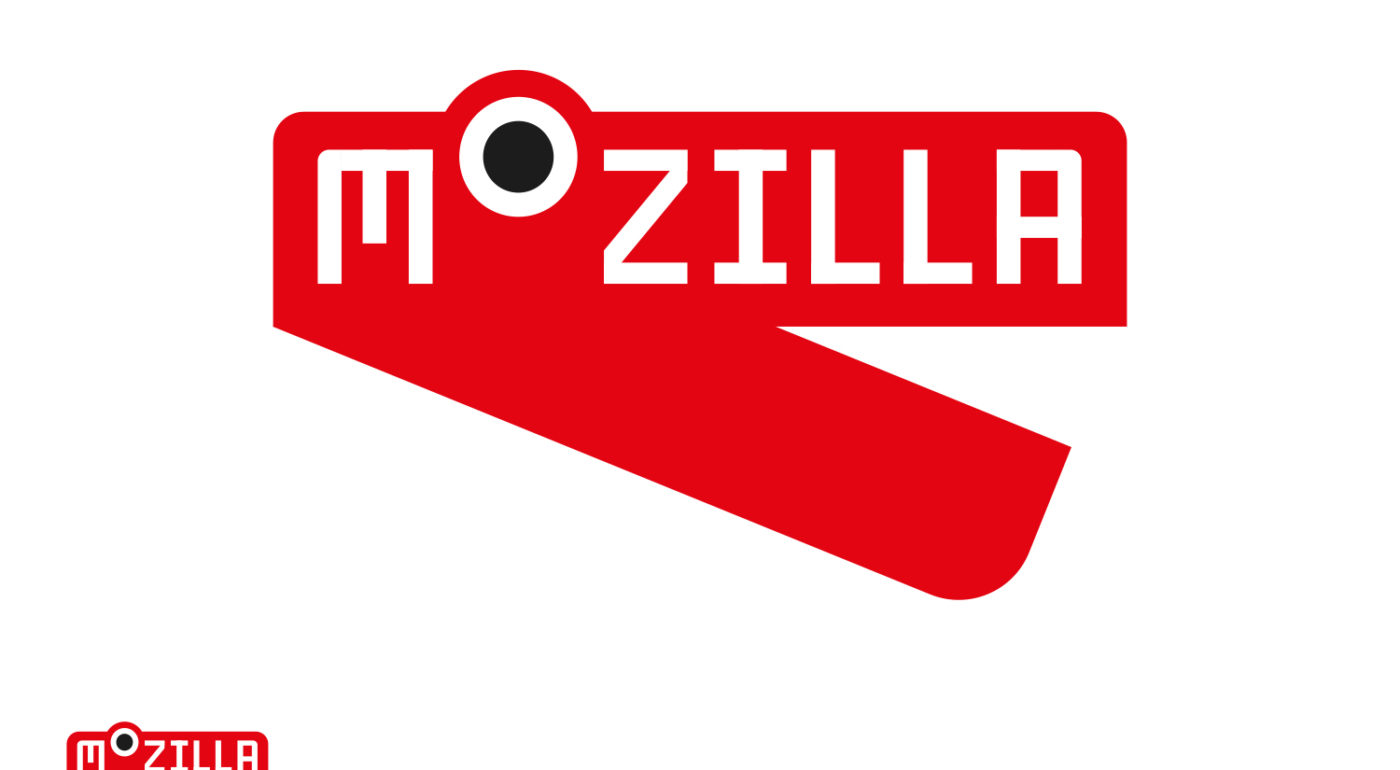
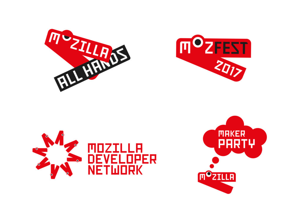
Essentially this Dino is just a red chevron and some white type – but somehow that one raised eye can watch and blink in a very unique way. And those jaws can merrily chomp when needs be.

We see this Dino as someone who can straddle two narratives – one that can stand up, be counted, shout, bark and bite when needed – yet act as a figurehead for Mozilla’s maker community across the globe. We’re developing a kind of ‘agit’ toolkit for this route, with crude hand-drawn industrial typefaces, and a suitably red, white and black colour scheme.

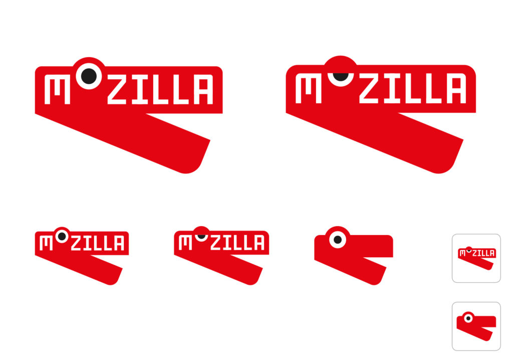
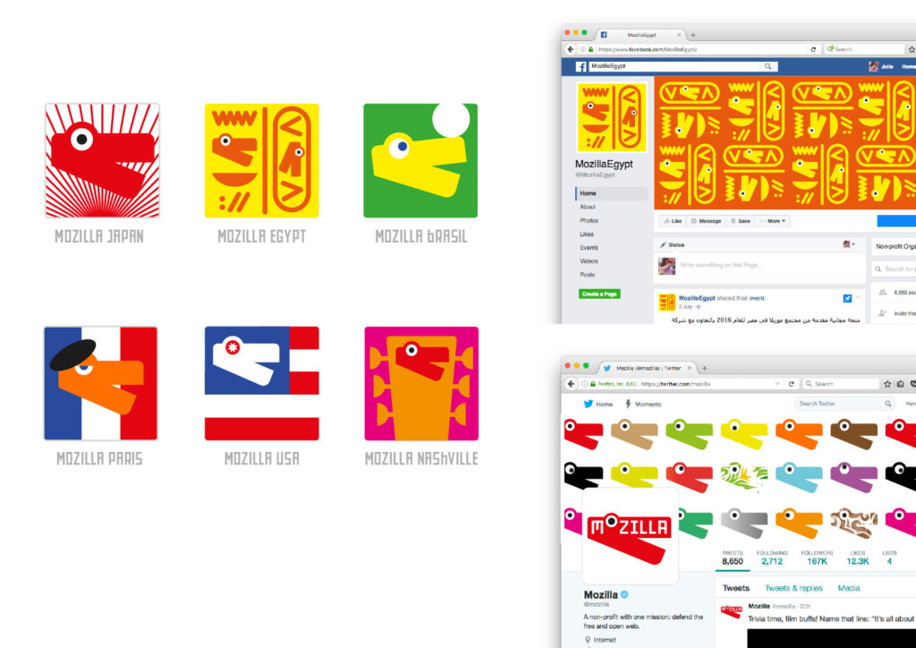
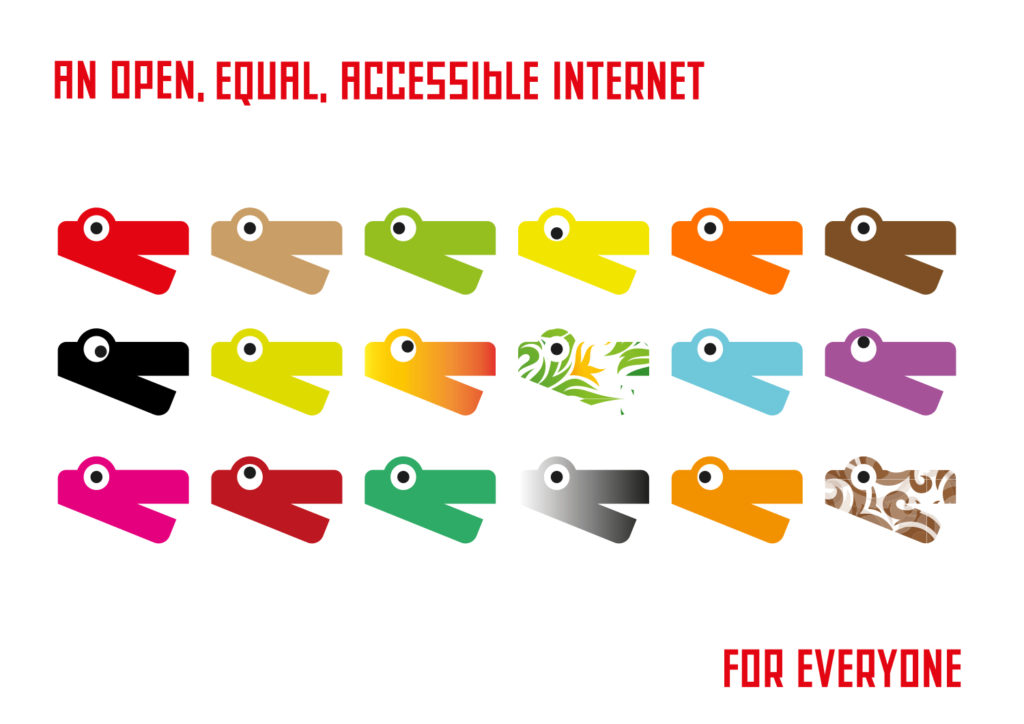
We’ve discovered Dino 2.0 successfully change its spots for communities and countries too.

dino_2-0_chomping1


jb_mozilla-sept_a_dino_2jb_mozilla-sept_a_dino_3jb_mozilla-sept_a_dino_4jb_mozilla-sept_a_dino_5jb_mozilla-sept_a_dino_6jb_mozilla-sept_a_dino_7


32 comments on “Route Four: Dino 2.0”

  1. Gervase Markham wrote on

    I’m really pleased that you are continuing to explore dino imagery, and aware of the risk that I would react badly to anything other than what we do at the moment :-) But I do think this dino is a bit cartoonish; he doesn’t have much gravitas. Do I want to go into a meeting at the EU Commission with this on my business card? I would worry they’d think I was representing a children’s TV channel. Perhaps there are other variants which wouldn’t make me think this, but I’m not sure this is there yet.

    Gerv

  2. Benjamin Smedberg wrote on

    Please can we give up on dinosaurs (or in this case, alligators)? Unless it becomes “cute”, it’s inherently a predatory and animalistic symbol. It’s the exact opposite of a community of people making the world better. Is “chomping” really the message we want to convey with our logo (Or in some variants here, shouting)?

    In addition, it’s not uncommon to hear comments about Mozilla/Firefox being “a dinosaur”. Please let’s not play to that image.

    We should have ditched the dinosaur years ago. This is by far my least favorite idea.

  3. Chris H-C wrote on

    I love the dino-stapler!

    I see it as a secondary brand design, though… I can definitely see this being used like the lizard is used today: in cute and clever, mostly “insider”, contexts where people are ready for the whimsy.

    I don’t know that I can see it on the letterhead.

    I am going to bookmark the gif and the video, though, and use it to explain Mozilla to people I know.

    Maybe that’s evidence that I’m wrong — that this is an excellent brand design because it can be used to explain Mozilla to people… but I feel as though the audience would already have to be primed with knowledge _of_ Mozilla for it to work.

  4. Gabriela Owens wrote on

    The ‘all hands’ dino looks tired or bored to me

  5. Les Orchard wrote on

    On the other hand, I feel like some whimsy at Mozilla has been one of our strengths. Who better to troll the giants than a chompy dino?

    That said, I do agree the Protocol option is better for gravitas and biz cards. Would be nice if we could have this one as a mascot for alternate branding for in-community events & such

  6. zam wrote on

    I am so pleased if All of us Mozillians make this changes a reality .. i want to get involved and make it happen.. !!

  7. Helmut Wolff wrote on

    Mozilla is a name of inovation.

    mozilla-logo-round2-route2-2

  8. Jess wrote on

    I really like the overall look of this branding. I think the Dino lends itself well to integration with all of Mozilla’s projects. No matter how you change it (colour, addition of other objects) it is still recognisable as a part of the Mozilla brand.

    It’s also something that can easily be replicated since it’s made up of simple shapes.

    My only criticism is the Dino with his eye half open looks a bit bored or stoned.

  9. Teradyne Ezeri wrote on

    This is honestly my favorite. There’s so much that can be done with this design in general, and it gives off a very family-friendly vibe. It’s also /very/ eye-catching, and could easily be recognized with nothing more than a glance. The logos are inventive, the font just screams “fun”, and the chompy dino animation makes sense in context.

    The only thing that needs a bit of work is the MDN logo. The starburst look just doesn’t work. Perhaps have it holding a blueprint in its mouth, or having a blueprint design for the dino itself?

  10. Potch wrote on

    I love this. Human, quirky, and completely and utterly different from anything else out there!

  11. Aaron wrote on

    This is one of my favorite options. Good because it can be used in different ways. But I also feel the Dino is too cartoony and can be a little more designed-out for more of a friendly corporate approach that would be more fitting to the Mozilla brand. The type can also use a helping hand. It feels a little off and maybe there is a way to keep it consistent throughout the entire wordmark.

    Good new start tho!

  12. Brad Werth wrote on

    It’s cute. Without teeth, my initial read of the image was that it was a slate used to synchronize sound in filmmaking. Teeth might be good. The half-lidded eye looks bad in the still images because it looks asleep/stoned.

  13. Dennis Schubert wrote on

    I really like the approach, but I wonder if the new font is necessary. Is using Fira an option? Using the “old” font in a new logo would make all the old imagery (and, FWIW, t-shirts!) still somewhat usable.

    jb_Mozilla-sept_A_dino_1

  14. Cameron Kaiser wrote on

    Definitely my preferred of the four. Animates well, distinctive, lends itself to lots of variations, and it’s a fun link to the past.

  15. Steph W wrote on

    I can’t help loving this one. I absolutely get what folks are saying about gravitas and it being a bit cartoonish / cute and for a little bit I agreed but I like:
    * how it can resonate w/ kids
    * the different designs in the tshirts
    * the different color possibilities
    * the Mozfest and All Hands versions
    * the chomping tags

    I prefer:
    * the Fira font or even the combination with Protocol… that way can be red background w/ moz://a for business cards / letterhead & such but can also bring in the dino for more of a mascot use.
    * to not see the lidded / tired dino.

    Really hope to see something in the final that uses this.

  16. Steve Fink wrote on

    It says “unhinged” to me. No comment as to whether that is good or bad.

  17. alexis burgess wrote on

    I love this. Sorts out the issue of the eye in the previous iteration looking a bit like it was spying on you / about to eat you. It’s playful, and Mozilla thrives on playful experimentation and creativity – things that children are good at and gradually have driven out of them by corporate culture; It’s your point of difference. There is so much confidence in this logo. Compared to the other iterations, which seem to me clever visualisations of generic ideas (flames/connectivity) it stands out a mile.

  18. Olias Gupta wrote on

    I agree about using the Protcol 2.0 characters (://a) for this design, effectively combining the advantages of ideas 1 and 4 into one approachable and meaningful design.

  19. Nick wrote on

    Seems like this one is approachable but misses the geek crowd that Protocol brings in. Maybe they could be combined to allow the dino to become more of a bracket and stylistically become something like .

  20. Enrico wrote on

    I disliked previous dino-design, but this is a huge improvement! I like it, it’s recognizable as Mozilla’s, it’s apt to variations and other uses (a set of emoticons?).

    The animation could probably be improved, even though I can’t tell why it looks “wrong” to me. Also, the font is nice, but if Mozilla plans on sticking to Fira Sans, it would look natural to have that in the logo instead.

  21. Paul Tincknell wrote on

    I like this for the whimsy and humor, and the history too. While I prefer the “moz://a” version the best, this one is a very close second, as it is very well done, and does look great on merchandise. Do keep the fully open eye over the version with the eyelid; it is important to maintain the readability of the word with a complete “o”.

  22. Sam Whited wrote on

    I’m a big fan of this logo; it’s simple, once you’ve seen it once it’s easy to recognize (with or without text since it’s a bit of a mascot as well as a logo), and it will translate well to large and small screens.

    I feel that this is one of the more flexible of the logo choices too; you can change the color, change the configuration (or remove) the eye, add a patern, etc. and it will still be recognizable. I’d be curious to see the MDN example above with all the eyes removed, I suspect it would be a lot cleaner in that particular example (having so many eyes feels a bit cluttered to me; just the plain geometric pattern might look better in the MDN example case).

  23. Sebastian wrote on

    This takes second place for me behind the Protocol design. It’s very recognizable and still very flexible. Minimalistic enough to be easily transferable to SVG and other vector formats. Don’t like the sleepy version very much.

  24. Julius wrote on

    Hi!
    I would prefer the dino because it has some kind of personality and is very versatile.
    Moz://a (Protocol 2.0) is my second favorite because it expresses the connection between Mozilla and the web and its protocols. But the blue hue seems to come directly from the nineties…
    Julius

  25. Myk Melez wrote on

    Although I like the original Mozilla dinosaur and appreciate this reimagining of it (perhaps the most of the current design directions), I’ve been nagged by the thought, as bsmedberg similarly noted, that an extinct creature is a troubling metaphor for a mature organization (and product).

    It recently struck me that while dinosaurs themselves have become extinct, their descendants continue to walk—and fly—among us in the form of those endothermic vertebrates popularly known as birds. And I wonder if there are evolutions ;-) of this design that make Dino 2.0 more birdlike (whether it becomes an actual bird, a flying dino, or just loftier, featherier, or otherwise birdlike in some way).

  26. Paul Burke wrote on

    This is a very whimsical direction. I’m a bit worried that the paths being explored are so divergent after months of work. Shouldn’t the decision already have been made whether to pursue more technical or more whimsical creative directions? Seems like the personality or attributes or whatever you want to call them should have been nailed down a bit more tightly.
    Also, the exploration of ‘zilla designs makes me wonder – given that there isn’t massive attachment to the Mozilla name, was a name change considered? Maybe I missed this in previous blogs in which case, apologies. But it may have been worth at least exploring new names that might better communicate the same qualities you’re looking for the identity to express.

    1. Tim Murray wrote on

      Hi Paul, Changing the name Mozilla was not part of the scope of this work. Regardless, finding another name that is as distinctive and memorable would be a tall order, and would give up the recognition we currently enjoy. We’re attempting to move from recognition to understanding through our our strategy and brand work. Thanks for your comment.

      1. Paul Burke wrote on

        Tim, thanks for the reply and clarification. Changing an established name can be worth it, but agreed – it isn’t easy and comes at a cost. Good luck with this endeavor!

  27. Seburo wrote on

    Hi

    I like the idea of the return of the DIno logo. Love it or loathe it, the mozilla is a key part of the heritage of Mozilla and I think that this is a good evolution of the design.

    I would recommend making two changes:

    1) Make the jaw length shorter and the depth of each jaw higher. At the moment it looks like a big red crocodile, compacting it will give it more a red T-Rex (a close, non web browsing relation of Mozilla) feel.
    2) Lose the faux-Soviet poster typeface and the random capitalization. It does not make the text very readable and feels a bit to political.

    I also agree with not using the eye lid. Mozilla is wide awake, not half asleep!

    With some tweaks, this could be really good.

  28. André Jaenisch wrote on

    I’d draw the lower jaw in white with a black outline – and less tall. I hope this won’t increase the association with a stapler further!

    I enjoy this proposal. It’s warm and has some kind of character. I’m only worried about how it will perform on small sizes like a FavIcon or business card (or a mug).

    Regarding the font: It is not obvious to me, why some characters are written in lowercase while others are uppercase. I like how the M and the A round up the wordmark.

    And please, don’t write text with a rotation like in: https://blog.mozilla.org/opendesign/files/2016/09/jb_Mozilla-sept_A_dino_3-1024×724.jpg It causes neck pain x_X

  29. Robert Kaiser wrote on

    I love this one. It associates with the actual name (and its history). It keeps some of the revolutionary, unconventional spirit we’re coming from – though it should not just chomp up the “bad” stuff but also spit/shout out the “good” alternatives in the animation. Also I love how the “lizard” wording makes a re-appearance.
    I also love how the regional suggestions play with graphic integration with regional metaphors and not just colors.

  30. amanda wrote on

    Love it! Has history and is own-able. Protocol is my number 1 but Dino 2.0 is a close second.