Categories: General

Progress in the making

Since posting the seven initial design directions for the Mozilla brand identity three weeks ago, we’ve continued to shape the work. Guided by where Mozilla is headed strategically, principles of good design, and the feedback we’ve received through this open process, today we release four design contenders. These will continue to be refined over the course of the next two weeks, then put through global consumer testing. We expect a brand identity recommendation to emerge in October.
mj_tm_Moz_Nashville_edits for new pics.key

If you’re just joining this process, you can get oriented here and here. We’re  grateful that this process has sparked such interest among Mozillians, those who care about Mozilla, and the global design community—dozens of articles, hundreds of tweets, thousands of comments, and perhaps tens of thousands of words of feedback. As believers in transparency at Mozilla, we consider this a success.

Thanks to all of you who have added your voice to the conversation. Your many constructive comments and suggestions have helped us chart a path forward. Some of you will find that your favored design directions have been let go in the pursuit of something better. We hope you’ll find a design here that you feel best represents Mozilla today and tomorrow.

mj_tm_Moz_Nashville_edits for new pics.key

Some that we’ve left behind.
Of our original seven, four have fallen by the wayside, one has remained intact and two others have directly led to new ideas. We have let go The Open Button, which upon further study we found lacked a clear connection to Mozilla’s purpose, and Flik Flak, which had its fervent supporters but was either too complex, or too similar to other things, depending on your point of view.

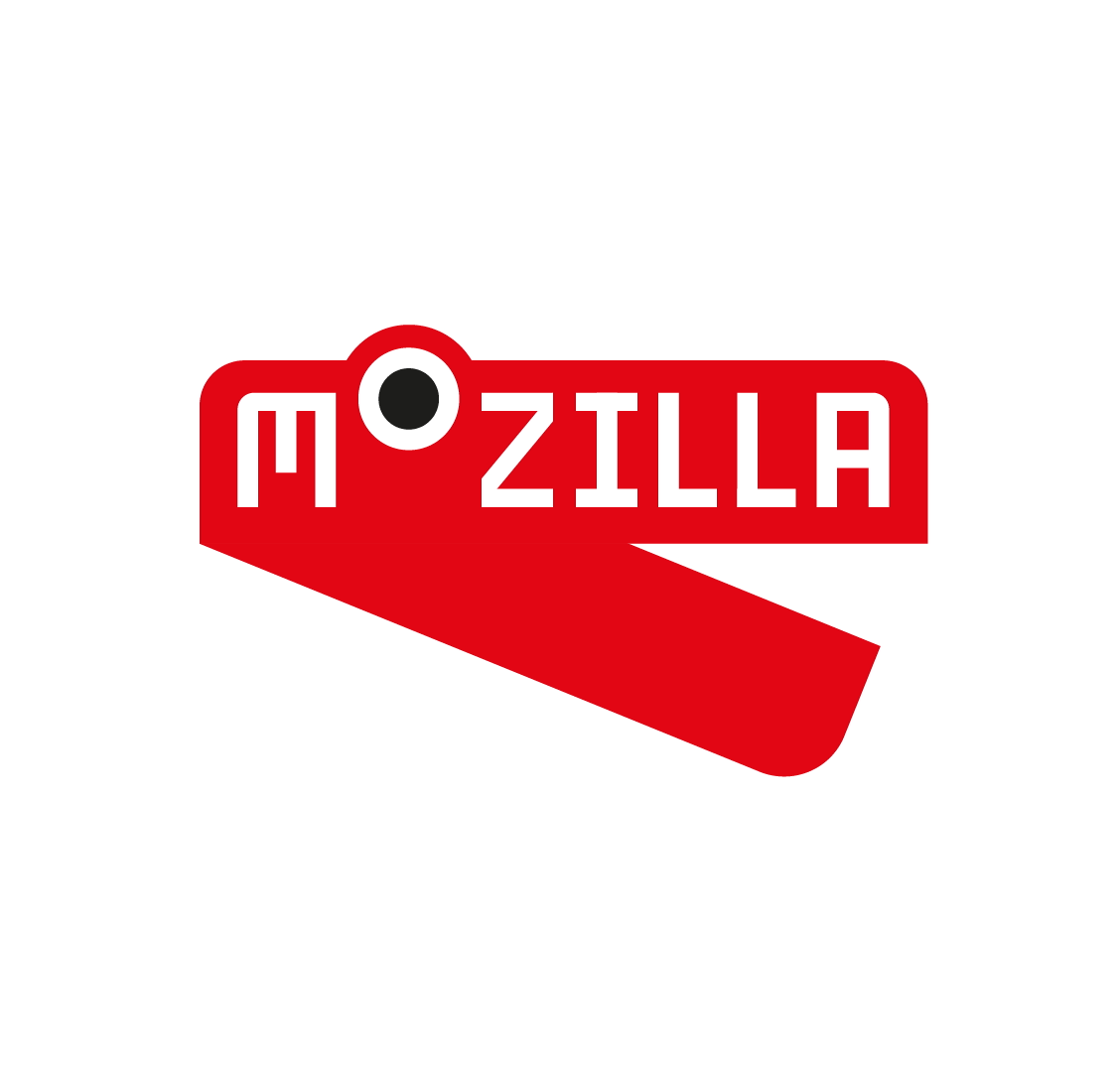
For many, The Impossible M was an early favorite, but we discovered that it was just too close to other design treatments already in the public domain. The Connector stayed in the running for some time, but was eventually overtaken by new ideas (and always slightly suffered from being a bit too complex).

What we resolved to do next.
Working in tandem with our London agency partner johnson banks and making the most of our time zone difference nearly around the clock, we agreed to redirect efforts toward these design goals:

  • Focusing first on the core marks, particularly on their visual simplicity, before figuring out how they extend into design systems.
  • Exploring the dinosaur. From the blog feedback, it was clear that we had permission to link more directly back to the former dinosaur logo. Aside from The Eye, what other paleo elements might we explore?
  • Celebrating the Internet. Rather than seeking ways to render the Internet in three dimensions (as Wireframe World and Flik-Flak had bravely attempted to do), might be influenced by the random beauty of the Internet works and how people use it?
  • Refining and simplifying the two routes, Protocol and Wireframe World, that showed the most promise in the first round.
How the work links to the core narratives
At this stage of the project, we’re down to four overarching narratives, three from the original set and a new one:

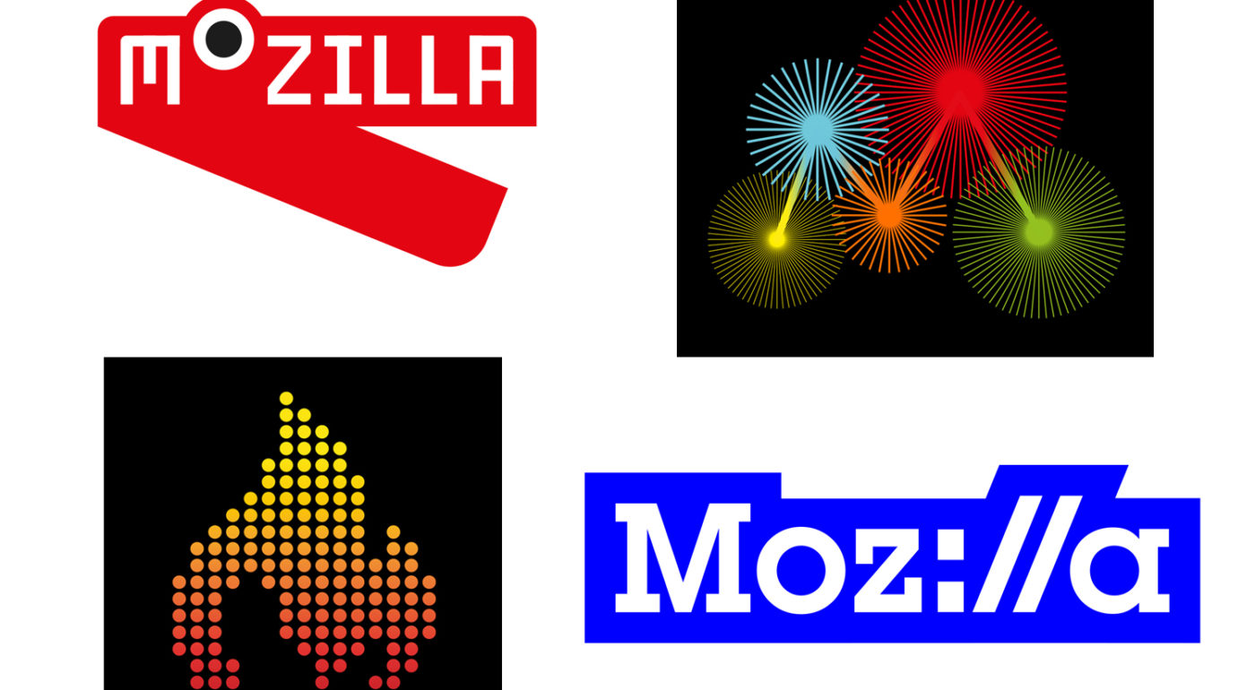
The Pioneers: This is still a strong and resonant territory, and one that works well with at least one of the final four.
Taking a stand: This positioning emerged directly from our earliest discussions and is still very strong.
The maker spirit: We’ve seen from the first round, the community of Mozillians is vocal and engaged and is key to the organization going forward.
The Health of the Internet: This is a new idea that posits Mozilla is a guardian and promoter of the Internet’s overall well-being.

The Final Four
Below is our continued work in progress on the four refined identity directions that we’ll take into testing with our key audiences. Please click on the image to be taken to a page revealing the related design system, and make individual comments there. If you wish to compare and contrast these designs, please do so in the comments section below.
Route One: Protocol
protocol_master_logo
 
Route 2: Burst
burst_rotating
Route 3: Flame
flame_flicker
Route 4: Dino 2.0
dino_2-0_chomping1So there you have it: four final directions. Let us know what you think!

117 comments on “Progress in the making”

  1. AirElemental wrote on

    I really think these four are an improvement over the previous seven. My thoughts:

    Burst: It took me a while to see the M, and it is painful to look at.
    Dino 2.0: Looks more like a red stapler. I don’t really like it.
    Protocol: Really neat! Not sure about the color, but definitely better than the Dino’s color.
    Flame: I really like this one as just an image, but the animation makes it a bit busy for me. I also think the negative space looks like a buff arm flexing. Pretty cool.

  2. Hildy J wrote on

    Protocol is the best of the four, as is. But I’d like to see Burst redone with meshing gears, representing meaningful activity, instead of busy and meaningless “bursts”.

  3. Chris Jorgensen wrote on

    I agree with what has been said by several others, some kind of combination of dino and protocol would be great. It would be difficult to use the colours together though. I like the bright blue colour in protocol, but how does it relate to the Mozilla brand identity people already know? The dino as it is now looks a bit too simplistic, something hinting a bit more of the original would be great.

    The two last entires burst and flame don’t really relate to you as well as the two others in my opinion. I think burst is also a bit too complex for a logo and while the flame is a powerful symbol, and used well by e.g. Amnesty International and UNHRC it does not have the same connection to you as the dino. If you must use it go with a dino with a torch :)

    Are you going to experiment with different fonts also? I am not sure the serif font in protocol is the best choice.

    I am looking forward to seeing the next iterations!

    Chris

  4. Enrico wrote on

    I really like both Protocol and Dino, I can’t tell which one I prefer.

    Flame is a nice logo, but it looks totally unrelated with Mozilla.

    I don’t like Burst: it looks weird on the screen, like those optical illusions where you see a still picture moving (and the final effect is unpleasant).

  5. Jason wrote on

    There is no doubt that Protocol is the strongest contender. Clean. Versatile. Universal. Clear.

  6. Kosmonaut wrote on

    Protocol: love the concept! Almost perfect! I would just change the color as blue logos are everywhere. (no red also, sry :P)
    Burst: please don’t! It makes my eyes hurt! Badly!!!
    Flame: meh! really?
    Dino: cute but that’s just it. Like many others said before, it looks juvenile.

  7. Jana DeWitt wrote on

    burst.

  8. Magdalena wrote on

    My favorite is Protocol, it shows what Mozilla is all about and might last longer than the other logos that follow the latest trends.

  9. Laura wrote on

    As they are, Protocol is my top choice but I really don’t like the blue. Dino is too childlike (an the stapler thing is hard to unsee) – Perhaps making the eye larger and/or lengthening the double ls (ll) to create teeth might change things? Plus, a proper dinosaur should be green! :) Burst ad Flame are too abstract and really could be anything.

  10. Geoffrey Ledingham wrote on

    The Protocol is the best of the bunch but being from Canada, I can’t disassociate it with The Movie Network channel logo (see attached)

    The_Movie_Network

  11. Francesco wrote on

    The fireworks from a pure design perspective are shit: there’s o way you are going to display that correctly on a small scale, there are too many details (apart from the fact that personally don’t like it).
    The dino I don’t understand what stands for. Also looks very childish.
    The fire is nice, although the “pixelate” effect is been used a lot… and again, it loses a lot on small scales.

    I find the protocol version brilliant. It convey a strong message with super simple details. Just lovely. That’s what real graphic design is about.

  12. Damijan wrote on

    Flame, no doubt. Looks cool and simple and it is related to FireFox that is still main product.

  13. Jason Lustig wrote on

    Protocol all the way. While still not a super strong branding identity (will it be a classic in 80 years?) At least it’s clean, tied to the purpose, and I like the serif’d font a lot better than the version from round 1 in that those serifs contribute to a more solid, lasting, and perhaps classic feel. Sans-serif feels too “now” and won’t stick around. Flame seems random even if pretty (and using the dots is cool if arbitrary), burst makes no real sense (I know it spells an “M” but who cares if it’s that distracting) – the spinning makes me think of gears, but they have no obvious mechanical relationship to each other and it also seems meaningless related to Mozilla’s purpose. Dino 2 is cute (ish) but the heavy bottom jaw is distracting and visually unbalanced, and the purpose again meaningless other than to be a dinosaur (and yes, I really actually am wearing dinosaur socks to work today even as I type that).

  14. Wilhelm wrote on

    Protocol is great right now, will still have that impact in 5 years?

    The Dino concept is fun, but I feel it needs to be explored quite further to reach a point more timeless anesthetic.

    Burst is one of those 5 minute illustrator experiments we all did, and liked for 30 seconds before moving on to something with substance.

    Flame is too similar to every other flame-ish and pixel-ish logo out there.

    Cheers

  15. Paul Hooper wrote on

    Looks like you’ve probably got the solution in Protocol.

    As others have said, the animated M Flame and the fireworks 5, whilst attractive, are not really relevant to the casual viewer and could be anything, whilst the dino is fun, but is not a ‘zilla’ to me and more a Barney or even alligator.

    I do suggest though that whilst Protocol can have many different guises, it should not become overcomplicated and too fractured. Its effectiveness is derived from its simplicity and visual pun. I understand that the designers are trying to illustrate it’s future flexibility and that may well be demonstrated in what goes on around the wordmark itself, but on the whole the core I feel should remain strong and relatively consistent. Any ‘fracture’ of the identity should be well reasoned and for a specific and planned effect.

    Take it or leave it :// )

  16. Laura Moraiti wrote on

    Protocol seems by far the most solid one in the bunch. Clearly shouts “Mozilla” and connects with the internet… The flame unfortunatelly is too far out there to be tied to anything internet-related. The M made out of stars gives an advertising agency vibe with the multicolor styling. And finally the dyno, is cute as a mascot but not main logo.

  17. Max wrote on

    Dino 2.0 works well as an icon, recognizable even as a small image. It’s an appropriate image, given that the name is still “Mozilla.” I see the red stapler, and if anything that’s positive for me.

    I like Protocol too, but not as much. The other two don’t work for me.

  18. John wrote on

    Make the bursts on the M a mouse over processing effect. The the mouse hits a joint, a quick burst happens at that point. The gradient M on its own with out the pin wheels would be quite nice.

  19. Sparkle wrote on

    – Protocol I think is best. Very strong in my opinion (though I don’t know if the blue background needs to not be a rectangle).
    – Fond of Dino, but I see why many people see it as childish. It’s a bit harder to associate it with a serious company.
    – Burst is just a very unappealing logo. I find it unpleasant to look at.
    – Flame – meh. It’s a good graphic, but I don’t think it’s a strong enough contender.

  20. Kal wrote on

    Sorry but these are all just bad.

    Protocol, though, is the least bad and could be a great brand with some different colors and lose the thick blocky background/outline. Just use the words/symbols themselves.

    1. Kal wrote on

      Also, I just showed these logos to everyone in my chat channel, and they collectively said “Ew! Wtf.” Just something to think about.

  21. Kit Cambridge wrote on

    I like the dino; it feels playful and approachable, especially with the wink! It lends itself well to different colors, too. Thanks so much for engaging with everyone on this, and for your openness to feedback, Tim. It’s really appreciated!

  22. Ricky Barbosa wrote on

    Protocol all the way. I doubt that any users could take any of the other three seriously.

  23. Snape wrote on

    Burst is really sad, not even a logo attempt. It wont scale, print and people cant read it. Should have left it in on the Illustrator art board of death. Deleting all Mozilla related items just because you thought for one second that it would work as a logo.

  24. Matthew Anderson wrote on

    Protocol is amazing.

  25. G B wrote on

    Protocol, all the way. Dino is cute and all, but it’s flatter that Protocol. It communicates less.

  26. Keith Kirkwood wrote on

    Protocol without a doubt

  27. sa wrote on

    I’d definitely go with Protocol
    it’s an intuitive visual reference for what the brand represents

  28. Alan Hart wrote on

    I like Dino the best. Protocol is fine but looks quite corporate and you can’t tell quite what it is. Dino updates the heritage. The others are a no-go for me.

  29. Dan wrote on

    Protocol, but with the colouring and font from Dino! (White on red).

    White on blue looks very clinical / medical in my mind.

    Burst is too noisy, and makes weird patterns when scrolling.

    Flame looks nice, but I couldn’t see the M at all, I was drawn into the negative space and trying to work out what that was.

    I really like the font and colours of Dino, but it does look like a stapler.

  30. JP wrote on

    Protocol in a different color. (That blue on white -> MS Word from the days of DOS).

  31. Kara Hartman wrote on

    I like Dino.

  32. J.A. wrote on

    Protocol is my favorite of the bunch. Like others before me, though, I’m not sold on the blue. Perhaps a reddish-orange? A color that gives a nod to the much loved Firefox logo.

    A fellow interwebbers $0.02.

  33. Grayson Rosato wrote on

    Love Protocol. Clear while still being flexible.

  34. VP wrote on

    Dino:
    Looks like it would be perfect for a children’s brand. It’s cute and utterly boring. If it evolved into something more mature and potentially dangerous, then maybe it could represent a brand that saw itself as a protector of the internet. Besides, there is the inherent issue of dinosaurs and extinction, despite all previous connections with the Mozilla brand…

    Burst:
    I seem to be in the minority, but I like the subtle movement and the M. Of all of them, it reminds me of another tech company in a highly positive way. When you update iOS, the gears in the icon slowly rotate. If you aren’t paying attention, you never notice it. I’ve always loved that subtle attention to detail. Does it make crazy moiré patterns when you scroll? Yes. Is there something that’s maybe a bit too art school or graphic design project about it? Without a doubt. But, this stands out as both a still image and an animation in a way the others don’t.

    Flame:
    It’s a flame. If the flame resembled a fox, or a fox appeared while the flames were moving, then it resolved into an M, you might have something. As it is, it’s no good.

    Protocol:
    It’s got a colon and forward slashes because internet. Reminds me of way too many ads, news transitions, even the date/location text that you see all the time in movies. Go ahead and make it green letters on a black background, and we’ll all go ‘Oh, the Matrix!’ Plus, it’s boring and ugly. Just no.

  35. Nigel Boor wrote on

    I think Protocol works on so many levels and the M: is such an obvious sub element to use in smaller situations. Not a fan of the block outline but it does not greatly offend the eye – just a personal preference for cleaner, text only approach.
    Dino is OK and maybe more “fun” than Protocol but the eye does not work as sucessfully as a sub element since it less obviously [M:]ozilla.
    Both work really well as static or animated versions.
    Sorry but I really dislike Burst – it just confuses the eye and I can see all sorts of problems with unexpected effects on varying resolutions colour depths and screen sizes.
    Flame – just don’t see it without looking hard. A logo needs to hit you, even if its in your peripheral vision & this one doesn’t. A bit like stereograms – some will see it, the rest of us will go “huh?”

  36. Sonja van der Westhuizen wrote on

    Apologies for falling into the process at this late stage and probably repeating what might already have been said.

    Although I’m not crazy about Protocol, it wins hands down when it comes to longevity and at least it’s recognisable as a logo. All the logos are animated, but one has to take into account how effective they will be if they need to be used as static images.

    Burst will lose its efficiency and so, unfortunately, will Dino. I agree with the stapler resemblance – maybe not quite the association you want? Flame just looks like a random animation. There doesn’t seem to be any clear corporate identity.

    I would suggest that the blue in Protocol be replaced by red or orange for a stronger effect and possibly a more modern font.

  37. Tommy Duhn wrote on

    Dino is half decent. Protocol is not bad, but I think it may be too geeky, and I don’t know if Mozilla can afford to niche-itself to death right now.

  38. Peter Atcheson wrote on

    There can only be one… Moz://a for the win!

  39. Martin wrote on

    Initial thought: meh.
    After viewing the design systems: Better than meh.
    If Dino 2.0 could be adapted to be closer to the original tyrannosaur head shape (shorter, thinner bottom jaw, and perhaps a rounder noggin’) and a slight modification of the type (feels too totalitarian at the moment) this could work.

    Flame – design system can run the gamut – which is good…maintains a pop art vibe, truly flexible…slightly unreadable (though the version with the small dots to larger dots on the t-shirt works). Maybe the M but not as a flame?

    The Star Burst – really has a lot going for it…some refining could push this over the top…fewer spokes and thicker lines both for the M and the bursts could help…but adding text over top of this makes it very noisy. As a design system very good…as a logo…refinement needed.

    Protocol…good ol’ corporate blue…the most used color in the book. Maybe softer edges…and if you knock out the text so it’s see through (representing mozilla’s transparency) this might work. And use your moz red. :)

    Frankly, the current word mark for me is bang on. With an icon attached, it might then have more punch…and then re-boot your home page to express your product offerings a little clearer, would go a long way to “re-branding” for me. When I hit your front page I’m sort of left guessing as to what you provide…it feels like your hiding everything behind a word with no explanation.

    (You kind of explain it in your blurb.. ” Using the web as the platform, we build open, innovative technologies that allow developers to work free of closed, corporate ecosystems and create faster, safer web experiences for us all. ” You make technologies?…and then you list things like Rust and Servo with no explanation as to what they are…and I guess you have a browser? Don’t get me wrong – the page is pretty and well thought out…just I have no idea what’s what. A few more explanatory notes would be helpful).

    Here’s hoping your rebrand kicks in the clarity. Intrigued to see where you go.

  40. liuche wrote on

    Flame: I looked at the detailed version of Flame, and I actually find it to be fairly consistent with some of the other open source logos – I don’t understand why the “mozilla” part of that logo was cut out, because in its current form on this post, there is no discernible link to Mozilla at all. That being said, perhaps if the logo needs the “mozilla” text, perhaps it’s not distinctive enough.

    I think one of the main reasons everyone is very pro-Protocol is that it is the only reasonable logo that actually says “Mozilla” (the Dino looks so childish I can’t really take it seriously). I’d suggest updating the Flame in this post to include the grey “mozilla” that’s present in the detailed Flame blog post – I think the current version is extremely confusing and actually kind of misleading.

    Protocol: This logo is tying Mozilla to browsers, and since we are trying to move Mozilla to a bigger space than just Firefox, this really seems counterproductive. I like the visual pun, I like the nod to browsers, but this really shouldn’t be the logo because it’s regressing the mission by boxing it into a smaller space. Please talk to some Mozilla leadership, or listen to Mitchell Baker’s talks about going beyond the browser, or talk to some high level product people – tying the brand more tightly to browsers is *not* going to help further the Mozilla mission. I’ve commented more earlier in the thread so I won’t repeat myself any more here.

    Burst: I looked at the detailed post about Burst, and I find the thumbnail versions to be quite nice, because the “M” for Mozilla is clear and stands out, and even looks a little like a constellation. However, in the large version that’s up here, the line bursts are overwhelming and detract as well as distract from the underlying “M” of the logo. It’s nearly impossible to focus on the M, which I think is a failure of this logo. Perhaps a different version would work, but not in its current incarnation.

    Dino: This is just so childish, I can’t take it seriously. I like the Dino, I think it looks cute, but this version would be better suited to a funny sticker rather than the overarching logo of a global company devoted to fighting for the openness of the web. The animations in the extended blog post really just confirm my feeling that this is kind of a cutsey rebranding, and I really don’t think internet privacy and user choice and open web can effectively be represented as “cute”.

    In general, I think there’s a lot of pushback from the community because these logos just seem random and don’t do a good job of relating to the Mozilla mission, and at best seem to only fixate on a tiny part of it. It’s so myopic that I am starting to feel uncomfortable about whether the company that we have hired/partnered with actually understands the breadth and depth that Mozilla encompasses.

    If anything, I’d really just prefer the current logo, because in a lot of ways, it doesn’t pigeonhole Mozilla into one of these tiny categories, and also isn’t so vague as to seem like nothing but a vain, meaningless “brand facelift”. I guess I feel like a rebrand should help focus the world on what Mozilla stands for, and these either seem overly focused on one tiny aspect of Mozilla, or don’t mean anything at all.

    1. Tim Murray wrote on

      Thanks for sharing your thoughts Iiuche. I’d be curious to hear what you consider to be the current logo for Mozilla. The wordmark that says “Mozilla?” The most successful brand identities do indeed suggest the purpose of an organization in the world. A logo also plays a role in driving recognition, so that over time, one associates the symbol with the brand. One could argue that Protocol and Dino 2.0 are the more recognizable of the four designs, while Burst and Flame begin to suggest the overall purpose of Mozilla (championing the health of the Internet and being the keeper of the flame, respectively). In general as time passes, recognition comes from repeated exposure to a consistently applied brand identity. The Achilles heel of our past approach, in which teams, locales, and initiatives have been encouraged to make up their own identities, is that these many different looks contribute to confusion about what Mozilla does, believes, and stands for. If you had to select one image to convey the totality of Mozilla, what would it be? Thanks again.

      1. liuche wrote on

        “Burst and Flame begin to suggest the overall purpose of Mozilla (championing the health of the Internet and being the keeper of the flame, respectively).”

        I agree that those characteristics are consistent with what Mozilla represents, but at the same time, merely “suggesting it” doesn’t seem enough for a brand! I think the sign of good branding is not having to explain the details of why your logo or brand reflects your company/values.

        Going along that thread, I actually think using a red dinosaur to convey the totality of Mozilla is great – it matches the name, it’s distinctive, and its consistent with the history of Mozilla’s branding (which truly does appeal to Mozillians). But the cutsey-ness of this iteration completely over-rotates on the “accessible” and “friendly” facet to the point of obliterating the more meaningful (and distinctive) roles that I personally think Mozilla stands for and should try to communicate more broadly.

        Mozilla embodies an advocate, a guardian, and a guide for those navigating the web and the Internet (and fights for open technology and standards behind the scenes). Being accessible and approachable needs to be part of that, but it should not be the only aspect we portray. Perhaps other people on this thread put it best, but this dinosaur needs some teeth! (To be clear, I’m definitely not advocating literally just adding teeth – that’s just lazy.) Where are the more important roles of being an advocate, being a protector, the reasons to trust Mozilla being represented in this branding? I think building on the dinosaur is fantastic, and the friendliness and accessibleness is something that was lacking in the previous Mozilla browser dinosaur – but there are some key characteristics of Mozilla that don’t seem to have been represented clearly in any of these brand suggestions.

  41. liuche wrote on

    Also, what about the logos that johnson banks did here? The teeth/M one on the bottom right seems less pigeonholed than any of the others.
    http://johnsonbanks.co.uk/thoughtfortheweek/files/jb_Mozilla_Dino_investigation_2.jpg

    mj_tm_Moz_Nashville_edits for new pics.key

    1. Grace wrote on

      Super cool. Love the graphics. But as a logo is kind of hard to make sense of…..

  42. Nikko wrote on

    They all look odd, keep the current logo.

    1. Tim Murray wrote on

      Hi Nikko! Thanks for your comment. What do you consider Mozilla’s current logo?

  43. Grace wrote on

    Protocol definitely.
    Clean, smart, memorable, scalable, most definitely ownable. I can see longevity in this design whereas the other approaches could be interesting but not as recognizable and class as Protocol .

    The combinations of Protocol and Dinos in the previous comments seem very interesting but become too complex to process at a glance. Mashing too many layers of information is trying too hard to be smart. Logo 101 tells us a strong logo is one that convery one genius idea. One!

    Love the work so far. Protocol is great!! Dino 1.0 is great too with lots of personality…. not a huge fan of Dino 2.0

  44. Sam wrote on

    After thinking about all of these designs, this is what I’ve come to.

    Dino 2.0 – While I can tell there was a good amount of creative effort put into this one, but I really don’t have much of anything positive to say for it. When I asked people I know about the four logos, this one got little attention, and what it did get wasn’t very positive. All-in-all, this odd looking and slightly unsettling thing doesn’t say much to me about Mozilla – other than “weird”.

    Burst – This one exists. It’s a graph thing. The description for it sounds very corporate and it looks like a line graph. It doesn’t really say much about Mozilla unless you plan on becoming an analytics company. It scales across different screens oddly and it’s apparently made people’s eyes feel weird. It exists, I don’t like it much and I don’t see much creative potential with it. It doesn’t look ugly or creepy and it doesn’t leave a really bad impression. It just doesn’t leave much of an impression at all.

    Flame – Warm, flexible, and modern. That’s what came to mind when I looked at this logo. After the previous generation of design concepts I was pleasantly surprised by this one (as well as Protocol 2.0). It’s neat and seems to be a favorite among people I show it to. The logo is nice to look at and the narrative fits Mozilla very well. The flame just works, and of course it fits well with Firefox too. I struggled to find any criticism for it. The only thing I’ve come up with for a negative is that you didn’t use the Mozilla fonts. Flame would look fine next to the trusty old Meta Bold wordmark, and I should maybe remind you that “re-branding” doesn’t mean “get rid of all resemblance to old branding”. Fonts aside, this is a great design route and I would be very happy to see Mozilla go with it.

    Protocol 2.0 – While I wasn’t as much of a fan of it at first, especially the first version, this one has grown on me. It’s professional and clean, without feeling too cold or corporate. It was my Graphic Design Teacher’s favorite (Flame being his second) and I can pretty well see why. While I still can’t say that I like this one better than Flame, I can say that I like it.

    Between Flame and Protocol 2.0, I prefer flame, but I’d be happy to see Mozilla use either. That said, I do hope you don’t leave your trusty fonts out in the cold. They’re readable and they stand out in a sea of generic serif and sans-serif fonts. The current fonts have this wonderful balance of modernism and class, mixed with a little personality. Just wanted to mention them to be sure you weren’t planning on getting rid of them. This typography is huge part of Mozilla’s brand, which is why I felt the need to talk about it here.

    Back to logos – After careful consideration, here’s how I rate each design:
    Flame – very good
    Protocol 2.0 – also good
    Burst – So forgettable I had to stop and remember what the name of it was
    Dino 2.0 – Let’s not do that please

    Thanks for reading, I’ve been wanting to express all this for a while.
    I hope that even though I’m not a professional programmer, I can contribute something.

    – Sam

  45. amanda wrote on

    Definitely Protocol or Dino 2.0 for me. Both are brilliant in their own right and own-able as a brandmark.

    Other two are a bit generic, not an own-able/unique asset to Mozilla.

  46. Joshua Vizzacco wrote on

    Protocol all the way!

    Lets get down to design basics and what is most useable across all platforms / marketing materials. The fact that Protocol has a icon as its starting point gives this logo flexibility where the others do not. Even when it comes down to how these marks would scale down to smaller sizes – there is only one option. Its nice to let us contribute our thoughts but come on, there is only one option here.

More comments: 1 2