Categories: General

Design Route G: Flik Flak

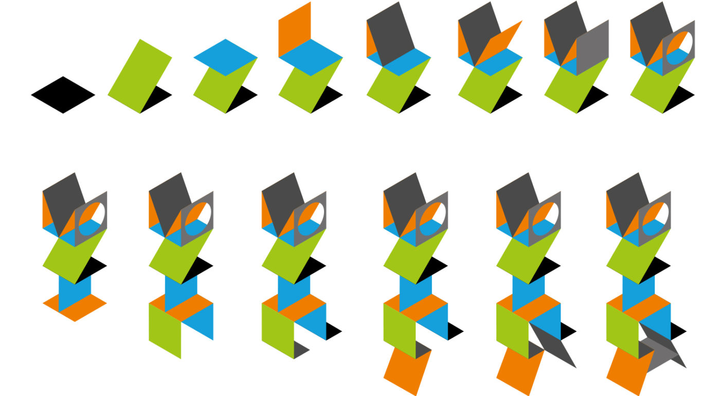
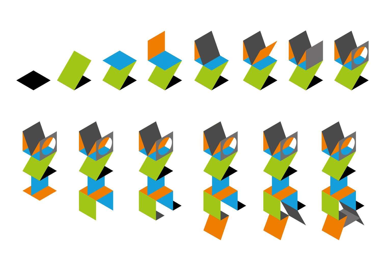
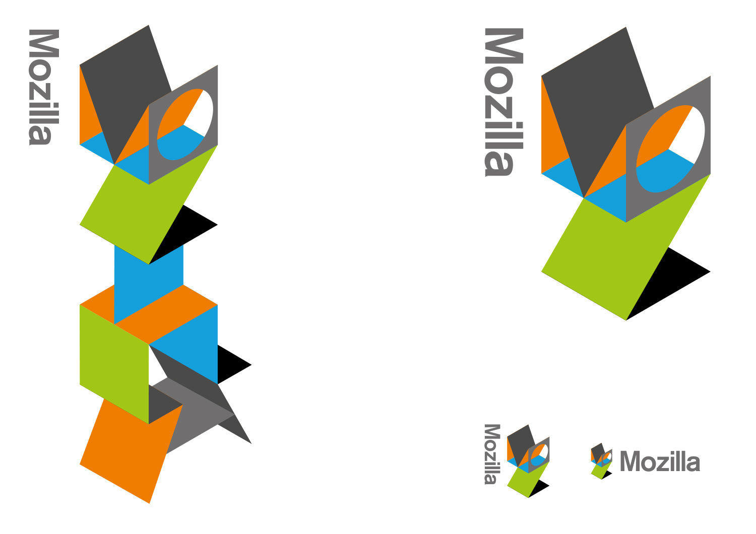
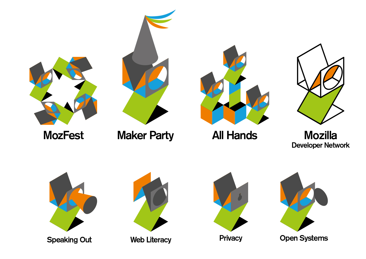
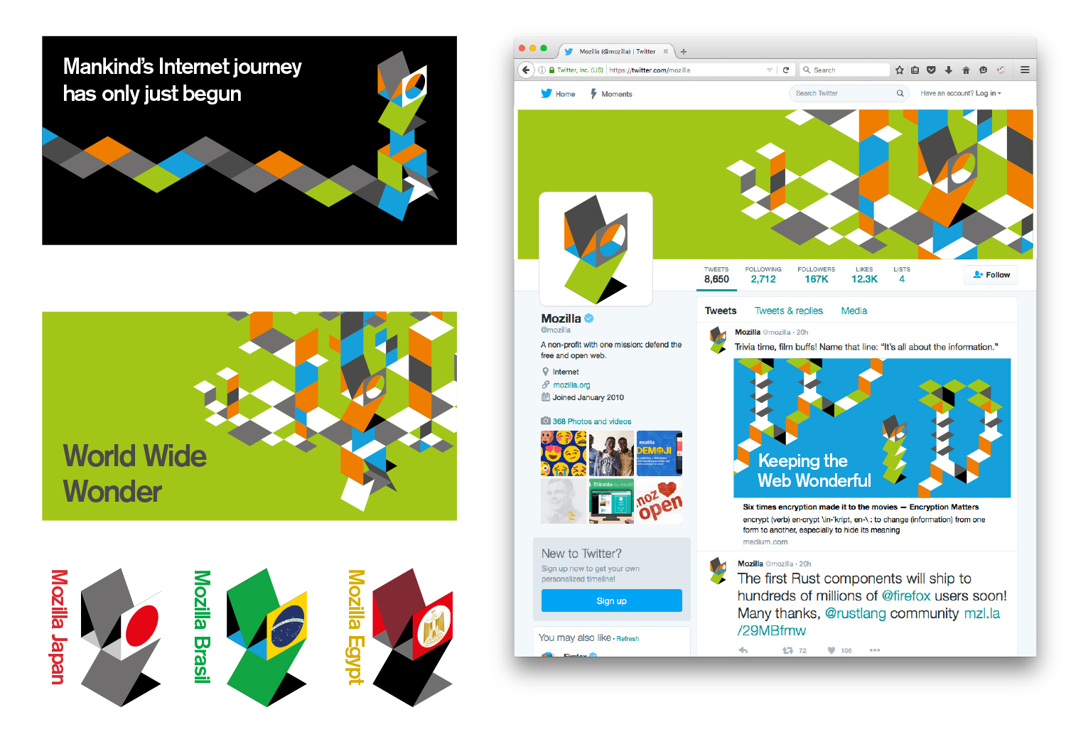
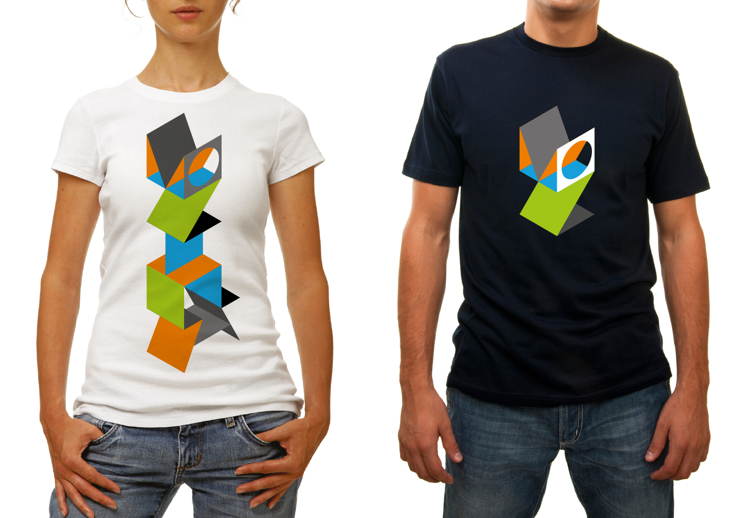
This final design route developed in parallel to route A, as we searched for animalistic solutions, but built characters out of consistent isometric shapes. The more we experimented, the more we realised we could construct a character that also spelt out the words, Mozilla.

This design direction also stems from the narrative pathway “Mavericks, United”

Mavericks, United.

The Internet belongs to mavericks and independent spirits. It’s the sum total of millions of people working towards something greater than themselves. We believe the independent spirit that founded the Internet is vital to its future. But being independent doesn’t mean being alone. We bring together free thinkers, makers and doers from around the world. We create the tools, platforms, conversations, and momentum to make great things happen. We’re not waiting for the future of the Internet to be decided by others. It’s ours to invent.

jb_Mozilla_design_pres_edit_3.keyjb_Mozilla_design_pres_edit_3.keyjb_Mozilla_design_pres_edit_3.keyjb_Mozilla_design_pres_edit_3.keyjb_Mozilla_design_pres_edit_3.keyjb_Mozilla_design_pres_edit_3.keymoz-flikflak-gif-logo4aug

78 comments on “Design Route G: Flik Flak”

  1. Endyl wrote on

    This is a very fun, colorful version, has a Mozilla vibe to it but it is way too busy for me to see it as a viable logo for Mozilla. I don’t see how, but if it could be simpler (less busy and artsy), more legible it could be a good option (but not the best).

  2. Leo wrote on

    This one is cool up until Moz… after that it’s just a mess… although those t-shirts are super cool! Can you still make these shirts even if this not the chosen logo?

  3. TeslApple_Guy wrote on

    I think this would look good as a startup animation for Firefox, especially on mobile. It just needs to unfold more fluently.

  4. David wrote on

    Origami is cool but the cluster brings to mind the Apple anti-IBM ad from the ’80s. The concept seems hard to associate with Mozilla and/or the Internet. Thumbs down.

  5. Lachamu wrote on

    This one is my favorite, but I don’t think it is the one that best serves your purposes. Here’s the rundown:

    A: The Eye. No. Just no. The Eye of Mozilla reminding us that we have no privacy on the internet makes for poor branding.
    B: The Connector. This reminds me of the 2012 London Olympics logo. Fun design, looks great on gear but utterly incomprehensible.
    C: The Open Button. Simple, not dependent on the English language, quickly recognizable. It looks good on gear. The proposed derivative icons for things like Mozfest and the developer network could use some serious work but I think this is the one to go with.
    D: Protocol. This one is simple and easily recognized . . . and far too geeky. People don’t type protocol:// in front of the address in the 21st century. You will be re-branding again sooner rather than later.
    E: The Wireframe World. Whatever message it is trying to convey is not getting across. It’s just lines and dots. It too seems pretty geeky to me.
    F: The Impossible M. I initially liked this one except for the colors but the more I look at it the more I realize why it makes me think of the 70’s. That design scheme would have been right at home on the PBS TV show The Electric Company. If you want that kind of groove, then go for it, man!
    G: Flik-Flak. This one is my favorite. It is artsy. It reminds you that Firefox is the flagship product, and it looks good on the web site examples and apparel/gear. The simplified “Moz” version is as far as this particular metaphor should go. When you expand it out to the full Mozilla you have to really be looking for it to figure out that it is trying to spell out “Mozilla”.

  6. Rick Colby wrote on

    I appreciate the thought and creativity that went into this one, but it’s way too complex and busy for a logo. It’s not readable on its own. It might work better as a (much) simplified abstract shape that could be used in conjunction with a logotype.

    I like the color palette of this concept the best by far.

  7. mike wrote on

    This is a fun, youthful and creative logo. Matches Mozilla’s culture. It would be great as a main logo but it doses not offer a very adaptable design to other site icons. I would plus one it.

  8. Uy Le wrote on

    I believe this is the best option so far. There’s a distinctiveness to it. The design is in a balance between simplicity and complexity. The adaptations and executions feels a bit stale (flat design graphic tiles), but there are room for improvement. The image projected feels appropriate to Mozilla. Innovative, Creative, Collaborative.

  9. Mezaki Massaru Hagio wrote on

    Interesting this soon! I was the most liked and most consistent with firefox among others!

    Original pt-br: Interessante essa logo! Foi a que mais gostei e mais condizente com o firefox entre as outras!

    Mezaki

  10. Andrew W Haddad wrote on

    My favorite. It’s beautiful and requires multiple looks.

  11. Jason wrote on

    Seriously? Way way way too much work went into making this unpacking cardboard box spell out the name of a company. It won’t stick in people’s heads the way it needs, the colors won’t have lasting cultural significance, and it doesn’t enhance the values/mission of the agency. It’s too vertical for most purposes, as the human eyes (being set on a horizontal plane) prefer horizontal design (think wide-screen TVs and anamorphic movies) over tall vertical objects.

    1. Eric Penn wrote on

      You’re asking the viewer to work to figure out what your logo means and spells out. It’s a geometric pattern that are also words that spell are name while also creating an animalistic creature that explains our journey to the future? Abstract art is enjoyable to look at in an art gallery because you get to spend time examining it and deciding what you think it meant to the artist as well as to yourself. That isn’t the point of a logo. A logo should immediately convey who the company is and what they’re about. I think this design misses the entire point of a logo

  12. Graham Swartzell wrote on

    This is really hard to parse out visually. Right now “connectors” seems to provide the abstract theme more coherently

  13. Smeikx wrote on

    – complicated, visually exhausting
    – looks immature
    – colours don’t harmonise

  14. Graham wrote on

    Too complicated.

  15. Ramzi Ibrahim wrote on

    There’s something charming about this. When it’s only MOZ with Mozilla written in a typeface next to it, it becomes easy to recognize and read for the public.

    The entire MOZILLA flik-flak becomes a bit complex to read as the main logo, although I love it. However, it can be part of the visual language, and used in certain parts of the brand guidelines, while the MOZ and the typeface can be the main logo.

    One of my favourites alongside The Connector (which I think is the best option here, and the best developed so far). 3rd would be the idea of M:// but not its execution.

    Really cool option.

  16. Sam wrote on

    The logo looks busy and confusing. I Personally think it looks too cluttered and messy.

    I love the colors, though. Seriously this is probably the best color scheme out of all the ideas. It’s welcoming and friendly. It’s bold without being intimidating. This color scheme suits Mozilla very well.

    Also please consider keeping a font that uses the same style of lowercase “l” you use now, I find it more readable and friendly compared to “|”.

  17. Teradyne Ezeri wrote on

    I don’t know where this came from. It looks like a house of cards that’s about to fall over. Admittedly, it looks almost as hacked together as the backbone of the web itself, but this feel so little like “Mozilla” that I can’t even recommend this one for its aesthetics. As Rob Kellett said, it’s “noisy and illegible”.

  18. C. Arrien wrote on

    I know we are not asking for “votes” but take it as a ranking point. This is my #2. Only after Route B. True it might be a better metaphor for architecture or the 3D world. But a brand doesn’t have to be that literal to be great.

    Love the depth, flexibility and modularity. Just looks interesting, brings you in and entices the imagination to retrace its planes and angles. The O is brilliant.

    2c

  19. Carlos Mariano wrote on

    Gostei desse

  20. Seburo wrote on

    Hi

    I like the build effect, but I think that people could tire of it fairly quickly. The colour mix is good, and perhaps the full version of the logo could work as a logo alongside a wordmark from one of the other proposals.

  21. Chris wrote on

    I like this approach best…here’s why: I have both Firefox and Chrome on my task bar. They’re right next to each other. On balance, I prefer to use Firefox. But 19 times out of 20, I hit the Chrome icon, not Firefox…no matter how much I try and change my behavior.

    My imagination suggests it’s for a simple reason: The Chrome icon stands out more than the Firefox icon…theirs has three fundamental colors…that STAND OUT.

    I can ‘love’ the Firefox icon as much as I want…but the Chrome icon stands out…because it draws the eye.

    Your design approach above gives a crucial element of that–color differentiation…but, could even this–by careful color selection and testing thereof–be brightened up to STAND OUT more?

  22. Chris wrote on

    P.S. My comments are about Design Route G: Flik Flak. All other design routes appear–to me–not to get where the Firefox/Mozilla needs to be from the dual aspects of distinctive, stand-the-test-of-time 1] Shape and 2] Color

  23. Wesley wrote on

    I’ll be honest, when I first saw this concept, I didn’t really like it. It just seemed to busy for me.
    However, after taking another look at the concept and all of the assets that could be included, I think that this is tied for first place with route D. I can just see so many design possibilities with this concept and marketing animations. Plus, it gives a face to the Mozilla brand because you get this neat looking character type thing.
    It’s also really good because it shows that Mozilla is made up of many diverse groups of people with different skill sets and abilities.

  24. joe miller wrote on

    nice when down to the MOZ version but held back by low contrast color breaks and an unrecognizable overall shape, resulting in very little presence or recognition when small.

More comments: 1 2