Categories: General

Design Route G: Flik Flak

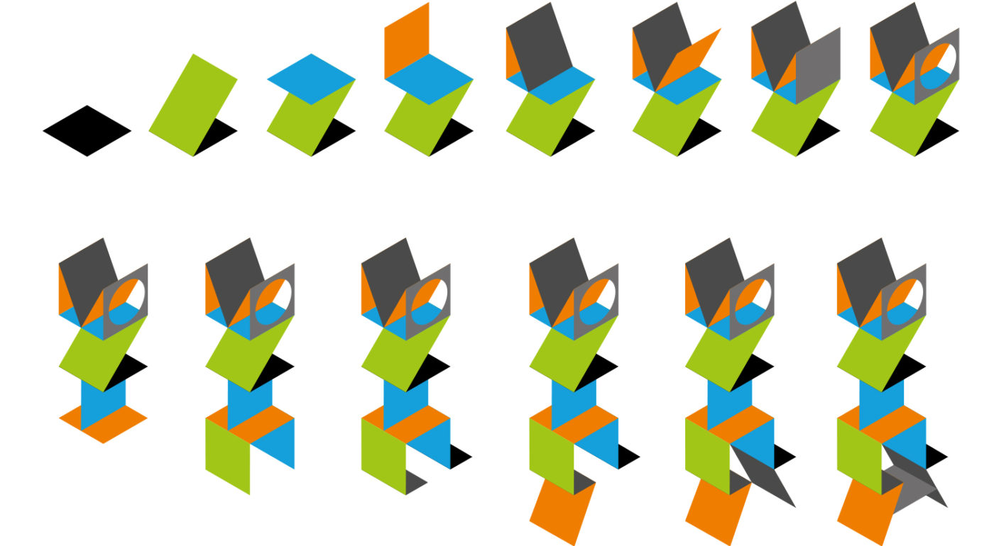
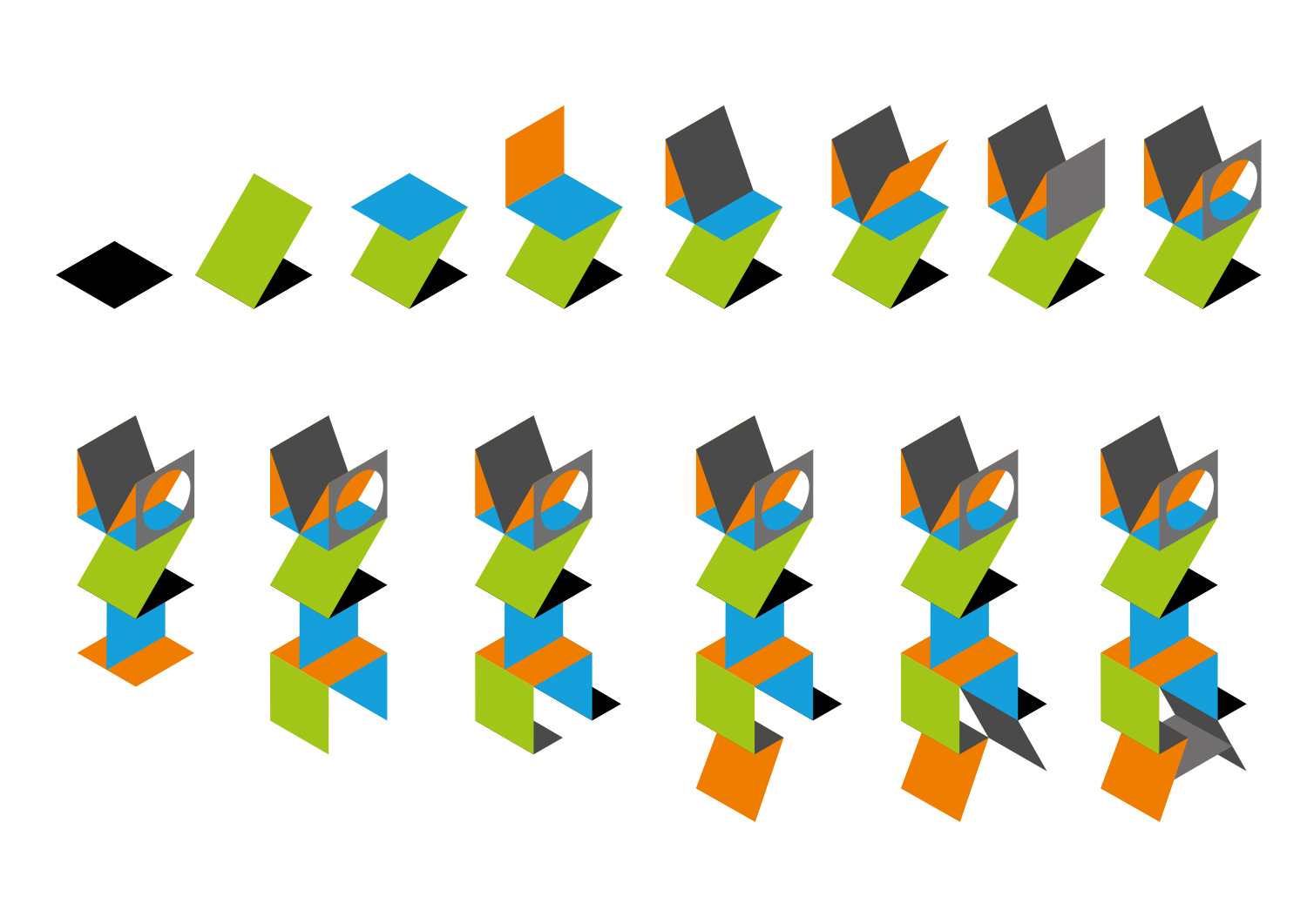
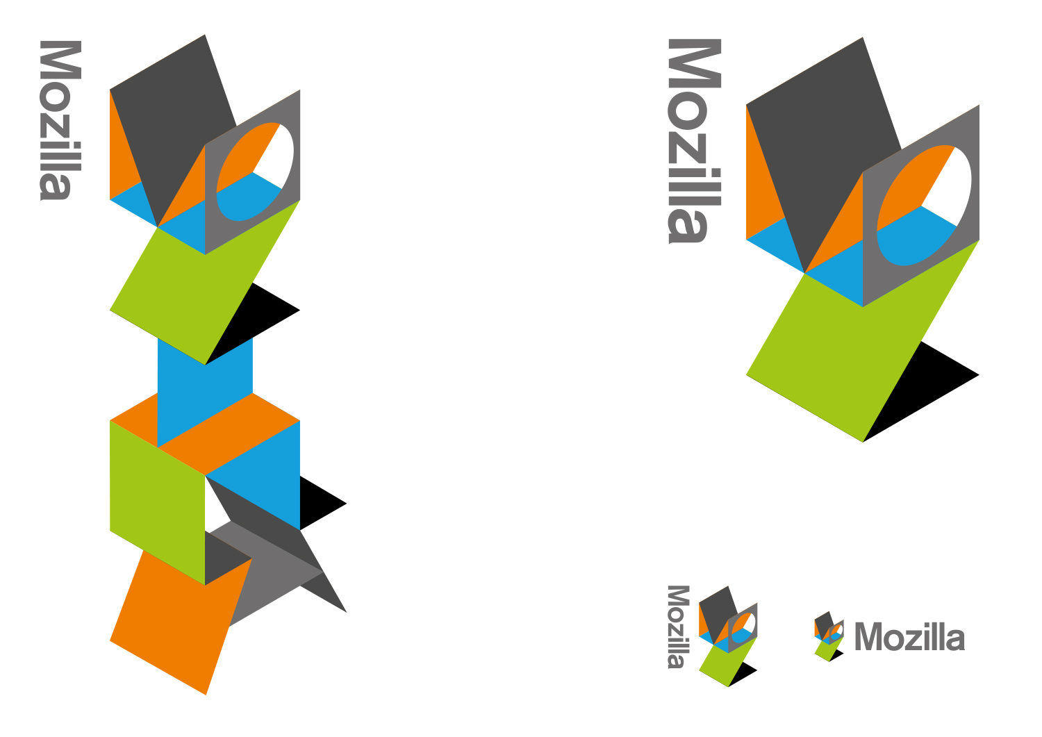
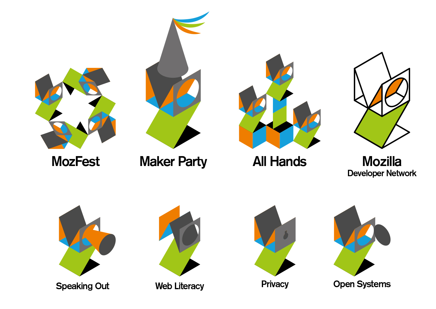
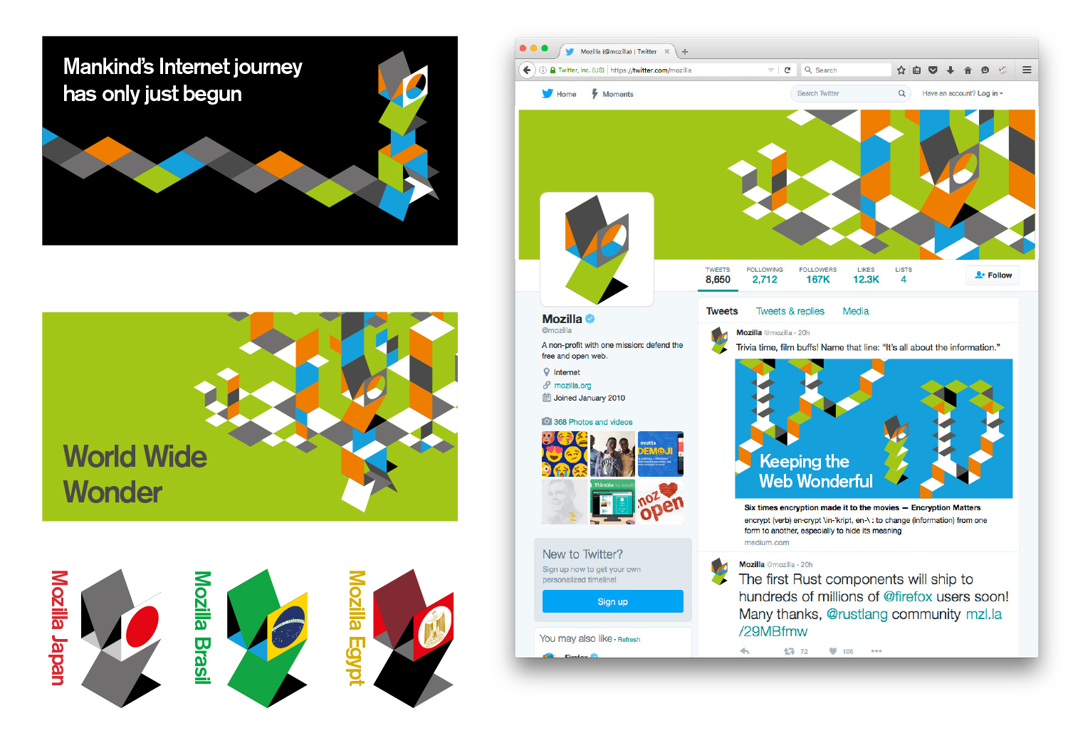
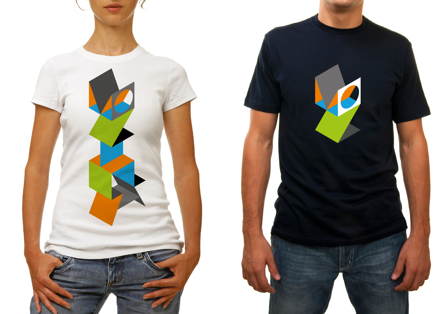
This final design route developed in parallel to route A, as we searched for animalistic solutions, but built characters out of consistent isometric shapes. The more we experimented, the more we realised we could construct a character that also spelt out the words, Mozilla.

This design direction also stems from the narrative pathway “Mavericks, United”

Mavericks, United.

The Internet belongs to mavericks and independent spirits. It’s the sum total of millions of people working towards something greater than themselves. We believe the independent spirit that founded the Internet is vital to its future. But being independent doesn’t mean being alone. We bring together free thinkers, makers and doers from around the world. We create the tools, platforms, conversations, and momentum to make great things happen. We’re not waiting for the future of the Internet to be decided by others. It’s ours to invent.

jb_Mozilla_design_pres_edit_3.keyjb_Mozilla_design_pres_edit_3.keyjb_Mozilla_design_pres_edit_3.keyjb_Mozilla_design_pres_edit_3.keyjb_Mozilla_design_pres_edit_3.keyjb_Mozilla_design_pres_edit_3.keymoz-flikflak-gif-logo4aug

78 comments on “Design Route G: Flik Flak”

  1. Rob Kellett wrote on

    It’s noisy and illegible, but most of all I don’t see how it reflects what Mozilla is. Mozilla is an advocate for the open web, not an art museum.

  2. Michael Sharp wrote on

    This took time, craft, and attention to detail. Lots of skill on display…I love the quote ‘Simplicity is complexity resolved’ and this is too complex.

  3. Vlad Burca wrote on

    It is so similar to this https://medium.com/blog/the-story-behind-medium-s-new-logo-4cd3e143dfcf#.1uw3jta4i

  4. Ric G wrote on

    You could get really creative with it’s digital presence, this is the strongest for me in something that can live and breathe online through animation.
    Take it and make something tactile and 3D. Something folding in and then folding out, generating new elements, opening portals to reveal new things. It can take you on a journey.

    Ric

    1. keu wrote on

      So true. A singularity from which all aspects Mozilla originate from.
      Currently this feels too long to visually comprehend over and above patterning…without borders.

      Seeing the animating helped…however like a seed or big bang this would be awesome.
      …I am getting ideas now that’s actually apply to my of company…thanks Ric G

  5. Michael Kaply wrote on

    I love throw throwback to the original Mozilla dinosaur, combined with some Firefox colors.

    I think it’s a little too busy, but a great concept.

  6. Tim Ahmed wrote on

    I can see this concept stand out among the rest, especially in applications and animations.
    There are too many tiles in different angles in the Mozilla character, which lacks in consistency. (Only one circle found in a group of folded rectangular sheets). It’s a bit too elaborate.
    Possibly exploring more ways to spell out ‘MOZ’ alone can help. Forget the ‘ILLA’ I suppose.
    Rearranging these three letter compositions when building the strands will help make it appear more visually coherent.
    I love the use of these colors and shapes.

    If “The Matrix” used this approach instead of the green data strand-animation, Neo would be recruited by a playful and creative software community, rather than a team of hackers/martial artists.

  7. Tyler Deitz wrote on

    This is really cool ?. I think this mark scales down really well and can be sub-branded in a lot of interesting ways. I’d like to see the art direction on the “Wireframe World” page interpreted for this logo – maybe the two styles can meet somewhere in the middle.

  8. joe mama besser wrote on

    truckasaurus.
    better in concept than execution, this direction is just too visually complex and disjointed. there isn’t an element that feels like the take a breath moment – it’s always on and in flux. which is interesting, but provides no real sense of purpose. but i do like the fourth step > rietveld chair.

  9. Carlos El Halabi wrote on

    It may seem complex, but its one of the best concepts so far. This one has the traditional Mozilla colors and is basically the only one that I could animate in my mind as soon as I saw it.

  10. Antriksh Yadav wrote on

    This one looks very cool on its own, but does not belong here. The jagged look tries to resemble Mozilla, but it’s almost impossible to read. We’re looking for a GLOBALLY recognizable logo, and this one may be too limited in that regard.

  11. Allen Meyer wrote on

    I keep looking at this, kind of reminds me of the Next computer logo, (the MOZ part) without the timelessness and legibility of that logo. This is fun and would be a great identity for a conference, but as a corporate identity it’s just too complex in it’s current form.

  12. Timur Uzel wrote on

    I like it with just the Moz. The full word is hard to read with the double L’s

  13. Olaoluwa Jesubanjo wrote on

    In two words… “Too complex”.

  14. nicolas wrote on

    This one is so different and weird and unlike any other identity that I want to consider it as one of my favourite options.
    As it is, it doesn’t really work yet, especially as a logo. It’s an illustration. Maybe a Vectorpark game. But I’d love to see this evolve into something viable!

  15. Shae wrote on

    Too complex for a logo. It’s almost impossible to read “Mozilla”. Colors are nice but a little too similar to Microsoft corporative colors (using square blocks make it more obvious). In small sizes the “Moz” symbol lose detail and the gray color gets all the attention.

  16. Bea wrote on

    This one is much too complex.
    It looks like a piece of art, not a logotype…
    If you keep this design you must simplify it.

  17. Zoraida wrote on

    Typography is to crafty for a logo… It would make a great campaign thou.

  18. Ali Akram wrote on

    A little irritating didnt depict the mozilla concept .
    color selection according to mozilla theme is bad
    Must have some thing that explains the name and actions
    best part in it is ‘maker party’

  19. Charron wrote on

    I think it’s the best design.
    I hate the others designs that you present.

  20. W. Zhang wrote on

    Leave it at “MOZ” otherwise it gets too complex and also long vertical text and logos don’t fit well in documents or web pages.
    This one blends in well everywhere like the Moz://a logo.

    1. Tim Murray wrote on

      Thanks for sharing your thoughts about Flik Flak, W. Zhang.

    2. Pacifica wrote on

      Definitely would agree with you there. Much like the others too many parts which are not cohesive makes it look more like a jumble whereas the MOZ variations both personalise the logo in a animal like shape (harking to the zilla) and they have a fun play on groups. Also there is an origami shape there. The abstract patterns in the backgrounds are a good tesselation and with variations in the colour scheme to perhaps more vivid ones can be more globally oriented. I can see the similarity to both Medium and IITP but this has quite a different appeal to it and has a potential to embody a character. imagine kids folding just the MOZ piece.

  21. NOne wrote on

    This design has to be a joke, right? RIGHT? Are these supposed to be puzzles or logos or what?

    I kinda feel like you guys are screwing with us. Nevertheless, attached is my submission for a slight modification to the above design.

    jacobsladder

  22. Kenneth wrote on

    Had a glance through the comments above. One comment from me: a logo doesn’t need to read as the brand name, it needs to be recognisable instead which I think this one does it quite well.

  23. M wrote on

    Too complicated to remember, reproduce or even read. I don’t think the branding can center around an oddly shaped ‘Mozilla’ text. I suspect most people don’t even understand or know what Mozilla is, the word means very little to them. This kind of branding is a good way to reflect that confusion, I guess.

  24. christina wrote on

    Obtuse. Vague.

  25. Jon D. wrote on

    I would like this if the truncated version (just the MOZ part) became the primary branding, and the full version were rarely used or abandoned.
    Hats off to the guy or gal who designed it, it’s clever and fun, but the full height version is just too busy and complicated.

  26. Walter Milliken wrote on

    I like the overall artistic style; it seems modern and not US-centric or corporate-feeling. But I just perceive it as a very complex origami figure: art, not brand. I can’t easily parse anything but the “M” and the “o” in the full version, though the partial version is more clearly “Moz”. The versions with the text name adjacent aren’t bad, but they seem to say “art museum” to me more than “Internet/web”.

  27. Dominik wrote on

    To be quite honest – I don’t really like any of the other concepts. I do like them as they are for themselves. They look good, but none of them reflect or fit Mozilla’s personality.

    This one though has potential. The font is nice. The colors are friendly. I just feel like these structures/cards/idk are too complex. You need to break it down to something more simple and more recognizable and THEN you could possibly use those cards in more complex situations to illustrate or animate something.

    I would like to see a simple logo (maybe even the eye or a “Godzilla”) combined with this style and font. I think that would match Mozilla’s personality.

  28. Jeremiah Lee wrote on

    This is my second favorite proposal, but it reminds me too much of the Medium logo. I don’t think this origami concept can evolve to be as memorable as the Firefox logo.

  29. kz wrote on

    Way too busy. difficult to identify the company behind the logo.

  30. Redmess wrote on

    This is very noisy and hard to read. I do like the colors and shapes, however. It would make more sense as decoration than as a logo, especially because of its verticality. The design also seems to suggest art museum more than internet company.

  31. Robert Kaiser wrote on

    The tie-in with building and creativity of this one is great, but it’s extremely noisy. The color scheme works better than any of the other logos and it also feels more current. Took me a while to even figure out that the unstable-looking folding stuff was actually the rest of the characters of the “Mozilla” name.

  32. Jarrod wrote on

    As an animator I could have fun with this. As a logo it is a complete failure. Unreadable. Too busy. Doesn’t work in black and white. Really you have to have a logo that also works in black and white only. This is a fundamental of logo design. If the people you hired to create the logo didn’t warn you about the limited applications of this design then you really need to hire new designers.

    This design doesn’t work as an icon or at small scale. It doesn’t work in limited color or black and white. It is going to be problematic for many print applications.

    Now to make this work I would limit the design to just the 3D M. Replace the knocked out O with a Z and then use a knocked out A on the opposite leg. This helps give the Mozilla vibe and conveys that you cover things in your field from A to Z or is for everyone from A to Z.
    These changes would open up the design for more applications in more sizes and mediums.

  33. Naylan wrote on

    For someone who doesn’t know Mozilla, this looks like a logo for company making origami paper, or puzzles. It looks fun, but it doesn’t look Mozilla. Even with the explanations, the link between this logo and Mozilla is dubious, so without them…

    Also, this logo is hardly intelligible.

  34. Thomas van Diepen wrote on

    This one is too complicated to be easily recognized.

  35. rugk wrote on

    This is one of my favorites. It looks nearly photorealistic and has good, calm colors. It shows the community, which can “build upon something”.
    The banners and Twitter header are really great. In the animation each piece of paper could fold out of the previous one, so the animation is smoother, but I think this will be improved.

  36. rugk wrote on

    I’d also say the individual icons need to be improved. E.g. the MDN icon could e.g. better show what can be done with this pieces of paper. Instead of empty space (which is a negative attribution) rather show “what can be done”.
    The web literacy is not differentiable to me and the privacy one is too similar to the usual one. The lock there clearly needs to be bigger.
    Also the tube in “Speaking out” is a bit confusing. Maybe it should start in the bottom left.

  37. Paco Núñez wrote on

    Too similar with medium, its bold, i like it but i think mozilla is best represented in other examples ;)

  38. ted wrote on

    This logo is poorly designed. No B&W version is going to hamper you a lot. Plus tall logos rarely work. The colors are fine, but this never should have made it this far on basic design principals alone.

  39. Rochelle Kopp wrote on

    I like this by far better than all the others. Unique memorable and interesting, and good to have the obviously Mozilla colors. Could be simplified a bit though.

  40. Random Paul wrote on

    Too busy. I like the derivations and animation that the team came up with. Very eye-catching.

  41. lehasb wrote on

    Completely unidentifiable. You don’t have a clue it’s Mozilla unless the name is included.

  42. Hagen Mahnke wrote on

    It’s far too complex for a logo. And even if this wasn’t supposed to be a logo I dislike the aesthetic a lot.

  43. Denis Bredelet wrote on

    Is this supposed to look like a dragon or a big lizard? It is more an origami.

    The white square used in some variations looks better than the grey one. The “Mozilla Developer Network” logo shows that can be used in black and white, unlike what has been said. In fact, going that route addresses some of the “too busy” complaints however not completely.

    I expect that the vertical orientation will be more of an issue.

  44. Vincent Gross wrote on

    The good:
    – the short form “Moz” reads nicely and leaves a good imprint
    – I really like how it lends to tiling and creating backgounds that roams everywhere
    – gives off a nice “work in progress” and “come play with us” vibe

    The meh :
    – the sub-brands looks again too much like the main
    – what about black and white ?

    The bad :
    – Hard to read in its full vertical form

    Suggestion:
    How about tacking the Z “on the backside” of the “MO” box ? This way you could read MOZ in a single eye sweep.

  45. Thomas Levesque wrote on

    Way too complex, especially the tall version.

  46. Jesse Johnson wrote on

    This is one of the better options, but it must be made much more legible, high contrast and compact to be practical.

  47. Arakun wrote on

    Nicest looking of the bunch, but the full logo is far too busy and nearly illegible. I agree with the people who say to stick with the “Moz” part only.

  48. fataha wrote on

    It’s so good, il like that

  49. Tobias wrote on

    I would love to see this as a fold-out, folding out step by step from a square peace of paper. Either animated or in actual paper.
    Probably doesn’t work very well in horizontal orientation. And many people will find it way too artsy. Still one of my personal favorites, a close second.

  50. Cory Koski wrote on

    Very visually complex and confusing. I think it’s clever on some levels, but it just feels like it’s trying to be too much at once. I look at this design and I want to look away.

More comments:1 2