Categories: General

Design Route F: The Impossible M

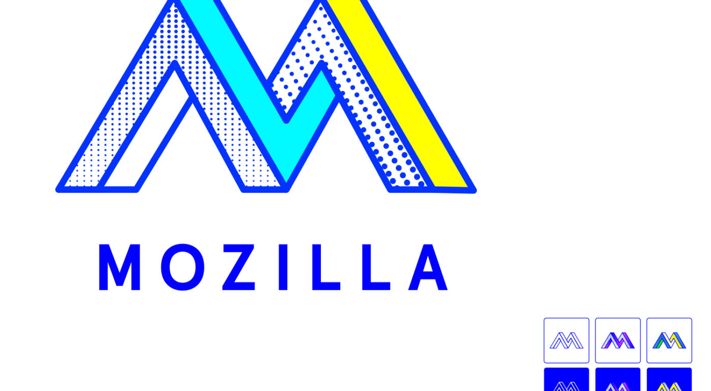
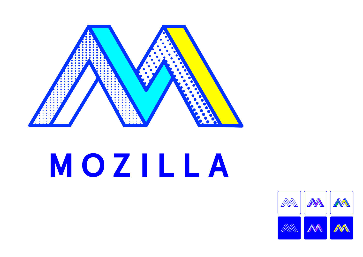
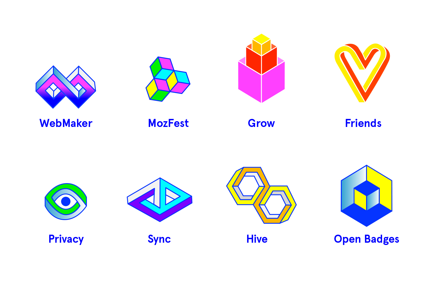
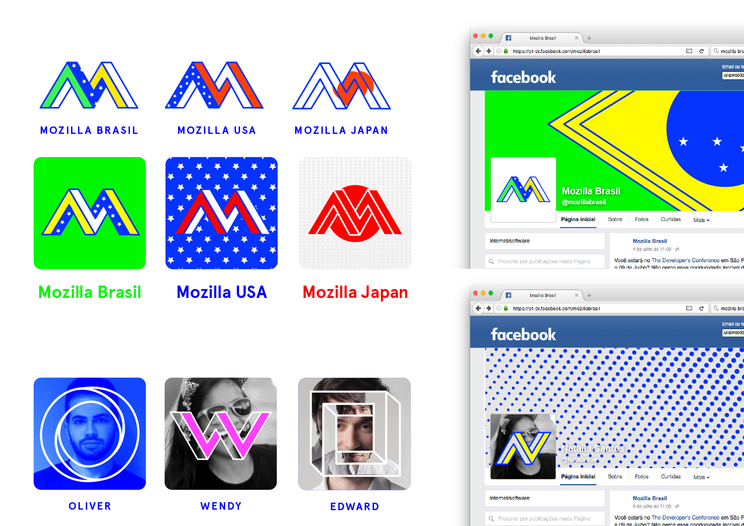
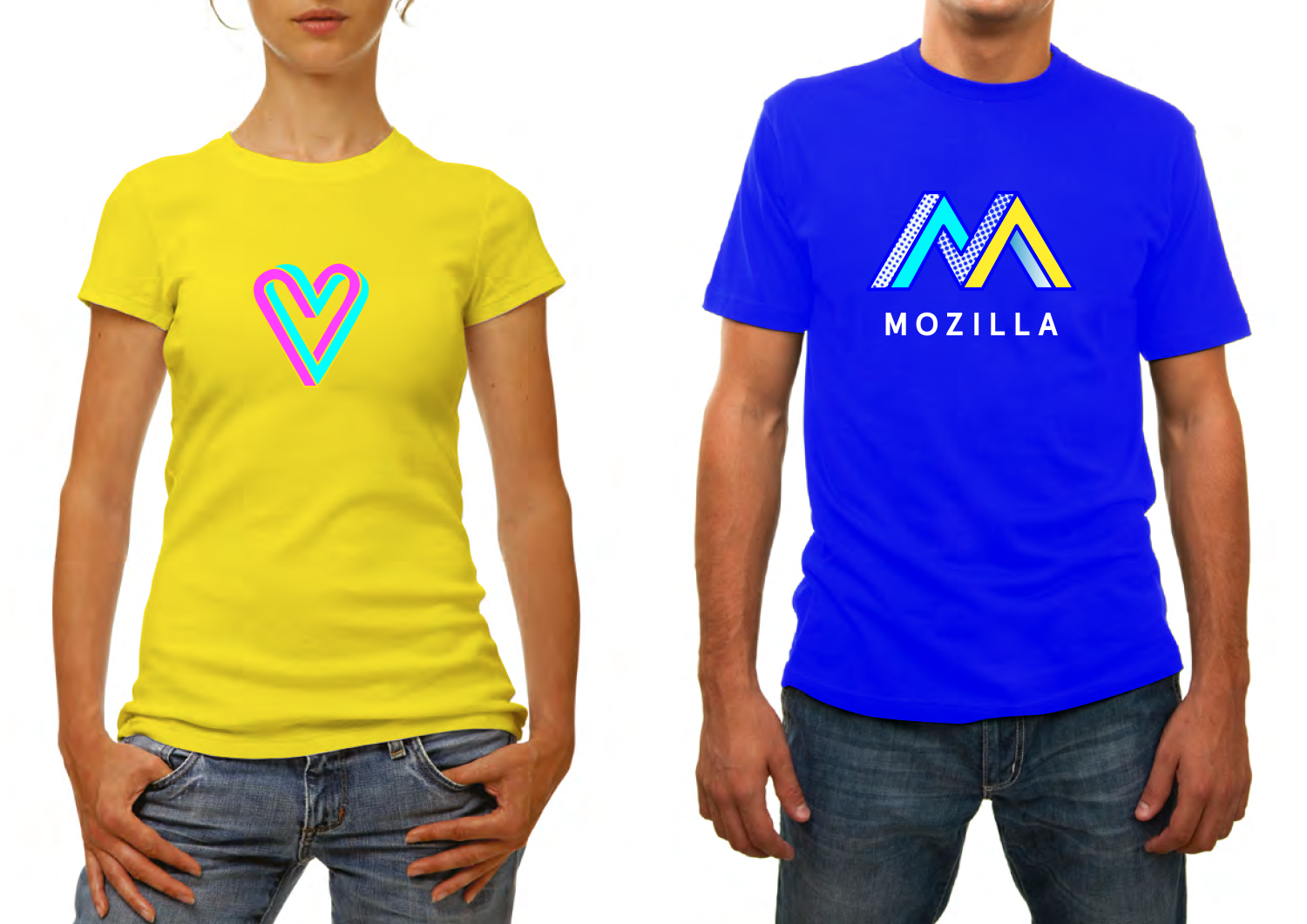
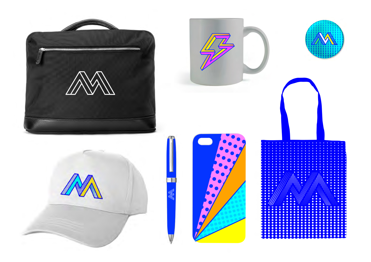
We wanted to show the collaborative aspect of the maker spirit in a simple typographic mark. Inspired by both computer graphics and optical illusions, an ‘impossible’ design developed that also revealed a cohesive design approach across all applications.

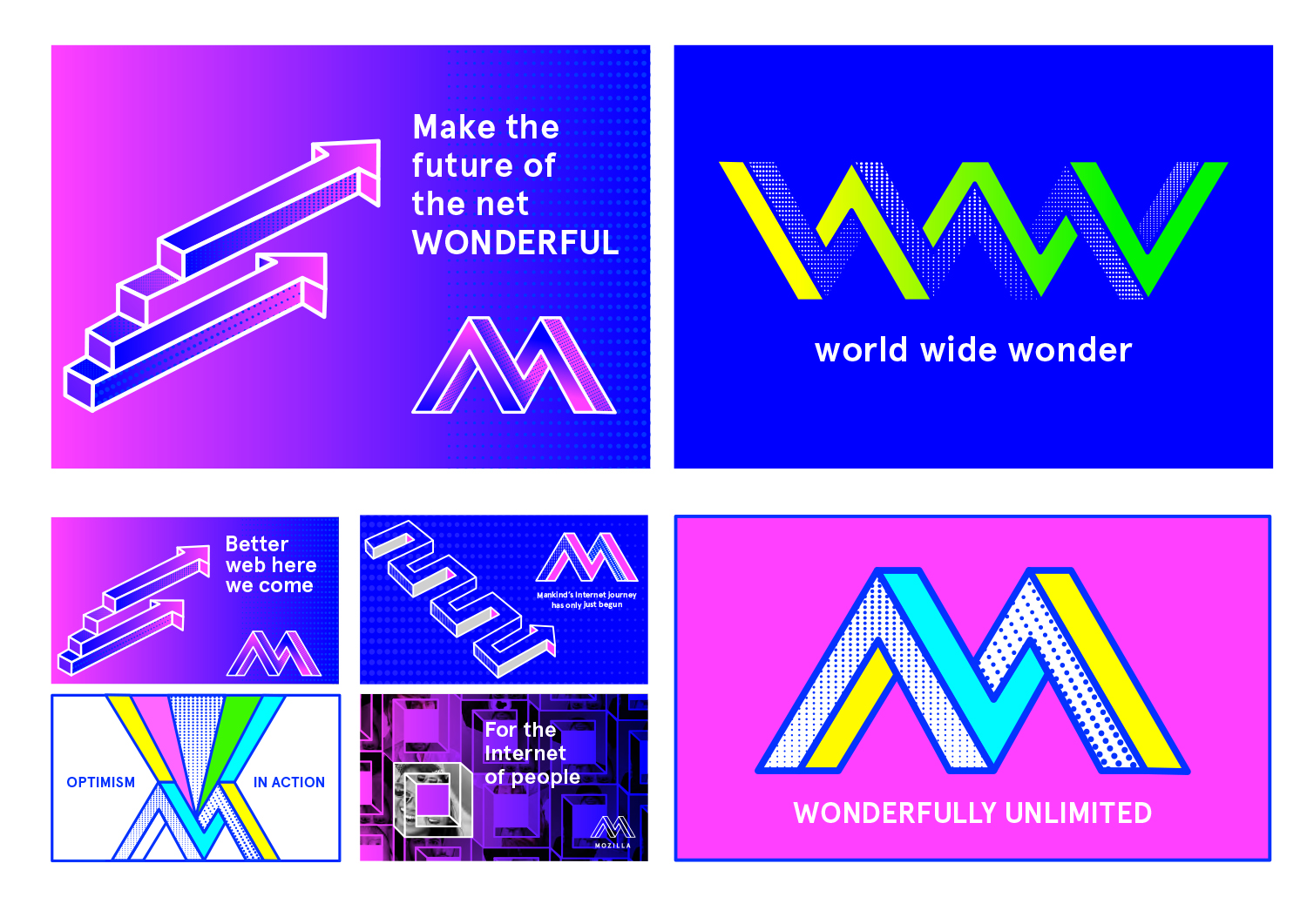
This design direction flows from the narrative theme “Mavericks United.”

Mavericks United

The Internet belongs to mavericks and independent spirits. It’s the sum total of millions of people working towards something greater than themselves. We believe the independent spirit that founded the Internet is vital to its future. But being independent doesn’t mean being alone. We bring together free thinkers, makers and doers from around the world. We create the tools, platforms, conversations, and momentum to make great things happen. We’re not waiting for the future of the Internet to be decided by others. It’s ours to invent.

jb_Mozilla_design_pres_edit_3.keyjb_Mozilla_design_pres_edit_3.keyjb_Mozilla_design_pres_edit_3.keyjb_Mozilla_design_pres_edit_3.keyjb_Mozilla_design_pres_edit_3.keyjb_Mozilla_design_pres_edit_3.keyMOZ-UNLIMITED-ANIMATION

136 comments on “Design Route F: The Impossible M”

  1. Susan wrote on

    Yes yes yes this one yes! :-)

  2. Honório Martins Kalidae wrote on

    this one looks extremely better. Modern, young and cool. My favorite.

  3. FremyCompany wrote on

    +1 on this one

  4. Bratschemili wrote on

    I really like the simplicity of this logo, I also think it’s versatil. Nice, clean, effective.

  5. Arash P wrote on

    At first, Flik flak supersized me, but it’s too complex for branding :)
    This one could spread into hearts faster :D

  6. Jason wrote on

    Probably my second “favorite” when at least talking about the raw logo. I like the colors (although they too are very 8-bit) and I like the geometry in an abstract way, as a logo I don’t think it really works. It’s a fun blend of Escher and Lichtenstein, again in an abstract un-related-to-corporate-logo sort of way, but as a major multi-national corporate logo and in terms of inspiring the broad design choices that will need to surround it, it doesn’t work. It’s not evocative of any corporate values or purpose, and what makes it work as pop-art, makes it fail as a corporate logo.

  7. Gthin wrote on

    Nope, not this one.

    Too much artistic and retro, if you put this in a flag without any label you will find a bunch of hipsters gathering around it. Reminded me of the wild color palette of redesigned Bloomberg website(but this is too many colors).

  8. Andrew Flowers wrote on

    The only one worth considering in my opinion. By a long chalk.
    Usability is key.

  9. Dan wrote on

    Love this concept, especially the bold colours and strong lines. Be interesting to see more examples of how this could be developed. The brand needs to be careful in how it uses the dots (actually, it could work without them), and throwing too many colours together.
    Just a couple of questions, what does the 8-bit colour scheme say about a technology company and how well will the brand age?
    Definitely the brand I’d most like to see succeed.

  10. Laurent wrote on

    Wonderful!

  11. b1cudo wrote on

    My second favorite after “Moz://a” version. Moz://a it’s more versatile, simple and we can write it only using keyboard too, what it’s more elegible like a mark.

  12. Smeikx wrote on

    – It’s very trendy, which means it’s not timeless. In a few months it will probably already look old.
    – Also, I’ve seen similar concepts in several other brands.
    – The colours appear aggressive and not as friendly and inviting as Mozilla seems to me.
    – It represents impossibility — that’s nothing I want to associate with Mozilla.

  13. Graham wrote on

    I like 60s Pop Art. But it doesn’t make a good logo.

  14. Ramzi Ibrahim wrote on

    Playful. Youthful. A bit trippy actually. Maybe too kitsche. It’s retro yet hipsterish yet too colorful to be hipsterish. It’s just lost…

    Feels a bit dated now, so I don’t think it’ll be perceived well for long.

    The applications are fun for sure, yet any of the other identities can be developed to have applications that can be as youthful or fun (if done with purpose).

    Youthful and fun for sure. But no. (sorry).
    And the typography under the main M is a big no. It’s as if it were an afterthought.

  15. bobdudu wrote on

    The best for me : simple and original
    But, please, you really have to change the colors

  16. Sam wrote on

    I think the impossible M shape is interesting and distinctive, but the colors and patterns look extremely dated and inconsistent. It also looks odd that while the M alone has slanted sides, the M in the Mozilla name below it does not.
    The flashy patterns could stand to be toned down a bit (or maybe a lot). The colors could be less retro and more… Mozilla, like the red you have now or some Firefox-y colors.

  17. Iris Katua wrote on

    Is not the same idea that uses “Orain gipuzkoa” in the new logo?
    http://www.brandemia.org/guipuzcoa-estrena-una-marca-para-impulsar-su-nueva-etapa

    logo_gipuzkoa_colores

  18. Teradyne Ezeri wrote on

    From a _purely_ aesthetic standpoint, this idea is amazing. It has the most options for logo and design usage, and it looks amazing to boot. Of the seven given designs, this comes closest to an actual design that would fit Mozilla’s websites. For the actual brand, it falls short on the same aspects as the others: it doesn’t really convey Mozilla’s ideals on its own. It needs a lot more context to really fit the story together. I’d say this is my second favorite, though.

  19. Seburo wrote on

    Hi

    I like this one, but the colour needs to change. A more “earthy” selection of reds, blues and greens could work really well. This concept would still need a word mark (like the flick flack idea), but it makes people look…and look again!

    As a contributor, I would not mind using this logo (if it was a little less bright).

  20. Wesley wrote on

    We should steer clear of this one. There just isn’t anything unique about this one. There are quite a few companies with similar logos to this one. We need something that is different than the rest to emphasize that Mozilla is a company that is different than the rest.

  21. joe miller wrote on

    an unfortunately familiar idea, although the form is quite nice in more basic presentation such as lines alone (as on the black bag) or when clearly contrasting from its background. the letterspaced typography is oddly standard and dated, which may have been intentional to match with the more fun ‘old web’ color scheme.

  22. Chris wrote on

    This is by far the best . Very nice , easily identified with mozilla thanks to the M sign . The colors used are very vibrant, which is good for kids too. Furthermore , even if it looks old ,the design is distinctive. If this were to be used , I would definitely buy the Black Bag .

More comments: 1 2 3