Categories: General

Design Route E: Wireframe World

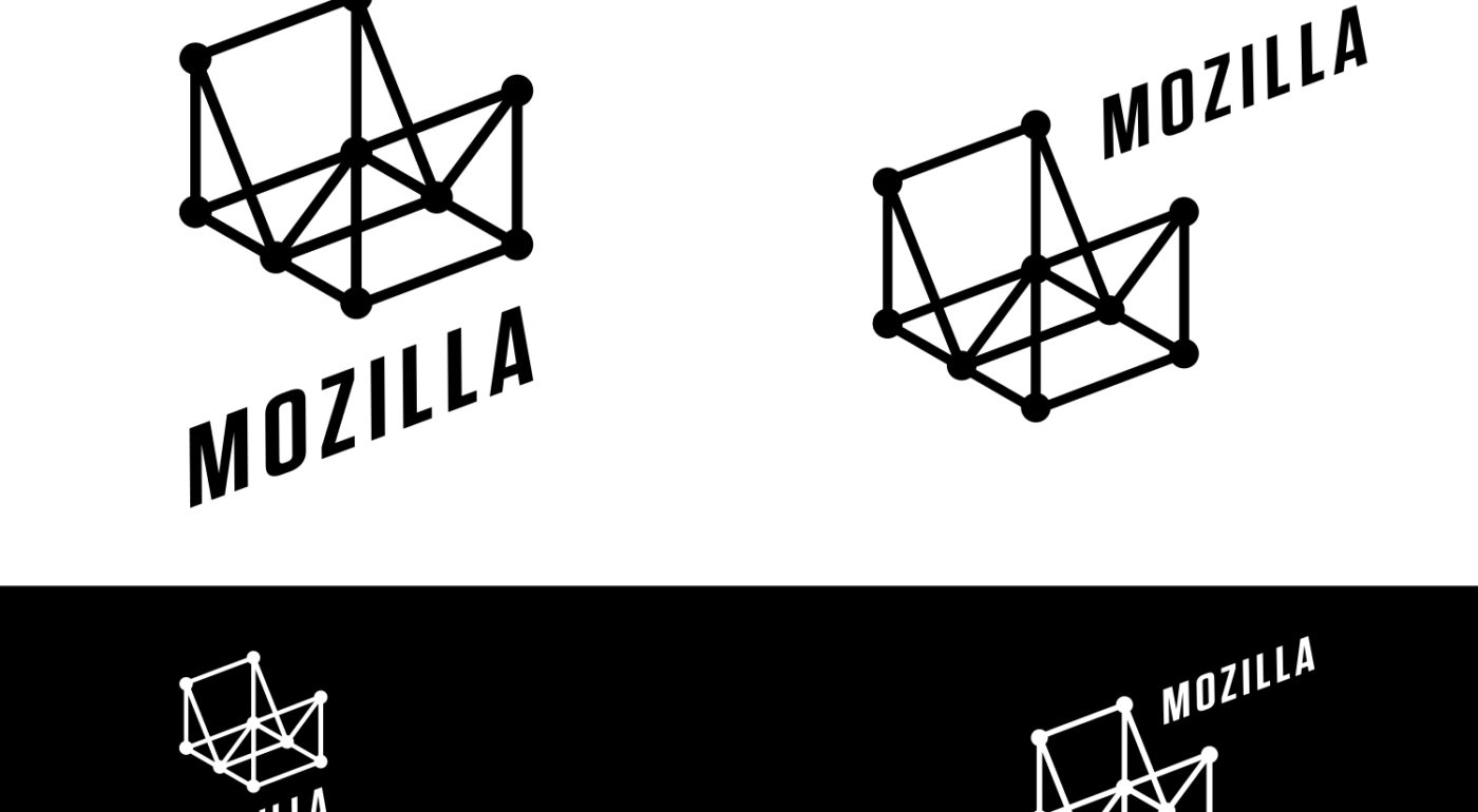
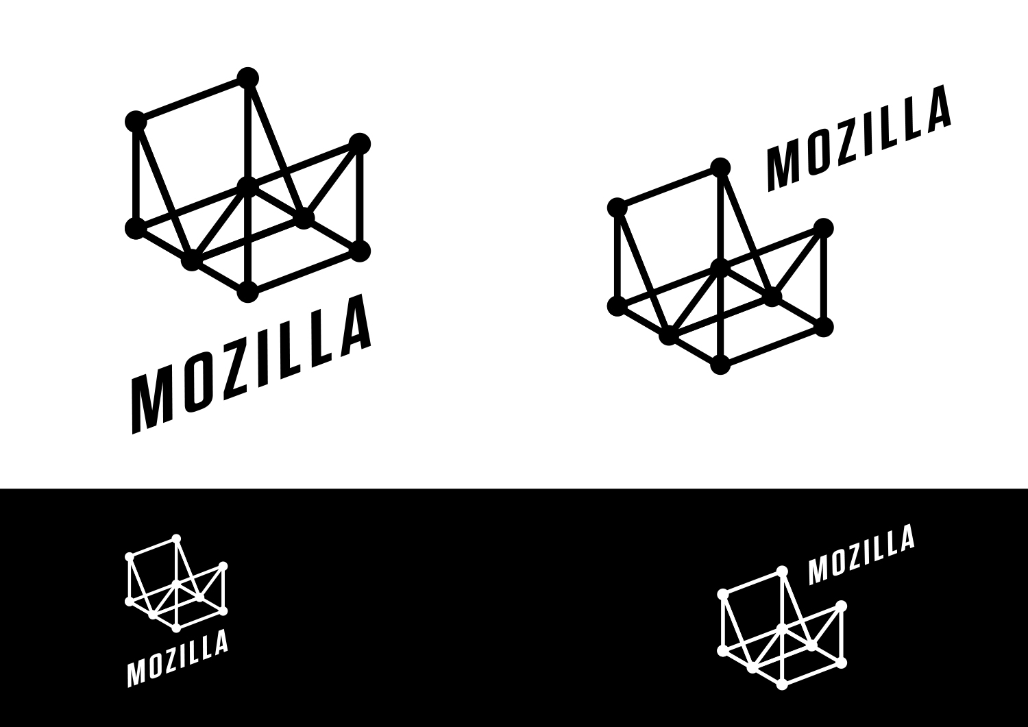
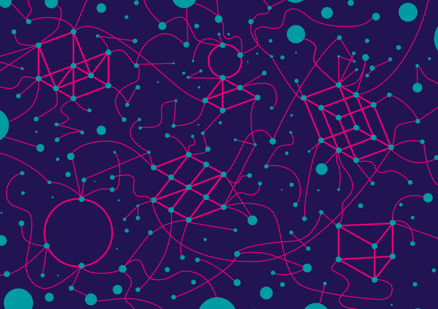
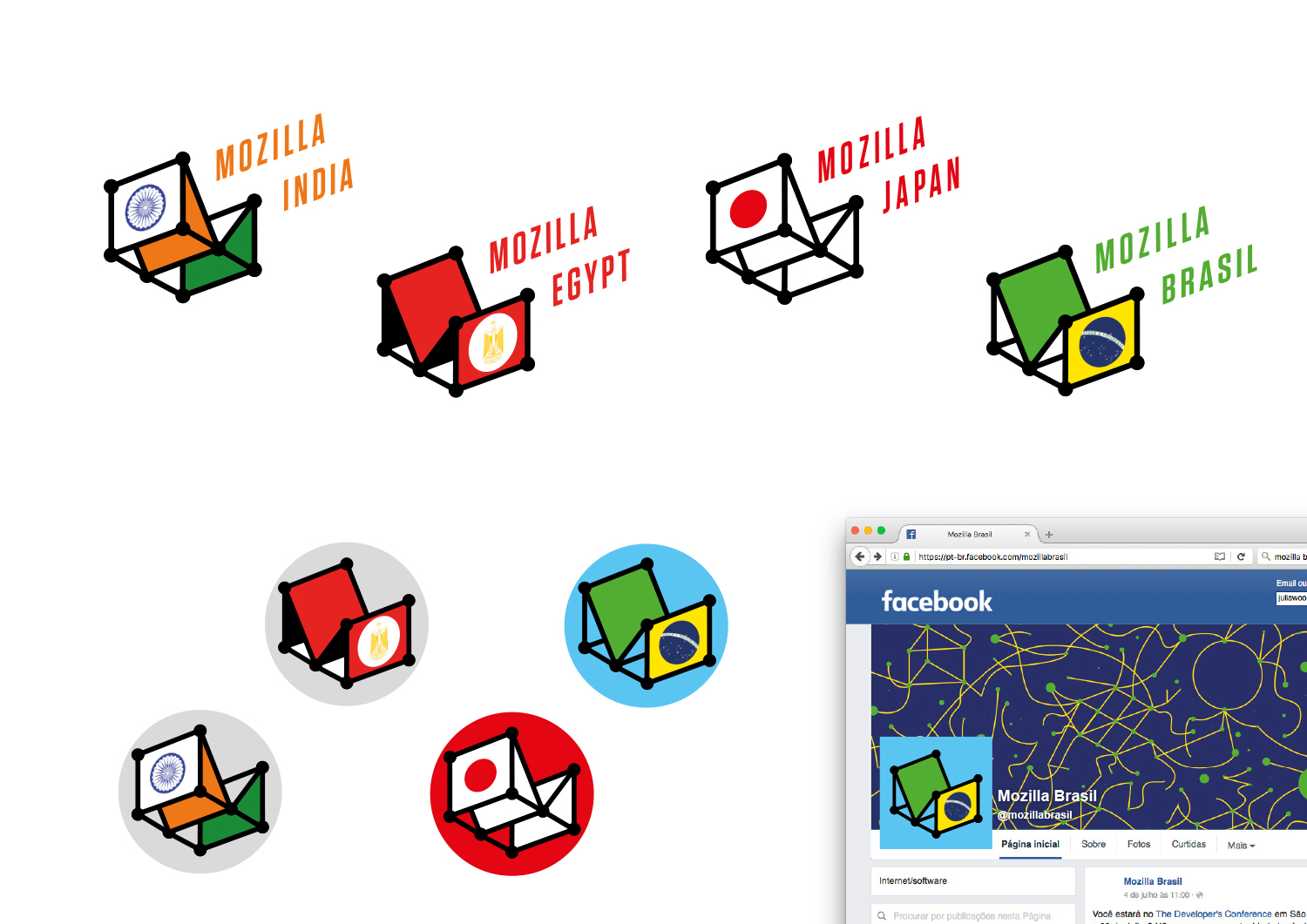
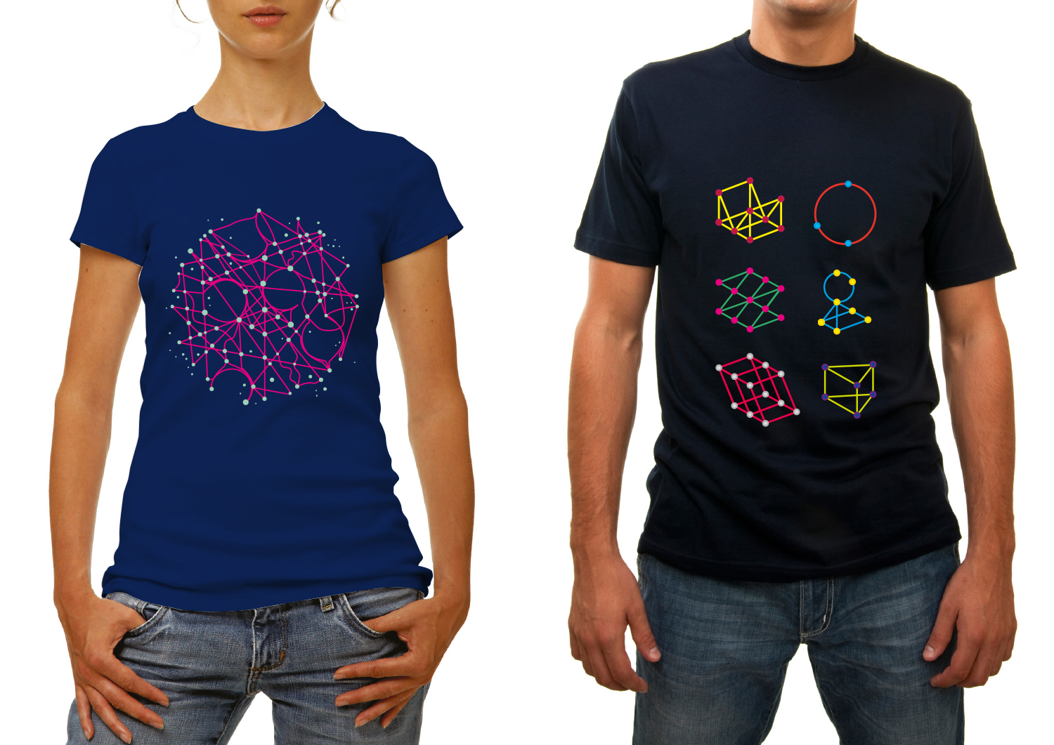
Is there a way to hint at the enormity of the internet, yet place Mozilla within that digital ecosystem? This route developed out of experiments with 3D grids and the realisation that a simple ‘M’ could form the heart of an entire system.

This design direction also flows from the narrative theme “With you from the start.”

With you from the start.

Mozilla was, is, and always will be on the side of those who want a better, freer, more open Internet. In the early days, we were among those helping to embed principles of openness and accessibility into the web’s DNA. Now those principles matter more than ever. We need an Internet that works wonders for the many, not just the few. We need to stand by the founding ideals of the Internet, and carry them forward into new products, platforms, conversations, and great ideas. We’ve been with you from the start. And we’re just getting started.

Click the image below to see an animation of how a user might interact with Wireframe World to create unending patterns:

jb_Mozilla_design_pres_edit_3.keyjb_Mozilla_design_pres_edit_3.keyjb_Mozilla_design_pres_edit_3.keyjb_Mozilla_design_pres_edit_3.keyjb_Mozilla_design_pres_edit_3.keyjb_Mozilla_design_pres_edit_3.key

69 comments on “Design Route E: Wireframe World”

  1. th wrote on

    it’s modern but cold. not sure if it will appeal to all demographics. i like it, though.

  2. Graham Swartzell wrote on

    I get where this idea is coming from, and separating the name addresses the issue with the more abstract logos being hard to read. However this creates a new problem where the name and logo don’t seem to mesh and the latter ends up feeling redundant. Perhaps if the font could be changed to be more like a wireframe?

  3. Smeikx wrote on

    – the M may be hard to recognise
    – looks timeless
    – gives a sense of connectedness
    – the patterns look quirky, they don’t fit the logo
    – the accompanying text needs refinement (different perspective, different type face, different position)

  4. Graham wrote on

    Not bad. A bit impractical in space requirements.

  5. Ramzi Ibrahim wrote on

    The icon isn’t really a wireframe. It more of polygons that might be of different touch points across a journey. However, why is it closed up. It’s as if this journey will only take you so far before you end up going back where you started.

    It’s too enclosed, whether the M icon looks good or not. It doesn’t have to show the endless possibilities or journeys that a user can take or experience online and in the digital world because that might be difficult to visualize in an icon (but maybe it can). However, what’s done here is the opposite. Instead of even hinting at the many possibilities, that got reduced to the limited paths of a 3D shape.

    Typography is inconsistent and a bit distorted. The flags are cool, but overall the identity isn’t really defined and a bit rigid.

    Not a favourite.

  6. Teradyne Ezeri wrote on

    Um…what? Even my non-designer boyfriends—one of whom isn’t even a geek—were utterly confused by this design. I read the story behind it, but if I don’t see that story in the logo or design language, it’ll be completely lost to anyone viewing it for the first time. It feels “too simple”, and while it’s about an interconnected web, it doesn’t convey that at all.

    I’ll give this design credit for one aspect: it’s about as abstract as modern JavaScript frameworks. This would make for a great JavaScript or MDN logo.

  7. C. Arrien wrote on

    This is my #2, after Rote B and G. I specially like the possibilities with the panels having a fill, like the Brazil logo. Like seeing it from different angles and the 3d aspect of it. Just really flexible while keeping a coherent presence.

    2c

  8. C. Arrien wrote on

    Sorry, sorry. I meant #3 after Rote B and G.

  9. Seburo wrote on

    Hi

    Whilst this design may feel a bit shallow for Mozilla as a whole, it would be good to see this one picked up by an project within Mozilla.

  10. Benjamin Kinzer wrote on

    Thank you for sharing the brand exploration for Mozilla. I enjoyed each of the directions and the time invested. Mozilla for me brings back memories of Netscape, HotBot, Lycos, Geocities and my rebellious teenage years. For me Direction E, has a feeling of nostalgia while remaining relevant.

More comments: 1 2