Categories: General

Design Route E: Wireframe World

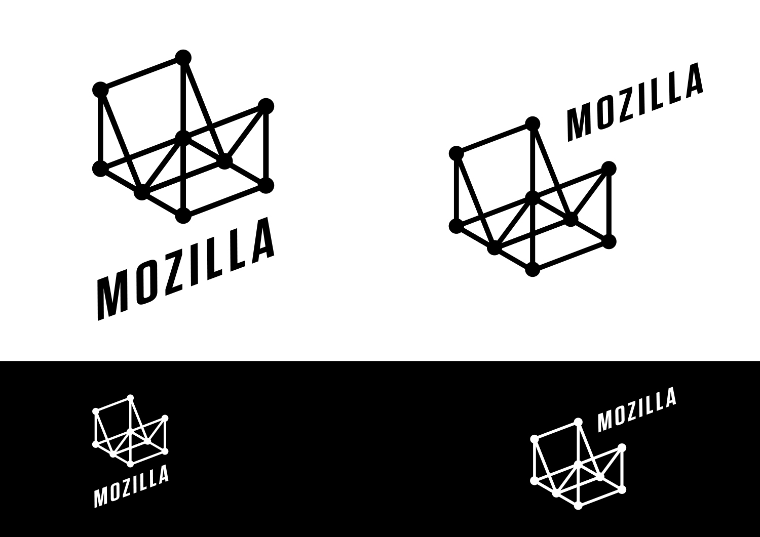
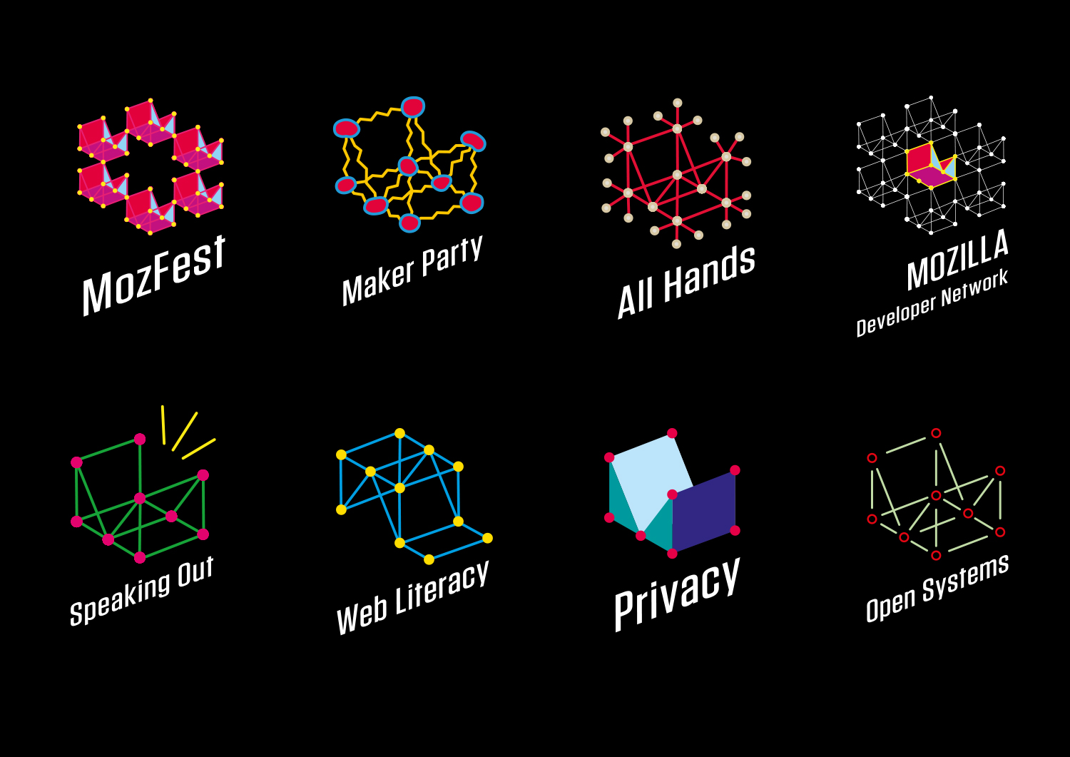
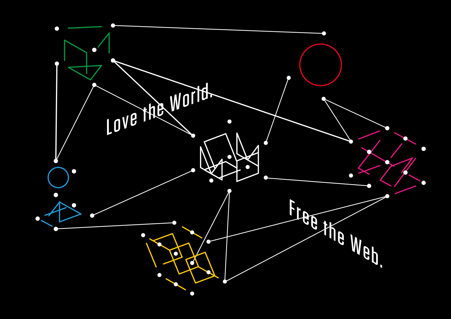
Is there a way to hint at the enormity of the internet, yet place Mozilla within that digital ecosystem? This route developed out of experiments with 3D grids and the realisation that a simple ‘M’ could form the heart of an entire system.

This design direction also flows from the narrative theme “With you from the start.”

With you from the start.

Mozilla was, is, and always will be on the side of those who want a better, freer, more open Internet. In the early days, we were among those helping to embed principles of openness and accessibility into the web’s DNA. Now those principles matter more than ever. We need an Internet that works wonders for the many, not just the few. We need to stand by the founding ideals of the Internet, and carry them forward into new products, platforms, conversations, and great ideas. We’ve been with you from the start. And we’re just getting started.

Click the image below to see an animation of how a user might interact with Wireframe World to create unending patterns:

jb_Mozilla_design_pres_edit_3.keyjb_Mozilla_design_pres_edit_3.keyjb_Mozilla_design_pres_edit_3.keyjb_Mozilla_design_pres_edit_3.keyjb_Mozilla_design_pres_edit_3.keyjb_Mozilla_design_pres_edit_3.key

69 comments on “Design Route E: Wireframe World”

  1. Michael Sharp wrote on

    Inconsistent type, and I don’t see wireframes looking like this. Its like a word cloud without the words.

    1. Tim Murray wrote on

      Leaving aside the reference to wireframe, is this a good visual metaphor for the unlimited nature of the Internet?

      1. Timur Uzel wrote on

        Yeah also maybe an atom? (though this may be GitHub’s metaphor for atom and electron)

      2. Ryan Quinn wrote on

        No, it’s small enclosed spaces, small enclosed networks, or microscopic biological system.

        This would be cool for a biotech, IoT, or 3D printer company.

      3. Jarrod wrote on

        No. This design screams chemistry or CAD.

  2. Michael Kaply wrote on

    This one is growing on me because of the versatility.

    As a side note, these pages with a lot more uses of the logo really help in visualizing the logo.

    That being said, the logo seems to work better when it isn’t open (like Brazil or egypt. The M seems to get lost in the Wireframe.

    1. Timur Uzel wrote on

      Agreed seeing the Brazil and Egypt versions made me like it. I didn’t see the M until reading this post.

    2. Leon Hosie wrote on

      Interesting to see your choice of words “isn’t open” being easier to recognise.. this is supposed to represent an open and visionary company. Too much structure in this logo.

  3. Kevin Marks wrote on

    Because the lines intersect in the middle, it is hard to read as an M – the nearest and furthest vertices merge into one and it looks like a messy flat pattern instead.

  4. Halleh Tidaback wrote on

    My heart actually started racing in panic as I scrolled down on this concept… The lack of consistency in the mark went a little too far for me–in type, color, and pattern. It looks like a brand that cannot commit and lacks structure vs. one that celebrates differences and openness.

    I do enjoy the free-formed nature and artistic appeal of the marks individually and on a t-shirt, but this is one of my least favorite.

    The concept could be improved with a stronger visual anchor in typography and shape; making it easier to identify when visually scanning from one to the next despite color and textural differences.

  5. Antriksh Yadav wrote on

    This is my second favorite after Route D.

    The reason I like these two is that they are both UNIVERSALLY readable while not looking tacky. Honestly, I’m surprised how some of the other ones even made the list. I mean, how are Route F and G even in consideration?

  6. Bouv wrote on

    Looks like Mozilla is an empty box.
    And what’s the link between animation curvy line and logo made by straight lines ?

  7. Saige Fraiha wrote on

    I like the different brand interactions. I would nail down either facing it left or right to improve brand recognition worldwide.

    In the black and white iterations I found it felt a little like roxy and quicksilver logos. Not sure why but it screems skater to me. Not necessarily a good or bad thing.

    1. Arakun wrote on

      “Skateboard ramp” was my first thought. It took me a while to realise it was supposed to be an “M”.

  8. Darío Pérez wrote on

    This is a very nice proposal but i can’t avoid to affiliate this one with the identity of Medium

    1. Andrew A Tatge wrote on

      I like the flexibility and adaptability of the framework to convey different ideas, themes and values. Seeing the different iterations really helped sell the idea… but my first impression was to that it was associated with Medium’s brand.
      Changing the angle/perspective might help in that regard.

  9. Eloi wrote on

    Interesting. I can see this become some sort of dynamic logo, animated.

  10. Shae wrote on

    Too confusing. I really didn’t see the “M” in the wireframe until someone pointed out, I just saw a mess of lines (an Origami-like shape). It’s very hard to notice the “M”.

  11. Zoraida wrote on

    Agree with Bouv, it does look like an empty box.

  12. Michael Cordover wrote on

    I like the visual metaphor but it feels unconnected to Mozilla.

  13. W. Zhang wrote on

    I’m getting a “tech startup” vibe with this logo. Not bad, but strangely, it looks too futuristic for Mozilla.

  14. NJB wrote on

    Doesn’t this look a bit like Medium’s logo, although only with the borders?

  15. Victoria Black wrote on

    I find this one pretty interesting, me personally – I could easily read the M . The first plain (white) one was kind of a – no, till I have seen the whole “set” . The personalized ones are quite promising, except one thing – the type. The problem consists in the inability of the type to connect with the symbol, those are supposed to be one, but it just looks like something is broken. But I do believe that if those problems are fixed, the metaphor and visuals can work very well for Mozilla.

  16. Noah wrote on

    Finally decided on this one, I think. Avoids being too conventional like Route D, without falling back on the nostalgia of Route F.

  17. M wrote on

    I guess the wireframe is pretty versatile, but ‘with you from the start’ doesn’t sound compelling to me. ‘There from the start, but still relevant or useful?’ I see this and I think basic, toy, prototype, building block, rudimentary. The different-letters-as-wireframe look neat. Some of the examples evoke the idea of a constellation and I like that idea more than just wireframe.

  18. christina wrote on

    Waa?

  19. Walter Milliken wrote on

    I find this one a bit too complex in the connected graph element. I’d consider removing some of the lines from the graph to make the “M” stand out better, and to make it look more 3D. Other than that, I just find it a bit dull and closed-in feeling. My overall reaction is “yawn”.

  20. Jesse Wilson wrote on

    Kinda reminds me of Medium’s new logo.

    tmp_13150-1_5ztbgEt4NqpVaxTc64C-XA1271391186

  21. Jeremiah Lee wrote on

    This is my favorite proposal by far.

    As design luminary Charles Eames said, “Eventually, everything connects.” Facebook used this quote and a similar concept for f8 2011: https://www.facebook.com/notes/facebook-design/designing-f8-2011-identity-1-of-4/10150526697702793 . I still think about this design years later and think this is a great direction for Mozilla to explore.

  22. Adam wrote on

    This is my favourite one. I actually like how the “M” is kind of hard to notice at first.
    I love how it looks like a network of nodes, all connected together.
    This one seems like it has the most potential for animations, interactivity, and variations (I really like the MDN one).
    I think the font is perfect, and it looks great in black and white.

  23. Mike Johnson wrote on

    Not trying to be overly harsh, but this is asking to choose from a lot of bad choices. I’m sure these all hold meaning to Mozilla, but I don’t like any of them. You need cleaner and simpler, and less gaudy. You should target simple and sophisticated…for the sophisticated browser. They’re not good.

  24. Redmess wrote on

    It is a nice design, but seems more fitting for an engineering or graphical design company than an internet company.

  25. Robert Kaiser wrote on

    The wireframe as a metaphor for building stuff is nice, but looking at the images it gets confusing to look at, as do its derivatives. I find it hard to find out what would need to be worked on to make it work better and avoid that visual confusion. Too bad, because it feels like the #2 or #3 of the designs to me.

  26. Naylan wrote on

    This looks like a logo for a construction company, or a pharmaceutical one. Maybe for someone with a bit of background in math this would look like a software to work with graphs. A subtitle that comes to my mind for this logo is “Mozilla, connecting people”; oops, sorry, that’s already taken. A graph can mean so many things, it doesn’t have a intuitive connection with the internet. Furthermore, I’m not sure that a lot of non-techies who know Mozilla will understand why the logo looks this way.

  27. Jarrod wrote on

    This design has a very chemical or drafting feel. It doesn’t scream web.
    The t-shirts very much look like they are chemistry related.
    The variants for the countries look like kites. The one for India looks like it would be for a patang competition or league.

    With this design, like most of the designs, the reasoning behind the logo’s design isn’t apparent in the design. For each logo so far I’ve looked at the images first, composed my initial impressions, then read the motivations. So far I can’t tell if the designs are missing the mark or the descriptions are disingenuous attempts to justify the designs. The fact that each design has a different justification worries me that Mozilla doesn’t have a firm grasp of their brand or a clear vision for that brand.

  28. James wrote on

    Too busy, too many lines. Looks like some kind 90s throwback to before we could fill polygons.

  29. rugk wrote on

    This is one of my favourites, especially the main logo (first image) is very impressive. It just has to be recognizable in 16×16 size, so this is something I worry about.

    I think the transformations of this logo are nice from a visual point, but it is hard to get which icon/logo stands for what.

    1. rugk wrote on

      As for the animation: I can pretty well imagine this animation in HTML/CSS in an interactive (and a bit subtle) way, so that users need some time until they see that they modify the lines with their mouse cursor or so.
      I like such subtle designs. As an example take a look at this website, which does it in a similar way: https://prototypefund.de/

  30. Paco Núñez wrote on

    I like the design and is easily the most artistic of all them, but i don’t think it represents mozilla

  31. Satrio wrote on

    Zune, anyone? ? I like this very much, though, except for the typography. The typeface doesn’t really fit the logogram, and skewed text is never good. I rank it #2.

  32. lehasb wrote on

    Meh. Why would most people associate a random wireframe with Mozilla?

  33. Blake Gonzales wrote on

    It’s ok. Cool design. But I don’t think it would have wide appeal.

  34. Finiderire wrote on

    Hi,
    Want a piece of advice ? Stop wasting money on branding. Never would I ever want to buy a T-Shirt or a mug with a logo on it. I tend to not define myself by the logos chosen by designers in some random office. I have been around Mozilla since the Netscape hours and really if you think you absolutely need to keep some sort of logo (for people who can’t read ?) what you want is not losing your history and put something with a T-Rex head at some point. Anyway I will block this logo like others with Adblock…
    a+,=)
    -=Finiderire=-

  35. Albert Doan wrote on

    WOW for me this is the best design :D

  36. Pacifica wrote on

    It looks like a scaffolding company or construction. It has a printing visual issue where the lines become pencil thin and the shapes are too simplistic to identify as a logo. There is little cohesion between this pattern and the curved background as the introduction of different splines is quite different to the strict straight lines of the M. In many ways the M also gets lost so it looks like a graph assignment identifying the node tree in pen etc. The ability to customise to a flag is a bit basic as a flag is already a sheet held up with a frame. So taking down a square of the primary colour/s and a square with the symbol does not connect back to the company logo as much. The frame is there, a country flag is there, but the company is not.

  37. Tobias wrote on

    The base logo looks very minimalistic and a bit outdated – or should I rather say retro. Maybe that’s a good thing. This is the last design I am commenting on, because I didn’t really feel I had much to say about such a simplistic design. But the longer I think about it the more it’s retro charm grows on me. And there are many possible variations that just seem to make sense.

  38. Jiad wrote on

    Although the typography looks dated and not very practical, I love the ‘wireframe’ application examples. But sadly the ‘wireframe’ makes me think of chemistry more than the internet.

  39. Endyl wrote on

    While this one looks quite versatile and visually pleasing in animations, the static versions come across as boring and dated on their own. I also don’t get any Mozilla vibe from it.

  40. Leo wrote on

    This one is my number one favorite… this is a well designed logo.

  41. Michael wrote on

    It does scream chemistry and cad. But on a good note, it is simple, universally translatable(neutral colors – it can be placed on any color) and it speaks to a design asthetic that is resonating with people. Simplicity. The web browser without the clutter, the one that gives you exactly what you need, ultimate security and the absolute bare essential for lightning fast browsing and minimal demand on your hardware. Make the logo resonate what you want Mozilla to be preceived as. The incredibly light, minimal, calming to look at, relaxing to use, fast, open sourced, plugin capable, ultra secure simplebrowser with super powers.

  42. Ross wrote on

    Great effort! Not quite there yet, though.

    Simpler than the others and definitely a product of the now, this one is identifiable, easy to read, and speaks more to creativity and connectiveness than any of the others. I loved the animation with the curvilinear and rectilinear lines, though the curved set and the straight set seemed to be indicating completely separate identities instead of just Mozilla.

    However, the main black and white logo as it is doesn’t immediately call to mind circuitry and connections to other things outside of the company. Perhaps take cues from the All Hands logo, which shows that Mozilla is connected to so much more, but make the M more obvious (maybe with a variation in color or line width).

    ScreenShot2016-08-23at8.53.51AM

  43. Eric Shepherd wrote on

    This is probably my second choice among the options (but far behind “D”). It’s flexible and has many ways you can play with it. But it’s too abstract and probably will just confuse most people. I think we can do better.

  44. Rick Colby wrote on

    It doesn’t feel substantial enough for a lasting mark. The wireframe look is too flimsy. The “M” doesn’t look distinct enough. It doesn’t look like the logo of an internet company. More like a builder, an architect, or possibly a biotech company. I think this is the weakest of the concepts. (Sorry!)

  45. Tristan wrote on

    Oh, Zune is back !
    Looking at all those proposals, I cannot help but wonder what is wrong with the old logo ?
    The all feel very 90’s at best.

  46. Uy Le wrote on

    While I love the functionality, I feel like the design approach is a bit dated. The versatility is great, but it gives me the impression of a design exercise, rather than a well thought-out brand identity. There’s something inherently cliche’d here (Tech = Connecting Dots)

  47. sarah hyder wrote on

    my minds eye saw a chute. who wants to fall into a chute?

  48. João Munhoz wrote on

    The most modern, I loved. It’s my 2nd favorite. The color use is amazing. And I like this idea of connection. The flag use is one of the best (but it’s not the best). The pattern fits for every flag, and keeps the ‘M’ of Mozilla. That’s nice. I think the angulation for the font is a little bit strange. Maybe we could use the angulated logo sometimes, but also a totaly horizontal version of it.

  49. Jason wrote on

    Needlessly complex, despite whatever they tell you it means or evokes, it doesn’t. Using both 3-D spacial representation and combining it with a 2-D text that can’t find a good place to sit is creating a mess in the space. It also doesn’t suggest what else should go on around it, how it should inform the web UI or things like that. Just needlessly complex visually and messy.

  50. Gthin wrote on

    “With you from the start”, but you will get lost easily in these complex network.

    Don’t skew text. In case it happened don’t make a logo out of it. Connected dots give infinite flexibility but in 3D that’s a mess,resulting in too complicated shapes. You will have to magnify to find what actually it is. Also, that ‘M’ shape for privacy looks similar to the new Medium logo. The shapes with country flags reminds me of kites.

More comments:1 2