Categories: General

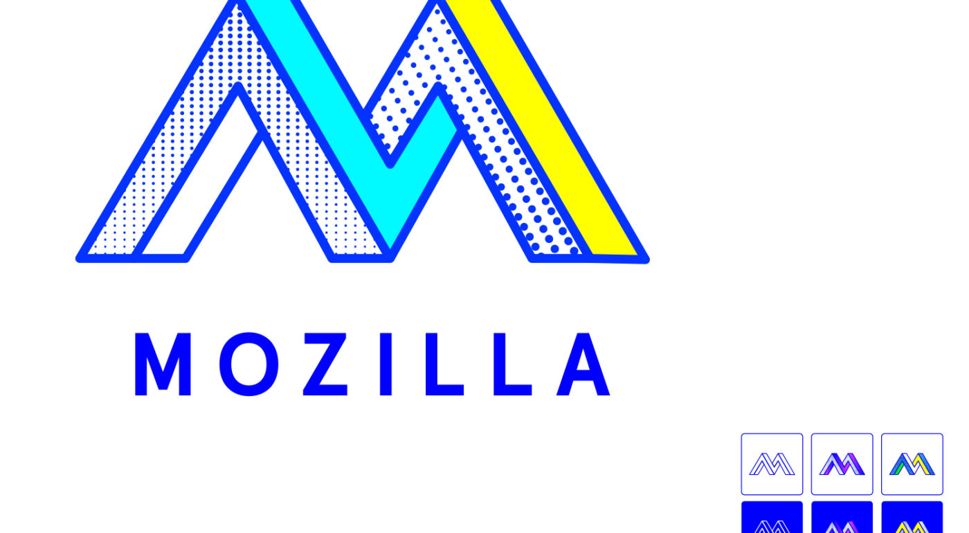
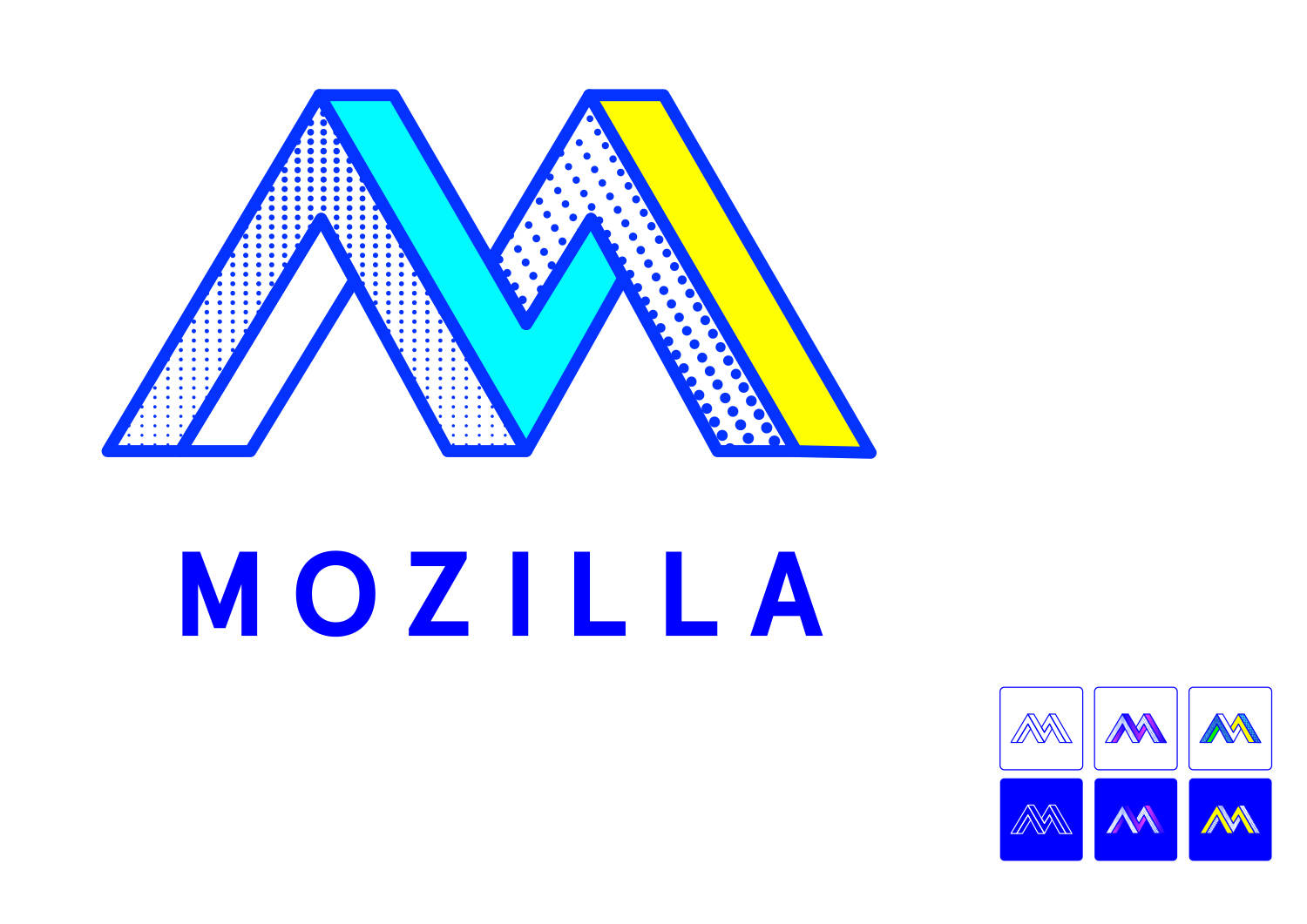
Design Route F: The Impossible M

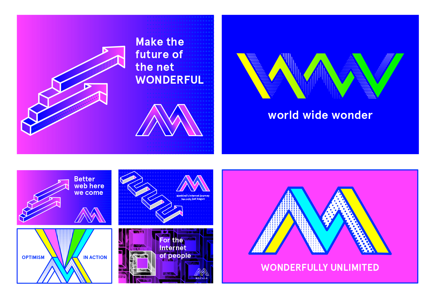
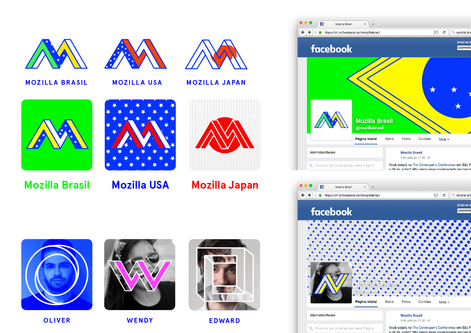
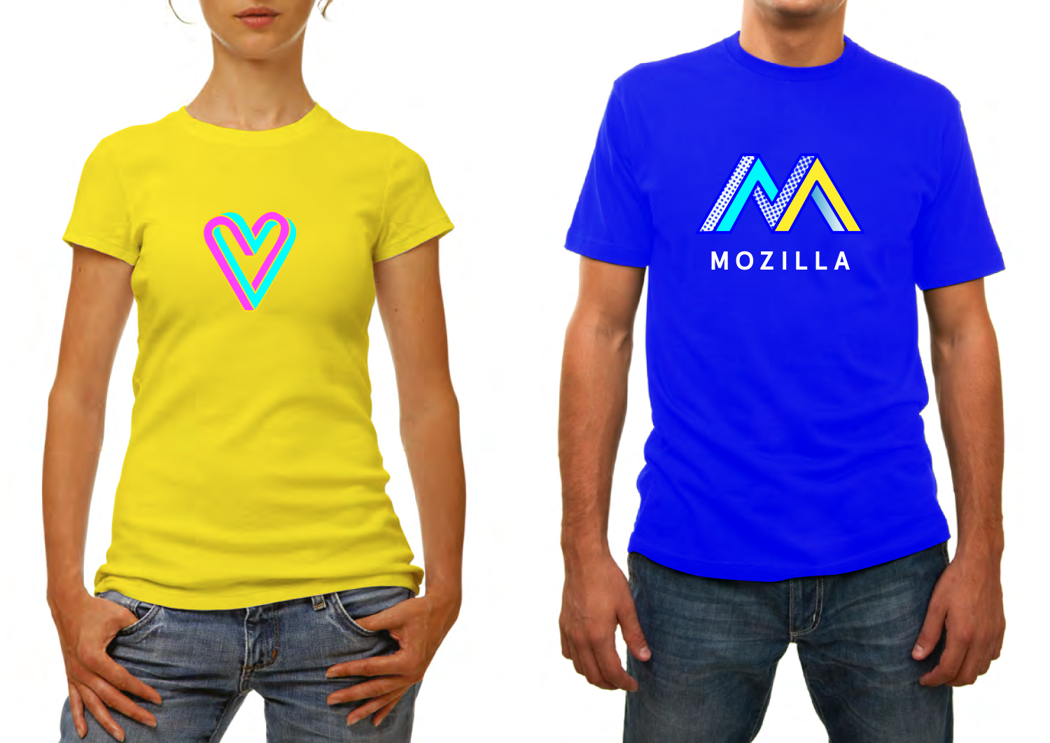
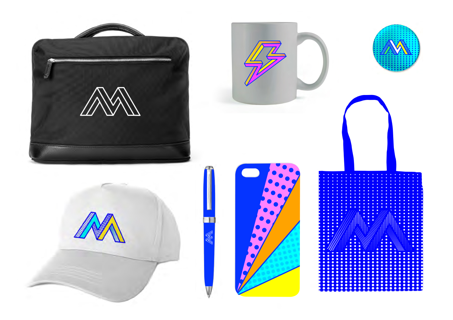
We wanted to show the collaborative aspect of the maker spirit in a simple typographic mark. Inspired by both computer graphics and optical illusions, an ‘impossible’ design developed that also revealed a cohesive design approach across all applications.

This design direction flows from the narrative theme “Mavericks United.”

Mavericks United

The Internet belongs to mavericks and independent spirits. It’s the sum total of millions of people working towards something greater than themselves. We believe the independent spirit that founded the Internet is vital to its future. But being independent doesn’t mean being alone. We bring together free thinkers, makers and doers from around the world. We create the tools, platforms, conversations, and momentum to make great things happen. We’re not waiting for the future of the Internet to be decided by others. It’s ours to invent.
jb_Mozilla_design_pres_edit_3.keyjb_Mozilla_design_pres_edit_3.keyjb_Mozilla_design_pres_edit_3.keyjb_Mozilla_design_pres_edit_3.keyjb_Mozilla_design_pres_edit_3.keyjb_Mozilla_design_pres_edit_3.keyMOZ-UNLIMITED-ANIMATION

136 comments on “Design Route F: The Impossible M”

  1. Margie Backhouse wrote on

    My favorite. I’d like to wear this t-shirt.

    1. Tim Murray wrote on

      Good to know, Margie. This is an important decision factor!

      1. ben wrote on

        being a digital brand I’d beg to differ

      2. Graham Swartzell wrote on

        As far as merch goes I’d say it’s a toss-up between this and Connector. Flik-Flak has too much going on, and Protocol doesn’t have enough.

    2. Jay wrote on

      Second favorite design. I like that it stretches the M out.

  2. Roger Dollins wrote on

    They all look good but I like this Maverick M
    GOOD LUCK Love your products, well done to the team

    1. Tim Murray wrote on

      Thanks for the good wishes, Roger.

  3. Rob Kellett wrote on

    The dots and gradients scream “retro” to me. It looks very 90’s, bright and neon designs from the wild west of graphic design. It looks outdated even now, and I shudder to think how it will be received 10 years from now.

    1. Wil Gilmore wrote on

      I agree. These look like fun one-off designs for t-shirts, but not for graphics people will see all the time.

    2. Andrew wrote on

      Agreed, the coloring is the biggest problem with this one in my opinion. The optical illusion is interesting enough, and the dots and bright colors make it too busy.

      I do however think that the textured look on the www is nice.

      I also think that the profile picture with a letter covering up the woman’s face partially defeats the picture.

    3. Redmess wrote on

      I agree as well, the dots and coloring make especially the big W look very retro and outdated. I do like the impossible shape idea, though. With better colors, it would make a nice T-shirt.

    4. Alberto Delgado wrote on

      Absolutely agree. This is my least favorite logo precisely because it looks very dated.

      It’s not that I don’t like the design itself, I just believe it gives off a huge 1.0 vibe, and I don’t think that is something the Mozilla community would like to associate itself with for the next 5-10 years.

      1. Alberto Delgado wrote on

        Not that Mozilla is not already associated with the early web, I just mean that, specially for those unfamiliar with the project, it might seem like Mozilla hasn’t changed its logo since the 90s

    5. Eric Penn wrote on

      I have the same concern, Rob. Tying your brand this closely to a passing fad isn’t great for longevity.

  4. Michael Sharp wrote on

    Love this direction. Icons are super consistent and its fun, just like the internets. Very right now. You might need to revisit in a few years, and I don’t see that as a bad thing. There aren’t too many ‘bullseyes’ out there that dont need an update. The design system and iconography is super strong and consistent. Hire this person, or send me an email with their contact info.

  5. Sam wrote on

    The main M mark is eye catching and I like how it symbolises creative maverick thinking and being part of something bigger. It also works well in outlines which should help it at small sizes. However, I would worry that this look would date super quickly.

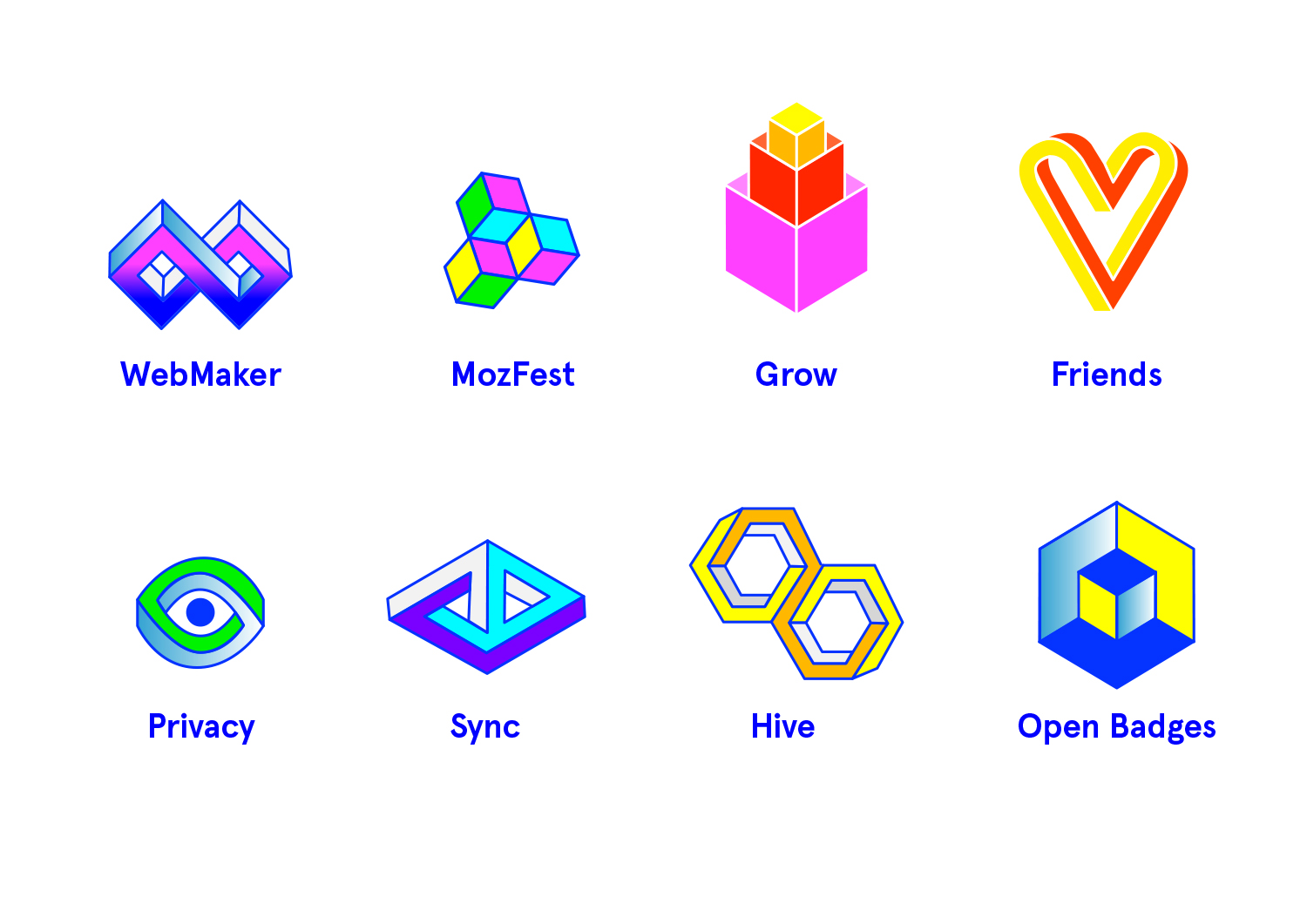
    The rest of the brand execution is a little chaotic, particularly the icons for individual products and some of the other screens and graphics, some have outlines, some don’t, some have gradients, some don’t. While I see that variety is the key to this look it can make things seem messy and disjointed.

    The M could provide a great starting point for a more rationalised brand, but it’s possibly a bit too cool for it’s own good.

  6. Darren Herman wrote on

    I think this is your strongest bet so far. Translates globally, is smart and clever, and work well across channels

  7. Jason Hunt wrote on

    Definitely passes ‘the t-shirt test’.
    Inkyness makes it stand out – heritage/craft.
    Quirky-er than the rest.

  8. Michael Kaply wrote on

    I love the direction, but the colors don’t do it for me. I’d rather see some bold retro Mozilla colors.

    Also the various logos don’t seem to tie together to a common theme as well as the other logos do especially Grow and MozFest.

    I think it would be much harder to use this design for multiple products.

  9. Emily Campbell wrote on

    I enjoy this visually, but it doesn’t speak “Mozilla” to me at all. I feel like it would look dated in a short while, but part of how I perceive Mozilla as a brand is that it is timeless. Maybe not super trendy, but reliable and consistent as the internet evolves. This variation does not evoke the same level of trust.

  10. Rahul Ghosh wrote on

    I think this should be the new logo of Mozilla

  11. Lucas wrote on

    I really liked this one. The M mark is kinda weird, too wide, maybe. But the textures and overall feel are very alligned with visual standards of today. Great job!

  12. joe mama besser wrote on

    so trendy that it’s time is already up. too much flash, not enough conceptual depth. gives me macpaint flashbacks.

  13. Daan van den Bergh wrote on

    My vote goes to this one, although the colors might be a bit to bright for some eyes. I’d totally buy the t-shirt and coffee mug, though. ?

  14. TheUnnamedNewbie wrote on

    I think the concept is good, but the color need some tweaking. As others have said, it looks somewhat dated. The most potential, given some work is done on the patters and so on used. But I just love the simplicity of the logo on the Tshirt. It’s clear. This is somewhat the opposite of the Moz://a candidate – there the name looks good, but it doesn’t play well on things like tshirts and mugs, while the opposite is true here – Too much retro on the base logo, but it looks great on stuff.

  15. Carlos El Halabi wrote on

    The colors just don’t do it. I think it’d look better with some more consistent colors. The M mark looks too wide for me.

  16. Lewis wrote on

    I love the early web influence on the patterns and colours, which definitely (as you said) harks back to the independent nature of the web. Plus, the CMYK 8-bit colour scheme is very much in trend right now in graphic design. But the problem I see is that it is going to look incredibly dated in just a few years, let alone 5–10.

  17. Antriksh Yadav wrote on

    I would like to speak against this one. It’s a great t-shirt design, and a fun set of branding overall. But it feels more apt for a graphic/web design company, and not Mozilla. The colors are way too hippie, retro looking.

  18. Allen Meyer wrote on

    I love this. Just love it. Ok, I’m not sure about the colors, and you need to ditch the texture for the brand standard version, but the complexity/simplicity of the M is intriguing and memorable. If I had one caveat, is that it is a little cold. Folks are so passionate about Mozilla and this needs to be reflected in this logo more.

  19. Timur Uzel wrote on

    I like this one a lot. It reminds me of the original n64 logo.

  20. George Mavrommatis wrote on

    This is by far my favorite, but still I wouldn’t use it as it is. Lots of potential, but still too noisy. The simpler one with only lines or a variation of it would be great for the global logo. Still reminds me of “Medium”, while the color and general look and feel reminds me “Bloomberg”.

    ScreenShot2016-08-19at10.02.33

  21. Pierre Goasdoue wrote on

    This design is awesome. The colors, shapes and gradient are great. I love the 90’s “new retro” look, and I think it would be an accurate design style for an open source web fondation like Mozilla, because it reminds the early age of web and fondamental ideas of share an freedom which made the web and Mozilla what they are today.
    Really hope this will be the one !

  22. nicolas wrote on

    That Penrose M could really be Mozilla for me.
    The style itself could be a little more unique. Pure RGB colours and half-tone patterns are nice and work well, but we’ve seen them elsewhere. Swapping one or both for something more incomparable may make this more characteristic of Mozilla.
    I’m not talking about details in the execution, because it’s probably not very relevant at this point in the project.
    Ultimately though, this is a path I can see Mozilla taking. The illusion shapes are nice. It feels ‘indie’ and arouses curiosity (and I like that ‘WWW world wide wonder’ visual).

    1. JASON M GEORGE wrote on

      Agree 100% with what Nicholas is saying here. I’m a sucker for all things Escher, so naturally the Penrose triangle application to the ‘M’ is a draw for me. I think the colors could become a nice playground, but personally, some of the colors/patterns displayed here are a bit too garish for me…but I’m not a millennial, so maybe I’m out of touch in some ways.

  23. Alec wrote on

    I think i like this the one the best, i read some comments on the eye one that said that it kinda feels like a surveillance company, always watching type thing, i don’t get that so much but maybe if the color palette was a little softer it wouldn’t have quite the surveillance vibe. Just a thought, good luck with this it seems a little frustrating but i applaud you.

  24. Martin wrote on

    it’ s good…yeah!

  25. candice wrote on

    that reminded me motorola for some reasons… the m shape and the flashy colors

  26. Conlin Durbin wrote on

    This one is definitely my favorite. I love the retro feel. There is a lot of harkening back to the early days of the web, which to me has a lot to do with community, inclusiveness, and experimentation – which are awesome values for Mozilla to be associated with.

    I would definitely wear this on a t-shirt and as a brand strategy, I think it is really easy to adapt the colors and style into whatever needs Mozilla has.

    A+ work here. Can’t wait to see the refinement stage!

  27. Chris Van Wiemeersch wrote on

    I really thoroughly enjoy this motif. What’s the typeface used? I assume they’re all using already commercial fonts. Or, does the font family not need to be “openness” for our company to exude open responsibilities.

  28. Zoraida wrote on

    This is definitely the ONE. What a wonderful system. Beautiful, just beautiful.

  29. Bea wrote on

    Would have been perfect in the 90’…
    Is Mozilla looking backward or forward?

    1. Stratus3D wrote on

      I see how it could be viewed that way, but I think even that could be viewed as a positive. They don’t need to look new and flashy because they are a company that provides cutting edge software we use everyday. Better software and an open internet is their focus, relevance and style are secondary.

      To me it indicates Mozilla is unchanging and here to stay.

  30. Michael Cordover wrote on

    I think this visually communicates a lot of what Mozilla is about, but I also worry that it brings to mind other logos, in particular on a dark blue background.

  31. Eliott wrote on

    This is my fave. It’s subtle because at first it looks like naff and old, and then the second after the colors and angular twists catch your eye and make you reconsider it. Then you think “well, i haven’t seen something that simple and still articulate”. Maybe it talks to people with some background in the web, i don’t know. To me it has the simplicity of the Google logo, but the concept of infinity behind each symbol/picto makes it full of depth, not just “flat design” like the “don’t do Evil” Corp is playing with.

  32. W. Zhang wrote on

    Looks good now, but it might be outdated later. Changing logos in the future is still doable.

  33. Reinhart Previano wrote on

    Good design, but the color and pattern choices matters. I think this logo could be improved by changing some of the colors. Oh, and of course, please publish this impossible geometrical fonts.

  34. Brenda Grannan wrote on

    Favorite. Relevant and hip.

  35. NOne wrote on

    The weird mismatched dots texture and horrific colors aside, I think George Mavrommatis submitted the best version. But again, like the Moz://a one, I think the whole Escher impossible geometry thing is WAY overthinking things. A new logo should be going for a general mood or impression about the product or company, not creating a puzzle that needs to be figured out. It took me years to see the FedEx arrow. But this is shoving that “look how clever I am” designer thing in the audience’s face.

  36. Victoria Black wrote on

    The shape as it is – is easily readable, has the vibe of “seriosity ” and “stability”, but the colours look cheap because of their association with outdated, slow technology.

  37. Wil Gilmore wrote on

    I like the concept but not the execution. The outline of the M seems too thin to be a wireframe and too thick to be a standout feature of the design. This design would look much cleaner with negative space separating the shapes that make up the M instead of lines.

  38. Noah wrote on

    While it’s hard to imagine this one as a tech company logo, this is probably the only one I’d actually wear on a shirt. For that reason I would be happy with it and gladly get used to it.

  39. Noah wrote on

    There’s are two TechCrunch Disrupt after parties. One is held by Mozilla with of Route D. One is held by Mozilla of Route F. You can only attend one. Which do you go to?

  40. M wrote on

    I like this one a bit more than the other 4/10 vs 2/10). You get a lot of flexibility out of the theme, but that also might make it hard to form a cohesive brand. I have a soft spot for optical illusions, too, but what makes these optical illusions say ‘Mozilla’? Maybe blend these shapes with something else (like ‘fire’ for the sake of discussion), to convey a stronger message or be more recognizable. Otherwise it’s just ‘colorful weird shape’, which could represent anything.

  41. Ken Slater wrote on

    Of all the designs, this one stood out for me as the one I just didn’t want. It just work for me on any level for your organization. Looks like a subway (Metro) sign from a 50’s comic book.

  42. christina wrote on

    Reminds me that a camel has been described as a horse designed by committee. Why would Mozilla want to imply they’ve created a shape that’s not possible? The design strikes me as cartoonish.

  43. Jon D. wrote on

    I like the escher concept and the basic outline, but I really don’t like the color choices, and I don’t think I care for the screentone-like fill pattern (especially not as a core branding motif)

  44. Stratus3D wrote on

    Overall I like this one the best. It strikes me as the most “timeless” of all the designs. It reminds me of the JSON logo (the impossible O), which in my opinion is a classic.

    I do think it could benefit from a little simplification. Maybe pare down the number of colors and patterns used?

  45. Walter Milliken wrote on

    Ranks about third for me. It’s moderately interesting, reasonably clear, and readable. The zipatone shading says “1950s” to me, though. And I don’t like the derivative designs much at all. The “impossible” nature of the pseudo-blivet doesn’t really come across well, possibly because of the multi-color shading; the optical illusions it echoes are normally done in black and white, or shades of grey, I believe. I think most people will look at this and just see a somewhat complex, stylized M that someone’s kid started coloring. Might work if the various textures on the surfaces were more harmonious.

  46. Liam wrote on

    The only good one out ALL of them. Change colors and get rid of dots. Way too retro with those colors and dots. Great animation. Great shirts, I would love one. A shirt with an icons would also be great. Feel free to send me one of each. Wouldn’t hold it against you.

    All icons, except the heart, are amazing. The heart icon doesn’t seam to belong there. It’s not the fact that it’s a heart. It’s the shape of it. It’s way too tall. It just doesn’t seam like it’s a part of the collection. Perhaps if you were to change its top. Make it like the top of the WebMaker icon, and make it shorter, or wider.

  47. Liam wrote on

    Way too much color. Pick two primary colors that would represent your brand and go with those. Perhaps, a third color to accentuate overall design. Especially the big M. Love the M.
    I feel like one of the colors should be red from the original design. That way it still reassures continuation of what Mozilla is about, it connects it to its heritage of Open Source.

  48. Jeremiah Lee wrote on

    The design and the colors feel dated. It’s not notably original or memorable. It could be for any company with a name that begins with “M”.

  49. Anant wrote on

    The color scheme is way too outdated. Might be more digestible if the colors were changed.

  50. Vezquex wrote on

    The sides of an M are supposed to be parallel. Don’t make the logo an upside-down W.

More comments:1 2 3