Categories: General

Design Route F: The Impossible M

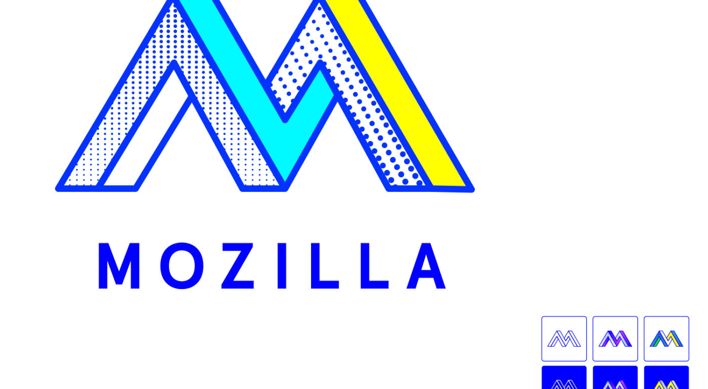
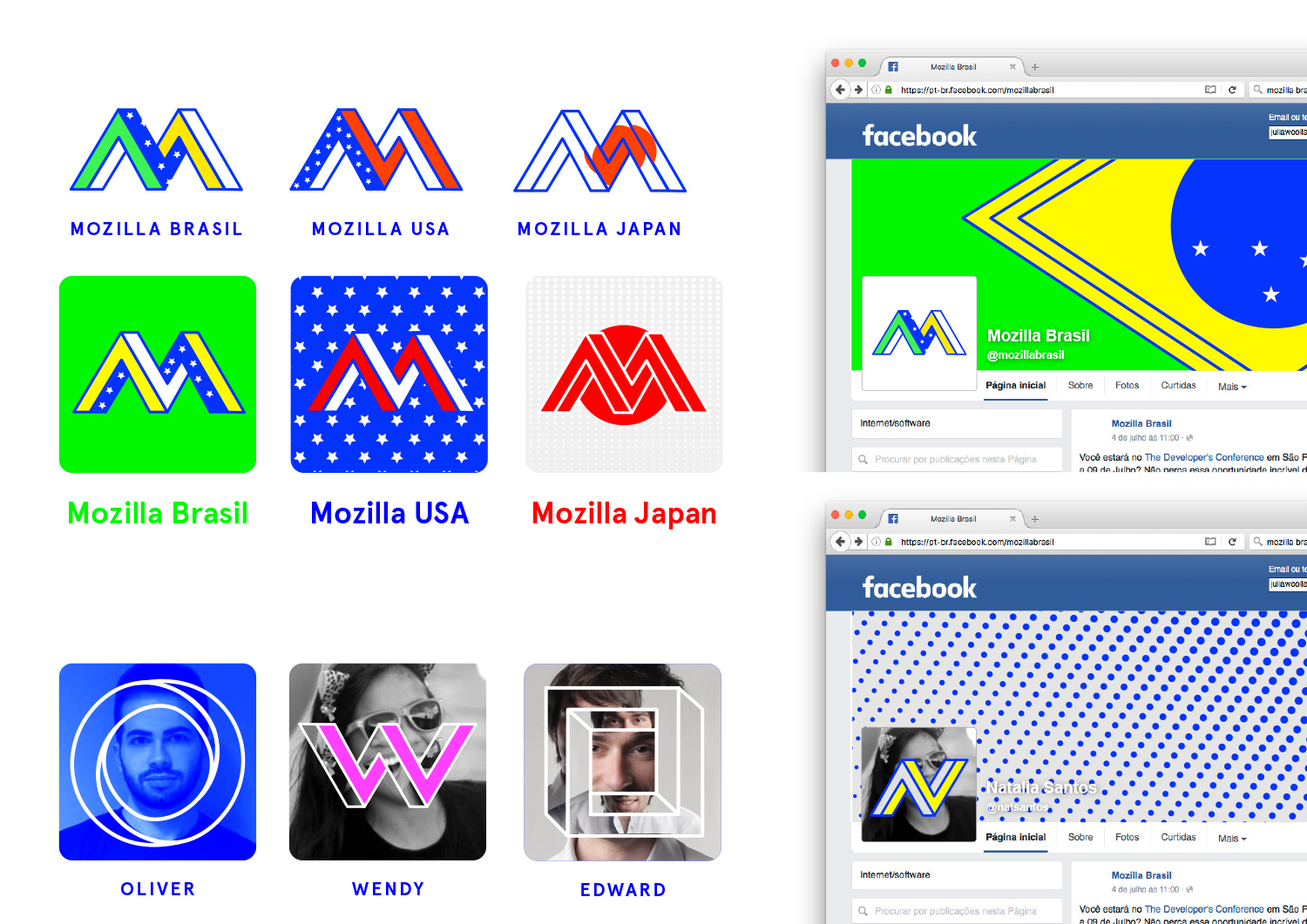
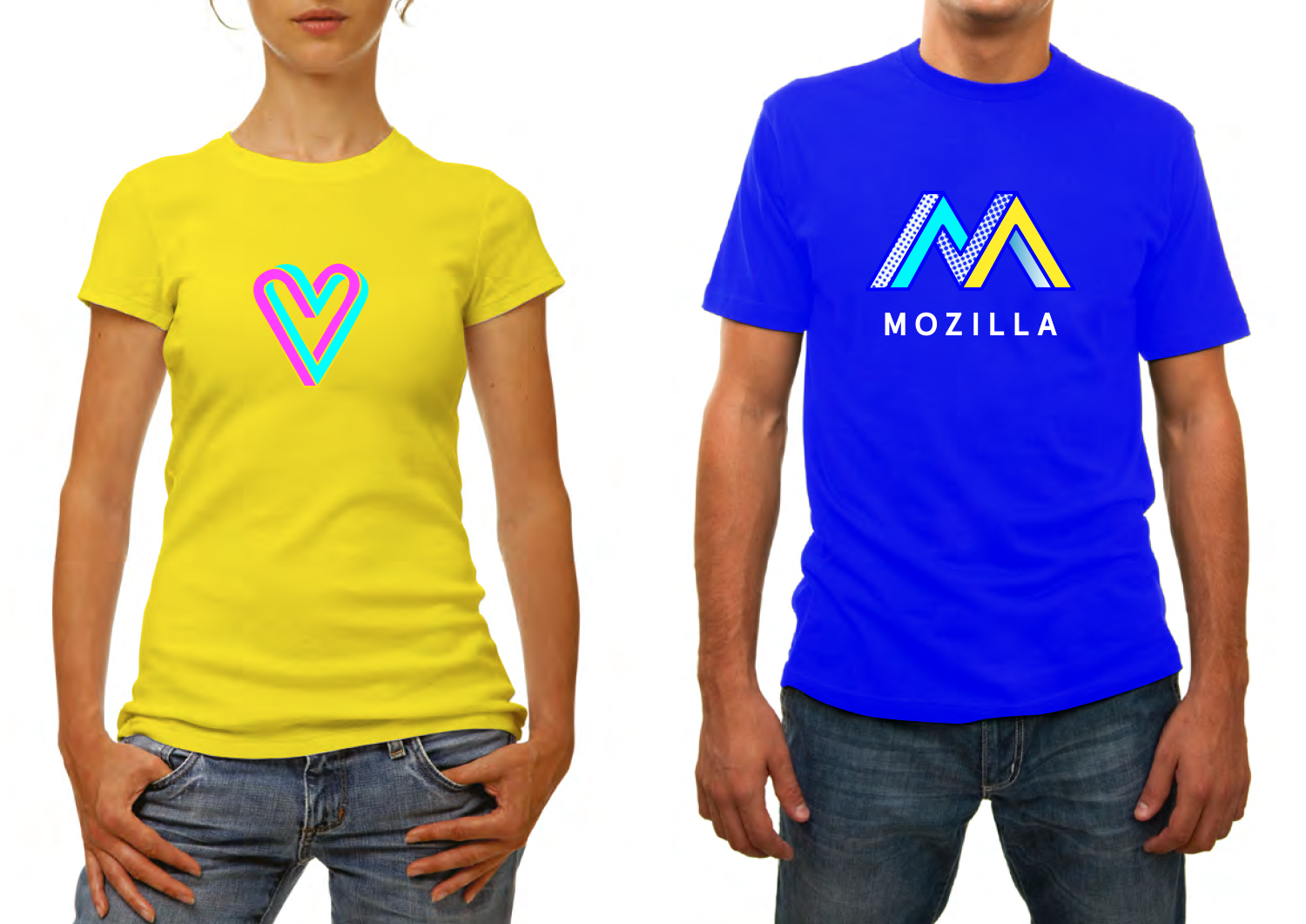
We wanted to show the collaborative aspect of the maker spirit in a simple typographic mark. Inspired by both computer graphics and optical illusions, an ‘impossible’ design developed that also revealed a cohesive design approach across all applications.

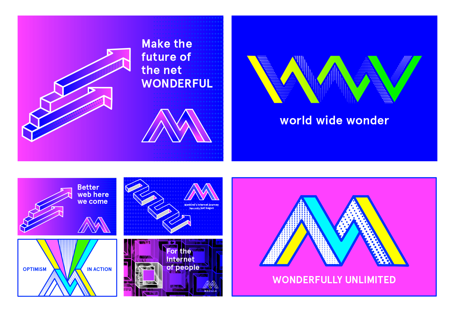
This design direction flows from the narrative theme “Mavericks United.”

Mavericks United

The Internet belongs to mavericks and independent spirits. It’s the sum total of millions of people working towards something greater than themselves. We believe the independent spirit that founded the Internet is vital to its future. But being independent doesn’t mean being alone. We bring together free thinkers, makers and doers from around the world. We create the tools, platforms, conversations, and momentum to make great things happen. We’re not waiting for the future of the Internet to be decided by others. It’s ours to invent.

jb_Mozilla_design_pres_edit_3.keyjb_Mozilla_design_pres_edit_3.keyjb_Mozilla_design_pres_edit_3.keyjb_Mozilla_design_pres_edit_3.keyjb_Mozilla_design_pres_edit_3.keyjb_Mozilla_design_pres_edit_3.keyMOZ-UNLIMITED-ANIMATION

136 comments on “Design Route F: The Impossible M”

  1. Margo Cerno wrote on

    New Retro meets the Penrose Triangle. Nice.

    There’s no way that an organization as established as Mozilla makes this choice–it’s too cool. But it’s nice to know that some of them listen to Vaporwave.

  2. John Tekeridis wrote on

    Really like this one! I like the implementation of the icons of sync, privacy, hive ect. Also liked the animation on the bottom and the iPhone case ;)

    Good job, good luck !

  3. thomas browne wrote on

    not bad but hews to all the usual themes we are currently seeing in tech logo design. 3d “widget” effect? Check. Primary colours? check. Printed-page style dithered colouring? Check. Not a bad effort but lost in the wind a bit in my opinion. The only saving grace is that here’s a bit of colour clash going on here which is quite cool.

  4. Otto wrote on

    My Favorite

  5. Bill wrote on

    I’m a desktop/CLI user who prefers uncluttered design. I think this one comes closest; some others really have me shaking my head.

  6. ramin radmehr wrote on

    6

  7. Bruno PIRON wrote on

    too flashy color, you are not MTV

  8. kz wrote on

    Of all the designs presented this is the cleanest. That said, I would humbly submit a couple of ideas for improvement to make it great.
    First, it would be better without the colors and polka dots. They just clutter up an otherwise clean design. Use of some grey scale would perform the same function with less visual clutter if you feel you need something.
    Second, incorporate the company name “Mozilla” into the basic design rather than presenting it as an external and optional add-on. For example, incorporate the Mozilla name into the left riser of the M, reading up from the bottom. This would then clearly identify the logo and it’s underlying company even to the uninitiated.

  9. Jani Nurminen wrote on

    What message do you want to send with this logo with all the neon complementary colors and all that stipple? “M is for migraine”?

    Seriously, this design is not nice at all… Remember that Mozilla products are used by ordinary people too, not only hipsters looking for fresh and in-your-face popping designs. Acid test: what will your parents think when they see the logo? What will your neighbours think? What will your boss think? What will the old geezer down the road think? Do they associate the logo with “dodgy” or “solid” – do they get the logo?

    There is hope yet – George Mavrommatis has a good point. This design becomes so much more nicer if you just use the lines and drop the gradients and patterns completely.

    One can go crazy with outline color in the lines-only version but whatever you do, please make the M less busy overall.

    IMO the logo should really also spell out Mozilla. The font like in the blue shirt in the pictures above looks very nice.

  10. Edward Allanby wrote on

    This is my fav. An internet that sees things differently, that is creative at its core and would rather innovate then follow is something I buy into. Optical tricks are a nice lateral way to express these concepts.

    But – stylistically it sucks (sorry! – Only my opinion!!). Too many corporates are already using those dots, colours and gradients. It needs to trailblaze it’s very own style.

    The actual illusions need to be more radical, I have seen all those ones before. If Mozilla is to live up to its promise new ones will need to be created that wow and excite (Think the Sonos rebrand). How these come to life in animation, audio and interactivity may make or breaks it.

  11. Robert Kaiser wrote on

    The basic idea is nice, but I’m also not sure if we want to market Mozilla as something “impossible”. Actually, it’s very much possible to achieve our mission, though sometimes it may not look that way. That logo idea looks possible but is in practice impossible, which is the exact reverse.
    Apart from that basic idea, the widely angled sides of the “M” and the color/texture scheme look very awkward to me and like something very outdated. Yes, Mozilla is from the 90s originally but we need something looking to the future, not the past.

  12. Jarrod wrote on

    Already looks outdated. Color pallet is off. Doesn’t work well at all scales. Sub brands like Grow don’t jump out as being part of the main brand. The color palette leaves much to be desired.
    The better implementations of just the M in this design are the red and white M in the bottom US icon and the W in the Wendy icon. Most of the other interpretations are too busy or simply uninteresting.
    The black and white design as seen on the bag feels very bland and derivative.
    There is potential here starting with the US and Wendy variants and building from there.

  13. Andrew A Tatge wrote on

    I get major MEMPHIS design and pop art vibes from this. The former was more concerned with making a statement against stodgy status–quo “good taste” design than offering functionality/usability. Pop art elevates the common, but I think it becomes kind of highbrow in the process, kind of taking it away from the masses. That doesn’t jive well with what I associate Mozilla with.

    I find the impossible shapes can be a little unsettling, but pulling off the impossible is a fun direction, and I like the message. Paired with vibrant color choices and varying patterns all at once, I get a little overwhelmed.

    Moz Fest’s color combination turns me off more than others’.
    The heart logo reminds me of Unilever’s heartbrand, especially if used in Red/Yellow.

    I do think this direction fits with an IoT and tinker-y image. A little on the fringe and pushing envelopes in under-defined spaces. I have some doubts about how this aesthetic ages, but modest changes could adapt it perhaps.

  14. Thomas van Diepen wrote on

    This one is the best. Very characteristic differentiating and not to forget cool!

  15. rugk wrote on

    In it’s current way it is the worst logo IMHO. Sorry to say, but the colors are just ugly.

    Maybe if you change the colours it may be a logo with some interesting ideas. I e.g. like the visual “impossible” way of the M and for some reasons I also like the privcacy icon. Maybe because the colors do not look so bad there.
    Also the Sync icon is nice if it would had some less screaming colors.

  16. Paco Núñez wrote on

    Too retro for mozilla

  17. Satrio wrote on

    The 80’s called, they want their logo back. Too dated and looks like an outdoor equipment brand.

  18. lehasb wrote on

    Cool logo, and easier to identify than some of the others, but the colors are a little odd.

  19. Jenn Goble wrote on

    I love the M and the interpretation of concept in this one. However, I have concerns about the colors looking dated and not having a lasting power to make this a longterm brand identity. I do think this one is the one with the most communication power.

    1. jgreenspan wrote on

      Thanks, Jenn, that’s helpful feedback.

  20. Denis Bredelet wrote on

    This is fun and cool, one of the best choices in my humble opinion.

    The retro look takes time to get used to and it could get quickly tired if you abuse of it.

  21. Chris wrote on

    I like the concept, and the animated and printed version of the logos, but I’m not wild about the textured parts on the M on screen for some reason. Also, color scheme may need to be tweaked, I know it’s supposed to be fun, but it feels like 80’s dayglo nonsense instead of approachable 2016 tech.

  22. Arakun wrote on

    The blue and white versions look okay although a bit boring. The cyan and yellow version makes me think of the Windows 1.0 colour scheme and that campy old commercial with Steve Ballmer.

  23. Blake Gonzales wrote on

    logo looks like it was made in the 80s. ugly.

  24. Daniele Palombi wrote on

    What a cool design, i love it!

  25. John Arkison wrote on

    This one easily works best for me. People have commented on the colors. If you tried shifting it a little to Art Deco, that might work. I am biased, though, towards that style.

  26. Karthik wrote on

    My favourite. M for Mozilla!

  27. Farokh Shahabi wrote on

    This design is far better than the others and it’s my favorite.

    But on the side note, all design are either too flashy or too complicated. I expected more.

  28. Peter wrote on

    Some are saying this is too on trend, while others are getting early 90s flashbacks. I think this could actually be a fairly durable mark. It’s possible that the colors and textures may be a bit loud, but considering they’re emulating newsprint I don’t think they’re part of some fleeting trend.

    I think this has the most personality and potential of any of the proposals and I’d like to see it fleshed out more.

  29. Benjamin Christine wrote on

    Really beautiful work! Love the geometry and multi-faceted look. Its strong and recognisable, working on lots of media. May I even say it has quite a disruptive look and feel for a software/tech company.

    I would possibly rethink colouring and texture as it starts to touch on a 80s era which I don’t believe Mozilla really wants to be related to, and I don’t believe it would have longevity.

  30. Baptiste wrote on

    Retro … and i love it ! Definitely my favorite :)

  31. Pacifica wrote on

    I am all for obscure maths jokes, Maths was my major and Escher’s art is quite good. But mostly people would not get the in joke here. As with all science, exposure to culture is quite thin on the ground for high school, and university so at first it would look like a stencilled shape. At least the variations are quite distinctive. The colour options various. A bit twee and uses a 90’s colour palette which would give rise to fluro pens again. Perhaps more vivid colours would be better to the eye because after a few moments you have to look away from the current ones (scotoma).

  32. Pacifica wrote on

    I am all for obscure maths jokes, Maths was my major and Escher’s art is quite good. For most though, it would look like a stencilled shape. At least the variations are quite distinctive. The colour options various. A bit twee and uses a 90’s colour palette which would give rise to fluro pens again. Perhaps more vivid colours would be better to the eye because after a few moments you have to look away from the current ones (scotoma, migraine).

  33. James Brooks wrote on

    This is my favourite design, but I also love the idea of the “Moz://a” text, and I think a combination of both would make for an excellent brand. However, I do agree with others in that the colour scheme is a little too vibrant in places. Overall, a really solid design route.

  34. Ferit wrote on

    Another cool looking concept. I like brand identities, logos, where it is clear which company we are all talking about. The retro looking, the colors makes it to stand out.

  35. Tobias wrote on

    I would probably like it if it weren’t for the fact that too many logos seem to play on some sort of Escher theme. Makes it feel derivative and reminiscent of “The Verge” logo (http://www.theverge.com/) and others.

  36. Cory Koski wrote on

    This design feels ugly and confusing, and I do not like the overly retro look. Please bin this.

  37. Endyl wrote on

    This looks too obscure to me. Although it’s fun and colorful, not in a way that speaks Mozilla to me.
    Would not vote for it.

  38. François BESNAÏNOU wrote on

    The Impossible M.
    C’est celui que je préfère. Résolument moderne, évolutif, percutant. Les différentes déclinaisons pour WebMaker, MozFest, Sync, Privacy, etc… sont très réussies également. Bravo !
    La variante “optimism in action” me plait beaucoup aussi.

  39. Leo wrote on

    This one is my third favorite. I like the logo but I don’t like the colors. It also feels too corporate.

  40. Michael wrote on

    Way too harsh, it’s like a daft punk album a few years ago. It tries to hard to appeal to the dub step culture of today.

  41. Shea wrote on

    I think this route is the most marketable as well as intelligently rebranding mozilla as part of the tech-art crowd. I love these designs and think they would serve the creative community well.

  42. Eric Shepherd wrote on

    I do like the retro feel of this design, although the colors are once again too bright and hard to look at for use on a web site people are going to look at a lot (we hope). I would love to see an iteration on this with more subdued colors. This is one of the better options provided, but I don’t love it, and I definitely don’t like it as much as “D”. It’s not bad though. Certainly worth doing a second iteration on to see if it can be made better.

  43. David wrote on

    I like the paean to M.C. Escher. It open lots of possibilities artistically and brings to mind seeing things in a different way; creativity; flexibility.

    Very cool but I still prefer “B”.

  44. mike wrote on

    Feels like a clip art logo. It has a cold sharp angular feel. This logo will only work with bright bold colours. It’s a little too basic.

  45. Rick Colby wrote on

    The Escher “M” is an interesting and distinctive mark with possibilities that could be built on. It works better with flat colors, though. It simplifies the mark and makes it easier to read. The patterns in the “M” are too distracting and look too much like a comic book or a Roy Lichtenstein illustration. The color palette for the system is also a bit too cartoonish. I’d like to see “fun” but not “80s disco fun”.

  46. Uy Le wrote on

    This is fresh and modern visually. However it feels a bit trendy. Impossible shapes, neon colors and experimental layouts is my cup of tea, but to represent a brand, they come across as a bit immature and more of a post-rationale. Might not be the most sustainable choice.

  47. Dank Memes wrote on

    AESTHETIC

  48. Kelley Lueck wrote on

    Hate the colours, looks like the standard colours you found in the first Paint porgrams in the 90’s. Love to see these in a less aggresive in your face colours

  49. Hyrum wrote on

    Geocities…. no, please no. The black and white back looks acceptable, but that smacks of tower corporate persona. The wireframe and the colors are just painful.

    If you really want to go with the impossible M, try something with wavelengths/internet/wireless signal with less… Windows 95 in 8 bit color.

  50. Suche wrote on

    First I like Moz://a, but now I find it little bit boring.

    This M logo is far better, it could be modificated in many ways.
    If the fillness of the shapes was a just simple colors it may look better.
    It’s simple and trendy, easy to remember and unique.

More comments: 1 2 3